Sans-serif
| |
Sans-serif font |
 |
Serif font |
 |
Serif font (serifs in red) |
In typography and lettering, a sans-serif, sans serif, gothic, or simply sans letterform is one that does not have the small projecting features called "serifs" at the end of strokes.[1] Sans-serif fonts tend to have less line width variation than serif fonts. In most print, sans-serif fonts are often used for headings rather than for body text.[2] They are often used to project an image of simplicity and modernity or minimalism.
Sans-serif fonts have become the most prevalent for display of text on computer screens. On lower-resolution digital displays, fine details like serifs may disappear or appear too large. The term comes from the French word sans, meaning "without" and "serif" of uncertain origin, possibly from the Dutch word schreef meaning "line" or pen-stroke.
Before the term "sans-serif" became common in English typography, a number of other terms had been used. One of these outmoded terms for sans serif was gothic, which is still used in East Asian typography and sometimes seen in font names like Century Gothic, Highway Gothic, or Trade Gothic.
Sans-serif fonts are sometimes, especially in older documents, used as a device for emphasis, due to their typically blacker type color.
Classification
For the purposes of type classification, sans-serif designs are usually divided into three or four major groups, the fourth being the result of splitting the grotesque category into grotesque and neo-grotesque.[3][4]
Grotesque

This group features most of the early (19th century to early 20th) sans-serif designs. Influenced by Didone serif fonts of the period and signpainting traditions, these were often quite solid, bold designs suitable for headlines and advertisements. The early sans-serif typefaces often did not feature a lower case or italics, since they were not needed for such uses. They were sometimes released by width, with a range of widths from extended to normal to condensed, with each style different, meaning to modern eyes they can look quite irregular and eccentric.[5][6] Grotesque fonts have limited variation of stroke width (often none perceptible in capitals). The terminals of curves are usually horizontal, and many have a spurred "G" and an "R" with a curled leg. Capitals tend to be of relatively uniform width. Cap height and ascender height are generally the same to create a more regular effect in texts such as titles with many capital letters, and descenders are often short for tighter linespacing.[7] Most avoid having a true italic in favour of a more restrained oblique or sloped design, although at least some did have true italics.[8]
Examples of grotesque fonts include Akzidenz Grotesk, News Gothic, Franklin Gothic and Monotype Grotesque, though some digital releases of these reduce their eccentricities in order to make them more suitable to modern tastes. Akzidenz Grotesk Old Face, Knockout, Grotesque No. 9 and Monotype Grotesque are examples of digital fonts that retain eccentricities of early sans-serif types.[9][10][11][12] The term realist has also been applied to these designs due to their practicality and simplicity.
Neo-grotesque

As the name implies, these modern designs consist of a direct evolution of grotesque types. They are relatively straightforward in appearance with limited width variation. Unlike earlier grotesque designs, many were issued in extremely large and versatile families from the time of release, making them easier to use for body text. Similar to grotesque typefaces, neogrotesques often feature capitals of uniform width and a quite 'folded-up' design, in which strokes (for example on the 'c') are curved all the way round to end on a perfect horizontal or vertical. Helvetica is an example of this. Others such as Univers are less regular.
Neo-grotesque type began in the 1950s with the emergence of the International Typographic Style, or Swiss style. Its members looked at the clear lines of Akzidenz Grotesk (1896) as an inspiration to create rational, almost neutral typefaces. In 1957 the release of Helvetica, Univers, and Folio, the first typefaces categorized as neo-grotesque, had a strong impact internationally: Helvetica came to be the most used typeface for the following decades.[13] Other examples include: Rail Alphabet, Acumin, San Francisco and Roboto.
Geometric

As their name suggests, Geometric sans-serif typefaces are based on geometric shapes, like near-perfect circles and squares. Common features are a nearly-exactly circular letter "O" and a "single-story" lowercase letter "a". Of these four categories, geometric fonts tend to be the least useful for body text and often used for headings and small passages of text.
The geometric sans originated in Germany in the 1920s.[14] Two early efforts in designing geometric types were made by Herbert Bayer and Jakob Erbar, who worked respectively on Universal Typeface (unreleased at the time but revived digitally as Architype Bayer) and Erbar (circa 1925).[15] In 1927 Futura, by Paul Renner, was released to great acclaim and popularity.[16]
Geometric sans-serif fonts were popular from the 1920's and 30's due to their clean, modern design, and many new geometric designs and revivals have been created since.[lower-alpha 1] Notable geometric types of the period include Kabel, Nobel and Metro; more recent designs in the style include ITC Avant Garde, Brandon Grotesque, Gotham and Avenir. Many geometric sans-serif alphabets of the period, such as those created by the Bauhaus art school (1919-1933) and modernist poster artists, were hand-lettered and not cut into metal type at the time.[18]
A separate inspiration for many types considered "geometric" in design has been the simplified shapes of letters engraved or stenciled on metal and plastic in industrial use, which often follow a simplified structure. Designs considered geometric in principles but which are less descended from the Futura/Erbar/Kabel tradition include Bank Gothic, DIN 1451, Eurostile and Handel Gothic.
Humanist

Sans-serifs take inspiration from traditional letterforms, such as Roman square capitals, traditional serif fonts and calligraphy. Many have true italics rather than an oblique, ligatures and even swashes in italic. One of the earliest humanist designs was Edward Johnston's Johnston typeface of c. 1916, and, a decade later, Gill Sans (Eric Gill, 1928).[19] Edward Johnston, a calligrapher by profession, was inspired by classic letter forms, especially the capital letters on the Column of Trajan.[20]
Humanist designs vary more than gothic or geometric designs.[21] Some humanist designs have stroke modulation (strokes that clearly vary in width along their line) or alternating thick and thin strokes. These include most popularly Hermann Zapf's Optima (1958), a typeface expressly designed to be suitable for both display and body text.[22] Some humanist designs may be more geometric, as in Gill Sans and Johnston (especially their capitals), which like Roman capitals are often based on perfect squares, half-squares and circles, with considerable variation in width. These somewhat architectural designs may feel too stiff for body text.[19] Others such as Syntax, Goudy Sans and Sassoon Sans more resemble handwriting, serif fonts or calligraphy.
Frutiger, from 1976, has been particularly influential in the development of the modern humanist sans genre, especially designs intended to be particularly legible above all other design considerations. The category expanded greatly during the 1980s and 1990s, partly as a reaction against the overwhelming popularity of Helvetica and Univers and also due to the need for legible fonts on low-resolution computer displays.[23][24][25][26] Designs from this period intended for print use include FF Meta, Myriad, Thesis, Charlotte Sans, Bliss and Scala Sans, while designs created for computer use include Microsoft's Tahoma, Trebuchet, Verdana, Calibri and Corbel, as well as Lucida Grande, Fira Sans and Droid Sans. Humanist sans-serif designs can (if appropriately proportioned and spaced) be particularly suitable for use on screen or at distance, since their designs can be given wide apertures or separation between strokes, which is not a conventional feature on grotesque and neo-grotesque designs.
Other/mixed
Due to the diversity of sans-serif typefaces, many do not fit neatly into the above categories. For example, Neuzeit S has both neo-grotesque and geometric influences, as does Herman Zapf's URW Grotesk. Other "trans-sans" designs include Whitney and Klavika. Sans-serif fonts intended for signage, such as Transport and Highway Gothic used on road signs, may have unusual features to enhance legibility and differentiate characters, such as a lower-case "L" with a curl or "i" with serif under the dot.[27]
Modulated sans-serifs

A particular subgenre of sans-serifs is those such as Rothbury, Britannic, Radiant and National Trust with stroke contrast, which have been called 'modulated' sans-serifs. They are nowadays often placed within the humanist genre, although they predate Johnston which started the modern humanist genre. These may take inspiration from calligraphy or painted lettering, grotesque or humanist fonts.[28]
Sans-serif analogues in non-Latin scripts

The concept of a typeface without traditional flourishes spread from the Western European typographical tradition to other scripts in the late 19th century. Like their Latin counterparts, non-Latin linear faces are popular for on-screen text due to their legibility. Sans-serif analogues are in common use for Greek, Cyrillic, Hebrew, and Chinese, Japanese, and Korean. See also East Asian sans-serif typeface.
History

Letters without serifs have been common in writing across history, for example in casual, non-monumental epigraphy of the classical period. However, Roman square capitals, the inspiration for much Latin-alphabet lettering throughout history, had prominent serifs.

While simple sans-serif letters have always been common in "uncultured" writing, such as basic handwriting, most artistically created letters in the Latin alphabet, both sculpted and printed, since the Middle Ages have been inspired by fine calligraphy, blackletter writing and Roman square capitals. As a result, printing done in the Latin alphabet for the first three hundred and fifty years of printing was "serif" in style, whether in blackletter, roman type, italic or occasionally script.
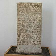
The earliest printing typefaces which omitted serifs were not intended to render contemporary texts, but to represent inscriptions in Ancient Greek and Etruscan. Thus, Thomas Dempster's De Etruria regali libri VII (1723), used special types intended for the representation of Etruscan epigraphy, and in c. 1745, Caslon foundry made Etruscan types for pamphlets written by Etruscan scholar John Swinton.[29] Another niche used of a printed sans-serif letterform from in 1786 onwards was a rounded sans-serif script font developed by Valentin Haüy for the use of the blind to read with their fingers.[30][31][32]
.jpg)

Towards the end of the eighteenth century Neoclassicism led to architects increasingly incorporating ancient Greek and Roman designs in contemporary structures.[lower-alpha 3] Among the architects, John Soane commonly used sans-serif letters on his drawings and architectural designs.[33] Soane's inspiration was apparently the inscriptions dedicating the Temple of Vesta in Tivoli, Italy, with minimal serifs.[33] These were then copied by other artists. The lettering style apparently became referred to as "old Roman" or "Egyptian" characters, referencing the classical past and a contemporary interest in Ancient Egypt and its blocky, geometric architecture.[33][36][lower-alpha 4]
In London, 'Egyptian' lettering became popular for advertising, apparently because of the "astonishing" effect the unusual style had on the public. Historian James Mosley, the leading expert on early revival of sans-serif letters, has written that "in 1805 Egyptian letters were happening in the streets of London, being plastered over shops and on walls by signwriters, and they were astonishing the public, who had never seen letters like them and were not sure they wanted to."[41] A depiction of the style was shown in the European Magazine of 1805.[42][43] However, the style did not become used in printing for some more years.[lower-alpha 5] (Early sans-serif signage was not printed from type but hand-painted or carved, since at the time it was not possible to print in large sizes. This makes tracing the descent of sans-serif styles hard, since a trend can arrive in the dated, printed record from a signpainting tradition which has left less of a record or at least no dates.) Around 1816, the Ordnance Survey began to use 'Egyptian' lettering, monoline sans-serif capitals, to mark ancient Roman sites. This lettering was printed from copper plate engraving.[42][32]


Around 1816, William Caslon IV produced the first sans-serif printing type in England for Latin characters, a capitals-only face under the title 'Two Lines English Egyptian', where 'Two Lines English' referred to the font's body size, which equals to about 28 points.[46][47] No uses of it from the period have been found; Mosley speculates that it may have been commissioned by a specific client.[48] Another hiatus followed until sans-serifs began again to be issued by London typefounders from around 1830 onwards, such as Vincent Figgins and Thorogood. These were quite different in design, arrestingly bold and similar in aesthetic to the slab serif and "fat faces" of the period. Intended for advertising, these typefaces, often display capitals, became very successful.[42]
Sans-serif lettering and fonts were popular due to their clarity and legibility at distance in advertising and display use, when printed very large or very small. Because sans-serif type was often used for headings and commercial printing, many early sans-serif designs did not feature lower-case letters. Simple sans-serif capitals, without use of lower-case, became very common in uses such as tombstones of the Victorian period in Britain. The term "grotesque" became commonly used to describe sans-serifs. The term "grotesque" comes from the Italian word for cave, and was often used to describe Roman decorative styles found by excavation, but had long become applied in the modern sense for objects that appeared "malformed or monstrous."[7]


The first use of sans serif as a running text is believed to be the short booklet Feste des Lebens und der Kunst: eine Betrachtung des Theaters als höchsten Kultursymbols (Celebration of Life and Art: A Consideration of the Theater as the Highest Symbol of a Culture),[49] by Peter Behrens, in 1900.[50]
Throughout the nineteenth and early twentieth centuries sans-serif types were viewed with suspicion by many printers, especially those of fine books, as being fit only for advertisements (if that), and to this day most books remain printed in serif fonts as body text.[51] This impression would not have been helped by the standard of common sans-serif types of the period, many of which now seem somewhat lumpy and eccentrically-shaped. In 1922, master printer Daniel Berkeley Updike described sans-serif fonts as having "no place in any artistically respectable composing-room."[52] By 1937 he stated that he saw no need to change this opinion in general, though he felt that Gill Sans and Futura were the best choices if sans-serifs had to be used.[53]

Through the early twentieth century, an increase in popularity of sans-serif fonts took place as more artistic and complex designs were created. As Updike's comments suggest, the more constructed humanist and geometric sans-serif designs were viewed as increasingly respectable, and were shrewdly marketed in Europe and America as embodying classic proportions (with influences of Roman capitals) while presenting a spare, modern image.[56][57][58][59] While he disliked sans-serif fonts in general, the American printer J.L Frazier wrote of Copperplate Gothic in 1925 that "a certain dignity of effect accompanies...due to the absence of anything in the way of frills," making it a popular choice for the stationery of professionals such as lawyers and doctors.[60]
In the post-war period, an increase of interest took place in "grotesque" sans-serifs.[61] Writing in The Typography of Press Advertisement (1956), printer Kenneth Day commented that Stephenson Blake's eccentric Grotesque series had returned to popularity for having "a personality sometimes lacking in the condensed forms of the contemporary sans cuttings of the last thirty years."[17] Leading type designer Adrian Frutiger wrote in 1961 on designing a new face, Univers, on the nineteenth-century model: "Some of these old sans serifs have had a real renaissance within the last twenty years, once the reaction of the 'New Objectivity' had been overcome. A purely geometrical form of type is unsustainable.[62]" Of this period in Britain, Mosley has commented that in 1960 "orders unexpectedly revived" for Monotype's eccentric Monotype Grotesque design: "[it] represents, even more evocatively than Univers, the fresh revolutionary breeze that began to blow through typography in the early sixties" and "its rather clumsy design seems to have been one of the chief attractions to iconoclastic designers tired of the...prettiness of Gill Sans".[63][64]

By the 1960s, neo-grotesque fonts such as Univers and Helvetica had become popular through reviving the nineteenth-century grotesques while offering a more unified range of styles than on previous designs, allowing a wider range of text to be set artistically through setting headings and body text in a single font.[5][65][66][67][68]
Other names for sans-serif

Early appellatives
- Egyptian: The term was first used by Joseph Farington after seeing the sans serif inscription on John Flaxman's memorial to Isaac Hawkins Brown in 1805,[42] though today the term is commonly used to refer to slab serif, not sans serif.
- Antique: In about 1817, the Figgins foundry in London made a type with square or slab-serifs which it called 'Antique', and that name was adopted by most of the British and US typefounders. An exception was the typefounder Thorne, who confused things by marketing his Antique under the name 'Egyptian'. In France it became Egyptienne, and to worsen the confusion, the French called sans-serif type 'Antique'.[29] Some fonts, such as Antique Olive, still carry the name.
- Grotesque: It was originally coined by William Thorowgood of Fann Street Foundry in 1832.[69] The name came from the Italian word 'grottesco', meaning 'belonging to the cave'. In Germany, the name became Grotesk. German typefounders adopted the term from the nomenclature of Fann Street Foundry, which took on the meaning of cave (or grotto) art.[70] Nevertheless, some explained the term was derived from the surprised response from the typographers.
- Doric: It was the term first used by H. W. Caslon Foundry in Chiswell Street in 1870 to describe various sans-serif fonts at a time the generic name 'sans-serif' was commonly accepted. Eventually the foundry used Sans-serif in 1906. At that time, Doric referred to a certain kind of stressed sans-serif types.
- Gothic: Not to be confused with blackletter typeface, the term was used mainly by American type founders. Perhaps the first use of the term was due to the Boston Type and Stereotype Foundry, which in 1837 published a set of non-serifed typefaces under that name. It is believed that those were the first sans serif designs to be introduced in America.[71] The term probably derived from the architectural definition, which is neither Greek nor Roman,[72] and from the extended adjective term of "Germany", which was the place where sans-serif typefaces became popular in the 19th to 20th centuries.[73] Early adopters for the term includes Miller & Richard (1863), J. & R. M. Wood (1865), Lothian, Conner, Bruce McKellar. Although the usage is now rare in the English-speaking world, the term is commonly used in Japan and South Korea; in China they are known by the term heiti (Chinese: 黑體), literally meaning "black type", which is probably derived from the mistranslation of Gothic as blackletter typeface, even though actual blackletter fonts have serifs.
Recent appellatives
- Lineale, or linear: The term was defined by typographic historian Maximilien Vox in the VOX-ATypI classification to describe sans-serif types. Later, in British Standards Classification of Typefaces (BS 2961:1967), lineale replaced sans-serif as classification name.
- Simplices: In Jean Alessandrini's désignations préliminaries (preliminary designations), simplices (plain typefaces) is used to describe sans-serif on the basis that the name 'lineal' refers to lines, whereas, in reality, all typefaces are made of lines, including those that are not lineals.[74]
- Swiss: It is used as a synonym to sans-serif, as opposed to roman (serif). The OpenDocument format (ISO/IEC 26300:2006) and Rich Text Format can use it to specify the sans-serif generic font family name for a font used in a document.[75][76][77] Presumably refers to the popularity of sans-serif grotesque and neo-grotesque types in Switzerland.
Gallery
This gallery presents images of sans-serif font use across different times and places from early to recent. Particular attention is given to unusual uses and more obscure fonts, meaning this gallery should not be considered a representative sampling.
 Sample use of early sans-serifs, Dublin 1848. Setting is caps only for titling, with the letters very bold and condensed. Reasonably conventional except for the crossed V-form 'W'.
 Light sans-serif being used for body text. Germany, 1914
 Capitals on a German propaganda poster, 1914.
 Condensed but somewhat decorative sans-serif with small flourishes on the 'v' and 'e'. Ljubljana, 1916.
_Plakat_4._Kriegsanleihe_1916.jpg) A conventional, nearly monoline sans combined with a stroke-modulated sans used for the title. Austrian war bond poster, 1916.
A conventional, nearly monoline sans combined with a stroke-modulated sans used for the title. Austrian war bond poster, 1916. Broad block capitals. Hungarian film poster, 1918.
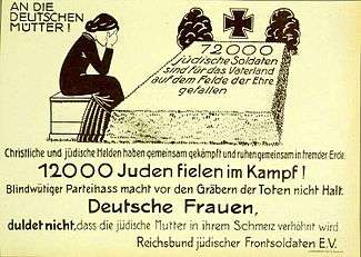 A monoline sans-serif with art-nouveau influences visible in the tilted 'e' and 'a'. Note embedded umlaut at top left: accents are often compressed in sans-serif capitals as here to allow tight linespacing. Commemoration of Jewish soldiers killed fighting for Germany, 1920.
 Thick block sans-serif capitals, with inner details kept very thin and narrow lines down the centres of letters, characteristic of Art Deco lettering. France, 1920s.
 Berthold Block, a thick German sans-serif with shortened descenders, allowing tight linespacing. Switzerland, 1928.
 Simple Geometric-style sans (the line 'O Governo do Estado', Brazil, 1930. Curves are kept to a minimum.
.jpg) Lightly modulated sans serif lettering on a 1930s poster, with pointed stroke endings suggesting a brush.
Lightly modulated sans serif lettering on a 1930s poster, with pointed stroke endings suggesting a brush. Classic geometric sans-serif capitals, 1934, Australia. Note the sharp points on the capital 'A' and 'N'.
 Dwiggins' Metrolite and Metroblack fonts, geometric types of the style popular in the 1930s.
 Lettering in relief, suggesting solid lettering on a wall. Sweden, 1942.
 Modernist setting on a 1940s American poster. The curve of the 'r' is a common feature in grotesque fonts, but the 'single-story' 'a' is a classic feature of geometric fonts from the 1920s onwards.
 1952 Jersey holiday events brochure, using the popular Gill Sans-led British style of the period
 Neo-grotesque type, 1972, Switzerland: Helvetica or a close copy. The tight setting is characteristic of the International style of graphic design. The irregular setting may have been the result of using transfers.
 Swiss TV logo: tightly-spaced neo-grotesque capitals with a more rounded sans-serif on the left.
See also
Articles:
- Serif
- East Asian sans-serif typeface
- Roman type
- Italic type
- Monospace
- Emphasis (typography)
- San Serriffe, an April fool joke by Guardian newspaper.
Notable sans-serif typefaces:
- Grotesque
- Neo-grotesque
- Humanist
- Geometric
- List of sans serif typefaces (general)
References
- ↑ "sans serif" in The New Encyclopaedia Britannica. Chicago: Encyclopaedia Britannica Inc., 15th edn., 1992, Vol. 10, p. 421.
- ↑ Serifs more used for headlines
- ↑ Childers; Griscti; Leben (January 2013). "25 Systems for Classifying Typography: A Study in Naming Frequency" (PDF). The Parsons Journal for Information Mapping. The Parsons Institute for Information Mapping. V (1). Retrieved 23 May 2014.
- ↑ Baines, Phil; Haslam, Andrew (2005), Type and Typography, Laurence King Publishing, p. 51, ISBN 9781856694377, retrieved May 23, 2014
In British Standards Classification of Typefaces (BS 2961:1967), the following are defined:
Grotesque: Lineale typefaces with 19th-century origins. There is some contrast in thickness of strokes. They have squareness of curve, and curling close-set jaws. The R usually has a curled leg and the G is spurred. The ends of the curved strokes are usually oblique. Examples include the Stephenson Blake Grotesques, Condensed Sans No. 7, Monotype Headline Bold.
Neo-grotesque: Lineale typefaces derived from the grotesque. They have less stroke contrast and are more regular in design. The jaws are more open than in the true grotesque and the g is often open-tailed. The ends of the curved strokes are usually horizontal. Examples include Edel/Wotan, Univers, Helvetica.
Humanist: Lineale typefaces based on the proportions of inscriptional Roman capitals and Humanist or Garalde lower-case, rather than on early grotesques. They have some stroke contrast, with two-storey a and g. Examples include Optima, Gill Sans, Pascal.
Geometric: Lineale typefaces constructed on simple geometric shapes, circle or rectangle. Usually monoline, and often with single-storey a. Examples include Futura, Erbar, Eurostile. - 1 2 Shinn, Nick. "Uniformity" (PDF). Nick Shinn. Graphic Exchange. Retrieved 1 July 2015.
- ↑ Coles, Stephen. "Helvetica alternatives". FontFeed. Retrieved 1 July 2015.
- 1 2 Berry, John. "A Neo-Grotesque Heritage". Adobe Systems. Retrieved 15 October 2015.
- 1 2 Specimens of type, borders, ornaments, brass rules and cuts, etc. : catalogue of printing machinery and materials, wood goods, etc. American Type Founders Company. 1897. p. 340. Retrieved 17 August 2015.
- ↑ Hoefler & Frere-Jones. "Knockout". Hoefler & Frere-Jones. Retrieved 1 July 2015.
- ↑ Hoefler & Frere-Jones. "Knockout sizes". Hoefler & Frere-Jones.
- ↑ "Knockout styles". Hoefler & Frere-Jones. Retrieved 1 July 2015.
- ↑ Lippa, Domenic. "10 favourite fonts". The Guardian. Retrieved 1 July 2015.
- ↑ Meggs 2011, pp. 376-377.
- ↑ Ulrich, Ferdinand. "Types of their time – A short history of the geometric sans". FontShop. Retrieved 19 August 2015.
- ↑ Kupferschmid, Indra. "On Erbar and Early Geometric Sans Serifs". CJ Type. Retrieved 20 October 2016.
- ↑ Meggs 2011, pp. 339-340.
- 1 2 Day, Kenneth (1956). The Typography of Press Advertisement. pp. 86–8.
- ↑ Kupferschmid, Indra. "True Type of the Bauhaus". Fonts in Use. Retrieved 15 October 2016.
- 1 2 Tracy 1986, pp. 86-90.
- ↑ Nash, John. "In Defence of the Roman Letter" (PDF). Journal of the Edward Johnston Foundation. Retrieved 13 October 2016.
- ↑ Blackwell, written by Lewis (2004). 20th-century type (Rev. ed.). London: Laurence King. p. 201. ISBN 9781856693516.
- ↑ Lawson 1990, pp. 326-330.
- ↑ Millington, Roy (2002). Stephenson Blake: The Last of the Old English Typefounders. Oak Knoll Press. ISBN 1-58456-086-X.
- ↑ Tankard, Jeremy. "Bliss". Retrieved 1 August 2014.
- ↑ "Speak Up Archive: Saab or Dodgeball?". Underconsideration.com. Retrieved 7 January 2011.
- ↑ « Previous Next » Commentary. "Questioning Gill Sans - Typography Commentary". Typographica. Retrieved 7 January 2011.
- ↑ Calvert, Margaret. "New Transport". A2-TYPE. Retrieved 2 May 2016.
- ↑ Coles, Stephen. "Identifont blog Feb 15". Identifont. Retrieved 17 August 2015.
- 1 2 Mosley, James (January 6, 2007), The Nymph and the Grot, an update, archived from the original on June 10, 2014, retrieved June 10, 2014
- ↑ "Perkins School for the Blind". Perkins School for the Blind. Retrieved 15 October 2016.
- ↑ Johnson, Alastair. "Robert Grabhorn Collection on the History of Printing". San Francisco Public Library. Retrieved 15 October 2016.
- 1 2 3 Mosley, James. "Comments on Typophile thread - "Unborn: sans serif lower case in the 19th century"". Typophile (archived). Retrieved 15 October 2016.
- 1 2 3 4 5 6 7 8 Mosley, James (1999). The Nymph and the Grot: the Revival of the Sanserif Letter. London: Friends of the St Bride Printing Library. pp. 1–19. ISBN 9780953520107.
- ↑ John L Walters (2 September 2013). Fifty Typefaces That Changed the World: Design Museum Fifty. Octopus. pp. 1913–5. ISBN 978-1-84091-649-2.
- ↑ Barnes, Paul. "James Mosley: A Life in Objects". Eye. Retrieved 23 September 2016.
- ↑ Alexander Nesbitt (1998). The History and Technique of Lettering. Courier Corporation. p. 160. ISBN 978-0-486-40281-9.
- ↑ L. Parramore (13 October 2008). Reading the Sphinx: Ancient Egypt in Nineteenth-Century Literary Culture. Springer. pp. 22–3. ISBN 978-0-230-61570-0.
- ↑ Jason Thompson (30 April 2015). Wonderful Things: A History of Egyptology 1: From Antiquity to 1881. The American University in Cairo Press. pp. 251–2. ISBN 978-977-416-599-3.
- ↑ Southey, Robert (1808). Letters from England: by Don Manual Alvarez Espriella. pp. 274–5.
- ↑ Farington, Joseph; Greig, James (1924). The Farington Diary, Volume III, 1804-1806. London: Hutchinson & Co. Retrieved 15 October 2016.
- ↑ Mosley, James. "The Nymph and the Grot: an Update". Typefoundry blog. Retrieved 12 December 2015.
- 1 2 3 4 James Mosley, The Nymph and the Grot: the revival of the sanserif letter, London: Friends of the St Bride Printing Library, 1999
- ↑ "L. Y.". "To the Editor of the European Magazine". European Magazine. Retrieved 15 October 2016.
- ↑ Callingham, James (1871). Sign Writing and Glass Embossing. pp. 54–55.
- ↑ Specimen of Plain & Ornamental Types from the Foundry of V. & J. Figgins. London: V. & J. Figgins Letterfounders. 1846. Retrieved 16 October 2016.
- ↑ Tracy, Walter (2003). Letters of credit : a view of type design. Boston: David R. Godine. ISBN 9781567922400.
- ↑ Tam, Keith (2002). Calligraphic tendencies in the development of sanserif types in the twentieth century (PDF). Reading: University of Reading (MA thesis).
- ↑ Simon Loxley (12 June 2006). Type: The Secret History of Letters. I.B.Tauris. pp. 36–8. ISBN 978-1-84511-028-4.
- ↑ Behrens, Peter (1900), Feste des Lebens und der Kunst: eine Betrachtung des Theaters als höchsten Kultursymbols (in German), Eugen Diederichs
- ↑ Meggs 2011, p. 242.
- ↑ Rogers, Updike, McCutcheon (1939). The work of Bruce Rogers, jack of all trades, master of one : a catalogue of an exhibition arranged by the American Institute of Graphic Arts and the Grolier Club of New York. New York: Grolier Club, Oxford University Press. pp. xxxv–xxxvii.
- ↑ Updike, Daniel Berkeley (1922). Printing types : their history, forms, and use; a study in survivals vol 2 (1st ed.). Cambridge, MA: Harvard University Press. p. 243. Retrieved 17 August 2015.
- ↑ Lawson, Alexander (1990). Anatomy of a typeface (1st ed.). Boston: Godine. p. 330. ISBN 9780879233334.
- ↑ Badaracco, Claire (1991). "Innovative Industrial Design and Modern Public Culture: The Monotype Corporation, 1922–1932" (PDF). Business & Economic History. Business History Conference. 20 (second series): 226–233. Retrieved 19 December 2015.
- ↑ "Promotional Poster, 1928". Red List. Monotype.
- ↑ "Fifty Years of Typecutting" (PDF). Monotype Recorder. 39 (2): 11, 21. 1950. Retrieved 12 July 2015.
- ↑ "Gill Sans Promotional Poster, 1928". Red List. Monotype.
- ↑ Robinson, Edwin (1939). "Preparing a Railway Timetable" (PDF). Monotype Recorder. 38 (1): 24. Retrieved 12 July 2015.
- ↑ East Coast Joys: Tom Purvis and the LNER
- ↑ Frazier, J.L. (1925). Type Lore. Chicago. p. 20. Retrieved 24 August 2015.
- ↑ Brideau, K.; Berret, C. (16 December 2014). "A Brief Introduction to Impact: 'The Meme Font'". Journal of Visual Culture. 13 (3): 307–313. doi:10.1177/1470412914544515.
- ↑ Frutiger, Adrian (2014). Typefaces: The Complete Works. p. 88. ISBN 9783038212607.
- ↑ The Nymph and the Grot, an update
- ↑ Mosley, James (1999). The Nymph and the Grot. London. p. 9.
- ↑ Shaw, Paul. "Helvetica and Univers addendum". Blue Pencil. Retrieved 1 July 2015.
- ↑ Schwartz, Christian. "Neue Haas Grotesk". Retrieved 28 November 2014.
- ↑ "Neue Haas Grotesk". The Font Bureau, Inc. p. Introduction.
- ↑ "Neue Haas Grotesk". History. The Font Bureau, Inc.
- ↑ Lawson 1990, p. 296.
- ↑ Typolexicon.de: Grotesk
- ↑ Lawson 1990, p. 295.
- ↑ OED Definition of Gothic
- ↑ The Sans Serif Typefaces
- ↑ Haralambous 2007, p. 411.
- ↑ Open Document Format for Office Applications (OpenDocument) Version 1.2, Part 1: Introduction and OpenDocument Schema, Committee Draft 04, 15 December 2009, retrieved 2010-05-01
- ↑ OpenDocument v1.1 specification (PDF), retrieved 2010-05-01
- ↑ Microsoft Corporation (June 1992), Microsoft Product Support Services Application Note (Text File) - GC0165: RICH-TEXT FORMAT (RTF) SPECIFICATION (TXT), retrieved 2010-03-13
- Bringhurst, Robert (2004), The Elements of Typographic Style (3rd ed.), Hartley & Marks Publishers, ISBN 9780881792065
- Haralambous, Yannis (28 November 2007), Fonts & Encodings, O'Reilly Media, ISBN 9780596102425
- Lawson, Alexander (1990), Anatomy of a Typeface, David R. Godine, Publisher, ISBN 9780879233334
- Lyons, Martyn (2011), Books: A Living History (2nd ed.), Getty Publications, ISBN 9781606060834
- Meggs, Philip B.; Purvis, Alston (2011), Meggs' History of Graphic Design (5th ed.), Wiley, ISBN 9781118017760
- Tracy, Walter (1986), Letters of Credit: A View of Type Design, David R. Godine, Publisher, ISBN 9780879236366
- Kupferschmid, Indra, Some Type Genres Explained
- ↑ In this period and since, some sources have distinguished the nineteenth-century "grotesque/gothic" designs from the "sans-serifs" (including humanist designs) of the twentieth, or used some form of classification that emphasises a different between the groups.[17]
- ↑ Mosley's book on early sans-serifs The Nymph and the Grot is named for the sculpture. The name is a dual reference, also to "grotesque" being coincidentally a term also applied to early sans-serif fonts, although Mosley suggests that the design does not seem to be a direct source of modern sans-serifs. Unfortunately, the inscription was destroyed by mistake in 1967, and had to be replicated from Mosley's photographs.[35][33] The corporate font of the National Trust of the United Kingdom, which manages Stourhead, was loosely designed by Paul Barnes based on the inscription.
- ↑ A trend of this period was increasing interest in original models, developing from Palladian-style adaptations.
- ↑ The inappropriateness of the name was not lost on the poet Robert Southey, in his satirical Letters from England written in the character of a Spanish aristocrat.[37][38] It commented: "Everything now must be Egyptian: the ladies wear crocodile ornaments, and you sit upon a sphinx in a room hung round with mummies, and with long black lean-armed long-nosed hieroglyphical men, who are enough to make the children afraid to go to bed. The very shopboards must be metamorphosed into the mode, and painted in Egyptian letters, which, as the Egyptians had no letters, you will doubtless conceive must be curious. They are simply the common characters, deprived of all beauty and all proportion by having all the strokes of equal thickness, so that those which should be thin look as if they had the elephantiasis."[39][33] Similarly, the painter Joseph Farington wrote in his diary in 1805 of a memorial in to Isaac Hawkins Browne in Trinity College, Cambridge engraved "in what is called Egyptian Characters which to my eye had a disagreeable effect."[40][33]
- ↑ Apparently based on traditions in his industry, master sign-painter James Callingham writes in his textbook "Sign Writing and Glass Embossing" (1871) that "What one calls San-serif, another describes as grotesque; what is generally known as Egyptian, is some times called Antique, though it is difficult to say why, seeing that the letters so designated do not date farther back than the close of the last century. Egyptian is perhaps as good a term as could be given to the letters bearing that name, the blocks being characteristic of the Egyptian style of architecture. These letters were first used by sign-writers at the close of the last century, and were not introduced in printing till about twenty years later. Sign-writers were content to call them “block letters,” and they are sometimes so-called at the present day; but on their being taken in hand by the type founders, they were appropriately named Egyptian. The credit of having introduced the ordinary square or san-serif letters also belongs to the sign-writer, by whom they were employed half a century before the type founder gave them his attention, which was about the year 1810."[44][33]
Typography terminology | |||||||||||||||
|---|---|---|---|---|---|---|---|---|---|---|---|---|---|---|---|
| Page | |||||||||||||||
| Paragraph | |||||||||||||||
| Character |
| ||||||||||||||
| Classifications |
| ||||||||||||||
| Punctuation | |||||||||||||||
| Typesetting | |||||||||||||||
| Typographic units | |||||||||||||||
| Digital typography |
| ||||||||||||||
| Related | |||||||||||||||
| |||||||||||||||