Typeface anatomy

Typeface anatomy describes the graphic elements that make up printed letters in a typeface.[1]
Strokes
The strokes of a letter are the lines that make it up. Strokes may be straight, as in k l v w x z, or curved, as in c o s. If straight, they may be horizontal, vertical, or diagonal; if curved, open or closed. Typographers also speak of an instroke, where one starts writing the letter, as at the top of a c f, and an outstroke, where the pen leaves off, as at the bottom of c e j k t y.[2]
Typefaces are born from the struggle between rules and results. Squeezing a square about 1% helps it look more like a square; to appear the same height as a square, a circle must be measurably taller. The two strokes in an X aren't the same thickness, nor are their parallel edges actually parallel; the vertical stems of a lowercase alphabet are thinner than those of its capitals; the ascender on a d isn't the same length as the descender on a p, and so on. For the rational mind, type design can be a maddening game of drawing things differently in order to make them appear the same.
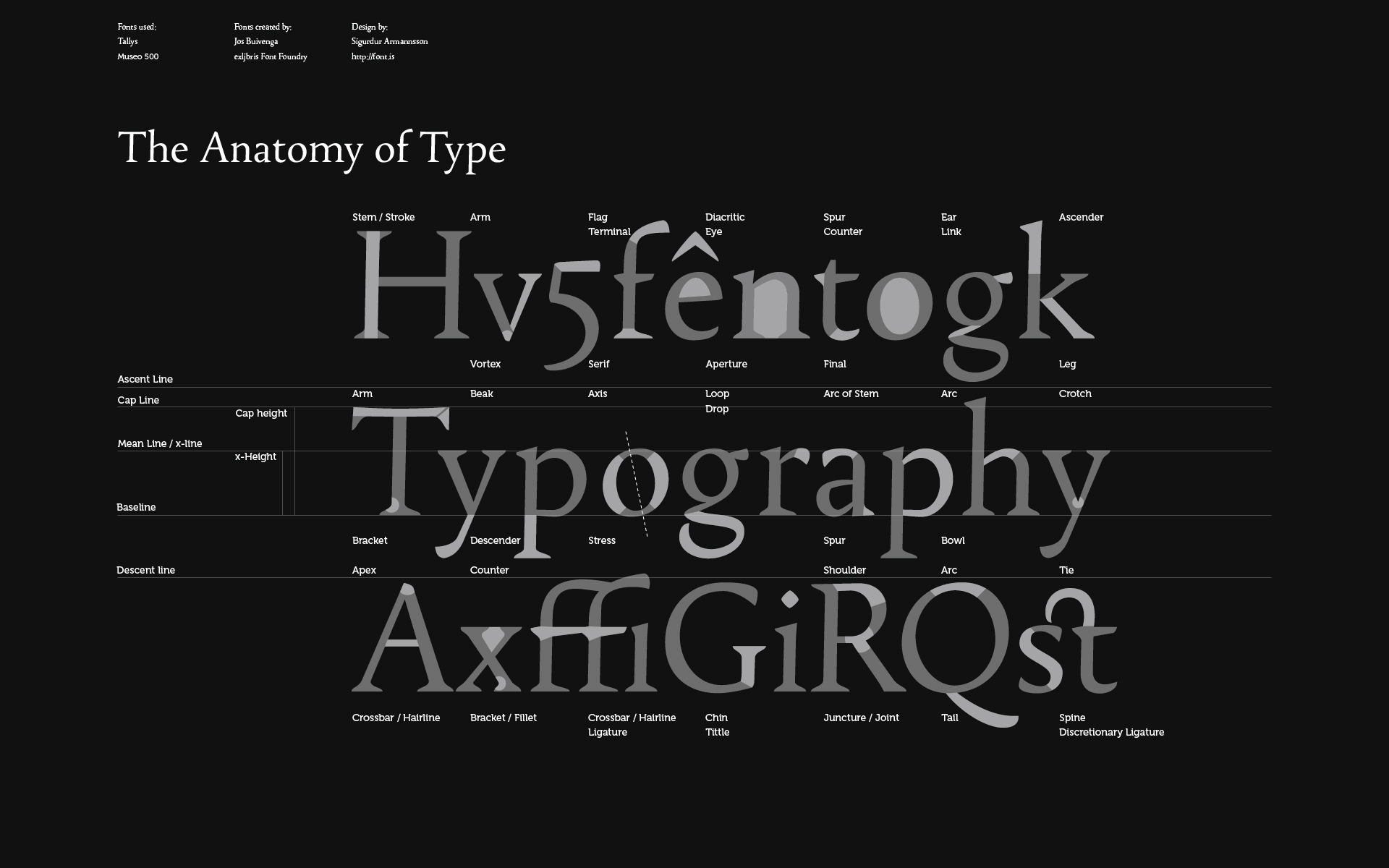
A main vertical stroke is called a stem. The letter m has three, the left, middle, and right stems. The central stroke of an s is called the spine. A stroke, usually a stem, which rises above the height of an x (called the x height) is called an ascender.[4] Letters with ascenders are b d f h k l. A stroke which drops below the baseline is a descender.[4] Letters with descenders are g j p q y. An arching stroke is called a shoulder or sometimes just an arch, as in h n m. A closed curved stroke is called a bowl in b d o p q D O P Q R; B has two bowls. A trailing outstroke, as in j k y J K Q R is called a tail. A short horizontal stroke, as in the center of e f t A and the middle stroke of E F, is called a bar. A longer horizontal stroke at the top or bottom, as in E F L T, is called an arm. The bottom of the two-story g is called a loop; the very short stroke at the top is called the ear.[5] i j each have a dot, jot, or tittle.[5] Angles of strokes are called apices if at the top and vertices if at the bottom. w has one apex and two vertices; v has one vertex.[5]
The font shown in the example is stressed: strokes have varying widths. In this example, the stroke at the top of the g is thinner at the top and bottom than on the sides - a vertical stress.
Terminals
The terminals (ends) of instrokes and outstrokes often end in serifs in a serif font. A serifed or unserifed terminal may be described as a wedge, bulbous, teardrop, etc., depending on the design of the type. Some designs also have spurs, which are smaller than serifs and appear on angles rather than at a terminal, as on e or G.
Space
Areas of negative space (white space) formed by straight or curved strokes are called counters. Closed counters are found in a b d e g o p q A B D O P Q R, and open counters in a c e f h m n r s t u. Angles of white space, as in w, are corners (w has three corners); the term is not used for angles of strokes. The small corner formed by a serif, whether curved or angular, is called the serif bracket.
Proportions
During the late metal type period, many fonts (particularly in American typefounding) were issued to "common line". This meant that they were made to standardised proportions, so that fonts of different typefaces could be mixed with no difficulty. This made it possible to mix typefaces from completely different genres such as sans-serifs and serifs and have the cap height, baseline and linespacing match perfectly, something not possible with most digital fonts. It even allowed mixing of different sizes of type with a consistent baseline. It however had the disadvantage of often forcing typefaces to be issued with cropped descenders compared to historical typefaces, to allow tight linespacing.[6] A "script line" or "art line" was used for more delicate fonts with long descenders. Titling capitals, meanwhile, were issued taking up the whole space of the metal type area, with no room for descenders.[7]
References
- ↑ Studer, Anton (29 February 2016). "Is What I See What I Get? — Math & Optics in Type Design". Typographica. Retrieved 17 April 2016.
- ↑ Pecina, Martin; Březina, David (2008). "Type Anatomy 1.0". Typomil.
- ↑ "Introducing Ideal Sans". Fonts by Hoefler & Co. 4 May 2011.
- 1 2 Dean, Paul (11 April 2008). "eXtreme Type Terminology. Part Three: The 'Black Art'". I Love Typography.
- 1 2 3 Dean, Paul (27 March 2008). "eXtreme Type Terminology. Part 2: Anatomy of a Letterform". I Love Typography.
- ↑ "Founders Type Alignments". Happy Dragons Press. Retrieved 29 June 2016.
- ↑ American Specimen Book of Type Styles. American Type Founders. 1912. p. 38.
Further reading
- Gaskell, Philip (January 1976). "A nomenclature for the letterforms of roman type". Visible Language. 10 (1): 41–51.
External links
| Wikimedia Commons has media related to Examples of typography terms. |
- Armannsson, Sigurdur (6 July 2009). "Wallpaper: Font Anatomy". Font.is. Full-size image (1920×1200)
- Dean, Paul (2008). eXtreme Type Terminology – Part 1, Part 2, Part 3, Part 4 and Part 5
- Devroye, Luc. "Hoefler & Frere-Jones". Retrieved 21 January 2015.
- Frere-Jones, Tobias. "Typeface Mechanics: 001". Frere-Jones Type. Retrieved 17 April 2016.
- Frere-Jones, Tobias. "Typeface Mechanics: 002". Frere-Jones Type. Retrieved 17 April 2016.
- Coles, Stephen. "The Anatomy of Type". Blog for Coles' 2012 book The Anatomy of Type: A Graphic Guide to 100 Typefaces.
- "Glossary". FontShop. Monotype.
Typography terminology | |||||||||||||||
|---|---|---|---|---|---|---|---|---|---|---|---|---|---|---|---|
| Page | |||||||||||||||
| Paragraph | |||||||||||||||
| Character |
| ||||||||||||||
| Classifications |
| ||||||||||||||
| Punctuation | |||||||||||||||
| Typesetting | |||||||||||||||
| Typographic units | |||||||||||||||
| Digital typography |
| ||||||||||||||
| Related | |||||||||||||||
| |||||||||||||||