DIN 1451
 | |
| Category | Sans-serif |
|---|---|
| Foundry | FontFont, Linotype GmbH |
DIN 1451 is a sans-serif typeface that is widely used for traffic, administrative and technical applications.
It was defined by the German standards body DIN - Deutsches Institut für Normung (German Institute for Standardization) in the standard sheet DIN 1451-Schriften (typefaces) in 1931.
Originally designed for industrial uses, the first DIN-type fonts were a simplified design that could be applied with limited technical difficulty. Due to the design's legibility and uncomplicated, unadorned design, it has become popular for general purpose use in signage and display adaptations. Many adaptations and expansions of the original design have been released digitally.[1][2]
Overview

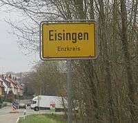
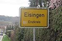
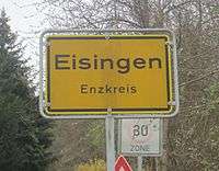
The DIN 1451 typeface family includes both a medium (Mittelschrift) and a condensed (Engschrift) version; an older extended version (Breitschrift) is no longer used since the early 1980s, but may still be encountered on older road signs in Germany. DIN 1451 is the typeface used on road signage in Germany and a number of other countries. It was also used on German car number plates from 1956, until replaced there in January 1995 by FE-Schrift, a typeface especially designed to make the plates more tamper-proof and to optimize automatic character recognition. The typeface has gained popularity due to its wide exposure through its release as a PostScript typeface in 1990. Since then it is also used by non-governmental organisations and businesses. For graphic design and desktop publishing, several type foundries offer redesigned and extended versions of this typeface.
History

In 1931 the DIN institute published DIN 1451. It contained several standard typefaces for mechanically engraved lettering, hand-lettering, lettering stencils and printing types. These were to be used in the areas of signage, traffic signs, wayfinding, lettering on technical drawings and technical documentation.
The origins of DIN 1451 Engschrift (Condensed) for hand lettering go back to 1905, when the Königlich Preußische Eisenbahn-Verwaltung (Royal Prussian Railway Administration) standardized the lettering to be used on all its rolling stock in a master drawing (pattern drawing) known as Musterzeichnung IV 44. In 1915 the then Prussian-Hessian Railways decided that all lettering on railway platforms and stations had to be executed according to the 1905 master drawing as well. As a by-product of the merger of all German railway companies into Deutsche Reichsbahn in 1920, the Prussian railway typeface had already become a national de facto standard before the DIN Committee of Typefaces took up its work for DIN 1451 a few years later. The DIN Committee of Typefaces was headed by the Siemens engineer Ludwig Goller (1884–1964), who also led the central standardization office at Siemens & Halske in Berlin between 1920 and 1945. ]
The design included not only the DIN "Engschrift" but also a DIN "Mittelschrift" (medium width, now very popular. A DIN "Breitschrift" (Extended) design was also included, but it has never been widely used.
In order to enable quick and easy reproduction, all drawings were originally based on a coarse grid and could be executed with compass and rulers. The standard sheet DIN 1451-Schriften (typefaces) was released in 1931 as a pre-norm. With some minor changes DIN 1451 was officially released as a norm in 1936. In 1938 Temporary Order No. 20 required DIN 1451 to be used on the new German Autobahn (motorways). This and other similar regulations resulted in DIN 1451 dominating German public lettering until today.

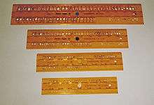
In 1923 Stempel was the first type foundry that produced printing types according to a DIN Standard. The design follows DIN 16, an earlier standard for oblique lettering on technical drawings which had been released in 1919. In 1929, the Berthold type foundry released a similar typeface. DIN 16 had also been made available as lettering templates engraved in celluloid material for drafting use by the company of Filler and Fiebig in Berlin.
Within the scope of public and technical lettering the use of the DIN 1451 typefaces spread rapidly, once they were adopted. They were released as celluloid lettering stencils for smaller applications, as larger metal stencils for application to machinery, vehicles and airplanes, and as cast metal lettering for street and building signage. Printing types according to DIN 1451 have never been produced though. During World War II DIN 1451 was also adopted for the Protectorate of Bohemia and Moravia. The 1943 version of DIN 1451 also included a showing of Cyrillic characters, although their design did not match the weight and proportions of DIN Mittelschrift.
Geometric sans serif lettering and typefaces were very popular in the 1920s and 1930s. At the Bauhaus the design of lettering on coarse grids was advocated by Herbert Bayer and Joost Schmidt during the Dessau period. Although being designed in a similar way, the DIN typefaces lacked elegance and did not take advantage from these design trends.
Inspired by the DIN standard, a consortium of Dutch organisations created an equivalent standard lettering, NEN 3225.[3] Created by a group of designers including Jan van Krimpen, the design has no similarity to the DIN standard: it is a humanist family with serif and sans-serif styles. The sans-serif is similar to Gill Sans and Johnston and the serif on the Garalde model.
Releases

The transferable-lettering-sheet company, Letraset made several variants available in the 1970s. Also the Berthold type foundry adopted the DIN typefaces for their optomechanical phototype setting systems such as Staromat. In 1980 the DIN typefaces were redrawn by Adolf Gropp (1911–1996), a lettering artist from Frankfurt. The drawings were made on a finer grid. This enabled an exact definition of details such as the amount of overshoot of round characters (e.g. C, G and O) below the baseline and above the cap height. Also characters such as S for which an accurate construction drawing had never been made were now defined using lines and arcs for the new cutting plotters that were to be used for the lettering on motorway signage. A number of the glyphs were changed, in particular those for "a", "6" and "9" as well as "t" in DIN Engschrift.
By the mid 1980s, Linotype adopted the redrawn DIN typefaces for digital photocomposition. Together with Adobe they released it as DIN Mittelschrift and DIN Engschrift in 1990. Thus the typefaces became part of the Adobe/Linotype PostScript typeface library. The use of DIN typefaces started to appear in the work of cutting edge graphic designers and design studios such as Uwe Loesch in Germany, Tel Design in the Netherlands as well as David Carson and April Greiman in the USA. Soon other leading designers began using DIN Mittelschrift and Engschrift, making it a popular option to other sans serif faces.
While the 'official' DIN designs are standardised, considerable room exists for personal interpretation in matters such as spacing, provision of new weights (such as light or extra-bold, or extended), causing a range of digital interpretations to exist.

One of the most famous and best-selling digitisations of DIN is FF DIN (1995), created by Dutch typeface designer Albert-Jan Pool for FontFont.[4][5][6][7] Typographica editor Stephen Coles has particularly praised it for the quality of its hinting for onscreen display.[8] Users include the New York City Ballet, ETH Zurich, The Verge and the film The Wolf of Wall Street.[9][10][11] Unlike the original design, it uses conventional weight names.
As the original DIN design is out of copyright, other companies have offered digital releases (or obtained rights to resell Linotype's). Parachute (Latin, Arabic, Cyrillic, Greek), Elsner+Flake, Paratype (with Cyrillic characters) and others have issued revivals of some DIN styles, often upgraded with additional weights.[12] Fontsite renamed its release 'Fette 1451'.[13]
An extensive set of digitisations is that made by Peter Wiegel with donations requested from users under the OFL. This includes the regular style (Mittelschrift) in two grades for printing with less and more ink spread, and the less well-known Breitschrift.[14][15][16] He also digitised the rounded DIN 16 and inclined DIN 17, using the names TGL 0-16 and 0-17, the names under which they were known in the German Democratic Republic.[17][18]
Usage examples
Uses in corporate branding and media
- GoPro corporate website
- Corporate typeface used by Hella
- Logotype of Rovio Entertainment
- Logotype of Paramount Channel
- Logotype and corporate typeface of Sapient corporation
- Logotype of JetBlue Airways
- Logo of the video game Half-Life, with the "A" supplanted by the lower case lambda symbol. Its sequel, Half-Life 2, uses this font in various places as well, including HUD.
- Logo of the video game Portal 2.
- Early 2000s (decade) on-screen branding of Channel 4 (British television station)
- An adapted version, Habitat DIN, is used by Habitat (retailer)
- Corporate branding of The New West End Company (the Business Improvement District company for London's West End)
- Belgian VRT news service (De Redactie) for logo and news broadcasts.
- Plone logo
- Dutch website DigitaalMedia.nl for logo and the news broadcasts.
- Primary font used in Simon Fraser University documents
- Font for Nine News for their title
- Font for Formula One for their timing graphics from the 2010 season until the end of the 2014 season
- Used on Test the Nation's question graphics
- Primary font used in York Region Transit
- On-air newscasts of most NBC owned-and-operated stations (i.e. KNBC, WCAU, WRC-TV, etc.) from 2009-2011, and again from 2016-present
- On-Air typeface for ABC News
- On-Air typeface for PBS NewsHour
- Corporate font used by Birmingham City University
- Corporate font used by Moen Faucets
- Opening titles of Dexter
- Font for many license plates throughout Europe, including older German plates, Lithuania, Latvia, Moldova, Sweden, Romania, and older plates of Albania.
- Used as one of the interface and HUD fonts for the video game Grand Theft Auto IV and its expansion packs.
- Musician Steven Wilson has used the font on the artwork of his solo releases Insurgentes and NSRGNTS RMXS, as well as The Incident by his band Porcupine Tree.
- Used by Measure of America, a project of the Social Science Research Council
- On-air typeface for most stations owned by Sinclair Broadcast Group (primarily their local newscasts) and Ring of Honor.
- On-air typeface for stations owned by TEGNA.
- Corporate font used by The Mutual Fund Store.
- On-air typeface for CBS Sports and TBS Sports from 2016–present.
- On-air typeface for CNBC's Mad Money from May 2007 – present.
See also
References
- ↑ Berry, John D. (2006). Dot-font: Talking About Fonts (1st ed.). New York: Mark Batty Publisher. pp. 50–51. ISBN 0-9772827-0-8.
- ↑ Berry, John. "dot-font: Industrial-Standard Typefaces". Creative Pro. Retrieved 16 July 2016.
- ↑ Jan Middendorp (2004). Dutch Type. 010 Publishers. pp. 298–9. ISBN 978-90-6450-460-0.
- ↑ Spiekermann, Erik. "Comments on Typophile thread". Typophile. Archived from the original on April 10, 2009. Retrieved 13 July 2015.
- ↑ "Can the typefaces we see around us on highway signs be turned into usable fonts for general use? Sometimes". Creativepro.com. Retrieved 2012-10-10.
- ↑ "FF DIN Round". Issuu.com. 2010-07-28. Retrieved 2012-10-10.
- ↑ "FF DIN in use :: A FontFont Focus by FontShop". Dinfont.com. Retrieved 2012-10-10.
- ↑ Coles, Stephen. "Twitter post". Twitter. Retrieved 1 September 2015.
- ↑ "The Verge Logo and Website". Fonts In Use. 2013-11-19.
- ↑ "The Wolf of Wall Street movie posters". Fonts In Use. 2014-01-08.
- ↑ "Communication - Font". ETH Zurich. Retrieved 22 January 2016.
Arial and FF DIN Pro are the corporate fonts for ETH Zurich.
- ↑ "Parachute DIN". MyFonts. Parachute. Retrieved 1 September 2015.
- ↑ "Fette 1451". Fontsite. Retrieved 1 September 2015.
- ↑ Wiegel, Peter. "DIN Breitschrift". Retrieved 1 September 2015.
- ↑ Wiegel, Peter. "Alte DIN 1451". Peter Wiegel. Retrieved 1 September 2015.
- ↑ Wiegel, Peter. "DIN 1451 H". Peter Wiegel. Retrieved 1 September 2015.
- ↑ Wiegel, Peter. "TGL 0-16". Retrieved 1 September 2015.
- ↑ Wiegel, Peter. "TGL 0-17". Retrieved 1 September 2015.
- The series of articles "The history of the design of a contemporary typeface" in which Albert-Jan Pool published many of his findings on the history of the typefaces of DIN 1451 is a vault of references on this subject. The series was published in the e-magazine 'Encore', issues 13-15, 17-18. These are direct links to the articles.
- Industrial Archeology – DIN, the first German Corporate Typeface?
- The Constructivist Connection – DIN, Bauhaus and the New Typography
- Siemens sets a Standard – DIN 1451 on its way up
- DIN for All: From the Economic Miracle to Art and Vernacular Typography – FF DIN: New at the Start
- How German is the DIN typeface? – Fahren, fahren, fahren at the Autobahn
- Blackwell, Lewis. 20th Century Type. Yale University Press: 2004. ISBN 0-300-10073-6.
- Friedl, Friedrich, Nicholas Ott and Bernard Stein. Typography: An Encyclopedic Survey of Type Design and Techniques Through History. Black Dog & Leventhal: 1998. ISBN 1-57912-023-7.
- Jaspert, W. Pincus, W. Turner Berry and A.F. Johnson. The Encyclopædia of Type Faces. Blandford Press Lts.: 1953, 1983. ISBN 0-7137-1347-X.
- Macmillan, Neil. An A–Z of Type Designers. Yale University Press: 2006. ISBN 0-300-11151-7.
Further reading
- DIN 1451-2: Schriften – Serifenlose Linear-Antiqua – Verkehrsschrift. Deutsches Institut für Normung, 1986-02.
- Made with FontFont: FF DIN – The history of a contemporary typeface, article by Albert-Jan Pool in collaboration with Jan Middendorp, BIS Publishers, 2006.
This is an updated version of the series of articles in Encore Magazine that were published in 2004–2005.
External links
| Wikimedia Commons has media related to DIN 1451. |
- Download of fonts used on roadsigns
- A free implementation of Fette Engschrift, an early version of the DIN 1451 typeface
- A minisite from Fontshop regarding FF DIN, includes history and specs as well as an interview with FF DIN's designer Albert-Jan Pool.
- Weights overview of FF DIN and in-use examples
- Linotype DIN pages: DIN 1451, DIN Next, DIN Next Arabic, DIN Next Devanagari font family - Designed by Akira Kobayashi in 2012, Kimya Gandhi in 2012
- Parachute DIN: PF DIN Text Pro, PF DIN Text Arabic, PF DIN Text Universal, PF DIN Text Condensed Pro, PF DIN Text Compressed Pro, PF DIN Display Pro, PF DIN Mono Pro, PF DIN Stencil Pro, PF DIN Type System - Comparison Table