Franklin Gothic
 | |
| Category | Sans-serif |
|---|---|
| Classification | Grotesque |
| Designer(s) | Morris Fuller Benton |
| Foundry | American Type Founders |
| Date released | 1902–1967 |
| Also known as | Gothic #1, Square Gothic Heavy, Gothic #16 |
Franklin Gothic and its related faces are realist sans-serif typefaces originated by Morris Fuller Benton (1872–1948) in 1902. “Gothic” was a contemporary term (now little-used except to describe period designs) meaning sans-serif. Franklin Gothic has been used in many advertisements and headlines in newspapers. The typeface continues to maintain a high profile, appearing in a variety of media from books to billboards. Despite a period of eclipse in the 1930s, after the introduction of European faces like Kabel and Futura, they were re-discovered by American designers in the 1940s and have remained popular ever since.
History
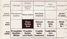
Franklin Gothic itself is an extra-bold sans-serif type. It draws upon earlier, nineteenth century models, from many of the twenty-three foundries consolidated into American Type Founders in 1892. Historian Alexander Lawson speculated that Franklin Gothic was influenced by Berthold’s Akzidenz-Grotesk types but offered no evidence to support this theory[1] which was later presented as fact by Philip Meggs and Rob Carter.[2] It was named in honor of a prolific American printer, Benjamin Franklin. The faces were issued over a period of ten years, all of which were designed by Benton and issued by A.T.F.[3]
- Franklin Gothic (1902)
- Franklin Gothic Condensed + Extra Condensed (1906)
- Franklin Gothic Italic (1910)
- Franklin Gothic Condensed Shaded (1912)
Many years later, the foundry again expanded the line, adding two more variants:
- Franklin Gothic Wide (1952) designed by John L. “Bud” Renshaw
- Franklin Gothic Condensed Italic (1967) designed by Whedon Davis
It can be distinguished from other sans serif typefaces by its more traditional double-story a and especially g (as double-story gs are rare in sans-serif fonts), the tail of the Q and the ear of the g. The tail of the Q curls down from the bottom center of the letterform in the book weight and shifts slightly to the right in the bolder fonts.
Hot metal copies
Barnhart Brothers & Spindler copied the face as Gothic #1, while both Linotype and Intertype, called their copies Gothic #16. Monotype’s copy kept the name Franklin Gothic, but because of the demands of mechanical composition, their version was modified to fit a standard arrangement. The Ludlow version was known as Square Gothic Heavy.[4]
Cold type copies
Due to the post-war popularity of Gothic faces, most producers of cold type offered their own versions of Franklin Gothic. These included:[5]
- Franklin Gothic — Alphatype, Autologic, Berthold, Dymo, Star/Photon, Mergenthaler, MGD Graphic Systems, Varityper
- Franklin — Compugraphic
- Pittsburgh — Graphic Systems Inc.
Digital copies
Digital copies have been made by Adobe, International Typeface Corporation, Monotype Imaging, and URW. Victor Caruso drew a multi-weight family for the International Typeface Corporation (ITC) in 1980 and in 1991, ITC commissioned the Font Bureau in Boston to create condensed, compressed and extra compressed versions of ITC Franklin Gothic. Bitstream’s version is called Gothic 744. Microsoft Windows has distributed "Franklin Gothic Medium," one of ITC's variants of the font, in all copies since at least Windows 95.
While ITC Franklin Gothic is the most common release, it has been criticised for modifying the structure of the family considerably. Calligrapher and design historian Paul Shaw argued that it was a failure for "mucking about with the distinctive Franklin Gothic g. In ITC Franklin Gothic...the g keeps popping up like a schoolchild overly eager to answer a question."[6]
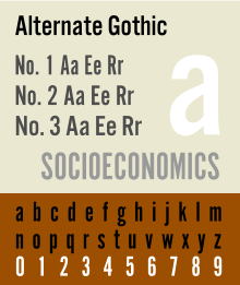
Alternate Gothic
 | |
| Category | Sans-serif |
|---|---|
| Classification | realist |
| Designer(s) | Morris Fuller Benton |
| Foundry | American Type Founders |
| Date released | 1903 |
| Re-issuing foundries | Monotype |
| Design based on | Franklin Gothic |
| Also known as | Gothic Condensed (Linotype + Intertype + Ludlow) |
Alternate Gothic was designed by M.F. Benton for A.T.F. in 1903. It is essentially a moderately bold condensed version of Franklin Gothic, made in three numbered widths. No.1 is the most condensed, 3 the least.
Hot metal copies
This face was copied by Monotype under the same name, #1 by Ludlow, Linotype and Intertype as Gothic Condensed. Ludlow’s Trade Gothic Condensed is very similar as well. Two variants were made:
- Alternate Gothic Modernized (1927, Monotype), added thirteen alternate characters drawn by Sol Hess.
- Condensed Gothic Outline (1953, Ludlow), is essentially an outline of Alternate Gothic #2.[7]
Cold type copies
Alternate Gothic was copied by Compugraphic as Alpin Gothic.[8]
Digital copies
Digital copies have been made by URW, Elsner+Flake, and Monotype as CG Alternate Gothic #3.
Micah Rich and several contributors of The League of Moveable Type have made a popular OFL-licensed version of Alternate Gothic #1, League Gothic.[9]
Monotone Gothic
| Category | Sans-serif |
|---|---|
| Classification | realist |
| Designer(s) | Morris Fuller Benton |
| Foundry | American Type Founders |
| Date released | 1907 |
| Design based on | Franklin Gothic |
Monotone Gothic was designed by M.F. Benton for A.T.F. in 1907. It is essentially a lighter, more extended version of Franklin Gothic. Only one weight was made and it was apparently never copied under that name by any other foundry. Digital versions of Franklin Gothic Light Extended are essentially knock-offs of this face.[10]
News Gothic
 | |
| Category | Sans-serif |
|---|---|
| Classification | realist |
| Designer(s) | Morris Fuller Benton |
| Foundry | American Type Founders |
| Date released | 1908 |
| Design based on | Franklin Gothic |
| Also known as | Trade Gothic (Linotype), Record Gothic (Ludlow), Balto Gothic, (Baltimore Type & Composition Company) |
News Gothic was designed by M.F. Benton for A.T.F. in 1908 as a continuing effort to consolidate and systematize the nineteenth-century Gothic faces inherited from the company’s predecessors. It is essentially a medium weight companion to Franklin Gothic. Morris cut seven variations for A.T.F.:
- News Gothic
- News Gothic Italic
- News Gothic Condensed
- News Gothic Extra Condensed
- News Gothic Extra Condensed Title
- News Gothic Bold
- News Gothic Condensed Bold
As with Franklin Gothic, the foundry expanded the line sometime later, adding two more variants:
- News Gothic Bold (1958) designed by John L. “Bud” Renshaw
- News Gothic Condensed Bold (1965) designed by Frank Bartuska
Particularly extensive designs in the same style were Trade Gothic from Linotype and Record Gothic by Ludlow.[11] [12] Benton Sans is a notable, and extremely comprehensive, modern revival.[13][14]
Lightline Gothic
| Category | Sans-serif |
|---|---|
| Classification | realist |
| Designer(s) | Morris Fuller Benton |
| Foundry | American Type Founders |
| Date released | 1908 |
Lightline Gothic was designed by M.F. Benton for A.T.F. in 1908 as a lighter version of News Gothic, which makes it an ultra-light version of Franklin Gothic. Only one weight was made and it was apparently never copied under that name by any other foundry. Digital versions of Franklin Gothic Ultra-Light are essentially knock-offs of this face.
Hot metal variants
In 1921, M.F. Benton had the capitals of this face cast in different sizes on identical bodies, thus creating, ex nihilo, a lining Gothic which was sold under the name Lightline Title Gothic[15]
Usage
- New York University lists Franklin Gothic as an official font.[16]
- Franklin Gothic is the headline and article title font used by Time Magazine.
- The Franklin Gothic font was the resident typeface of the PBS series The Electric Company.
- The category cards on all 1973-92 versions of Pyramid were printed in Franklin Gothic Extra Condensed.
- Franklin Gothic is the official typeface of the Museum of Modern Art in New York.
- The letter tiles in the American and Canadian versions of Scrabble currently uses the Franklin Gothic Book font.
- The film Rocky's title is Franklin Gothic Heavy.
- The game show Press Your Luck used this font for dollar amounts and other special spaces on the Big Board.
- The computer game You Don't Know Jack.
- Cardiff University uses Franklin Gothic as its main corporate typeface.
- Franklin Gothic Condensed was the typeface used for subtitles in the Star Wars films,[17] but contrary to some reports, News Gothic and Univers are used for the opening crawl.[18]
- Bank of America's logo uses Franklin Gothic Condensed.
- Intertitle during commercials on 1980s Nickelodeon
- Many of Lawrence Weiner's art works are set in Franklin Gothic Extra Condensed.
- AXA Group in the UK use Franklin Gothic Heavy and Book in their Redefining/Standards branding
- The 2008 Batman film, The Dark Knight, used Franklin Gothic in its advertising material.
- In the children's book Corby Flood, Franklin Gothic is a member of the evil Brotherhood of Clowns.
- CBS Sports used this font for their graphics during the early–mid-1980s; with a slight variation in that there was no serif on the number "1".
- TNT used this font for their graphics during the early 1990s.
- Lady Gaga's cover text on her second album, The Fame Monster.
- Various section headlines of The New York Times.
- ESPN used the font for in-game graphics from 2006 to 2009; it is also the typeface for their sports-talk show Pardon the Interruption. it was deemphasized beginning with the Monday Night Football telecasts in 2009.
- The printed version of The Onion uses Franklin Gothic Extra Condensed for all headline text.
- Showtime uses this font in its logo.
- Dutch record label Spinnin Records also uses this font in its logo, as well as on the artworks of songs released by the label.
- Frederator Studios uses this font on its website.
- Loesje uses this font on its posters.
- Van Morrison's cover text on his single Brown Eyed Girl.
- Nickelodeon's show Bucket & Skinner's Epic Adventures uses this typeface in its logo.
- The Conservative Party of Canada uses this font in their logo.
- Countdown with Keith Olbermann used this font in its graphics during its period on Current TV.
- The Price Is Right uses this font in the pricing game, Range Game.
- CBS's coverage of the Macy's Thanksgiving Day Parade uses this font in their graphics and lower thirds.
- Lidl uses Franklin Gothic as its main font.
- Columbia College Chicago implements Franklin Gothic in its primary branding.[19]
- This Font used TV-Company CTC-Chelyabinsk, in «City News. Chelyabinsk in Details.
- Microsoft used Franklin Gothic Medium for product branding during the Windows XP timeframe. It was also used as the label for the Start button in Windows XP's Luna Theme.
- Sgt. Peppers Lonely Hearts Club Band: 20 Years Ago Today uses the font for counting the dates going down ("1 JUN 1987 — 1 JUN 1967").
- Franklin Gothic Medium Condensed was used for the roles, crew titles and names in the end credits of the 1996 film Space Jam.
- A custom cut of the font is used to display player numbers on the player kit in Indian Premier League[20]
- Curb Your Enthusiasm uses it in its title shot.
References
| Wikimedia Commons has media related to Franklin Gothic. |
- ↑ Lawson, Alexander S., Anatomy of a Typeface, Godine, Boston, 1990, ISBN 978-0-87923-333-4, pp. 295–307.
- ↑ Meggs, Philip and Carter, Rob, Typographic Specimens: The Great Typefaces, Van Nostrand Rheinhold, 1993, ISBN 0-442-00758-2, pp. 151.
- ↑ MacGrew, Mac, "American Metal Typefaces of the Twentieth Century," Oak Knoll Books, New Castle Delaware, 1993, ISBN 0-938768-34-4, pp. 142 - 143.
- ↑ MacGrew, "American Metal Typefaces of the Twentieth Century," pp. 142 - 143.
- ↑ Lawson, Alexander, Archie Provan, and Frank Romano, "Primer Metal Typeface Identification," National Composition Association, Arlington, Virginia, 1976, pp. 34 - 35.
- ↑ Shaw, Paul. "Flawed Typefaces". Print magazine. Retrieved 2 July 2015.
- ↑ MacGrew, "American Metal Typefaces of the Twentieth Century," pp. 10 - 11.
- ↑ Wheatley, W.F., "Typeface Analogue," National Composition Association, Arlington, Virginia, 1988, p. 5.
- ↑ "League Gothic - The League of Moveable Type".
- ↑ MacGrew, "American Metal Typefaces of the Twentieth Century," pp. 222 - 223.
- ↑ MacGrew, "American Metal Typefaces of the Twentieth Century," pp. 264 - 267.
- ↑ Coles, Stephen. "Record Gothic: fictional samples". Fonts in Use. Retrieved 29 August 2015.
- ↑ "Benton Sans". Font Bureau. Retrieved 29 August 2015.
- ↑ "Benton Gothic". Fonts in Use. Retrieved 29 August 2015.
- ↑ MacGrew, "American Metal Typefaces of the Twentieth Century," pp. 200 - 201.
- ↑ "Web Communication Standards: Core Identity Elements". New York University. Archived from the original on 20 August 2009.
- ↑ http://www.starwars.com/episode-i/bts/production/news19990302.html
- ↑ http://www.starwars.com/episode-iii/bts/production/f20050126/index.html
- ↑ http://www.colum.edu/Administrative_offices/CPS/Identity/wordmark/
- ↑ "IPLT20.com - Clothing And Equipment Regulations". IPLT20.
- Baines, Phil; Hastam, Andrew (2005). Type and Typography. Watson-Guptill Publications. ISBN 0-8230-5528-0.
- Lawson, Alexander S. (1990). Anatomy of a Typeface. Godine. ISBN 978-0-87923-333-4.
- Meggs, Phillip B. (2002). Revival of the fittest. RC Publications, Inc. ISBN 1-883915-08-2.
- Meggs, Phillip B. (1993). Typographic Specimens: The Great Typefaces. Van Nostrand Reinhold. ISBN 0-442-00758-2.
External links
- ATF's 1912 specimen book, showing Franklin Gothic on pages 738 onwards and many contemporary types. Lightline from p. 668, Alternate from p. 722. Many sample advertising settings.
- ATF's 1923 specimen book (their legendary last major specimen before the Depression), Gothic types from p. 459. Lightline Gothic on p. 490.
- News/Trade/Franklin Gothic alternatives - survey by Stephen Coles