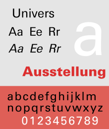
Univers
 | |
| Category | sans-serif |
|---|---|
| Classification | Neo-grotesque sans-serif |
| Designer(s) | Adrian Frutiger |
| Foundry |
Deberny & Peignot Linotype |
| Date released | 1957 |
| Variations | Zurich |
Univers (French pronunciation: [ynivɛʁ]) is the name of a sans-serif typeface designed by Adrian Frutiger in 1954.[1] Classified as a neo-grotesque typeface, one based on the model of the 1898 typeface Akzidenz-Grotesk, it was notable on its launch for its availability in a comprehensive but consistent range of weights and styles.
Frutiger would go on to become one of the most notable typeface designers of the 20th century, and Univers proved enormously influential: it was one of the first typefaces to fulfill the idea that a typeface should form a family of consistent, similar designs. Past sans-serif designs such as Gill Sans had much greater differences between weights, while Akzidenz-Grotesk and the Franklin Gothic family often were advertised under different names for each style, to emphasise that they were separate and different. By creating a matched range of styles and weights, Univers allowed documents to be created in one consistent typeface for all text, increasing the range of documents that could be artistically set in sans-serif type.
Originally conceived and released by Deberny & Peignot in 1957, it was rapidly licensed and re-released by Monotype, American Type Founders and others.[2] The original marketing for the design deliberately referenced the periodic table to emphasise its scope.[3] Historian James Mosley has described it as "probably the last major" release of a large family as metal type.[4]
Characteristics
Some of these old sans serifs have had a real renaissance within the last twenty years, once the reaction of the 'New Objectivity' had been overcome. A purely geometrical form of type is unsustainable.
Frutiger in 1961, explaining why his design had rejected the geometric sans-serif design trend popular from the 1920s to the 1950s.[5]
Univers is one of a group of neo-grotesque sans-serif typefaces, all released in 1957,[6] that includes Folio and Neue Haas Grotesk (later renamed Helvetica). As all are based on Akzidenz-Grotesk, these three faces are sometimes confused with each other. These typefaces figure prominently in the Swiss Style of graphic design.
Univers was released after a long period in which geometric typefaces such as Futura had been popular. Frutiger disliked purely geometric designs, finding them too rigid, following a common school of thought among Swiss designers of the period. While studying at the Kunstgewerbeschule (Arts and Crafts School) in Zürich, he had begun to sketch a revived grotesque family based on nineteenth-century grotesques, at the time considered antiquated outside Switzerland. He described Univers in 1998 as having a 'visual sensitivity between thick and thin' strokes, avoiding perfect geometry.[7]
Different weights and variations within the type family are designated by the use of numbers rather than names, a system since adopted by Frutiger for other type designs. Frutiger envisioned a large family with multiple widths and weights that maintained a unified design idiom. However, the actual typeface names within Univers family include both number and letter suffixes.
Like most grotesque and neo-grotesque sans-serifs, Univers's slanted form is an oblique, in which the letterforms are slanted, with minor corrections but no other major alterations. This is different to a true italic, in which the letterforms become modified to resemble handwriting more.[8] In the original design, Frutiger chose obliques with the extremely aggressive slant of sixteen degrees, which was reduced to twelve in some later releases. Linotype Univers (below) returns to the original angle.
Frutiger's original ampersand was a true 'et' ligature, similar to that in Trebuchet among others. Frutiger later provided an alternative for non French-speaking countries in which the form might be less familiar.[9][10]
The Deberny & Peignot library was acquired in 1972 by Haas Type Foundry. It was transferred into the D. Stempel AG and Linotype collection in 1985 and 1989 respectively upon the Haas'sche Schriftgiesserei's acquisition and closure; it is now owned by Monotype following its purchase of Linotype in 2007.[11] An independent version of Univers was licensed by the Berthold Type Foundry for its phototypesetting system with adaptations by Günter Gerhard Lange; Frutiger wrote in his autobiography that he had some affection for it.[9]
Comparison with Akzidenz-Grotesk, Folio, and Helvetica
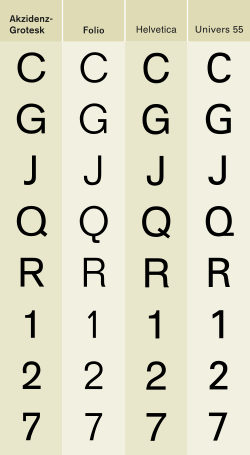
Univers is similar in design to other European grotesque fonts, of which Akzidenz-Grotesk, Folio, and Helvetica are among the most common. Differences include:
- The tail of 'a' and the top of '1' are much less rounded.
- Upper-case 'G' is formed without an arrow head (called a spur).
- Both arms of 'K' join at the stem.
- The tail of 'Q' runs along the baseline.
- The tail of 'R' is curved (compared with Akzidenz-Grotesk).
- The top of 't' is angled.
- The dot of the 'i' is not square but a rectangle.
- Lower-case 'y' has a straight descender.
- Many of the numerals in Univers have straight vs. curved ascenders
- Helvetica tends to have a slightly greater x-height than Univers
- Univers generally has quite a wide spacing between letters, and its low x-height gives it a more low-slung, splayed appearance than Helvetica, especially in bold.
Dutch font designer Martin Majoor, while praising Univers for its "almost scientific" range of weights, criticised it for its lack of originality: "basing a sans serif on another is rather cheap."[8] Frutiger's later landmark sans-serif designs, Avenir and Frutiger, would take very different, more humanist and geometric approaches. Frutiger himself has commented: "Helvetica is the jeans, and Univers the dinner jacket."[12]
Usage
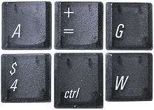

Univers enjoyed great popularity in the 1960s and 1970s because many corporations adopted it for usage. It is used in a modified version by the new Swiss International Air Lines (previously, Swissair used the typeface Futura), Deutsche Bank and for signage all over the world. General Electric used the font from 1986 to 2004 before switching to GE Inspira.[13] Apple Inc. previously used this typeface as well as its condensed oblique variant for the keycaps on many of its keyboards, before completely switching to VAG Rounded in August 2007 with the introduction of new keyboards and the new iMac (their notebook computers already featured that typeface since 1999). Munich Re used a custom version of Univers until 2009.[14] Univers is known for its clear lines and legibility at great distances.
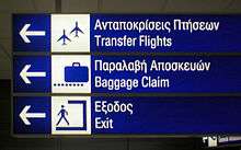
The Montreal Metro, Bay Area Rapid Transit,[15] various Toronto Subway and RT stations, Frankfurt International Airport and the Walt Disney World road system also make extensive use of this typeface (though Disney is in the process of replacing it with Avenir). Some but not all London boroughs use Univers Bold Condensed for street signs.[16] The Royal Air Force adopted the font for all merchandising material in 2006 to complement its new corporate logo. Ordnance Survey also adapted Univers for use on their maps (added tails on the lowercase l and t, and other small changes to help distinguish the type from the map details) of which they own all rights to. In 2006, the Office of Fair Trading adopted Univers as its corporate typographic voice in size 12-point so that visually impaired people can more easily read its publications.
Univers was widely used by the East German government during the 1980s for propaganda material, especially during the 40th anniversary of the country.[17]
Univers was used for George W. Bush's campaign logos in both 2000 and 2004. Bush's 2000 campaign logo was set in Univers 85 Extra Black, while the 2004 campaign logo used Univers 85 Extra Black Oblique (slanted).
Rand McNally once used Univers on their maps and atlases from the 1970s to 2004 when they adopted use of Frutiger.
Frutiger (with Howard "Bud" Kettler) adapted Univers for the IBM Selectric Composer in the 1960s.[18][19] This was an ultra-premium electric 'golfball' typewriter system, intended to be used for producing high-quality office documents or copy to be photographically enlarged for small-scale printing projects.[20] Unlike most typewriters, the Composer produced proportional type, rather than monospaced letters. Ultimately the system proved a transitional product, as it was displaced by cheaper phototypesetting, and then in the 1980s by word processors and general-purpose computers.[21] The release was somewhat compromised due having to be made to fit a 9-unit escapement system.
Audi Sans is a variant based on Univers,[22] designed by Ole Schäfer.[23] It became Audi's corporate identity font in the 1990s.[24] when Audi contracted MetaDesign to support Audi's brand management strategy.[25] The font was used extensively by Audi, appearing in sales literature, corporate communications, owners' documentation and even on the vehicles themselves in the instrument panel graphics and their MMI dashboard displays.
Both former & current eBay logo is set in Univers.[26]
Univers 45, 55, 65, 57, 67, 53, 63 are incorporated in PostScript standard as PostScript 3 core fonts. As Univers is installed with many printers, the PostScript substitute implementation Ghostscript uses a free version of the most common weights created by URW++ called U001, which is available for download.[27]
The Frutiger numbering system
Adrian Frutiger designed his unique classification system to eliminate naming and specifying confusion. It was first used with Univers, and was adopted for use in the Frutiger, Avenir, and Neue Helvetica typeface families.
The number used in a font is a concatenation of two numbers. The first digit defines weight, while the second defines width and whether it is oblique or not.
| Suffix | ||||||||||
|---|---|---|---|---|---|---|---|---|---|---|
| Number | 1 | 2 | 3 | 4 | 5 | 6 | 7 | 8 | 9 | 10 |
| Weight | - | Ultra Light | Thin | Light | Normal, Roman, or Regular | Medium | Bold | Heavy | Black | Ultra or Extra Black |
| Width and position | Ultra Extended | Ultra Extended Oblique | Extended | Extended Oblique | Normal | Oblique | Condensed | Condensed Oblique | Ultra Condensed | - |
(note: oblique is not strict italic)
Due to some typeface manufacturers’ failure to understand and implement the system correctly, however, things have actually become more confusing. To further complicate matters, the numbering system is not consistently applied to the Univers font family. In older publications, all oblique fonts have even-numbered 2nd values; but in digital versions, both odd and even 2nd values have been used on oblique fonts, but not in all font formats or weights. For example, Univers 55 Roman Oblique has both Windows menu names and PostScript full names as Univers LT 55 Oblique and Univers 56 Oblique, but only for the Windows PostScript version of the font; however, in Univers 85 Extra Black Oblique, there is no font named Univers 86 in any format. Nevertheless, oblique Univers fonts always have even-numbered 2nd value.
Inconsistent usage aside, the syntax of 2nd value is also inconsistent with 1st value. Bigger 1st value implies the glyph of a given character uses more horizontal space, but it has opposite meaning in 2nd value.
Linotype numbering system
In Linotype Univers and Univer Next font family, a 3-number system is used. First numeral describes font weight, second numeral describes font width, third numeral describes position.[28]
| Suffix | ||||||||||
|---|---|---|---|---|---|---|---|---|---|---|
| Number | 0 | 1 | 2 | 3 | 4 | 5 | 6 | 7 | 8 | 9 |
| Weight | - | Ultra Light | Thin | Light | Regular | Medium | Bold | Heavy | Black | Extra Black |
| Width | - | Compressed | Condensed | Basic | Extended | - | - | - | - | - |
| Position | Roman | Italic | - | - | - | - | - | - | - | - |
Unlike the original Univers, tilted fonts in Linotype Univers and derivative font families have not been named 'oblique'.
Linotype Univers
In 1997 Frutiger reworked the whole Univers family in cooperation with Linotype, thus creating the Linotype Univers, which consists of 63 fonts. By reworking the Univers more "extreme" weights as Ultra Light or Extended Heavy were added as well as some monospaced typefaces. The numbering system was extended to three digits to reflect the larger number of variations in the family.
In addition to extra font width and weight combinations, the fonts are digitally interpolated, so that character widths scale uniformly with changing font weights. For fonts within a specific font weight, caps height, x-height, ascender and descender heights are the same. For oblique fonts, the slope is increased from 12° to the 16° of Frutiger's original drawings, and the character widths were adjusted optically. In addition, characters such as &, ®, euro sign, are redesigned, the ampersand to Frutiger's preferred true et ligature.[10]
Linotype Univers Typewriter
Linotype Univers Typewriter is a sub-family of fixed-width fonts under the Linotype Univers family. Four fonts have been produced in Regular and Bold weights, with obliques on each weight. Characters such as 1, I, J, M, W, i, j, l, dotless j are drawn differently.
Univers Next (2010)
In 2010, Linotype extended the Linotype Univers family with true small caps and renamed as "Univers Next". All later extensions of the font family were marketed under the Univers Next title.
The font family includes all fonts previously released under the Linotype Univers title.
Univers Cyrillic, Univers Pro Cyrillic (2010)
In April 2010, Linotype announced the release of Cyrillic versions of the original Univers family, in TrueType, PostScript, and OpenType Pro font formats. Released fonts include Univers 55 Roman Oblique; Univers Pro Cyrillic 45 (roman, oblique), 55 (roman, oblique), 65 (roman, oblique), 75 (roman, oblique), 85 (roman, oblique), 47 (roman, oblique), 57 (roman, oblique), 67 (roman, oblique), 39 (roman), 49 (roman), 59 (roman).[29]
Univers Next W1G
This version supports Greek and Cyrillic characters.
The font family includes 12 fonts (330, 331, 430, 431, 530, 531, 630, 631, 730, 731, 830, 831) in 6 weights and 1 width, with complementary obliques.
The Cyrillic version was released as Univers Next Cyrillic in OpenType Pro format.
Zurich
Zurich is a variation of Univers also created by Adrian Frutiger.
Univers Next Arabic (2011)
It is a companion to the Latin typeface Univers Next designed by Nadine Chahine with the consulting of Adrian Frutiger. It is a modern Kufi design with large open counters and low contrast, mainly designed to work in titles and short runs of text. The font includes the basic Latin part of Univers Next and support for Arabic, Persian, and Urdu. It also includes proportional and tabular numerals for the supported languages.
The font family consists of 3 fonts (330, 430, 630) in 3 weights and 1 width, without obliques. OpenType features include fraction, localized forms, proportional figures, contextual alternates, discretionary ligatures, initial forms, terminal forms, glyph composition/decomposition, isolated forms, medial forms, required ligatures.
References
- ↑ Meggs, Philip B. (1998). "Meggs' History of Graphic Design - 4th Edition". John Wiley & Sons. p.361. ISBN 0-471-69902-0
- ↑ Budrick, Callie; Biemann, Emil (1961). "Subtleties of the Univers". Print. Retrieved 22 January 2016.
- ↑ Univers specimen book. American Type Founders. 1968. Retrieved 18 September 2015.
- ↑ Mosley, James (1999). The Nymph and the Grot. London. p. 9.
- ↑ Frutiger, Adrian (2014). Typefaces: The Complete Works. p. 88. ISBN 9783038212607.
- ↑ Spiekermann, Erik and E.M. Ginger (2003). Stop Stealing Sheep & find out how type works. Peachpit Press, p. 65. ISBN 978-0-201-70339-9
- ↑ Schwemer-Scheddin, Yvonne. "Reputations: Adrian Frutiger". Eye. Retrieved 12 September 2015.
- 1 2 Majoor, Martin. "My type design philosophy". Retrieved 12 September 2014.
- 1 2 Frutiger, Adrian. Typefaces: The Complete Works. pp. 97–102.
- 1 2 Shaw, Paul. "Flawed Typefaces". Print magazine. Retrieved 30 June 2015.
- ↑ "Univers". MyFonts. Monotype. Retrieved 26 March 2015.
- ↑ Majoor, Martin (Spring 2007). "Inclined to be dull". Eye. Retrieved 3 August 2015.
- ↑ "A Website about Corporate Identity", entry for GE
- ↑ "2010 REBRAND 100 Notable - Munich Re - Rebranding by MetaDesign German".
- ↑ "BART Wayfinding: The Shotgun Technique".
- ↑ Photo.net
- ↑ "GDR Wall Newspaper Material (1989)". Calvin.edu. Retrieved 2013-09-15.
- ↑ Macmillan, Neil (2006). An A-Z of Type Designers. Laurence King Publishing. p. 118. ISBN 1-85669-395-3.
- ↑ Frutiger, Adrian (1967-02-27). "The IBM Selectric Composer: The Evolution of Composition Technology". IBM Journal of Research and Development. IBM. 12 (1): 9–14. doi:10.1147/rd.121.0009. Retrieved 2007-12-12.
- ↑ Stamm, Swiss Foundation Type and Typography ; edited by Heidrun Osterer and Philipp (2009). Adrian Frutiger typefaces : the complete works (English ed.). Basel: Birkhäuser. p. 192. ISBN 978-3764385811.
- ↑ McEldowney, Dennis (1 October 2013). A Press Achieved: the Emergence of Auckland University Press, 1927-1972. Auckland University Press. pp. 102–5. ISBN 978-1-86940-671-4.
- ↑ "Linotype Fonts in Use - Ads / Recreation".
- ↑ Primetype GmbH. "primetype.com".
- ↑ Neil Macmillan. An A-Z of Type Designers, p29-30. 2006. King Publishing Ltd. ISBN 1-85669-395-3/ISBN 1 85669 395 3
- ↑ "Home - MetaDesign - Berlin". MetaDesign - Berlin.
- ↑ "Electronics, Cars, Fashion, Collectibles, Coupons and More - eBay".
- ↑ "Ghostscript". Ghostscript. Retrieved 19 January 2015.
- ↑ "Linotype Platinum Collection - Linotype Univers 3.0".
- ↑ "Cyrillic Fonts - Linotype Font Feature".
External links
| Wikimedia Commons has media related to Univers (typeface). |
- Linotype Univers
- Typowiki: Univers
- Univers specimen book, 1968, published by ATF for the American market
- Podium discussion: Univers is a classical typeface
- Univers History and Usage
- Univers on MyFonts
- U001: open source clone in regular and condensed styles