Typographic alignment
In typesetting and page layout, alignment or range is the setting of text flow or image placement relative to a page, column (measure), table cell, or tab. The type alignment setting is sometimes referred to as text alignment, text justification, or type justification. The edge of a page or column is known as a margin, and a gap between columns is known as a gutter.
Basic variations
There are four basic typographic alignments:
- flush left—the text is aligned along the left margin or gutter, also known as left-aligned, ragged right or ranged left;
- flush right—the text is aligned along the right margin or gutter, also known as right-aligned, ragged left or ranged right;
- justified—text is aligned along the left margin, and letter- and word-spacing is adjusted so that the text falls flush with both margins, also known as fully justified or full justification;
- centered—text is aligned to neither the left nor right margin; there is an even gap on each side of each line.
Note that alignment does not change the direction in which text is read; however text direction may determine the most commonly used alignment for that script.
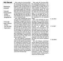
Flush left
In English and most European languages where words are read left-to-right, text is usually aligned "flush left",[1] meaning that the text of a paragraph is aligned on the left-hand side with the right-hand side ragged. This is the default style of text alignment on the World Wide Web for left-to-right text. [2] Quotations are often indented.
Flush left might also be used in very narrow columns, where full justification would produce too much whitespace between characters or words on some lines.
Flush right
In other languages that read text right-to-left, such as Arabic and Hebrew, text is commonly aligned "flush right". Additionally, flush-right alignment is used to set off special text in English, such as attributions to authors of quotes printed in books and magazines, or text associated with an image to its right. Flush right is often used when formatting tables of data.
Justified
A common type of text alignment in print media is "justification", where the spaces between words, and, to a lesser extent, between glyphs or letters, are stretched or compressed to align both the left and right ends of each line of text. When using justification, it is customary to treat the last line of a paragraph separately by simply left or right aligning it, depending on the language direction. Lines in which the spaces have been stretched beyond their normal width are called loose lines, while those whose spaces have been compressed are called tight lines.
Some modern typesetting programs offer four justification options: left justify, right justify, center justify and full justify. These variants specify whether the last line is flushed left, flushed right, centered or fully justified (spread over the whole column width). In programs that do not offer this extra functionality, justify is equal to the default for the language direction.
Centered

Text can also be "centered", or symmetrically aligned along an axis in the middle of a column. This is often used for the title of a work, headlines, and for poems and songs. As with flush-right alignment, centered text is often used to present data in tables. Centered text is considered less readable for a body of text made up of multiple lines because the ragged starting edges make it difficult for the reader to track from one line to the next.
Centered text can also be commonly found on signs, flyers, and similar documents where grabbing the attention of the reader is the main focus, or visual appearance is important and the overall amount of centered text is small.
Examples
The following table displays the difference between a justified (flush left and flush right) and a flush left (and ragged right) text.
Justified (flush left and right) Flush left, ragged right Thy father was delighted and cried out to the servant, ‘Give him a hundred and three gold pieces with a robe of honour!’ The man obeyed his orders, and I awaited an auspicious moment, when I blooded him; and he did not baulk me; nay he thanked me and I was also thanked and praised by all present. When the blood-letting was over I had no power to keep silence and asked him, ‘By God, O my lord, what made thee say to the servant, Give him an hundred and three dinars?’; and he answered, ‘One dinar was for the astrological observation, another for thy pleasant conversation, the third for the phlebotomisation, and the remaining hundred and the dress were for thy verses in my commendation.’” “May God show small mercy to my father,” exclaimed I, “for knowing the like of thee.”[3] Thy father was delighted and cried out to the servant, ‘Give him a hundred and three gold pieces with a robe of honour!’ The man obeyed his orders, and I awaited an auspicious moment, when I blooded him; and he did not baulk me; nay he thanked me and I was also thanked and praised by all present. When the blood-letting was over I had no power to keep silence and asked him, ‘By God, O my lord, what made thee say to the servant, Give him an hundred and three dinars?’; and he answered, ‘One dinar was for the astrological observation, another for thy pleasant conversation, the third for the phlebotomisation, and the remaining hundred and the dress were for thy verses in my commendation.’” “May God show small mercy to my father,” exclaimed I, “for knowing the like of thee.”[3]
It was common for early word processing systems to use monospaced fonts, and packages designed for these systems often allowed text to be justified by inserting extra spaces between words in the shorter lines. This has the disadvantage that it tends to lead to very uneven spaces between words.
The following is an example of justified text in a monospaced font, one in which each character, including the whitespace character, occupies the same amount of horizontal space:
And indeed  thou shalt never find  a man better versed in affairs
than I, and I am here standing on my feet to serve thee. I am not
vexed  with thee:  why  shouldest  thou be  vexed  with  me?  But
whatever happen I will bear patiently  with thee in memory of the
much kindness thy father shewed me."  "By God," cried I,  "O thou
with tongue  long as  the tail of a  jackass, thou  persistest in
pestering me  with thy prate and  thou becomest more  longsome in
thy long  speeches, when all I  want of thee is to  shave my head
and wend thy way!"
Problems with justification
Justification sometimes leads to typographic anomalies. One example: when justification is used in narrow columns, extremely large spaces may appear between words on lines with only two or three words.
Another example: when the spaces between words line up approximately above one another in several loose lines, a distracting river of white space may appear.[4] Rivers appear in right-aligned, left-aligned and centered settings too, but are more likely to appear in justified text, because of the additional word spacing. Since there is no added white space built into a typical full stop (period), other than that above the full stop itself, full stops only marginally contribute to the river effect.
At one time, common word-processing software adjusted only the spacing between words, which was a source of the river problem. Modern word processing packages and professional publishing software significantly reduce the river effect by adjusting also the spacing between characters. Additionally, these systems use advanced digital typography techniques such as automatically choosing among different glyphs for the same character and slightly stretching or shrinking the character in order to better fill the line. The technique of glyph scaling or microtypography has been implemented by Adobe InDesign and more recent versions of pdfTeX.
The problem of loose lines is reduced by using hyphenation. With older typesetting systems and WYSIWYG word processors, this was done manually: the compositor or author added hyphenation on a case-by-case basis. Currently, most typesetting systems (also called layout programs) and modern word processors hyphenate automatically, using a hyphenation algorithm. In addition, professional typesetting programs almost always provide for the use of an exception dictionary, in part because no algorithm hyphenates all words correctly, and in part because different publishers will follow different dictionaries. Different publishers may also have different rules about permissible hyphenation. Most publishers follow a basic system such as the Chicago Manual of Style or Oxford style, but will overlay their own "house style," which further restricts permissible hyphenation.
Word-processing software usually use a different kind of justification when dealing with Arabic texts. Using kashida, characters or glyphs are elongated instead of stretching the white spaces. Another technique sometimes used is word heaping.
History
Justification has been the preferred setting of type in many Western languages through the history of movable type. This is due to the classic Western manuscript book page being built of a column or two columns, which is considered to look "best" if it is even-margined on the left and right. The classical Western column did not rigorously justify, but came as close as feasible when the skill of the penman and the character of the manuscript permitted. Historically, both scribal and typesetting traditions took advantage of abbreviations (sigla), ligatures, and swash to help maintain the rhythm and colour of a justified line.
Its use has only waned somewhat since the early 20th century through the advocacy of the typographer Jan Tschichold's book Asymmetric Typography and the freer typographic treatment of the Bauhaus, Dada, and Russian constructivist movements.
Not all "flush left" settings in traditional typography were identical. In flush left text, words are separated on a line by the default word space built into the font.
Continuous casting typesetting systems such as the Linotype were able to reduce the jaggedness of the right-hand sides of adjacent lines of flush left composition by inserting self-adjusting space bands between words to evenly distribute white space, taking excessive space that would have occurred at the end of the line and redistributing it between words. This feature is also available in desktop publishing systems, although most now default to more sophisticated approaches.
Graphic designers and typesetters using desktop systems also have the option, though rarely used, to adjust word and letter spacing, or "tracking", on a manual line-by-line basis to achieve more even overall spacing. Some modern desktop publishing programs, such as Adobe InDesign, evaluate the effects of all the different possible line-break choices on the entire paragraph, to choose the one that creates the least variance from the ideal spacing while justifying the lines (so as to reduce rivers); this also gives the least uneven edge when set with a ragged margin.
See also
References
- ↑ Bringhurst, R. (1996). The Elements of Typographic Style. Second Edition. Point Roberts,WA: Hartley & Marks.
- ↑ HTML 4.01 Specification
- 1 2 Richard Francis Burton, Tale of the Tailor, The Book of One Thousand and One Nights
- ↑ Discussion of rivers and methods of avoiding them
External links
Typography terminology | |||||||||||||||
|---|---|---|---|---|---|---|---|---|---|---|---|---|---|---|---|
| Page | |||||||||||||||
| Paragraph | |||||||||||||||
| Character |
| ||||||||||||||
| Classifications |
| ||||||||||||||
| Punctuation | |||||||||||||||
| Typesetting | |||||||||||||||
| Typographic units | |||||||||||||||
| Digital typography |
| ||||||||||||||
| Related | |||||||||||||||
| |||||||||||||||