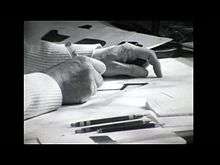
Type design

Type design is the art and process of designing typeface.
History
The technology of printing text using movable type was invented in China, but the vast number of Chinese characters meant that few distinctive, complete fonts were created in China in the early centuries of printing, despite the esteem which calligraphy held in that civilization.
Gutenberg's innovation in the mid 15th century was not printing itself, but casting type pieces with reusable molds. From then until at least 400 years later, type started with cutting punches, which acted as the masters. The material that was cut formed a prototype of the character from which type was cast by various means from an alloy usually containing lead. Type design accounted for the limitations of the printing process, such as the splashing properties of ink or the wear on the type itself.
Type design could be copyrighted typeface by typeface in many countries, though not the United States of America. The USA offered and continues to offer design patents as an option for typeface design protection.[1]
Beginning in the 1890s, each character was drawn in a very large size for the American Type Founders Corporation and a few others using their technology—over a foot (30 cm) high. The outline was then traced by a Benton pantograph-based engraving machine with a pointer at the hand-held vertex and a cutting tool at the opposite vertex down to a size usually less than a quarter-inch (6 mm). The pantographic engraver was first used to cut punches, and later to directly create matrices.
Type design became a form of computer graphics with the coming of computers, especially those on designers' desktops, employing specialized type design programs called font editors. The first digital fonts were pixel-based bitmap fonts, but scalable outline vector fonts became the norm by the mid-1990s. Hence, most font editors are essentially specialized vector drawing programs.
Each glyph design can be drawn or traced by a stylus on a digitizing board, or modified from a scanned drawing, or composed entirely within the program itself. Each glyph is then in a digital form, either in a bitmap (pixel-based) or vector (scalable outline) format. A given digitization of a typeface can easily be modified by another type designer; such a modified font is usually considered a derivative work, and is covered by the copyright of the original font software.
Principles
Glyphs of the same character have slightly different shapes when designed for different sizes, regardless of the method used to specify type design. This is done for artistic consistency, improved legibility, and to look more similar despite physical size differences.
Spacing is an important part of type design. Each glyph consists not only of the shape of the character, but also the white space around it.
Designing type requires many accommodations for the quirks of human perception, "optical corrections" required to make shapes look right, in ways that diverge from what might seem mathematically right. For example, round shapes need to be slightly bigger than square ones to appear "the same" size ("overshoot"), and vertical lines need to be thicker than horizontal ones to appear the same thickness.
Profession
Type design is performed by a type designer. It is a craft, blending elements of art and science. In the pre-digital era it was primarily learned through apprenticeship and professional training within the industry. Since the mid-1990s it has become the subject of dedicated degree programs at a handful of universities, including the MA Typeface Design at the University of Reading (UK) and the Type Media program at the KABK (Royal Academy of Art in the Hague). At the same time, the transition to digital type and font editors which can be inexpensive (or even open source and free) has led to a great democratization of type design; the craft is accessible to anyone with the interest to pursue it.

Industrial art
Type design, along with architecture, is one of the arts in which the concept of postmodernism best figures. The "modern" period of type design was the mid-twentieth century, during which sans-serif typefaces were supposed to be superior to all others due to their stark rationality. Suddenly, in the 1960s, professional typefaces started to appear that were not intended to be supremely readable, just in a style that was fashionable. One example is Aldo Novarese's 1971 typeface named Stop, which was used in various science fiction movies in the 1970s.[2]
See also
References
- ↑ "Types of Patents". United States Patent and Trademark Office. Retrieved 6 March 2015.
- ↑ "Stop - Identifont". Identifont. Retrieved 31 October 2015.
Further reading
- Stiebner, Erhardt D. & Dieter Urban. Initials and Decorative Alphabets. Poole, England: Blandford Press, 1985. ISBN 0-7137-1640-1