FF Meta
 | |
| Category | Sans-serif |
|---|---|
| Classification | Humanist sans-serif |
| Designer(s) | Erik Spiekermann |
| Foundry | FontFont |
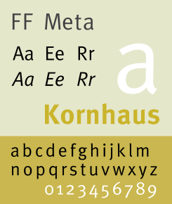
FF Meta is a humanist sans-serif typeface family designed by Erik Spiekermann and released in 1991[1] through his FontFont library. According to Spiekermann, FF Meta was intended to be a "complete antithesis of Helvetica", which he found "boring and bland".[2] It originated from an unused commission for the Deutsche Bundespost (West German Post Office). Throughout the 1990s, FF Meta was embraced by the international design community[2] with Spiekermann and E. M. Ginger writing that it had been dubiously praised as the Helvetica of the 1990s.[3]
FF Meta has been adopted by numerous corporations and other organizations as a corporate typeface, for signage or in their logo. These include Imperial College London, The Weather Channel, Free Tibet, Herman Miller, Zimmer Holdings, Mozilla Corporation, Mozilla Foundation, and Fort Wayne International Airport.[4] The University of Hull uses FF Meta Serif alongside FF Meta.[5]
Donald Trump used FF Meta initially as his primary campaign typeface before choosing Mike Pence as his vice presidential running mate. After Pence was chosen, Trump switched to Montserrat, a free typeface that is part of the Google Fonts library.
Visually distinctive characteristics
Characteristics of this typeface are:
- Lower case
- Round dot over the letter i and j.

- Ends of the letter s are nearly horizontal
- Curved bottom of l, making it clearly different to a 1 or upper-case i.
- Double-storey a with a very open aperture at the top.
- Not fully closed bottom loop in binocular g.
- Bend to the left at the top of the letters b, h, k, l.
- Bend to the right at the top of the letter d.
- A very distinctive y where the two strokes do not join smoothly.
- Upper case
- Angled letter M, more resembling Futura or an upturned W than Helvetica or Gill Sans
- Slanted upper terminal on the top right of E, T and F. E and T are not symmetrical.
A general feature of FF Meta is relatively open apertures, in contrast to the more folded-up appearance of Helvetica. This is believed to promote legibility and make the letterforms more clearly different from one another.
Development
Development began in February 1985[1] when Deutsche Bundespost approached Sedley Place Design, where Spiekermann was working at the time, and commissioned a comprehensive corporate design program. As the typeface would be used repeatedly in small sizes, for identification (rather than copy), require two different weights, and printed quickly on potentially poor paper stock, the brief called for a very legible, neutral, space-saving, and distinguishable (in regards to weight) typeface with special attention to producing unmistakable characters.[6] Whereas traditionally, typefaces are designed to be viewed beautifully large, the goal with this particular typeface was to produce a typeface which worked well for its primary application.[7]
Taking into account research done on six font families and the constraints of the brief, the characteristics of what would become FF Meta began to take shape. The typeface would have to be a sans-serif to match the client, narrow (but not condensed) to save space, feature strokes thick enough to withstand uneven printing but also light so that individual characters do not run together, contain clearly distinguishable characters for similar shaped characters, versatile capitals and figures that are clear but not obtrusive, and curves, indentations, flares, and open joins to combat poor definition, optical illusions, and over-inking. In addition to these demands, to meet Bundespost's needs, the family would also contain three fonts: regular, regular italic, and bold.[7] The typeface is particularly similar to Syntax, one of Spiekermann's candidate typefaces.
After completing and digitizing the typesetting font, mockups were generated for Bundespost's new forms and publication. However, despite positive interest from the German Minister of Telecommunications among others,[8] Bundespost decided not to implement[1] the new exclusive typeface for fear it would "cause unrest".[8] Bundespost, despite funding the project, continued instead to use a variety of different versions of Helvetica (before changing them to Frutiger). Spiekermann wrote an article on the abandoned design for Baseline magazine in 1986. At this time Meta was called PT55 (for the regular weight) and PT75 (bold).
Releases
Years later, realizing that Bundespost and Sedley Place Design would never utilize the typeface, Spiekermann with his company MetaDesign decided to continue work on the typeface and eventually published it—along with other orphaned typefaces[9]—under his newly formed publishing label FontFont resulting in the release of FF Meta in 1991.[1] This version of FF Meta was created by re-digitizing the original outlines and digitizing them in Fontographer on a Macintosh, work which was done by Spiekermann’s interns Just van Rossum and Erik van Blokland between 1988-1989.[8]
- 1991 FF Meta family released containing normal, normal small caps, and bold.[10]
- 1992 FF Meta 2 released as an expansion adding an italics weight, and small caps for bold.[10]
- 1993 FF MetaPlus released featuring some fine tuning of characters, spacing, and kerning along with the introducing three new weights: book, medium, and black in roman, italics, roman small caps, and roman small caps italics except for black which lacked small caps.[10]
- 1998 FF Meta reorganized and released with the following families: FF Meta Normal, FF Meta Book, FF Meta Medium, FF Meta Bold and FF Meta Black, all in roman, italic, small caps and italic small caps, which came with their respective expert and lining figures.[10]
- Sometime before 2005 foreign language versions by Tagir Safayev and Olga Chayeva.,[11] a condensed family, and additional light weights were added as: FF Meta Light, FF Meta Thin, and FF Meta Hairline.[10]
- 2007 A serif companion, entitled FF Meta Serif, was completed and released.[12]
- 2011 A Hebrew version was released.[13]
- 2013 Fira Sans, a free derivative for Mozilla's Firefox OS
Personnel
Writing in 1987, Spiekermann gave these credits for Meta as originally designed for the Bundespost.
- Original sketches, concept, and research for FF Meta by Erik Spiekermann and Michael Bitter at Sedley Place Design, Berlin.
- Design of the completed alphabets by Gerry Barney and Mike Pratley at Sedley Place Design, London.[8]
Notes
- 1 2 3 4 Sweet 1999, p. 17.
- 1 2 Sweet 1999, p. 16.
- ↑ Spiekermann & Ginger 2003, p. 67.
- ↑ "Using the right font". Imperial College London. Retrieved 10 August 2015.
- ↑ "Typography". University of Hull. Retrieved 10 October 2016.
- ↑ Spiekermann 1987, p. 6.
- 1 2 Spiekermann 1987, p. 7.
- 1 2 3 4 Spiekermann 1987, p. 9.
- ↑ Sweet 1999, p. 13.
- 1 2 3 4 5 Peters 2005.
- ↑ "FF Meta at ParaType". ParaType Shop. ParaType. Archived from the original on 2008-07-31.
Cyrillic versions were developed for ParaType in 2001 by Tagir Safayev and Olga Chayeva.
- ↑ Hallmundur, Aegir. "Meta Serif review". Typographica. Retrieved 11 July 2015.
- ↑ FontFont 2011.
References
- Blackwell, Lewis (2004). 20th Century Type. Yale University Press. ISBN 0-300-10073-6.
- Fiedl, Frederich; Nicholas Ott; Bernard Stein (1998). Typography: An Encyclopedic Survey of Type Design and Techniques Through History. Black Dog & Leventhal. ISBN 1-57912-023-7.
- Macmillan, Neil (2006). An A–Z of Type Designers. Yale University Press. ISBN 0-300-11151-7.
- Sweet, Fay (1999). MetaDesign : Design from the Word Up. New York: Watson-Guptill Publications. ISBN 0-8230-1212-3.
- "New FontFont Release 55". FontFont. 8 August 2011. Retrieved 4 July 2012.
- Peters, Yves (2 October 2005). "Meta-morphosis: How FF MetaPlus Became FF Meta". Retrieved 18 February 2010.
- Spiekermann, Erik (1987), "Post Mortem or how I once designed a typeface for Europe's biggest company" (PDF), Baseline (9): 6–9
- Spiekermann, Erik; Ginger, E. M. (2003). Stop Stealing Sheep & Find Out How Type Works (Second ed.). Berkeley, California: Adobe Press. ISBN 0-201-70339-4.