Goudy Old Style
 | |
| Category | Serif |
|---|---|
| Classification | Old-style |
| Designer(s) | Frederic W. Goudy |
| Foundry | American Type Founders |
| Date released | 1915 |
| Re-issuing foundries |
Lanston Monotype Intertype Ludlow |
Goudy Old Style (also known as just Goudy) is a classic old-style serif typeface originally created by Frederic W. Goudy for American Type Founders (ATF) in 1915.
Suitable for both text and display applications, Goudy Old Style is a graceful, balanced design with a few eccentricities, including the upward-curved ear on the g and the diamond shape of the dots of the i, j, and the points found in the period, colon and exclamation point, and the sharply canted hyphen. The uppercase italic Q has a strong calligraphic quality. Generally classified as a Garalde (sometimes called Aldine) face, certain of its attributes—most notably the gently curved, rounded serifs of certain glyphs—suggest a Venetian influence.
Goudy Old Style is considered to be among the most legible and readable serif typefaces for use in print (offline) applications.[1]
History

Several variants, designed by several designers, were released in the ensuing years (all faces ATF unless otherwise specified).[2] By Goudy:
- Goudy Old Style (1915)
- Goudy Old Style Italic, inspired by Aldine designs.
- Goudy Cursive, a "loose italic" adding swashes and more calligraphic alternate characters. Missing from most digitisations but included on the LTC release.[3]
- Goudy Bold (1916)
- Goudy Title (1918), a full size variation on Goudy’s small capitals from the Goudy Old Style roman.
- Goudy Bold Italic (1919) The Lanston Monotype version of the italic includes cursive capitals by Sol Hess.
- Goudy Catalog (1919) and Goudy Catalog Italic (1921), designed as medium weight companions.
- Goudy Extra Bold + Italic (1927)
By others:
- Goudy Handtooled + Italic (1922), were in-line versions of Goudy Bold + Italic (with a white line inside the letter) and were probably designed by Charles H. Becker, though other authorities credit either Morris Fuller Benton or Wadsworth A. Parker. Again, the Lanston Monotype version of the italic includes cursive capitals by Sol Hess.
- Goudy Children, which features single-story variants of the letters a and g in italic, bold, and bold italic styles and is used in children's books but is not available commercially.
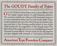
The face was an instant best seller, prompting ATF to issue a special 124-page specimen book of the series in 1927. The descenders of Goudy Old Style were kept short at ATF's insistence to allow tight line setting on their common line system, which irritated Goudy.[4] In addition, he sold the design to ATF for fifteen-hundred dollars and received no royalty on the type, causing his relationship with the foundry to deteriorate.
Over time, because graphic designers came to see the face as more suitable for display, the bold became the most enduringly popular of the family.[5]
In his 1946 autobiography, Goudy wrote that:
I had at some time or other copied a few letters of classic form from a portrait painting - I have always said "by Hans Holbein" but later search has never brought these particular pattern letters to light. [Goudy does not say which.] Anyway, I decided that I would attempt to complete an alphabet of capitals along the lines of the letters I had copied. Then came the difficult task of designing a lower-case in perfect harmony.
Regarding the italic, Goudy wrote:
I studied many of the older italics and came to the conclusion that...some of the outstanding italics of the sixteenth century had little or no inclination and yet preserved their italic character... Taking the Aldine italic as a starting point [I] succeeded in producing an original letter which, I believe, constituted the first distinctive italic in modern times.[6]
Hot metal copies
The face was immediately licensed to Lanston Monotype and some of the weights were issued by Intertype as well. Ludlow called its 1924 knock-off the Number Eleven series.[7] Monotype's designer F.H. Pierpont, better known for Rockwell and Monotype Grotesque, designed a similar face named Horley Old Style, adding a distinct influence of Caslon designs.[8]
Cold type copies
As the face was a "classic" almost from the day of its issue, producers of cold type offered their own versions of Goudy Old Style under the following names:[9]
- Goudy Oldstyle — Alphatype, Berthold, Harris, Mergenthaler
- Goudy Bold — Autologic
- Goudy Light — Dymo, Star/Photon
- Grecian Old Style — Graphic Systems Inc.
Digital copies

Commercial releases have been made by Monotype, Fontsite, DTP Types, Electric Typographer, Lanston Type, Bitstream, URW++ (bundled with Microsoft Office), Adobe, and Linotype. As many early digitisations were sublicensed, several of these may represent the same digitisation marketed by different rights-holders, possibly upgraded with modern features such as contextual ligature substitution and small caps. LTC's digitisation includes the calligraphic and swash alternate characters, as well as small caps.[10] Goudy Catalog has been copied by Scangraphic, Bitstream, URW++, and Elsner+Flake. A version called Goudy Schoolbook also exists, with single-story versions of the letters a and g, but it is not for sale to the general public. (The digitisation bundled with Microsoft Office lacks all these features; it does include ligatures, but they must be inserted manually.)
'Sorts Mill Goudy' is an open-source revival created by Barry Schwartz as part of the League of Movable Type project, which contains small capitals and other OpenType features.[11] Bhikkhu Pesala expanded this under the name 'Sukhumala', adding bold, bold italic and handtooled styles.[12]
ATF's other related fonts, Goudy Handtooled and Goudy Catalog, have also been digitised, again with a variety of companies holding some rights although only LTC's release includes Handtooled Italic.[13][14][15] Goudy Title has not been digitised under that name.
Usage
Goudy Old Style is the text typeface used in Harper's Magazine. It is the official typeface of Emory University in Atlanta, Georgia, Lewis & Clark College in Portland, Oregon, Moravian College in Bethlehem, Pennsylvania, Northwestern University in Evanston, Illinois, and Clemson University in Clemson, South Carolina. It is also used by the National University of Colombia.[16] It is also the standard body text font for Key Club publications. The bold italic weight is used for the wordmark of Whittard's.
Other Goudy typefaces
Frederic Goudy's name is associated with many other typefaces designed by Goudy, but not related to Goudy Oldstyle, including:[17]
- Goudy Light + Italic (1908, Lanston Monotype)
- Goudy Bookletter (1911, Village Letter Foundry + 1920, Lanston Monotype + 1927 Continental); also known as "Kennerly Old Style" as it was commissioned by Mitchell Kennerley
- Goudy Lanston (1912, Village Letter Foundry, later Lanston Monotype)
- Goudy Roman (1914, Barnhart Brothers & Spindler), it is unclear if the type was ever cast in quantity.
- Goudy Open (1918, Village Letter Foundry + 1924, Monotype Ltd. + 1927, Continental)
- Goudy Modern (1918, Village Letter Foundry + 1924, Monotype Ltd. + 1927, Continental), basically just a “filled in” version of Goudy Open.
- Goudy Open Italic and Goudy Modern Italic (1919, Village Letter Foundry + 1924, Monotype Ltd.)
- Goudy Newstyle (1921, Village Letter Foundry + 1927, Continental + 1941, Lanston Monotype), re-cut in 1935 and sold to Monotype who then marketed it as Goudy Bible.
- Goudy Heavy Face + Italic (1925, Lanston Monotype + 1927, Continental), intend to compete with Cooper Black.
- Goudy Heavy Face Open (1926, Lanston Monotype) and Goudy Heavy Face Condensed (1927, Lanston Monotype) were designed by Sol Hess.
- Goudy Antique (1926, privately cast by Village Letter Foundry + 1927, Continental)
- Goudytype (1928, ATF), designed and cut in 1916, not cast and sold until later.
- Goudy Black (1928, Continental), later cast as Goudy Text by Lanston Monotype.
- Goudy Sans Serif series
- Goudy Sans Serif Heavy or Sans Serif Bold (1929, Lanston Monotype)
- Goudy Sans Serif Light (1930, Lanston Monotype)
- GoudySans Serif Light Italic (1931, Lanston Monotype)
- Goudy Forum (1929, Continental + 1932, Lanston Monotype)
- Goudy Ornate or Ornate Title (1930, Continental), capitals only
- Saks Goudy + Italic + Bold Caps (1934), a private type cast for Saks Fifth Avenue department store. Saks Goudy Bold Caps actually consists of the small capitals of larger sizes cast on larger bodies.
- Goudy Stout (1939, Continental), only cut in 24 pt. capitals, few ever cast.
- Goudy Thirty (1953, Lanston Monotype), cut with the intention of being issued after Goudy’s death, “thirty” being a newspaper term for the end of the story. Goudy finished work on it in 1942 and Monotype waited several years after his death in 1947 before issuing the font.
References
- Friedl, Frederich, Nicholas Ott and Bernard Stein. Typography: An Encyclopedic Survey of Type Design and Techniques Through History. Black Dog & Leventhal: 1998. ISBN 1-57912-023-7.
- Lawson, Alexander S., Anatomy of a Typeface. Godine: 1990. ISBN 978-0-87923-333-4.
- Meggs, Philip B. and McKelvey, Roy.Revival of the Fittest: Digital Versions of Classic Typefaces. RC Publications: 2000. ISBN 1-883915-08-2.
- ↑ About.com review of Classic Serif Typefaces
- ↑ MacGrew, Mac, "American Metal Typefaces of the Twentieth Century," Oak Knoll Books, New Castle Delaware, 1993, pp. 160-161, ISBN 0-938768-34-4.
- ↑ "LTC Goudy Old Style Cursive". MyFonts. LTC. Retrieved 27 August 2015.
- ↑ Shaw, Paul. "Flawed Typefaces". Print magazine. Retrieved 30 June 2015.
- ↑ Lawson, Alexander, Anatomy of a Typeface,David R. Godine, Publisher, Boston, 1990, ISBN 0-87923-332-X, pp. 110-119.
- ↑ Goudy, Frederic (1946). A Half-Century of Type Design and Typography: 1895-1945, Volume 1. New York: The Typophiles. p. 92. Retrieved 18 November 2015.
- ↑ MacGrew, "American Metal Typefaces of the Twentieth Century," pp. 160-161.
- ↑ "Horley Old Style". MyFonts. Monotype. Retrieved 14 June 2015.
- ↑ Lawson, Alexander, Archie Provan, and Frank Romano, "Primer Metal Typeface Identification," National Composition Association, Arlington, Virginia, 1976, pp. 34 - 35.
- ↑ "LTC Goudy Oldstyle". MyFonts. Monotype. Retrieved 2 July 2015.
- ↑ Schwartz, Barry. "Sorts Mill Goudy". League of Movable Type. Retrieved 2 July 2015.
- ↑ Pesala, Bhikku. "Fonts". Softer Views. Retrieved 4 September 2015.
- ↑ "LTC Goudy Handtooled". MyFonts. LTC. Retrieved 27 August 2015.
- ↑ "Goudy Catalog MT". MyFonts. Monotype. Retrieved 31 August 2015.
- ↑ "Goudy Fontsite releases". Fontspring. Fontsite. Retrieved 31 August 2015.
- ↑ Resolución No. 001008, Agosto 14 de 2003, Universidad Nacional de Colombia, 14 August 2003
- ↑ MacGrew, "American Metal Typefaces of the Twentieth Century," pp. 160-169.
External links
| Wikimedia Commons has media related to Goudy Old Style. |
- Goudy at the Linotype Type Gallery
- Sorts Mill Goudy, a free and open-source revival of Goudy Oldstyle by Barry Schwartz