Caslon
 | |
| Category | Serif |
|---|---|
| Classification | Old-style |
| Designer(s) | William Caslon I |
| Foundry | Caslon Type Foundry |
| Variations |
Adobe Caslon Williams Caslon Big Caslon LTC Caslon Founders Caslon ITC Founders Caslon Wyld Caslon 3 Caslon 224 Caslon 471 Caslon 540 Caslon 641 Caslon Old Face |
| Shown here | Adobe Caslon by Carol Twombly |
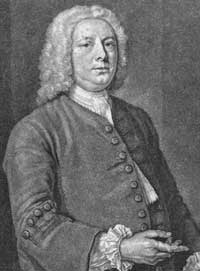
Caslon is the name given to serif typefaces designed by William Caslon I (1692–1766) in London, or inspired by his work.
Caslon worked as an engraver of punches, the masters used to stamp the moulds or matrices used to cast metal type. He worked in the tradition of what is now called old-style serif letter design, that produced letters with a relatively organic structure resembling handwriting with a pen. Caslon established a tradition of designing type in London, which had not been common, and so he was influenced by the imported Dutch Baroque typefaces that were popular in England at the time.[1][2][3] His typefaces established a strong reputation for their quality and their attractive appearance, suitable for extended passages of text.
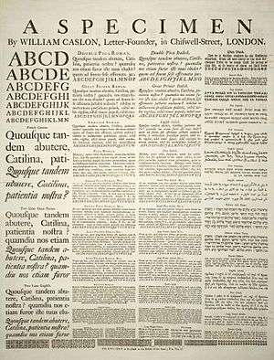
In Caslon's fonts, the 'A' has a concave hollow at top left, the 'G' is without a downwards-pointing spur at bottom right and the sides of the 'M' are straight.[4] The 'W' has three terminals at the top and the 'b' has a small tapered stroke ending at bottom left.[4] Ascenders and descenders are short and the level of stroke contrast is modest in body text sizes. However, Caslon created subtly different designs of letter at different sizes, with increasing levels of fine detail and sharp contrast in stroke weight at larger sizes. In italic, Caslon's types have a varied angle of slant, with particularly sharp slanting on the A. The Q, v, w, and z all have flourishes or swashes in the original design, something not all revivals follow.[4]
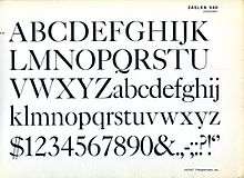
Caslon's typefaces were popular in his lifetime and beyond, and after a brief period of eclipse in the early nineteenth century remain common, particularly for setting printed body text and books. Many revivals exist, with varying faithfulness to Caslon's original design. Modern Caslon revivals also often add features such as a matching bold and 'lining' numbers at the height of capital letters, neither of which were used in Caslon's time.[5][lower-alpha 1]
History

Caslon began as an engraver of ornamental designs on firearms and other metalwork.[7] The accuracy of his work came to the attention of prominent London printers, who advanced him money to carve steel punches for printing.[8][9] Punchcutting was a very difficult technique and many of the techniques used were kept secret by punchcutters or passed on from father to son.[10] As British printers had little success or experience of making their own types, they were forced to use equipment bought from the Netherlands, or France.[11]
Type historians Stanley Morison and Alfred F. Johnson, a scientist who worked at the British Museum, point out the close similarity of Caslon's design to the Dutch Fell types cut by Voskens and other type cut by the Dutchman Van Dyck.[12][13] Dutch fonts were in use by several printers in England at that time. The Oxford University Press used the "Fell-types", character cut by the Dutch typefounder Voskens. The Cambridge University Press had received in January 1698 some 52 series of alphabets from Holland, all cut by Van Dyck.[14] But even before that in 1697 they used the text-sized roman and italic of Van Dyck in an edition of Gratulatio Cantabrigiences.[15]
John Nichols, writing in 1782, claims that the first fonts cut by William Caslon were:
- Arabic, used in a "Psalter" in 1725
- Hebrew, used for John Selden's collected works in 1726.
- Koptic, used for the bi-language Pentateuch of Dr. David Wilkins in Latin and Hebrew in 1731
There is much uncertainty about the first roman and italic Latin characters cut by Caslon himself. Nicols writes: "he (Caslon) cut the beautiful font of English which is used in printing Selden's Works [of] 1726." Nicols describes this character as far superior to contemporary Dutch fonts used in English books at this period. However, Johnson concluded in 1936 that this was incorrect, and that the earliest use of a roman and italic cut by Caslon could be identified in books printed by William Bowyer in:
- 1725: roman and italic Pica-size (modern 12pt), in the notes in Anacreon in Greek and Latin.
- 1726: roman and italic, Pica-size again in Reliquæ Baxterianæ (a collection of work by clergyman Richard Baxter)
- 1730: roman and italic, English-size (modern 14 pt), in the preface of Richard Baker's Chronicles of the Kings of England. The text-part is set in the Caslon Pica.
The Caslon types were distributed throughout the British Empire, including British North America. Much of the decayed appearance of early American printing is thought to be due to oxidation caused by long exposure to seawater during transport from England to the Americas. Caslon's types were immediately successful and used in many historic documents, including the U.S. Declaration of Independence. After William Caslon I’s death, the use of his types diminished, but had a revival between 1840–80 as a part of the British Arts and Crafts movement. The Caslon design is still widely used today.
Caslon's original designs do not include a bold weight. This is because it was unusual to use bold weights in typesetting during the 18th century, and Caslon never designed one for body text, although some of his titling-size fonts are quite bold.[5] For emphasis, italics or a larger point size, and sometimes caps and small caps would be used instead.
Besides regular text fonts, Caslon created blackletter types, which were also printed on his specimen. These could be used for purposes such as title pages and drop caps.[16]
One criticism of some Caslon-style typefaces has been a concern that the capitals are too thick in design and stand out too much, making for an uneven colour on the page. Printer and typeface designer Frederic Goudy was one supporter of this view, feeling that "the strong contrast between the over-black stems of the capitals and the light weight stems in the lower-case...makes a 'spotty' page". He cited dissatisfaction with the style as an incentive for becoming more involved in type design around 1911, when he created Kennerley Old Style as an alternative.[17]
Eclipse
Caslon's types fell out of interest in the late eighteenth century, due to the arrival of transitional typefaces like Baskerville and then Didone design, and his foundry split into successor companies, which began to sell alternative and additional designs.[18][19] However, a successor company remained in business under the Caslon name and his reputation remained. The printer and social reformer Thomas Curson Hansard wrote in 1825:
At the commencement of the 18th century the native talent of the founders was so little prized by the printers of the metropolis, that they were in the habit of importing founts from Holland, ...and the printers of the present day might still have been driven to the inconvenience of importation had not a genius, in the person of William Caslon, arisen to rescue his country from the disgrace of typographical inferiority.[20]
Many of Caslon's original punches and matrices survived in the collection of the Caslon company's descendants, and are now part of the St Bride Library and Type Museum collections in Britain. Copies held by the Paris office of the Caslon company, the Fonderie Caslon, were transferred to the collection of the Musée de l'Imprimerie in Nantes.[21]
Resurgence

Interest in eighteenth-century printing returned in the nineteenth century with the rise of the arts and crafts movement, and Caslon's types returned to popularity in books and fine printing among companies such as the Chiswick Press, as well as display use in situations such as advertising.[22][23] Some printing was done using Caslon's original matrices or electrotyped copies, while other releases used new designs in the same style to achieve a similar but cleaner appearance, making use of the improved technology of hot metal typesetting at the close of the 19th century.[22][24][25]
In the USA, Caslons became almost a genre (many recut or expanded with bold, condensed, and inline styles), with many foundries cutting their own design.[26] By the 1920s, American Type Founders offered a large range of styles, some numbered rather than named.[27] (Bookman Old Style is a descendant of one of these American Caslon revivals. A series of modifications has given most modern Bookman digitisations a somewhat exaggerated appearance with extremely high x-height very unlike the original Caslon.)
Caslon again entered a new technology with phototypesetting, mostly in the 1960s and 1970s, and then again with digital typesetting technology, mostly since the mid-1980s. There are many typefaces called "Caslon" as a result of that and the lack of an enforceable trademark on the name "Caslon" by itself, which reproduce the original designs in varying degrees of faithfulness.
Caslon Old Face

Caslon's company had long been based in Chiswell Street, but it had a somewhat chaotic history after his death in 1766, with a large number of successor companies and branches. These began to sell alternative designs quite unlike the original Caslon's style, reflecting the new tastes in printing. One of these successors was bought up by what became Stephenson Blake in 1818.
Caslon’s types began to attract the attention of fine printers, so the H.W. Caslon & Sons foundry reissued Caslon’s original types as Caslon Old Face from the original matrices. The last lineal descendent of Caslon, Henry William Caslon, brought in Thomas White Smith as a new manager shortly before his death in 1874. Smith instructed his sons to change their surnames to Caslon in order to provide an appearance of continuity.
Some Caslon typefaces were augmented by adding new features such as swash capitals, recut and more regular designs, bold type, and condensed and inline styles.[22][24] Due to the cachet of the Caslon name, some of these recuttings and modifications were apparently not publicly admitted.[22]
The H.W. Caslon company also licensed to other printers matrices made by electrotyping (although some companies may also have made unauthorized copies or made completely new designs in the same style), and the type become popular in American printing.[22] In 1937, the H.W. Caslon & Sons foundry was also acquired by Stephenson Blake & Co, who thereafter added 'the Caslon Letter Foundry' to their name.
George Ostrochulski adapted the designs from Stephenson Blake & Co for photocomposition at Mergenthaler Linotype during the 1950s. It has been digitised and released by Bitstream.[28]

A variety of typefaces are available commercially called Caslon Old Face. Visual differences exist between typefaces from different companies, and the authenticity is debatable of some of these typefaces.
Ludlow Typograph Company, Chicago, Illinois, USA

Ludlow had a wide variety of Caslon-types. The type-number is added between brackets behind the name.
| Style | Sizes |
|---|---|
| True-Cut Caslon (1-TC) | 8, 10, 12, 14, 18, 22, 24, 30, 36, 42, 48, 60, 72 punt |
| True-Cut Caslon Italic (1-TCI) | 8, 10, 12, 14, 18, 22, 24, 30, 36, 42, 48, 60, 72 punt |
| Light (1-L) | 6, 8, 10, 12, 14, 18, 22, 24, 30, 36, 42, 48, 60, 72 punt |
| Light Italic (1-) | 6, 8, 10, 12, 14, 18, 22, 24, 30, 36, 42, 48, 60, 72 punt |
| Bold (1-B) | 6, 8, 10, 12, 14, 18, 22, 24, 30, 36, 42, 48, 60, 72 punt |
| Bold Italic (1-BI) | 6, 8, 10, 12, 14, 18, 22, 24, 30, 36, 42, 48, 60, 72 punt |
| Bold Condensed (1-BC) | 6, 8, 10, 12, 14, 18, 22, 24, 30, 36, 42, 48, 60, 72 punt (6, 8 en 10 punt op matrijzen voor romein) |
| Bold Extra Condensed (1-BEC) | 12, 14, 18, 22, 24, 30, 36, 42, 48, 60, 72 punt |
| Caslon Old Face Heavy (1-OFH) | 6, 8, 10, 12, 14, 18, 22, 24, 30, 36, 42, 48, 60, 72 punt |
| Heavy Italic (1-HE) | 14, 18, 22, 24, 30, 36, 42, 48, 60, 72 punt |
Imprint
A more regular adaptation of Caslon by the British branch of Monotype was commissioned by the London publishers of The Imprint, a short-lived printing trade periodical that published during 1913.[29] It had a higher x-height and was intended to offer an italic more complementary to the roman. It has remained popular since and has been digitised by Monotype.[30]
The Monotype Corporation Limited at Salford, UK
This company produced three Caslon revivals:
- 1903, Series 20 Old Face (special) after 1967 out of production
- 1906, Series 45 Old Face Standard, after 1967 out of production
- 1915, Series 128 & 209, Caslon & Caslon Titling.
Caslon 471

Caslon 471 was designed by the staff of American Type Founders as their first revival of Caslon. It is based on the Old Style No. 1 typeface used in an 1865 specimen book from the L.J. Johnson foundry in Philadelphia.
Caslon 540

Caslon 540 was designed by the staff of American Type Founders and released in 1902. The typeface was originally intended for use in advertising and is based on Caslon 471 with shortened descenders. In use at large sizes it is more even than Caslon's original display faces or more faithful renditions of them such as Big Caslon (see below), quite light in colour. Its italic is extremely sharply slanted.[31] The italic was distributed by Letraset, whose designer Freda Sack created a matching set of swashes. As a result, this often became sold or used without the regular or roman style of this revival.[32]
Caslon 3
A slighter bolder version of Caslon 540, released by American Type Founders in 1905.[33] BitStream sells Caslon 3 under the name of Caslon Bold with its Caslon 540 release.[34] Russian studio ParaType have released both with Cyrillic glyphs.[35]
Caslon Openface
A decorative openface serif typeface with very high ascenders, popular in the United States. Despite the name, it has no connection to Caslon: it was an import of the French typeface "Le Moreau-le-Jeune", created by Fonderie Peignot in Paris, by ATF branch Barnhart Brothers & Spindlers.[36][37]
Caslon 641
A heavy version of Caslon 540, released by American Type Founders in 1966.
Caslon 224
Caslon 224 was designed by Ed Benguiat of ITC, and released in 1983. A classic advertising and display typeface, it features a large x-height, smooth weight transitions, and careful structuring of hairline strokes, offered in four weights (book, medium, bold, and black) each with a matching italic.
In lectures, Benguiat has frequently said he chose the number 224 because it was the address of the building where he did most of his work.
Digital-only releases

Adobe Caslon (1990)
Adobe Caslon is a very popular revival designed by Carol Twombly.[38] It is based on Caslon's own specimen pages printed between 1734 and 1770[39] and is a member of the Adobe Originals programme. It added many features now standard in high-quality digital fonts, such as small caps, old style figures, swash letters, ligatures, alternate letters, fractions, subscripts and superscripts, and matching ornaments.[9][40]
Adobe Caslon is the typeface used for body text in The New Yorker and is one of the two official typefaces of the University of Virginia.[41] A modification is used on U. VA's logo.[42] It is also available with Adobe's Typekit programme, in some weights for free.
Big Caslon (1994)

Big Caslon by Matthew Carter is inspired by the three largest sizes of type from the Caslon foundry. These have a unique design with dramatic stroke contrast, complementary to but unlike Caslon's text faces; one may mostly have been created by Joseph Moxon rather than Caslon.[6] The typeface is intended for use at eighteen point and above.[43][44] The standard weight is bundled with Apple's OS X operating system in a release including small caps and alternates such as the long s. Initially published by his company Carter & Cone, in 2014 Carter revisited the design adding bold and black designs with matching italics, and republished it through Font Bureau.[45][lower-alpha 2] It is used by Boston magazine and the Harvard Crimson.[48]
LTC Caslon (2005)
LTC Caslon is a digitisation of the Lanston Type Company's 14 point size Caslon 337 of 1915 (itself a revival of the original Caslon types).[49][50] This family include fonts in regular and bold weights, with fractions, ligatures, small caps (regular and regular italic only), swashes (regular italic weight only), and Central European characters.[51] An notable feature is that like some hot metal releases of Caslon, two separate options for descenders are provided for all styles: long descenders (creating a more elegant designs) or short (allowing tighter linespacing).
To celebrate its release, LTC included in early sales a CD of music by The William Caslon Experience, a downtempo electronic act, along with a limited edition upright italic design, 'LTC Caslon Remix'.[52][53]
Williams Caslon Text (2010)
A modern attempt to capture the spirit of Caslon by William Berkson, intended for use in body text.[54][55] Although not aimed at being fully authentic in every respect, the typeface closely follows Caslon's original specimen sheet in many respects. The weight is heavier than many earlier revivals, to compensate for changes in printing processes, and the italic is less slanted (with variation in stroke angle) than on many other Caslon releases. Berkson described his design choices in an extensive article series.[56][57]
Released by Font Bureau, it includes bold and bold italic designs, and a complete feature set across all weights, including bold small caps and swash italic alternates as well as optional shorter descenders and a 'modernist' option to turn off swashes on lower-case letters for a more spare appearance.[58][lower-alpha 3] It is currently used in Boston magazine and by Foreign Affairs.
A notable feature of Caslon's structure is its widely splayed T, which can space awkwardly with an 'h' afterwards. Accordingly, an emerging tradition among digital releases is to offer a 'Th' ligature, inspired by a tradition in calligraphy, to achieve tighter letterspacing.[59] Adobe Caslon, LTC Caslon, Williams Caslon and Big Caslon (italics only, in the Font Bureau release) all offer a 'Th' ligature as default or as an alternate.
Distressed revivals

A number of Caslon revivals are 'distressed' in style, adding intentional irregularities to capture the worn, jagged feel of metal type.
ITC Founder's Caslon (1998)
ITC Founder's Caslon was digitized by Justin Howes. He used the resources of the St. Bride Printing Library in London to thoroughly research William Caslon and his types.[60] Unlike previous digital revivals, this family closely follows the tradition of building separate typefaces intended for different sizes, despite the use of scalable typefaces in the digital counterpart. Distressing varies by style, matching the effect of metal type, with large optical sizes offering the cleanest appearance.
This family was released by ITC in December 1998.[61] It includes separate fonts for 12 point, 30 point, 42 point, and Poster sizes, and a typeface for ornaments. Also following the original Caslon types, it does not include bold typefaces, but uses old style figures for all numbers.
Another feature in the Windows TrueType version of the typeface is the allocation of extra ligatures and alternate forms to Basic Latin and ISO Latin-1 blocks, replacing |, <, >, =.
The OpenType Std version of the typeface adds small caps to the family and updates the character set to support the Adobe Western 2 character set.
H. W. Caslon version
Following the release of ITC Founder's Caslon, Justin Howes revived the H.W. Caslon & Company name, and released an expanded version of the ITC typefaces under the Founders Caslon name.
Caslon Old Face is a typeface with multiple optical sizes, including 8, 10, 12, 14, 18, 22, 24, 30, 36, 42, 48, 60, 72, 96 points. Each font has small capitals, long esses and swash characters. The 96 point font came in roman only and without small capitals. Caslon Old Face was released in July 2001.
Caslon Ornaments is a typeface containing ornament glyphs.
These typefaces are packaged in the following formats:
- Founders Caslon 1776: Caslon Old Face (14), Caslon Ornaments.
- Founders Caslon Text: Caslon Old Face (8, 10, 12, 14, 18), Caslon Ornaments.
- Founders Caslon Display: Caslon Old Face (22, 24, 30, 36, 42, 48, 60, 72), Caslon Ornaments.
However, following the death of Justin Howes, the revived H.W. Caslon & Company went out of business, and the expanded Founders Caslon is no longer offered in the retail market.
NotCaslon (1995)
An exuberant parody of Caslon italics created by Mark Andresen, this 1995 Emigre font was created by blending together samples of Caslon from "bits and pieces of dry transfer lettering: flakes, nicks, and all".[62][63][64]
Wyld (2002)
A somewhat distressed modern day recreation of Caslon by David Manthey which is intended to exactly match the typeface found in The Practical Surveyor, by Samuel Wyld,[65] published in London in 1725. The typeface contains a regular and italic style, with glyphs for several ligatures commonly used in printing during the early 18th century. It was released by Mathey as freeware for private use.
Franklin Caslon (2006)

This 2006 creation by P22 is based on the pages produced by Benjamin Franklin circa 1750. It has a distressed appearance.[66]
Caslon Antique
This decorative serif typeface was originally called Fifteenth Century, but later renamed Caslon Antique. It is not generally considered to be a member of the Caslon family of typefaces, because its design appears unrelated, and the Caslon name was only applied retroactively.
See also
References
- ↑ Macmillan, Neil (2006). An A-Z of Type Designers. Yale University Press. pp. 63–4. ISBN 0-300-11151-7.
- ↑ Loxley, Simon (12 June 2006). Type: The Secret History of Letters. I.B.Tauris. pp. 28–37. ISBN 978-1-84511-028-4.
- ↑ Alexander S. Lawson (January 1990). Anatomy of a Typeface. David R. Godine Publisher. pp. 169–183. ISBN 978-0-87923-333-4.
- 1 2 3 Tracy, Walter (January 2003). Letters of Credit: A View of Type Design. D.R. Godine. pp. 56–59. ISBN 978-1-56792-240-0.
- 1 2 Haley, Allan. "Bold type in text". Monotype. Retrieved 11 August 2015.
- 1 2 Mosley, James (2003). "Reviving the Classics: Matthew Carter and the Interpretation of Historical Models". In Mosley, James; Re, Margaret; Drucker, Johanna; Carter, Matthew. Typographically Speaking: The Art of Matthew Carter. Princeton Architectural Press. p. 35. ISBN 9781568984278. Retrieved 30 January 2016.
- ↑ Haley, Allan (1992). Typographic milestones ([Nachdr.]. ed.). Hoboken, NJ: John Wiley & Sons. p. 31. ISBN 9780471288947.
- ↑ Loxley, Simon (2005). Type : the secret history of letters. London [u.a.]: I. B. Tauris. p. 30. ISBN 9781845110284.
- 1 2 "Adobe - Fonts : Adobe Caslon Pro". Store1.adobe.com. Retrieved 2012-10-22.
- ↑ Musson, A.E. (2013). Trade Union and Social History. Hoboken: Taylor and Francis. p. 138. ISBN 9781136614712.
- ↑ Downer, John. "The Art of Founding Type". Emigre. Retrieved 19 August 2015.
- ↑ Johnson, Alfred (1936). "A Note on William Caslon" (PDF). Monotype Recorder. 35 (4): 3–7. Retrieved 19 October 2015.
- ↑ Stanley Morison, A tally of types, Cambridge at the University Press, second edition, 1973, pag 24-27
- ↑ Mr.S.C. Roberts, History of the Cambridge University Press, p. 77
- ↑ Alfred F. Johnson, A note on William Caslon, in: The Monotype Recorder, vol. 35, no. 4, 1936-7, pag. 6
- ↑ "Old English Text MT". MyFonts. Monotype. Retrieved 30 August 2015.
- ↑ Goudy, Frederic (1946). A half-century of type design and typography. New York: The Typophiles. pp. 67, 77. Retrieved 26 March 2016.
- ↑ A specimen of printing types. Wm. Caslon. 1798. Retrieved 20 August 2015.
- ↑ Foster, Dave. "Palladium Caslon" (PDF). Type & Media masters programme, Royal Academy of Art in The Netherlands. Retrieved 20 August 2015.
- ↑ Hansard, Thomas Curson (1825). Typographia, an Historical Sketch of the Origin and Progress of the Art of Printing. p. 348. Retrieved 12 August 2015.
- ↑ Mosley, James. "The materials of typefounding". Type Foundry. Retrieved 14 August 2015.
- 1 2 3 4 5 6 Mosley, James. "Recasting Caslon Old Face". Type Foundry. Retrieved 1 August 2015.
- ↑ Encyclopaedia Britannica - Caslon. Cambridge University Press. 1911. Retrieved 1 August 2015.
- 1 2 Specimens of Type. London: H.W. Caslon & Co. 1915. Retrieved 19 August 2015.
- ↑ "Learn About Fonts & Typography". Itcfonts.com. Retrieved 2012-10-22.
- 1 2 Pichotta, Jill. "Caslon FB". Font Bureau. Retrieved 30 August 2015.
- ↑ Specimen Book & Catalogue. American Type Founders. 1923. pp. 130–191, 780. Retrieved 30 August 2015.
- ↑ "Caslon Old Face". MyFonts. Bitstream. Retrieved 30 August 2015.
- ↑ McKitterick, David (2004). A history of Cambridge University Press. (1. publ. ed.). Cambridge: Cambridge University Press. ISBN 9780521308038.
- ↑ "Imprint MT". MyFonts. Monotype. Retrieved 12 July 2015.
- ↑ "Caslon 540 LT". MyFonts. Linotype. Retrieved 30 August 2015.
- ↑ "Caslon 540 Italic with swashes". MyFonts. Letraset. Retrieved 20 October 2015.
- ↑ "Caslon 3 LT". MyFonts. Linotype. Retrieved 30 August 2015.
- ↑ "Caslon Bold". MyFonts. Bitstream. Retrieved 30 August 2015.
- ↑ "ParaType Caslon 540 Bold". MyFonts. ParaType. Retrieved 30 August 2015.
- ↑ Devroye, Luc. "Le Moreau-le-Jeune: A Typographical Specimen with an Introduction by Douglas C. Murtrie". Type Design Information. Retrieved 26 March 2016.
- ↑ Kupferschmid, Indra. "Caslon Openface". Alphabettes. Retrieved 26 March 2016.
- ↑ Silverman, Randy (December 1994). "Carol Twombly on Type". Graphic Arts. Retrieved 22 September 2015.
- ↑ "Adobe - Fonts : Adobe Caslon". Store1.adobe.com. Retrieved 2012-10-22.
- ↑ "Adobe - Fonts : Adobe Caslon Expert". Store1.adobe.com. Retrieved 2012-10-22.
- ↑ Gopnik, Adam (February 9, 2009). "Postscript". The New Yorker: 35.
- ↑ "University of Virginia Usage Guidelines". Retrieved 2012-12-06.
- ↑ "Big Caslon promotional page". Font Bureau. Retrieved 27 July 2015.
- ↑ "Big Caslon - Desktop font « MyFonts". New.myfonts.com. 2000-01-01. Archived from the original on 2012-02-09. Retrieved 2012-10-22.
- ↑ "Big Caslon FB". Font Bureau. Retrieved 23 June 2015.
- ↑ Buchanan, Matthew. "Quarto Review". Typographica. Retrieved 19 August 2015.
- ↑ "Quarto". Hoefler & Frere-Jones. Retrieved 19 August 2015.
- ↑ "Big Caslon". Fonts in Use. Retrieved 30 August 2015.
- ↑ "LTC Caslon MyFonts". MyFonts. Retrieved 19 August 2015.
- ↑ "LANSTON FONT | CASLON OLDSTYLE, 337 | WILLIAM CASLON". P22.com. Retrieved 2012-10-22.
- ↑ "LTC Caslon Family". P22.com. Archived from the original on 2012-10-19. Retrieved 2012-10-22.
- ↑ "Microsoft Typography - News archive". Microsoft.com. Retrieved 2012-10-22.
- ↑ "Audio". P22. Archived from the original on 2012-10-19. Retrieved 2012-10-22.
- ↑ Berkson, William. "Announcement on Typophile thread". Typophile. Archived from the original on July 24, 2012. Retrieved 19 August 2015.
- ↑ "Boston Pops: A Conversation with Patrick Mitchell".
- ↑ Berkson, William. "Reviving Caslon, Part 1". Retrieved 23 June 2015.
- ↑ Berkson, William. "Reviving Caslon, Part 2". I Love Typography. Retrieved 21 September 2014.
- ↑ "WCT Features" (PDF). Font Bureau. Retrieved 23 June 2015.
- ↑ Shaw, Paul. "Flawed Typefaces". Print magazine. Retrieved 2 July 2015.
- ↑ "Download ITC Founder's Caslon™ font family". Linotype.com. Retrieved 2012-10-22.
- ↑ "New Releases - Fonts.com". Itcfonts.com. 2012-10-16. Retrieved 2012-10-22.
- ↑ "NotCaslon". Emigre. Retrieved 23 June 2015.
- ↑ "Buy NotCaslon". Emigre. Retrieved 23 June 2015.
- ↑ "NotCaslon". MyFonts. Emigre. Retrieved 30 August 2015.
- ↑ "The Practical Surveyor". Orbitals.com. Retrieved 2012-10-22.
- ↑ "P22 Franklin Caslon". MyFonts. P22. Retrieved 30 August 2015.
- ↑ Arabic numerals in Caslon's time were written as what are now called text figures, styled with variable height like lower-case letters.
- ↑ The modern family Quarto by Hoefler & Frere-Jones is a well-received revival of the Dutch display types that inspired Caslon’s larger sizes, and is therefore quite similar.[46][47]
- ↑ It is not to be confused with a totally different 'Caslon FB' by Jill Pichotta, inspired by bold condensed Caslon-inspired typefaces used in American newspaper headlines.[26]
Early sources
- Rowe More, Dissertation 1778
- John Nicols, Biographical and Literary Anecdotes of William Bowyer 1782
- John Nicols, Literary Anecdotes, 1812–1815
The following two authors based their writings entirely on these three publications.
- Talbot Baines Reed, A History of Old English Letter Foundries, 1897
- Daniel Berkeley Updike, Printing types, their History, forms and use, 1937
Further reading
- Carter, Rob, Day, Ben, and Phillip Meggs. Typography Design: Form and Communication. John Willey & Sons, Inc.: 1993. ISBN 0-471-28430-0
- Friedl, Friedrich, Nicolaus Ott and Bernard Stein. Typography, An Encyclopedic Survey of Type Design and Techniques throughout History. Black Dog & Leventhal: 1998. ISBN 1-57912-023-7
- Lawson, Alexander S., Anatomy of a Typeface. Godine: 1990. ISBN 978-0-87923-333-4.
- Meggs, Phillip B, McKelvey, Roy. Revival of the Fittest: Digital Versions of Classic Typefaces. RC Publications, Inc.2000. ISBN 1-883915-08-2
- [4] Nesbitt, Alexander The History and Technique of Lettering (c) 1998, Dover Publications, Inc. ISBN 0-486-40281-9, The Dover edition is an abridged and corrected republication of the work originally published in 1950 by Prentice-Hall, Inc. under the title Lettering: The History and Technique of Lettering as Design.
- Updike, Daniel Berkeley. Printing Types: Their History, Forms, and Use. Dover Publications, Inc.: 1980. ISBN 0-486-23929-2
Specimen books available online
- By the original Caslon Company, run by William Caslon II: Specimen of 1785
- By a breakaway company run by William Caslon III: Specimen of 1798 (completely different typeface designs, in the transitional and modern style)
- H.W. Caslon & Co. Ltd, specimen book, 1915. The 20th century Caslon company at its height, including many sample settings.
- American Type Founders, 1912 Specimen Book. Includes Caslon samples on pages 116-123 & 314-353.
- American Type Founders, 1923 Specimen Book: complete digitisation, separate volumes (incomplete). Includes many examples of American releases of Caslon and sample settings in full-colour printing.
External links
| Wikimedia Commons has media related to Caslon. |
- Typowiki: Caslon
- Recasting Caslon, Professor James Mosley
- John Downer on Caslon
- Williams Caslon Text
- Typowiki: Caslon Old Face
- U&lc Online Issue: 25.3.2: ITC Founder's Caslon
- What's Hot From ITC: August 2004
- H. W. Caslon and Company home page
- Microsoft Typography: H. W. Caslon & Company
- Justin Howes: Expert on letter forms, preserver of original typefaces and curator of the Type Museum in London
- Founder’s Caslon character sets
- Wyld typeface