Small multiple
A small multiple (sometimes called trellis chart, lattice chart, grid chart, or panel chart) is a series of similar graphs or charts using the same scale + axes, allowing them to be easily compared. It uses multiple views to show different partitions of a dataset. The term was popularized by Edward Tufte.
According to Tufte (Envisioning Information, p. 67):
- At the heart of quantitative reasoning is a single question: Compared to what? Small multiple designs, multivariate and data bountiful, answer directly by visually enforcing comparisons of changes, of the differences among objects, of the scope of alternatives. For a wide range of problems in data presentation, small multiples are the best design solution.
Modern Example
In the example, the departmental salary expense is charted by month with a dashed line indicating the average for each department. The scales on each panel are different to emphasize the relative change over time compared to the range. Standardizing the scales could provide insight into comparisons in magnitude between the different departments.

Historical Examples
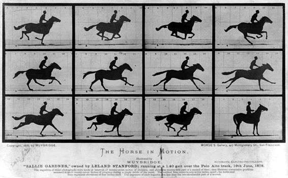
Some of the earliest known examples of this type of visualization include the photographic series Horse In Motion by Eadweard Muybridge, circa 1886, and Francis Amasa Walker's chart of citizen's occupations in census year 1870 appearing in the Statistical Atlas of the United States.
Muybridge's work not only proved for the first time that all four of a horse's hooves left the ground during gallop (see upper central plates), but it also broke new ground in terms of artistic expression and became foundational to the development of the motion picture. Muybridge went on to produce many more examples of small multiples showing animal locomotion through the medium of stop-motion photography, including boys playing leapfrog and a bison cantering.
For more traditional sketched graphic examples, refer to Francis Amasa Walker's charts appearing in the 1870 Statistical Atlas of the United States. Superintendent of the US Census at the time of its creation, Walker was determined to modernize the Census collection and analysis methods and used the Atlas to present the final data set using unprecedented visual forms, including many beautiful examples of small multiples. It is notable that the 1870 Census featured the first usage of automated tabulation and processing machines for analysis, including Herman Hollerith's punchcard counting machine, which no doubt played a role in the creation of Walker's data-rich displays.
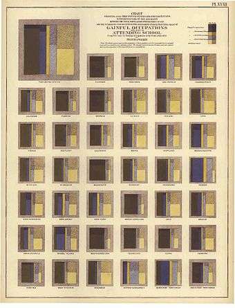
At left is a chart showing the population broken down by occupation, including a count of those attending school, according to the 1870 Census. This graphic is innovative in its use of both a treemap display and a latticed layout of small multiples. Additional examples appearing in the Atlas include side-by-side geographic maps showing the changes in population over time, as well as tiled mosaic charts showing population demographic breakdowns, and diverging bar graphs showing deaths broken down by age and gender, tiled by state.
References
- Tufte, Edward (1983). Visual Display of Quantitative Information.
- Tufte, Edward (1990). Envisioning Information.
- United States Bureau of the Census (1874). Statistical Atlas of the United States.