Edward Tufte
| Edward Rolf Tufte | |
|---|---|
 Tufte during his one-day course in Dallas, May 21, 2015 | |
| Born |
March 14, 1942 Kansas City, Missouri |
| Occupation | Professor, statistician, writer, sculptor |
| Nationality | American |
| Notable works |
|
| Website | |
|
www | |
Edward Rolf Tufte (/ˈtʌfti/; born March 14, 1942) is an American statistician and professor emeritus of political science, statistics, and computer science at Yale University.[1] He is noted for his writings on information design and as a pioneer in the field of data visualization.[2]
Biography
Edward Rolf Tufte was born in 1942 in Kansas City, Missouri, to Virginia Tufte and Edward E. Tufte (1912–1999). He grew up in Beverly Hills, California, where his father was a longtime city official,[3] and he graduated from Beverly Hills High School.[4] He received a BS and MS in statistics from Stanford University and a PhD in political science from Yale.[5] His dissertation, completed in 1968, was entitled The Civil Rights Movement and Its Opposition. He was then hired by Princeton University's Woodrow Wilson School, where he taught courses in political economy and data analysis while publishing three quantitatively inclined political science books.
In 1975, while at Princeton, Tufte was asked to teach a statistics course to a group of journalists who were visiting the school to study economics. He developed a set of readings and lectures on statistical graphics, which he further developed in joint seminars he taught with renowned statistician John Tukey, a pioneer in the field of information design. These course materials became the foundation for his first book on information design, The Visual Display of Quantitative Information.[6][7]
After difficult negotiations with mainline publishers failed, Tufte decided to self-publish Visual Display in 1982, working closely with graphic designer Howard Gralla. He financed the work by taking out a second mortgage on his home. The book quickly became a commercial success and secured his transition from political scientist to information expert.[6]
On March 5, 2010, President Barack Obama appointed Tufte to the American Recovery and Reinvestment Act's Recovery Independent Advisory Panel "to provide transparency in the use of Recovery-related funds".[5]
Work
Tufte is an expert in the presentation of informational graphics such as charts and diagrams, and is a fellow of the American Statistical Association. He has held fellowships from the Guggenheim Foundation and the Center for Advanced Study in the Behavioral Sciences.
He is intensely critical in the self-editing process. He pulls in and casts out ideas from books, journals, posters, auction catalogs, and other less common sources. He invites others to critique his work in-progress and may nurture dozens of ideas over months in various states of growth and fruition. He deletes almost every photograph he takes. Over time, he deletes most of what he writes on his own forum, ET Notebooks. Every printing of every book corrects numerous small blemishes, ranging from color registration to kerning and hinting.
Information design

Tufte's writing is important in such fields as information design and visual literacy, which deal with the visual communication of information. He coined the word chartjunk to refer to useless, non-informative, or information-obscuring elements of quantitative information displays. Tufte's other key concepts include what he calls the lie factor, the data-ink ratio, and the data density of a graphic.[8]
He uses the term "data-ink ratio" to argue against using excessive decoration in visual displays of quantitative information.[9] In Visual Display, Tufte explains, "Sometimes decoration can help editorialize about the substance of the graphic. But it is wrong to distort the data measures—the ink locating values of numbers—in order to make an editorial comment or fit a decorative scheme."[10]
Tufte encourages the use of data-rich illustrations that presented all available data. When such illustrations are examined closely, every data point has a value, but when they are looked at more generally, only trends and patterns can be observed. Tufte suggests these macro/micro readings be presented in the space of an eye-span, in the high resolution format of the printed page, and at the unhurried pace of the viewer's leisure.
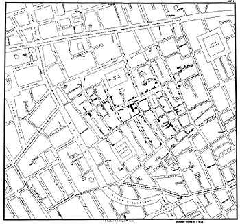
He uses several historical examples to make his case. These include John Snow's cholera outbreak map, Charles Joseph Minard's Carte Figurative, early space debris plots, Galileo Galilei's Sidereus Nuncius, and Maya Lin's Vietnam Veterans Memorial. For instance, the listing of the names of deceased soldiers on the black granite of Lin's sculptural memorial is shown to be more powerful as a chronological list rather than as an alphabetical one. The sacrifice each fallen individual has made is thus highlighted within the overall time scope of the war.[11] In Sidereus Nuncius Galilei presents the nightly observations of the moons of Jupiter in relation to the body itself, interwoven with the two-month narrative record.[12]
Criticism of PowerPoint
Tufte has criticized the way Microsoft PowerPoint is typically used. In his essay "The Cognitive Style of PowerPoint," Tufte criticizes many aspects of the software:
- Its use to guide and reassure a presenter, rather than to enlighten the audience;
- Its unhelpfully simplistic tables and charts, resulting from the low resolution of early computer displays;
- The outliner's causing ideas to be arranged in an unnecessarily deep hierarchy, itself subverted by the need to restate the hierarchy on each slide;
- Enforcement of the audience's lockstep linear progression through that hierarchy (whereas with handouts, readers could browse and relate items at their leisure);
- Poor typography and chart layout, from presenters who are poor designers or who use poorly designed templates and default settings (in particular, difficulty in using scientific notation);
- Simplistic thinking—from ideas being squashed into bulleted lists; and stories with beginning, middle, and end being turned into a collection of disparate, loosely disguised points—presenting a misleading facade of the objectivity and neutrality that people associate with science, technology, and "bullet points".
Tufte cites the way PowerPoint was used by NASA engineers in the events leading to the Space Shuttle Columbia disaster as an example of the many problems. The software style is designed to persuade rather than to inform people of technical details. Tufte's analysis of a NASA PowerPoint slide is included in the Columbia Accident Investigation Board’s report—including an engineering detail buried in small type on a crowded slide with six bullet points, that if presented in a regular engineering white paper, might have been noticed and the disaster prevented.[13][14]
Instead, Tufte argues that the most effective way of presenting information in a technical setting, such as an academic seminar or a meeting of industry experts, is by distributing a brief written report that can be read by all participants in the first 5 to 10 minutes of the meeting. Tufte believes that this is the most efficient method of transferring knowledge from the presenter to the audience and then the rest of the meeting is devoted to discussion and debate.[15]
Small multiple
One method Tufte encourages to allow quick visual comparison of multiple series is the small multiple, a chart with many series shown on a single pair of axes that can often be easier to read when displayed as several separate pairs of axes placed next to each other. He suggests this is particularly helpful when the series are measured on quite different vertical (y-axis) scales, but over the same range on the horizontal x-axis (usually time).
Sparkline
Although Tufte is said to have invented sparklines, in actuality he invented only the name and popularized it as technique.[16] Sparklines are a condensed way to present trends and variation, associated with a measurement such as average temperature or stock market activity, often embedded directly in the text; for example: The Dow Jones index for February 7, 2006 ![]() .[17][18] These are often used as elements of a small multiple with several lines used together. Tufte explains the sparkline as a kind of "word" that conveys rich information without breaking the flow of a sentence or paragraph made of other "words" both visual and conventional. To date, the earliest known implementation of sparklines was conceived by interaction designer Peter Zelchenko and implemented by programmer Mike Medved in early 1998.[19]
.[17][18] These are often used as elements of a small multiple with several lines used together. Tufte explains the sparkline as a kind of "word" that conveys rich information without breaking the flow of a sentence or paragraph made of other "words" both visual and conventional. To date, the earliest known implementation of sparklines was conceived by interaction designer Peter Zelchenko and implemented by programmer Mike Medved in early 1998.[19]
Sculpture
Beyond his academic endeavors over the years, Tufte has created sculptures, often large outdoor ones made of metal or stone,[4] which were first primarily exhibited on his own rural Connecticut property. In 2009–10, some of these artworks were exhibited at the Aldrich Contemporary Art Museum in Ridgefield, Connecticut, in the one-man show Edward Tufte: Seeing Around.[20] The Tufte sculpture garden in Woodbury, Connecticut is open to the public one day per year.[21]
In his sculpture, he digs through sources ranging from other art and other genres (most notably Feynman diagrams), to flea markets, nuclear power plants, and fields of grass. He is in search of forms and ideas from which to build models, table pieces, and occasionally larger landscape pieces. Even some nominally finished, large scale works are reworked heavily. But at the same time, some random sculptural equivalents of brush strokes or artifacts of a piece's former life are retained, a degree of wabi-sabi, as may be seen in Rocket Science (circa 2006–9, Hogpen Hill, Connecticut).
In 2010, "the man known as 'ET'... opened a gallery, ET Modern, in New York City's Chelsea Art District"[22] at 11th Avenue and 20th Street.[23] The gallery closed in 2013 "after 3.5 good years".[24]
Bibliography
Works on political economy
- Brody, Richard A.; Tufte, Edward R. (March 1964). "Constituent-Congressional Communication on Fallout Shelters: The Congressional Polls". Journal of Communication. 14 (1): 34–39. doi:10.1111/j.1460-2466.1964.tb02345.x.
- Ekman, Paul; Tufte, Edward R.; Archibald, Kathleen; Brody, Richard A (June 1966). "Coping with Cuba: Divergent Policy Preferences of State Political Leaders". The Journal of Conflict Resolution. 10 (2): 180–97. doi:10.1177/002200276601000203.
- Tufte, Edward R. (1968), The Civil Rights Movement and Its Opposition (PhD thesis).
- ——— (July 1969). "Improving Data Analysis in Political Science". World Politics. Cambridge University Press. 21 (4): 641–54. doi:10.2307/2009670. JSTOR 2009670.
- ———; Reed, John Shelton (Winter 1969–1970). "A Note of Caution in Using Variables That Have Common Elements". The Public Opinion Quarterly. 33 (4): 622–6. doi:10.1086/267756.
- ———; Kish, Ed L. (1970). Some statistical problems in research design. The Quantitative Analysis of Social Problems. Reading, MA: Addison–Wesley.
- Edward R. Tufte reviewed work: Palumbo, Dennis J. (September 1970). "Statistics in Political and Behavioral Science". Journal of the American Statistical Association. 65 (331): 1414–5. doi:10.2307/2284317.
- ———; Dahl, Robert (1973), Size & Democracy: The Politics of the smaller European democracies, Stanford, CA, US: Stanford University Press, ISBN 0-8047-0834-7.
- ——— (June 1973). "The Relationship between Seats and Votes in Two-Party Systems". The American Political Science Review. 67 (2): 540–54. doi:10.2307/1958782. JSTOR 1958782.
- ——— (1974), The Political Manipulation of the Economy: Influence of the Electoral Cycle on Macroeconomic Performance and Policy (mimeo), Department of Politics, Princeton University.
- ——— (1974), Data Analysis for Politics and Policy, Prentice Hall College Div, ISBN 0-13-197525-0.
- Lemieux, Peter H.; Kort, Fred; Pfotenhauer, David; Stewart, Philip R; Burnham, Walter Dean; Tufte, Edward R. (March 1974). "Communications". The American Political Science Review. 68 (1): 202–13.
- Tufte, Edward R. (June 1974). "Electoral Reform: An Introduction". Policy Studies Journal. 2 (4): 240–2. doi:10.1111/j.1541-0072.1974.tb00406.x.
- ———; Sun, Richard A (1974). "Are there Bellwether Electoral Districts?". Public Opin Q. 39 (1): 1–18. doi:10.1086/268196.
- ——— (November 1975). "Electronic Calculators and Data Analysis: A Consumer's Report on the SR-51, HP-21, HP-55, and HP-65". American Journal of Political Science. 19 (4): 783–94. doi:10.2307/2110727.
- ——— (1977). "Improving Data Display". Dept. of Statistics. University of Chicago.
- ——— (March 1977). "Political Statistics for the United States: Observations on Some Major Data Sources". The American Political Science Review. 71 (1): 305–14. doi:10.2307/1956972. JSTOR 1956972.
- ——— (1978), Political Control of the Economy, Princeton, NJ: Princeton University Press, ISBN 0-691-07594-8.
- ——— (January 1979). "Political Parties, Social Class, and Economic Policy Preferences". Government and Opposition. 14 (1): 18–36. doi:10.1111/j.1477-7053.1979.tb00240.x.
- Edward R. Tufte reviewed work: Shultz, George P.; Dam, Kenneth W. (June 1979). "Economic Policy Beyond the Headlines". The American Political Science Review. 73 (2): 605. doi:10.2307/1954949.
- Edward R. Tufte reviewed work: Cohen, Jacob; Cohen, Patricia (December 1979). "Applied Multiple Regression/Correlation Analysis for the Behavioral Sciences". Journal of the American Statistical Association. 74 (368): 935. doi:10.2307/2286442.
- Hoffman, David; Matisse, Henri; Tufte, Edward R (1987). "The computer-aided discovery of new embedded minimal surfaces". The Mathematical Intelligencer. 9 (3): 8–21. doi:10.1007/BF03023947.
- Edward R. Tufte reviewed work: Rose, Richard; Peters, Guy (June 1980). "Can Government Go Bankrupt?". The American Political Science Review. 74 (2): 567–8. doi:10.2307/1960736.
- ——— (1985). "Evidence Selection in Statistical Studies of Political Economy: The Distribution of Published Statistics" (unpublished manuscript)..
- ——— (November 1987). "Dynamic Graphics for Data Analysis: Comment". Statistical Science. 2 (4): 389–92. doi:10.1214/ss/1177013109.
- ——— (November 1988). "A Conversation with Cuthbert Daniel". Statistical Science. 3 (4): 413–24. doi:10.1214/ss/1177012760.
Works of analytic design

- Tufte, Edward R (2001) [1983], The Visual Display of Quantitative Information (2nd ed.), Cheshire, CT: Graphics Press, ISBN 0-9613921-4-2.
- ——— (June 1990). "Data-Ink Maximization and Graphical Design". Oikos. 58 (2): 130–144. doi:10.2307/3545420.
- ——— (2001b) [1990], Envisioning Information, Cheshire, CT: Graphics Press, ISBN 0-9613921-1-8.
- ——— (1991). Dequantification in scientific visualization: Is this science or television. New Haven, CT: Yale University.
- ——— (1993). "Design of a cancer atlas". National Center for Health Statistics contract report.
- Powsner, SM; Tufte, Edward R (August 1994). "Graphical Summary of Patient Status". Lancet. 344 (8919): 386–9. doi:10.1016/S0140-6736(94)91406-0. PMID 7914312.
- ———; Tufte, Edward R (1997). "Summarizing clinical psychiatric data". Psychiatr Serv. 48 (11): 1458–61. PMID 9355175.
- Tufte, Edward R (1997), Visual Explanations: Images and Quantities, Evidence and Narrative, Cheshire, CT: Graphics Press, ISBN 0-9613921-2-6.
- ——— (2003), "PowerPoint is evil", Wired, 11 (9), ISSN 1059-1028.
- ——— (2003), The Cognitive Style of PowerPoint, Cheshire, CT: Graphics Press, ISBN 0-9613921-6-9.
- ——— (2006), Beautiful Evidence, Cheshire, CT: Graphics Press, ISBN 0-9613921-7-7.
Exhibitions
- Visual Explanations: Prints and Sculptures, 2000–1, New York: Artists Space.
- Escaping Flatland, Los Angeles: Architecture+Design Museum, 7 November 2002 – 13 February 2003.
- Seeing Around, June 13, 2009, to April 11, 2010, Ridgefield, Connecticut: Aldrich Contemporary Art Museum.
References
- ↑ Edward Tufte, Yale University: Political Science webpage.
- ↑ Yaffa, Joshua. "The Information Sage". Washington Monthly.
- ↑ (PDF) http://46.105.251.113/Centennial/biographies/Tufte_Edward%20E.pdf. Retrieved 10 November 2015. Missing or empty
|title=(help) - 1 2 Reynolds, Christopher. "ART; Onward means going upward; Edward Tufte has spent his career fighting the visually dull and flat. Even his sculpture is a leap.", Los Angeles Times, November 14, 2002. Accessed April 23, 2008. "[Edward Tufte], who shares 20 acres (81,000 m2) in Cheshire, Conn., with his wife, graphic design professor Inge Druckrey, and three golden retrievers, is a 1960 graduate of Beverly Hills High School."
- 1 2 President Obama Announces More Key Administration Posts, White House Office of the Press Secretary, March 5, 2010.
- 1 2 Zachry, Mark; Thralls, Charlotte (2004), "An interview with Edward R. Tufte" (PDF), Technical Communication Quarterly.
- ↑ Tufte 2001.
- ↑ Mulrow, EJ (2002). "The Visual Display of Quantitative Information". Technometrics. 44 (4): 400. doi:10.1198/tech.2002.s78.
- ↑ Kosslyn, Stephen Michael (2006). Graph design for the eye and mind. Oxford University Press. p. 126. ISBN 978-0-19-531184-6.
- ↑ Tufte 2001, p. 59.
- ↑ Tufte 2001b, pp. 43–44.
- ↑ ——— (2006), Beautiful Evidence, Cheshire, CT: Graphics Press, ISBN 0-9613921-7-7
- ↑ Tufte, Edward Rolf, "Analysis", Forum.
- ↑ Report (PDF), 1, Columbia Accident Investigation Board, August 2003, p. 15.
- ↑ Tufte, Edward Rolf, PowerPoint Does Rocket Science—and Better Techniques for Technical Reports.
- ↑ Bissantz, Nicolas. "Sparklines, another masterpiece of Edward Tufte" (blog). Bissantz & Co. Retrieved 2011-03-20.
- ↑ Oppenheimer, Diego. "Sparklines in Excel". The Microsoft Office Blog. Microsoft. Retrieved 2011-03-20.
- ↑ Rimlinger, Fabrice. "Project Summary". Sparklines for Microsoft Excel. SourceForge. Retrieved 2011-03-20.
- ↑ Tufte, Edward. "Microsoft patent claim for "sparklines in the grid"".
- ↑ "Edward Tufte: Seeing Around". Aldrich Contemporary Art Museum. Retrieved 2012-06-03.
- ↑ "The Work of Edward Tufte and Graphics Press".
- ↑ The Many Faces (And Sculptures) of Edward Tufte, NPR, June 5, 2010, retrieved 2010-06-06.
- ↑ Tufte, Edward Rolf, ET Modern gallery opening (announcement), retrieved 2010-06-30.
- ↑ "Edward Tufte's Twitter feed". Twitter. Retrieved 12 July 2014.
External links
- Tufte, Edward Rolf, Website.
- "The Data Artist", Salon, 1997-03-10.
- Tufte, Edward Rolf (2007), "Intelligent Designs", Magazine (article), Stanford University's Alumni.
- Pen and Parchment – The Beautiful Evidence of Medieval Drawings (video), The Metropolitan Museum of Art, 47 min.
- Swartz, Aaron, The Cognitive Style of PowerPoint (MS PowerPoint) (Presentation).
- Robison, Wade; Boisjoly, Roger; Hoeker, David; Young, Stefan (2002) [1996], "Representation and Misrepresentation: Tufte and the Morton Thiokol Engineers on the Challenger", Science and Engineering Ethics, Online Ethics Center for Engineering, 8: 59–81, doi:10.1007/s11948-002-0033-2, retrieved 2013-04-17 sharply criticizes Tufte's analysis of pre-disaster non-employment of graphics in Visual Explanations. Robison was a Rochester Institute of Technology professor; Boisjoly a directly involved Thiokol engineer; Hoeker and Young freshman RIT students. Alternative link.
- Ivy League Rock and Roll – A day with Edward Tufte (review of a Tufte seminar, including discussion of his work).
- Art Directors Club (biography, portrait and images of work).
- Edward Tufte's 'Beautiful Evidence' (review), Yuri web.
- "Portrait of the artist", News, UK: The BBC.
- Tufte, Edward Rolf (2011-06-29), "How the government conveys information", The Washington Post (interview).
- ET Modern museum/gallery.
| Awards | ||
|---|---|---|
| Preceded by John Chapline |
ACM SIGDOC Rigo Award 1992 |
Succeeded by Jay Bolter |