Lexia Readable
 | |
| Category | Sans-serif |
|---|---|
| Design based on | Comic Sans |
| Variations | regular, bold, italic, italic bold, heavy, heavy outline |
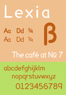
Lexia Readable is a geometric sans-serif typeface, loosely based upon Comic Sans. It was designed by Keith Bates specifically to address legibility and readability issues related to dyslexia.
It attempts to avoid some possible dyslexic confusions (e.g. b and d, q and p) by slightly altering the standard shapes. It may be particularly useful for anyone with dyslexia type tendencies by creating clearer distinctions between characters with a similar shape or appearance.
Lexia Readable font can be downloaded free from K-Type.[1]
See also
External links
- ↑ "K-Type Independent Type Foundry » Lexia Readable". Retrieved December 15, 2012.
This article is issued from Wikipedia - version of the 12/17/2015. The text is available under the Creative Commons Attribution/Share Alike but additional terms may apply for the media files.