Speech balloon
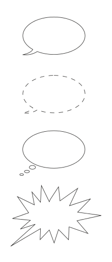
Speech balloons (also speech bubbles, dialogue balloons or word balloons) are a graphic convention used most commonly in comic books, comics and cartoons to allow words (and much less often, pictures) to be understood as representing the speech or thoughts of a given character in the comic. There is often a formal distinction between the balloon that indicates thoughts and the one that indicates words spoken aloud: the balloon that conveys subjective thoughts is often referred to as a thought bubble.
History
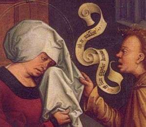
One of the earliest antecedents to the modern speech bubble were the "speech scrolls," wispy lines that connected first person speech to the mouths of the speakers in Mesoamerican art between 600 and 900 AD.[2]
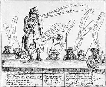
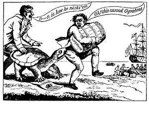
In Western graphic art, labels that reveal what a pictured figure is saying have appeared since at least the 13th century. These were in common European use by the early 16th century. Word balloons (also known as "banderoles") began appearing in 18th-century printed broadsides, and political cartoons from the American Revolution (including some published by Benjamin Franklin) often used them.[3][4] They later fell out of fashion, but by 1904 had regained their popularity, although they were still considered novel enough to require explanation.[5] With the development of the comics industry in the 20th century, the appearance of speech balloons has become increasingly standardized, though the formal conventions that have evolved in different cultures (USA as opposed to Japan, for example), can be quite distinct.
Richard F. Outcault's Yellow Kid is generally credited as the first American comic strip character. His words initially appeared on his yellow shirt, but word balloons very much like those in use today were added almost immediately, as early as 1896. By the start of the 20th century, word balloons were ubiquitous, and since that time only a very few comic strips and comic books have relied on captions, notably Hal Foster's Prince Valiant and the early Tarzan comic strip. For many years, word balloons were less common in Europe than in the USA, or were used together with captions. (One example is the Dutch cartoonist Marten Toonder's comics about Tom Puss and Oliver B. Bumble, where the literary captions are printed out below the strip and almost take up as much space as the drawings, so that the strip fills twice the space of most newspaper strips. A similar example from the UK is Rupert Bear.)
Popular forms
Speech bubbles
The most common is the speech bubble. It comes in two forms for two circumstances: An in-panel character and an off-panel character. An in-panel character (one who is fully or mostly visible in the panel of the strip of comic that the reader is viewing) uses a bubble with a pointer, called a tail, directed towards the speaker.
When one character has multiple balloons within a panel, often only the balloon nearest to the speaker's head has a tail, and the others are connected to it in sequence by narrow bands. This style is often used in Mad Magazine, due to its "call-and-response" dialogue-based humor.
An off-panel character (the comic book equivalent of being "off screen") has several options, some of them rather unconventional. The first is a standard speech bubble with a tail pointing toward the speaker's position. The second option, which originated in manga, has the tail pointing into the bubble, instead of out. (This tail is still pointing towards the speaker.) The third option replaces the tail with a sort of bottleneck that connects with the side of the panel. It can be seen in the works of Marjane Satrapi (author of Persepolis).
In American comics, a bubble without a tail means that the speaker is not merely outside the reader's field of view but invisible to the viewpoint character, often as an unspecified member of a crowd.
Characters distant (in space or time) from the scene of the panel can still speak, in squared bubbles without a tail; this usage, equivalent to voice-over in film, is not uncommon in American comics for dramatic contrast. In contrast to captions, the corners of such balloons never coincide with those of the panel; for further distinction they often have a double outline, a different background color, or quotation marks.
Thought bubbles
Thought bubbles come in two forms: the chain thought bubble and the "fuzzy" bubble.
The chain thought bubble is the almost universal symbol for thinking in cartoons. It consists of a large, cloud-like bubble containing the text of the thought, with a chain of increasingly smaller circular bubbles leading to the character. Some artists use an elliptical bubble instead of a cloud-shaped one.
Often animal characters like Snoopy and Garfield "talk" using thought bubbles. Thought bubbles may also be used in circumstances when a character is gagged or otherwise unable to speak.
Another, less conventional thought bubble has emerged: the "fuzzy" thought bubble. Used in manga (by such artists as Ken Akamatsu), the fuzzy bubble is roughly circular in shape (generally), but the edge of the bubble is not a line but a collection of spikes close to each other, creating the impression of fuzziness. Fuzzy thought bubbles do not use tails, and are placed near the character who is thinking. This has the advantage of reflecting the TV equivalent effect: something said with an echo.
Writers and artists can refuse to use thought bubbles, expressing the action through spoken dialogue and drawing; they are sometimes seen as an inefficient method of expressing thought because they are attached directly to the head of the thinker, unlike methods such as caption boxes, which can be used both as an expression of thought and narration while existing in an entirely different panel from the character thinking. However, they are restricted to the current viewpoint character. An example is Alan Moore and David Lloyd's V for Vendetta, wherein during one chapter, a monologue expressed in captions serves not only to express the thoughts of a character but also the mood, status and actions of three others.
Other forms
The shape of a speech balloon can be used to convey further information. Common ones include the following:
- Scream bubbles indicate a character is screaming or shouting, usually with a jagged outline or a thicker line which can be colored. Their lettering is usually larger or bolder than normal.
- Broadcast bubbles (also known as radio bubbles) may have a jagged tail like the conventional drawing of a lightning flash and either a squared-off or jagged outline. Letters are sometimes italicised without also being bold. Broadcast bubbles indicate that the speaker is communicating through an electronic device, such as a radio or television, or is robotic.
- Whisper bubbles are usually drawn with a dashed (dotted) outline, smaller font or gray lettering to indicate the tone is softer, as most speech is printed in black.
Another form, sometimes encountered in manga, looks like an occidental thought bubble. - Icicle bubbles have jagged "icicles" on the lower edge, representing "cold" hostility.
- Monster bubbles have blood or slime dripping from them.
- Colored bubbles convey the emotion that goes with the speech, such as red for anger or green for envy. This style is seldom used in modern comics.
Captions
Captions are generally used for narration purposes. They are generally rectangular and positioned near the edge of the panel. Often they are also colored to indicate the difference between them and the bubbles used by the characters, which are almost always white.
Artist-specific variations
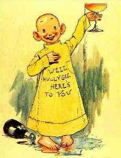
Some characters and strips use highly unconventional methods of communication. Perhaps the most notable is the Yellow Kid, an early American comic strip. His (but not the other characters') words would appear on his large, smock-like shirt.
Also noteworthy are the many variations on the form created by Dave Sim for his comic Cerebus the Aardvark. Depending on the shape, size, and position of the bubble, as well as the texture and shape of the letters within it, Sim could convey large amounts of information about the speaker. This included separate bubbles for different states of mind (drunkenness, etc.), for echoes, and a special class of bubbles for one single floating apparition.
An early pioneer in experimenting with many different types of speech balloons and lettering for different types of speech was Walt Kelly, in his Pogo strip. Deacon Mushrat speaks in blackletter, P.T. Bridgeport speaks in circus posters, Sarcophagus MacAbre speaks in condolence cards, "Mr. Pig" (a take on Nikita Khrushchev) speaks in faux Cyrillic, etc.
In the famous French comic series Asterix, Goscinny and Uderzo use bubbles without tails to indicate a distant or unseen speaker. They have also experimented with using different types of lettering for characters of different nationalities to indicate they speak a different language that Asterix may not understand; Goths speak in blackletter, Greeks in angular lettering (though always understood by the Gaulish main characters, so it is more of an accent than a language), Norse with "Nørdic åccents", Egyptians in faux hieroglyphs (depictive illustrations and rebuses), etc. Another experiment with speech bubbles was exclusive to one book, Asterix and the Roman Agent. The agent in question is a vile manipulator who creates discord in a group of people with a single innocent-sounding comment. His victims start quarreling and ultimately fighting each other while speaking in green-colored speech bubbles.
Font variation is a common tactic in comics. The Sandman series, written by Neil Gaiman and lettered by Todd Klein, features many characters whose speech bubbles are written with a font that is exclusive to them. For examples, the main character, the gloomy Dream, speaks in wavy-edged bubbles, completely black, with similarly wavy white lettering. His sister, the scatterbrained and whimsical Delirium speaks in bubbles in a many-colored explosive background with uneven lettering, and the irreverent raven Matthew speaks in a shaky angular kind of bubble with scratchy lettering. Other characters, such as John Dee, have special shapes of bubbles for their own.[6]
In Mad's recurring Monroe comic strip, certain words are written larger or in unusual fonts for emphasis.
In manga, there is a tendency to include the speech necessary for the storyline in balloons, while small scribbles outside the balloons add side comments, often used for irony or to show that they're said in a much smaller voice. Satsuki Yotsuba in the manga series Negima is notable because she speaks almost entirely in side scribble.
Graphic symbols in speech bubbles
Speech bubbles are used not only to include a character's words, but also emotions, voice inflections and unspecified language.
Punctuation marks
One of the universal emblems of the art of comics is the use of a single punctuation mark to depict a character's emotions, much more efficiently than any possible sentence. A speech bubble with a single big question mark (?) (often drawn by hand, not counted as part of the lettering) denotes confusion or ignorance. An exclamation mark (!) indicates surprise or terror. This device is broadly used in the European comic tradition, the Belgian artist Hergé's The Adventures of Tintin series being a good example. Sometimes, the punctuation marks stand alone above the character's head, with no bubble needed.
In manga, the ellipsis (i.e. three dots) is also used to express silence in a much more significant way than the mere absence of bubbles. This is specially seen when a character is supposed to say something, to indicate a stunned silence or when a sarcastic comment is expected by the reader. The ellipsis, along with the big drop of sweat on the character's temple—usually depicting shame, confusion, or embarrassment caused by other people's actions—is one of the Japanese graphic symbols that have taken root in comics all around the world, although they are still rare in Western tradition. Japanese even has a sound effect for "deafening silence", shiin (シーン).
Foreign languages
In many comic books, words that would be foreign to the narration but are displayed in translation for the reader are surrounded by angle brackets or chevrons ⟨like this⟩.
Gilbert Hernandez's series about Palomar is written in English, but supposed to take place mainly in a Hispanic country. Thus, what's supposed to be representations of Spanish speech is written without brackets, but occasional actual English speech is written within brackets, to indicate that it is unintelligible to the main Hispanophone characters in the series.
Some comics will have the actual foreign language in the speech balloon, with the translation as a footnote; this is done with Latin aphorisms in Asterix.
Another convention is to put the foreign speech in a distinctive lettering style; for example, Asterix's Goths speak in blackletter.
Since the Japanese language uses two writing directionalities (vertical, which is the traditional direction; and horizontal, as most other languages), manga has a convention of representing translated foreign speech as horizontal text.
The big Z
It is a convention in American comics that the sound of a snore is represented as a series of Z's, dating back at least to Rudolph Dirks' early 20th-century strip The Katzenjammer Kids.[7] This practice has even been reduced to a single letter Z, so that a speech bubble with this letter standing all alone (again, drawn by hand rather than a font type) means the character is sleeping in most humorous comics. This can be seen, for instance, in Charles Schulz's Peanuts comic strips.
Being such a long-established device, the Z-bubble does not even imply that the character is snoring anymore, but just sleeping. Jim Davis has based some jokes starring Garfield upon this technique; for example, in one strip, Garfield is unable to sleep because his Z-bubble is pointing in the wrong direction. When he grabs the bubble's tail to make it point at himself, he falls asleep.
Originally, the resemblance between the 'z' sound and that of a snore seemed exclusive to the English language, but the spread of American comics has made it a frequent feature in other countries. An exception to this is in Japanese manga, where the usual symbol for sleep is a large bubble coming out of the character's nose.
Drawings within the speech bubble
Singing characters usually have musical notes drawn into their word balloons. Archie Comics' Melody Valentine, a character in their Josie and the Pussycats comic, has musical notes drawn into her word balloons at all times, to convey that she speaks in a sing-song voice.
The above-mentioned Albert Uderzo in the Asterix series decorates speech bubbles with beautiful flowers depicting an extremely soft, sweet voice (usually preceding a violent outburst by the same character).
A stormy cloud with a rough lightning sticking out of it, either in a bubble or just floating above the character's head as a modified 'cloudy' thought bubble, depicts anger, not always verbally expressed.
Light bulbs are sometimes used when the character comes up with an idea or solution to a problem.
In the Western world, it is common to replace profanity with a string of nonsense symbols (&%$@*$#), sometimes called grawlixes. In comics that are usually addressed to children or teenagers, bad language is censored by replacing it with more or less elaborate drawings and expressionistic symbols. For example, instead of calling someone a swine, a pig is drawn in the speech bubble.
One example is the Spanish Mortadelo series, created by Francisco Ibáñez. Although not specifically addressed to children, Mortadelo was born during Francisco Franco's dictatorship, when censorship was the order of the day and the slightest attempt of rough language was prohibited. When Ibáñez's characters are angry, donkey heads, lightning, lavatories, billy goats and even faux Japanese characters are often seen in their bubbles.
When Mortadelo was portrayed on film by Spanish director Javier Fesser in 2003, one of the critiques made to his otherwise successful adaptation was the character's use of words that never appeared in the comics. Fesser claimed: "When you see a bubble speech containing a lightning falling on a pig, what do you imagine the character's saying?"
Order
In order for comic strip and graphic novel dialogue to make sense, it has to be read in order. Thus, conventions have evolved in the order in which the communication bubbles are read. The individual bubbles are read in the order of the language. For example, in English, the bubbles are read from left to right in a panel, while in Japanese, it is the other way around. Sometimes the bubbles are "stacked", with two characters having multiple bubbles, one above the other. Such stacks are read from the top down. Poor use of speech balloons can unintentionally make the proper reading order ambiguous, confusing the reader.
Lettering
Traditionally, a cartoonist or occupational letterer would draw in all the individual letters in the balloons and sound effects by hand. A modern alternative, used by most comics today and universal in English-translated manga, is to letter with computer programs. The fonts used usually emulate the style of hand-lettering.
Traditionally, most mainstream comic books are lettered entirely in upper-case, with a few exceptions:
- Name particles such as de and von, and the "c" in a surname of Scottish or Irish origin starting with Mc
- To indicate a frightened or quiet manner of speech
- An interjection such as "er", "um", etc.
When hand-lettering, upper-case lettering saves time and effort because it requires drawing only three guidelines, while mixed-case lettering requires five.[8]
In a few comics, uppercase and lowercase are used as in ordinary writing. Since the mid-1980s, mixed case lettering has gradually become more widely used in mainstream books. Some comics, such as Pearls Before Swine, also use lowercase speech to mark a distinctive accent (in this case, the male crocodiles’ accented speech, opposed to all other characters who use standard uppercase speech).
From 2002–2004, Marvel Comics experimented with mixed-case lettering in all its books.[8] Most mainstream titles have since returned to traditional all upper-case lettering but titles specifically marketed to younger readers or a more manga audience such as the Marvel Adventures line, Runaways and Spider-Man Loves Mary Jane have retained mixed case lettering.
In many comics, although the lettering is entirely in capital letters, serif versions of "I" are used exclusively where a capital I would appear in normal print text, and a sanserif (i.e., a simple vertical line) is used in all other places. This reduces confusion with the number one, and also serves to indicate when the personal pronoun "I" is meant. This lettering convention can be seen in computer fonts such as Blambot's "DigitalStrip.ttf" and "AnimeAce.ttf" fonts, which make no other distinction between lower- and uppercase letters.
Substance of balloons
In several occasions, comics artists have used balloons (or similar narrative devices) as if they have true substance, usually for humorous meta-like purposes. In Peanuts, for example, the notes played by Schroeder occasionally take substance and are used in various ways, including Christmas decorations or perches for birds. Sometimes balloons can be influenced by the strip's environment: in the Italian strip Sturmtruppen they freeze and crack when the temperature is very low, or an Archie comic strip where two men from Alaska remarked on how cold it was, by saying the speech balloons froze as they said them, and the words had to be thawed out to be heard.
In the Flemish Suske en Wiske series, on one occasion a thought bubble full of mathematical formulas is cut open with scissors and its contents emptied in a bag, to be saved for later (in a manner not unlike the pensieve in the Harry Potter series). In the same series, speech balloons are occasionally even held and blown up to function as actual balloons or the words of the speech bubble are occasionally shown coming out the side of the speech bubble, to signify that the speaker is moving so fast that their words can't keep up with them, i.e. at supersonic speed.
In the novel Who Censored Roger Rabbit?, the last words of a murdered Toon (cartoon character) are found under his body in the form of a speech balloon.
Computer-generated speech balloons
Many digital artists generate speech balloons with general-purpose illustration software. Products like Comic Book Creator for Microsoft Windows, Comic Life for Mac OS X and Windows target the non-professional end of the market.
See also
- Speech scroll
- Balloon help
- Cartouche - an oval design, often with text inside.
- Image macro
- The Bubble Project
References
| Wikimedia Commons has media related to Speech balloons. |
- ↑ Evolution of speech balloons. Retrieved on August 24, 2006. Archived July 14, 2006, at the Wayback Machine.
- ↑ Hull, Kerry Michael (2003). "Verbal Art and Performance in Ch'orti' and Maya Hieroglyphic Writing" (PDF).
- ↑ "Religion and the American Revolution, Divining America, TeacherServe®, National Humanities Center". rtp.nc.us.
- ↑ The Yellow Kid on paper and stage, Contemporary illustrations. Retrieved October 17, 2007
- ↑ The Art of Caricature, p. 134, by Grant Wright; published September 1904, by Baker & Taylor Publishing
- ↑ Burgas, Greg (January 7, 2013). "Comics You Should Own – Sandman". Comic Book Resources. Archived from the original on April 10, 2014.
- ↑ Adams, Cecil. "The Straight Dope: Why Does Z Stand for Snoring? And how do other languages represent the sound?," Washington City Paper (July 27, 2012).
- 1 2 Bradley, Drew. "Looking at Lettering: CAPS vs Mixed Case," Multiversity Comics (April 22, 2014).
| Formats |  | ||||||||||||||||||||||
|---|---|---|---|---|---|---|---|---|---|---|---|---|---|---|---|---|---|---|---|---|---|---|---|
| Creators |
| ||||||||||||||||||||||
| History | |||||||||||||||||||||||
| Genres | |||||||||||||||||||||||
| Tropes | |||||||||||||||||||||||
| By country |
| ||||||||||||||||||||||
| Lists |
| ||||||||||||||||||||||
| |||||||||||||||||||||||