William Addison Dwiggins
| William Addison Dwiggins | |
|---|---|
| Born |
William Addison Dwiggins June 19, 1880 Martinsville, Ohio |
| Died |
December 25, 1956 (aged 76) Hingham Center, Massachusetts |
| Other names |
W. A. Dwiggins W.A.D. |
| Occupation | Type designer, calligrapher, book designer |
| Spouse(s) | Mabel Hoyle Dwiggins |
William Addison Dwiggins (June 19, 1880 Martinsville, Ohio – December 25, 1956 Hingham Center, Massachusetts), was an American type designer, calligrapher, and book designer. He attained prominence as an illustrator and commercial artist, and he brought to the designing of type and books some of the boldness that he displayed in his advertising work.
He and his wife Mabel Hoyle Dwiggins (February 27, 1881 – September 28, 1958) are buried in the Hingham Center Cemetery, Hingham Center, Massachusetts, near their home at 30 Leavitt Street, and Dwiggins' studio at 45 Irving Street.

His scathing attack on contemporary book designers in An Investigation into the Physical Properties of Books (1919) led to his working with the publisher Alfred A. Knopf. Alblabooks, a series of finely conceived and executed trade books followed and did much to increase public interest in book format. Dwiggins was perhaps more responsible than any other designer for the marked improvement in book design in the 1920s and 1930s. He gained recognition as a calligrapher and wrote much on the graphic arts, notably essays collected in MSS by WAD (1949), and his Layout in Advertising (1928; rev. ed. 1949) remains standard. During the first-half of the twentieth century he also created pamphlets using the pen name "Dr. Puterschein".[1]
In 1926, the Chicago Lakeside Press recruited Dwiggins to design a book for the Four American Books Campaign. He said he welcomed the chance to "do something besides waste-basket stuff" which would be "promptly thrown away" and chose the Tales of Edgar Allan Poe. The Press considered his fee of $2,000 to be low for an illustrator of his commercial power.[2]
Dwiggins is credited with coining the term 'graphic designer' in 1922[3] to describe his various activities in printed communications, like book design, illustration, typography, lettering and calligraphy (his first typeface designs were released much later). The term did not achieve widespread usage until after the Second World War.
Typefaces
His most widely used typefaces, Electra and Caledonia, were specifically designed for Linotype composition and have a clean spareness.

His sans-serif typeface Metro was developed by Linotype in the late 1920s in response to similar type being sold from European foundries such as Erbar, Futura, and Gill Sans, which Dwiggins felt failed in the lower-case.[5] The following list of his typefaces is thought to be complete.[6] Dwiggins was unfortunate to enter the genre of type design in the time of the Depression, and many of his designs did not progress beyond experimental castings in sufficient quantity for use in books he designed.
- Metro series
- Metrolite + Metroblack (1930, Linotype)
- Metrothin + Metromedium (1931, Linotype)
- Metrolite No.2 + Metroblack No.2 (1932, Linotype)
- Metrolite No.2 Italic + Lining Metrothin + Lining Metromedium (1935, Linotype)
- Metromedium No.2 Italic + Metroblack No.2 Italic (1937, Linotype)
- Metrolight No.4 Italic + Metrothin No.4 Italic (Linotype)
The Metro series was redesigned on entering production, with several characters changed to better echo the then-popular Futura. This formed the Metro No. 2 series. Some revivals return to Dwiggins' original design choices or offer them as alternates.[7] Concourse by Matthew Butterick is a loose revival adding a wide variety of alternate character designs and small capitals.[8]
- Electra series[9][10][11]
- Charter (Designed 1937-42, used only for one book, never released, Linotype)
- Hingham (Designed 1937-43, cut in 7 pt. but not released, Linotype)[14][15]
- Caledonia series
- Arcadia (Designed 1943-47, used only for Typophile's Chapbook XXII, never released, Linotype)
- Tippecanoe + Italic (Designed 1944-46, used only for one book, never released, Linotype)
- Winchester Roman + Italic + Winchester Uncials + Italic (1944–48, hand cast by Dwiggins, not released in metal but digitised)[16]
- Stuyvesant + Italic (1949, Linotype), based on type cut by J.F. Rosart in Holland about 1750.
- Eldorado + Italic (1950, Linotype)[17]
- Falcon + Italic (1961, Linotype)
- Experimental 267D (not released)

Other fonts have been created after his death inspired by Dwiggins' lettering projects, although these were not authorised by Dwiggins in his lifetime.[18][19][20][21]
A trick used by Dwiggins to create dynamic-looking letter shapes was to design letters so the curves on the inside of the letter do not match those on the outside. This intentional irregularity was inspired by the difficulty of carving marionettes for his puppet theatre. It has since been used by other serif font designers such as Martin Majoor.
Marionettes
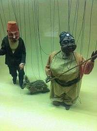
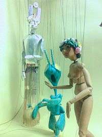
Dwiggins' love of wood carving led to his creation of a marionette theatre in a garage at 5 Irving Street, which was behind his home at 30 Leavitt Street in Hingham, Massachusetts. He also created a puppet group named the Püterschein Authority. In 1933 he performed his first show there, "The Mystery of the Blind Beggarman." Dwiggins built his second theatre under his studio at 45 Irving Street. Further productions of the Püterschein Authority included "Prelude to Eden," "Brother Jeromy," "Millennium 1," and "The Princess Primrose of Shahaban in Persia." Most of his marionettes were twelve inches tall.[22] The marionettes were donated to the three-room Dwiggins Collection at the Boston Public Library in 1967.[23]
Legacy

In 1957, a year after his death, Bookbuilders of Boston, an organization of book publishing professionals that Dwiggins helped to establish, renamed their highest award the W.A. Dwiggins Award.
Bibliography
LA DERNIÈRE MOBILISATION (1915). Story in The Fabulist and in The Best Short Stories of 1915.
- An Investigation into the Physical Properties of Books (1919)
- Layout in Advertising (1928)
- Towards a Reform of the Paper Currency, Particularly in Point of its Design (The Limited Editions Club, 1932)
- Form Letters: Illustrator to Author (William Edwin Rudge, 1930)
- The Power of Print—and Men (1936), with Thomas Dreier
- Marionette in motion; the Püterschein system diagrammed, described (1939)
- WAD to RR: A Letter about Designing Type (1940)[24]
- Millennium 1 (Alfred A. Knopf, 1945)
Books illustrated or designed
- William Addison Dwiggins: Stencilled Ornament and Illustration (By Dorothy Abbe), Princeton Architectural Press, 2015 (ISBN 978-1616893750)
- Beau Brummell, Virginia Woolf (Rimington & Hooper, 1930)
- The Complete Angler, Izaak Walton (Merrymount Press, 1928)
- Hingham, Old and New, (Hingham Tercentenary Committee, 1935)
- A History of Russian Literature, from the Earliest Times to the Death of Dostoyevsky, Prince D.S. Mirsky (Alfred A. Knopf, 1927)
- The Lone Striker, Robert Frost (Alfred A. Knopf, 1933)
- Paraphs, Hermann Püterschein (Alfred A Knopf for the Society of Calligraphers, 1928)
- The Time Machine: An Invention, H. G. Wells (Random House, 1931)
- The Witch Wolf: An Uncle Remus Story, Joel Chandler Harris (Bacon & Brown, 1921)
Footnotes
- ↑ Gonzales Crisp, Denise (2009). "Discourse This! Designers and Alternative Critical Writing". Design and Culture. 1 (1).
- ↑ Benton, Megan (2000). Beauty and the Book: Fine Editions and Cultural Distinction in America. Yale University Press. pp. 130–131. ISBN 9780300082135.
- ↑ Livingston, Alan and Isabella., 'Dictionary of graphic design and designers'. London: Thames and Hudson, 1992
- ↑ The Legibility of Type. Brooklyn: Mergenthaler Linotype Company. 1935. Retrieved 29 April 2016.
- ↑ Shaw, Paul. "Typographic Sanity". Blue Pencil. Retrieved 1 July 2015.
- ↑ MacGrew, Mac, American Metal Typefaces of the Twentieth Century, Oak Knoll Books, New Castle Delaware, 1993, ISBN 0-938768-34-4, p. 335.
- ↑ "Monotype Metro Nova" (PDF). Fonts.com. Monotype. Retrieved 2 September 2015.
- ↑ Butterick, Matthew. "Concourse Font". Typography for Lawyers. Retrieved 3 November 2015.
- ↑ Parkinson, Jim. "Parkinson Electra". MyFonts. Linotype. Retrieved 2 September 2015.
- ↑ "Adobe Electra". MyFonts. Adobe. Retrieved 2 September 2015.
- ↑ "Electra Linotype". MyFonts. Linotype. Retrieved 2 September 2015.
- ↑ "Caravan (Electra ornaments series)". MyFonts. Adobe. Retrieved 2 September 2015.
- ↑ "Caravan". MyFonts. Linotype. Retrieved 2 September 2015.
- ↑ Ross, David Jonathan. "Turnip (unofficial Hingham revival)". Font Bureau. Retrieved 2 September 2015.
- ↑ Sorkin, Eben. "Turnip review". Typographica. Retrieved 2 September 2015.
- ↑ Spiece, Jim. "ITC New Winchester". MyFonts. ITC. Retrieved 2 September 2015.
- ↑ "Eldorado revival". Font Bureau. Retrieved 2 September 2015.
- ↑ Desmond, Matt. "Dwiggins Deco". MyFonts. MADType. Retrieved 2 September 2015.
- ↑ 'koeiekat'. "Dwiggins Initials KK". 1001fonts. 'koeiekat'. Retrieved 2 September 2015.
- ↑ Kegler, Richard. "P22 Dwiggins". MyFonts. IHOF. Retrieved 2 September 2015.
- ↑ Rakowski, David. "Dwiggins 48 (Plimpton initials digitisation)". Will-Harris. Intecsas. Retrieved 2 September 2015.
- ↑ The Dwiggins Marionettes: A Complete Experimental Theatre in Miniature, Dorothy Abbe (Harry N. Abrams Inc. 1964)
- ↑ American Puppetry: Collections, History and Performance, edited by Phyllis T. Dircks, "The Dwiggins Marionettes at the Boston Public Library," Roberta Zonghi, pp 196-202
- ↑ Dwiggins, William Addison. "WAD to RR: A Letter about Designing Type". Archive.org. Retrieved 29 March 2013.
Further reading
- W. Tracy, Letters of Credit: A View of Type Design (1986), pp 174–194
- The Type Designs of William Addison Dwiggins, Vincent Connare, May 22, 2000
- S. Heller, 'W.A. Dwiggins, Master of the Book'
- B. Kennett, 'The White Elephant and the Fabulist: The Private Press Activities of W. A. Dwiggins, 1913-1921', in Parenthesis; 21 (2011 Autumn), p. 27-30
- B. Kennett, 'W A Dwiggins The Private Press Work, Part 2 The Society of Calligraphers 1922-9', in Parenthesis; 22 (2012 Spring), p. 34-39
- B. Kennett, 'The Private Press Work of W. A. Dwiggins, Part 3 Puterschein-Hingham and Related Projects, 1930-1956', in Parenthesis; 23 (2012 Autumn), p. 17-20
- P. Shaw, 'The Definitive Dwiggins' (online article series)
- Abbe, Fili & Heller, 'Typographic Treasures: The Work of W.A. Dwiggins' (exhibition catalog)
External links
- Works by or about William Addison Dwiggins at Internet Archive
- William Addison Dwiggins at the Internet Speculative Fiction Database
- Art Directors Club biography, portrait and images of work
- W. A. Dwiggins collection finding aid, University of Maryland Libraries (accessed 17 June 2013)
- Dwiggins at Typecon (anthology of artwork for talk by Rob Saunders)
- William Addison Dwiggins: Black & White Smith (talk by Saunders at San Francisco Public Library)