Violin plot
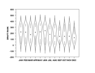
A violin plot is a method of plotting numeric data. It is similar to box plot with a rotated kernel density plot on each side.[1]
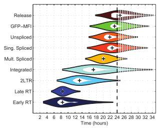
The violin plot is similar to box plots, except that they also show the probability density of the data at different values (in the simplest case this could be a histogram). Typically violin plots will include a marker for the median of the data and a box indicating the interquartile range, as in standard box plots. Overlaid on this box plot is a kernel density estimation. Like box plots, violin plots are used to represent comparison of a variable distribution (or sample distribution) across different "categories". For example temperature distribution compared between day and night or distribution of car prices compared across different car make.
A violin plot is more informative than a plain box plot. In fact while a box plot only shows summary statistics such as mean/median and interquartile ranges, the violin plot shows the full distribution of the data. The difference is particularly useful when the data distribution is multimodal (more than one peak). In this case a violin plot clearly shows the presence of different peaks, their position and relative amplitude. This information could not be represented with a simple box plot which only reports summary statistics. The inner part of a violin plot usually shows the mean (or median) and the interquartile range. In other cases, when the number of samples is not too high, the inner part can show all sample points (with a dot or a line for each sample).
Although more informative than box plots, a disadvantage of violin plots is that they are less popular. For this reason their meaning can be harder to grasp for many readers not familiar with the violin plot representation. In this case, an more accessible alternative can be plotting a series of stacked histograms or Kernel density distributions.
Violin plots are available as extensions to a number of software packages, including the R libraries vioplot, wvioplot, caroline, UsingR, lattice and ggplot2, the Stata add-on command vioplot,[2] and the Python libraries matplotlib[3] and Seaborn.[4]
References
- ↑ "VIOLIN PLOT". NIST DataPlot. National Institute of Standards and Technology. 2015-10-13.
- ↑ Hintze, Jerry L.; Nelson, Ray D. (1998). "Violin Plots: A Box Plot-Density Trace Synergism". The American Statistician. 52 (2): 181–4. doi:10.1080/00031305.1998.10480559.
- ↑ "violin plots". What's new in matplotlib.
- ↑ Waskom, Michael. "Violinplot from a wide-form dataset". Seaborn: statistical data visualization.
External links
| Wikimedia Commons has media related to Violin plots. |
- Vioplot add-in for Stata
- Example of violin plots in R
- violinplots in Python with the seaborn statistical visualization library based on matplotlib
![]() This article incorporates public domain material from the National Institute of Standards and Technology document "Dataplot reference manual: Violin plot".
This article incorporates public domain material from the National Institute of Standards and Technology document "Dataplot reference manual: Violin plot".