Violet (color)
| ||||||||||||||||||||||||||||||||
|
| ||||||||||||||||||||||||||||||||


Violet is the color of amethyst, lavender and beautyberries. It takes its name from the violet flower.[2][3]
Violet is the color at the end of the visible spectrum of light between blue and the invisible ultraviolet. Violet color has a predominant light wavelength of roughly 380-450 nanometers[4] (in experiments under special conditions, people have so far seen to 310 nm).[5][6][7] Light with a shorter wavelength than violet but longer than X-rays and gamma rays is called ultraviolet. In the color wheel historically used by painters, it is located between blue and purple. On the screens of computer monitors and television sets, a color which looks similar to violet is made, with the RGB color model, by mixing red and blue light, with the blue twice as bright as the red. This is not true violet, since it is composed of multiple longer wavelengths rather than a single wavelength shorter than that of blue light.
Violet and purple look very similar; but violet is a true color, with its own set of wavelengths on the spectrum of visible light, while purple is a composite color, made by combining blue and red.
In history, violet and purple have long been associated with royalty and majesty. The emperors of Rome wore purple togas, as did the Byzantine emperors. During the Middle Ages violet was worn by bishops and university professors and was often used in art as the color of the robes of the Virgin Mary.
According to surveys in Europe and the United States, violet is the color people most often associate with extravagance and individualism, the unconventional, the artificial, and ambiguity.[8]
In Chinese painting, the color violet represents the harmony of the universe because it is a combination of red and blue (Yin and yang respectively).[9] In Hinduism and Buddhism violet is associated with the Crown Chakra.[2]
Etymology
From the Middle English and old French violette, and from the Latin viola, the names of the violet flower.[10] The first recorded use of violet as a color name in English was in 1370.[11] Violet can also refer to the first violas which were originally painted a similar color.
Gallery
 Chemical structure of pigment violet 29. Violet pigments typically have several rings.
 Amethyst mineral, the violet color arises from an impurity of iron in the quartz.
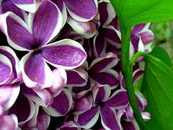 Lilac flowers
 A sample of manganese violet, a popular violet pigment
Violet and purple
In the traditional color wheel used by painters, violet and purple are both placed between red and blue. Purple occupies the space closer to red, between crimson and violet.[12] Violet is closer to blue, and usually less intense and bright than purple.
From the point of view of optics, violet is a real color: it occupies its own place at the end of the visible spectrum, and was one of the seven spectral colors of the spectrum first described by Isaac Newton in 1672.
In the additive color system, used to create colors on a computer screen or on a color television, violet is simulated by purple, by combining blue light at high intensity with a less intense red light on a black screen. The range of purples is created by combining blue and red light of any intensities; the chromaticities formed this way line along the "line of purples".
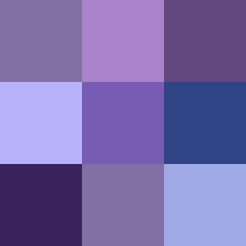 The shades of violet
 The shades of purple
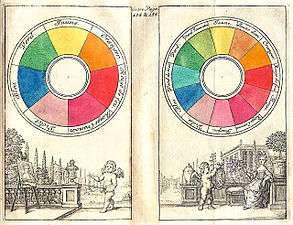 In the traditional Boutet color circle (1708), violet is shown between blue and purple.
In history and art
Prehistory and antiquity
Violet is one of the oldest colors used by man. Traces of very dark violet, made by grinding the mineral manganese, mixed with water or animal fat and then brushed on the cave wall or applied with the fingers, are found in the prehistoric cave art in Pech Merle, in France, dating back about twenty-five thousand years. It has also been found in the cave of Altamira and Lascaux.[13] It was sometimes used an alternative to black charcoal. Sticks of manganese, used for drawing, have been found at sites occupied by Neanderthal man in France and Israel. From the grinding tools at various sites, it appears it may also have been used to color the body and to decorate animal skins.
More recently, the earliest dates on cave paintings have been pushed back farther than 35,000 years. Hand paintings on rock walls in Australia may be even older, dating back as far as 50,000 years.
Berries of the genus rubus, such as blackberries, were a common source of dyes in antiquity. The ancient Egyptians made a kind of violet dye by combining the juice of the mulberry with crushed green grapes. The Roman historian Pliny the Elder reported that the Gauls used a violet dye made from bilberry to color the clothing of slaves. These dyes made a satisfactory purple, but it faded quickly in sunlight and when washed.[14]
The Middle Ages and the Renaissance
Violet and purple retained their status as the color of emperors and princes of the church throughout the long rule of the Byzantine Empire.
While violet was worn less frequently by Medieval and Renaissance kings and princes, it was worn by the professors of many of Europe's new universities. Their robes were modeled after those of the clergy, and they often square violet caps and violet robes, or black robes with violet trim.
Violet also played an important part in the religious paintings of the Renaissance. Angels and the Virgin Mary were often portrayed wearing violet robes. The 15th-century Florentine painter Cennino Cennini advised artists: "If you want to make a lovely violet colour, take fine lacca, ultramarine blue (the same amount of the one as of the other)..." For fresco painters, he advised a less-expensive version, made of a mixture of blue indigo and red hematite.[15]
 Madonna and child by Giotto (1266–1320)
.jpg) The Wilton Diptych (1395), painted for King Richard II
The Wilton Diptych (1395), painted for King Richard II.jpg) A violet-clad angel from the Resurrection of Christ by Raphael (1483–1520)
A violet-clad angel from the Resurrection of Christ by Raphael (1483–1520)
18th and 19th centuries
In the 18th century, violet was a color worn by royalty, aristocrats and the wealthy, and by both men and women. Good-quality violet fabric was expensive, and beyond the reach of ordinary people.
Many painters of the 19th century experimented with the uses of the color violet to capture the subtle effects of light. Eugène Delacroix (1798–1863) made use of violet in the sky and shadows of many of his works, such as his painting of a tiger.
The first cobalt violet, the intensely red-violet cobalt arsenate, was highly toxic. Although it persisted in some paint lines into the twentieth-century, it was displaced by less toxic cobalt compounds such as cobalt phosphate. Cobalt violet appeared in the second half of the 19th century, broadening the palette of artists. Cobalt violet was used by Paul Signac (1863–1935), Claude Monet (1840–1926), and Georges Seurat (1859–1891).[16] Today, cobalt ammonium phosphate, cobalt lithium phosphate, and cobalt phosphate are available for use by artists. Cobalt ammonium phosphate is the most reddish of the three. Cobalt phosphate is available in two varieties — a deep less saturated blueish type and a lighter and brighter somewhat more reddish type. Cobalt lithium phosphate is a saturated lighter-valued bluish violet. A color similar to cobalt ammonium phosphate, cobalt magnesium borate, was introduced in the later twentieth-century but was not deemed sufficiently lightfast for artistic use. Cobalt violet is the only truly lightfast violet pigment with relatively strong color saturation. All other light-stable violet pigments are dull by comparison. However, the high price of the pigment and the toxicity of cobalt has limited its use.
Vincent van Gogh (1853–1890) was an avid student of color theory. He used violet in many of his paintings of the 1880s, including his paintings of irises and the swirling and mysterious skies of his starry night paintings, and often combined it with it complementary color, yellow. In his painting of his bedroom in Arles (1888), he used several sets of complementary colors; violet and yellow, red and green, and orange and blue. In a letter about the painting to his brother Theo, he wrote, "The color here...should be suggestive of sleep and repose in general....The walls are a pale violet. The floor is of red tiles. The wood of the bed and the chairs are fresh butter yellow, the sheet and the pillows light lemon green. The bedspread bright scarlet. The window green. The bed table orange. The bowl blue. The doors lilac....The painting should rest the head or the imagination."[17]
In 1856, a young British chemist named William Henry Perkin was trying to make a synthetic quinine. His experiments produced instead an unexpected residue, which turned out to be the first synthetic aniline dye, a deep violet color called mauveine, or abbreviated simply to mauve (the dye being named after the lighter color of the mallow [mauve] flower). Used to dye clothes, it became extremely fashionable among the nobility and upper classes in Europe, particularly after Queen Victoria wore a silk gown dyed with mauveine to the Royal Exhibition of 1862. Prior to Perkin's discovery, mauve was a color which only the aristocracy and rich could afford to wear. Perkin developed an industrial process, built a factory, and produced the dye by the ton, so almost anyone could wear mauve. It was the first of a series of modern industrial dyes which completely transformed both the chemical industry and fashion.[18]
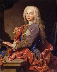 Charles de Bourbon, the future King Carlos III of Spain (1725).
_2.jpg) Portrait of Empress Catherine the Great of Russia, by Fyodor Rokotov. (State Hermitage Museum).
Portrait of Empress Catherine the Great of Russia, by Fyodor Rokotov. (State Hermitage Museum). The Tiger, by Eugène Delacroix, used violet in the sky and shadows.
 In England, pre-Raphaelite painters like Arthur Hughes were particularly enchanted by purple and violet. This is April Love (1856).
 Nocturne: Trafalgar Square Chelsea Snow (1876) by James McNeil Whistler, used violet to create a wintery mood.
 Portrait of Caroline Remy de Guebhard, by Pierre-Auguste Renoir (1841–1919). Mauve became a popular fashion color after the invention of the synthetic dye in 1856.
 Irises (1889) by Vincent van Gogh, (Metropolitan Museum of Art)
 Starry Night, by Vincent van Gogh (Houston Museum of Art).
20th and 21st centuries
The violet or purple necktie became very popular at the end of the first decade of the 21st century, particularly among political and business leaders. It combined the assertiveness and confidence of a red necktie with the sense of peace and cooperation of a blue necktie, and it went well with the blue business suit worn by most national and corporate leaders.
 Five presidents in the oval office. The two more recent presidents, George Bush and Barack Obama, are wearing violet ties.
In science
Optics

Violet is at one end of the spectrum of visible light, between blue and the invisible ultraviolet. It has the shortest wavelength of all the visible colors. It is the color the eye sees looking at light with a wavelength of between 380 and 450 nanometers.
In the traditional color wheel used by painters, violet and purple lie between red and blue. Violet is inclined toward blue, while purple is inclined toward red.
Violet colors composed by mixing blue and red light are within the purple colors[19] (the word "purple" is used in the common sense for any color between blue and red). In color theory, a purple is a color along the line of purples on the CIE chromaticity diagram and excludes violet. Violet light from the rainbow, which can be referred as spectral violet, has only short wavelengths.
Violet objects are objects that reflect violet light. Objects reflecting spectral violet often appear dark, because human vision is relatively insensitive to those wavelengths. Monochromatic lamps emitting spectral-violet wavelengths can be roughly approximated by the color shown below as electric violet.
 Violet on a TV or computer screen is made by mixing blue light with a less-intense red light.
Chemistry – pigments and dyes
The earliest violet pigments used by humans, found in prehistoric cave paintings, were made from the minerals manganese and hematite. Manganese is still used today by the Aranda people, a group of indigenous Australians, as a traditional pigment for coloring the skin during rituals. It is also used by the Hopi Indians of Arizona to color ritual objects.
The most famous violet-purple dye in the ancient world was Tyrian purple, made from a type of sea snail called the murex, found around the Mediterranean.
In western Polynesia, residents of the islands made a violet dye similar to Tyrian purple from the sea urchin. In Central America, the inhabitants made a dye from a different sea snail, the purpura, found on the coasts of Costa Rica and Nicaragua. The Mayans used this color to dye fabric for religious ceremonies, and the Aztecs used it for paintings of ideograms, where it symbolized royalty.[20]
During the Middle Ages, most artists made purple or violet on their paintings by combining red and blue pigments; usually blue azurite or lapis-lazuili with red ochre, cinnabar or minium. They also combined lake colors made by mixing dye with powder; using woad or indigo dye for the blue, and dye made from cochineal for the red.[20]
Orcein, or purple moss, was another common violet dye. It was known to the ancient Greeks and Hebrews, was made from a Mediterranean lichen called archil or dyer's moss (Roccella tinctoria), combined with an ammoniac, usually urine. Orcein began to achieve popularity again in the 19th century, when violet and purple became the color of demi-mourning, worn after a widow or widower had worn black for a certain time, before he or she returned to wearing ordinary colors.[21]
In the 18th century, chemists in England, France and Germany began to create the first synthetic dyes. Two synthetic purple dyes were invented at about the same time. Cudbear is a dye extracted from orchil lichens that can be used to dye wool and silk, without the use of mordant. Cudbear was developed by Dr. Cuthbert Gordon of Scotland: production began in 1758, The lichen is first boiled in a solution of ammonium carbonate. The mixture is then cooled and ammonia is added and the mixture is kept damp for 3–4 weeks. Then the lichen is dried and ground to powder. The manufacture details were carefully protected, with a ten-feet high wall being built around the manufacturing facility, and staff consisting of Highlanders sworn to secrecy.
French purple was developed in France at about the same time. The lichen is extracted by urine or ammonia. Then the extract is acidified, the dissolved dye precipitates and is washed. Then it is dissolved in ammonia again, the solution is heated in air until it becomes purple, then it is precipitated with calcium chloride; the resulting dye was more solid and stable than other purples.
Cobalt violet is a synthetic pigment that was invented in the second half of the 19th century, and is made by a similar process as cobalt blue, cerulean blue and cobalt green. It is the violet pigment most commonly used today by artists, along with manganese violet.
Mauveine, also known as aniline purple and Perkin's mauve, was the first synthetic organic chemical dye,[22][23] discovered serendipitously in 1856. Its chemical name is 3-amino-2,±9-dimethyl-5-phenyl-7-(p-tolylamino) phenazinium acetate.
In the 1950s, a new family of violet synthetic organic pigments called quinacridone came onto the market. It had originally been discovered in 1896, but were not synthetized until 1936, and not manufactured until the 1950s. The colors in the group range from deep red to violet in color, and have the molecular formula C20H12N2O2. They have strong resistance to sunlight and washing, and are used in oil paints, water colors, and acrylics, as well as in automobile coatings and other industrial coatings.
Zoology
 The marine hatchetfish (here eating a small crustacean) lives in extreme depths. It is luminous, and can adjust its light level to match the light coming from the surface, so as not to be visible to predators below.
 The violet carpenter bee (Xylocopa violacea) is one of the largest bees in Europe.
 The violet-backed starling is found in sub-Saharan Africa.
 The imperial amazon parrot is featured on the national flag of Dominica, making it the only national flag in the world with a violet color.
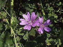
Botany


In culture – symbolism and associations
Cultural associations
In Western culture
Popularity of the color
- In Europe and America, violet is not a popular color; in a European survey, only three percent of men and women rated it as their favorite color, ranking it behind blue, green, red, black and yellow (in that order), and tied with orange. Ten percent of respondents rated it their least favorite color; only brown, pink and gray were more unpopular.[8]
The color of royalty and luxury
- Because of their status as the color of Roman emperors, and as colors worn by monarchs and princes, the colors violet and purple are often associated with luxury. Certain luxury goods, such as watches and jewelry, are often placed in boxes lined with violet velvet, since violet is the complementary color of yellow, and shows gold to best advantage.
Vanity, extravagance, and individualism
- While violet is the color of humility in the symbolism of the Catholic Church, it has exactly the opposite meaning in general society. A European poll in 2000 showed it was the color most commonly associated with vanity.[24] As a color that rarely exists in nature, and a color which by its nature attracts attention, it is seen as a color of individualism and extravagance.
Ambiguity and ambivalence
- Surveys show that violet and purple are the colors most associated with ambiguity and ambivalence.
In Asian culture
In dress
- In Japan, violet was a popular color introduced into Japanese dress during the Heian Period (794–1185). The dye was made from the root of the alkanet plant (Anchusa officinalis), known as murazaki in Japanese. At about the same time, Japanese painters began to use a pigment made from the same plant.[25]
 A Japanese woman in the kimono stye popular in the Heian Period (794–1185), with a violet head covering
New Age
- The "New Age Prophetess", Alice Bailey, in her system called the Seven Rays which classifies humans into seven different metaphysical psychological types, the "seventh ray" of "Ceremonial Order" is represented by the color violet. People who have this metaphysical psychological type are said to be "on the Violet Ray".[26]
- In the Ascended Master Teachings, the color violet is used to represent the Ascended Master St. Germain.[27]
- The Invocation of the Violet Flame is a system of meditation practice used in the "I AM" Activity and by the Church Universal and Triumphant (both Ascended Master Teaching religions).
Religion
- In the Roman Catholic church, violet is worn by bishops and archbishops, red by cardinals, and white by the Pope. Ordinary priests wear black.
- In the Roman Catholic and many other Western churches, violet is the liturgical color of Advent and Lent, which respectively celebrate the expectant waiting and preparation for the celebration of the Nativity of Jesus and the time for penance and/or mourning.
- There is a stained glass window created in the early 1920s in the Cathedral of Our Lady of the Angels in Los Angeles depicting God the Father wearing a violet robe.[28]
- After the Vatican II Council, which modified many of the rules of the Catholic church, priests began to wear violet robes when celebrating masses for the dead. Black was no longer used, since it was the color of mourning outside the church, and was felt to be inappropriate in a religious ceremony.[29]
- In Hinduism, violet is used to symbolically represent the seventh, crown chakra (Sahasrara).[30]
Politics
- At the beginning of the 20th century, violet, green and white were the colors of the women's suffrage movement in the United States and Britain, seeking the right to vote for women. The colors were said to represent liberty and dignity.[31] For this reason, the postage stamp issued in 1936 to honor Susan B. Anthony, a prominent leader of the suffrage movement in the United States, was colored the reddish tone of violet known as red-violet.
- In the 1970s, violet, purple, or pink were colors of the women's liberation or feminist movement.
- There is a small New Age political party in Germany with about 1,150 members called The Violet Party. The party believes in direct democracy, a guaranteed minimum income, and that politics should be based on spiritual values. "The Violet Party" was founded in Dortmund, Germany in 2001.[32]
 The Susan B. Anthony stamp (1936), was the reddish tone of violet known as red-violet since violet was a color that represented the Women's Suffrage movement.
Flags
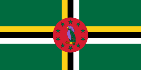 The flag of Dominica, an island in the Caribbean, is the only national flag in the world containing violet. The flag features a sisserou parrot, a national symbol.
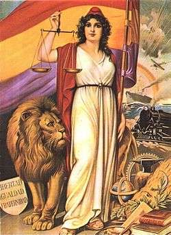 Allegory of the Spanish Republic with the Flag of the Second Spanish Republic
See also
- Flag of the Second Spanish Republic
- High-energy visible light
- Indigo
- Lavender
- List of colors
- Purple
- Shades of violet
References
- Ball, Philip (2001). Bright Earth, Art and the Invention of Colour. Hazan (French translation). ISBN 978-2-7541-0503-3.
- Heller, Eva (2009). Psychologie de la couleur: Effets et symboliques. Pyramyd (French translation). ISBN 978-2-35017-156-2.
- Pastoureau, Michel (2005). Le petit livre des couleurs. Editions du Panama. ISBN 978-2-7578-0310-3.
- Gage, John (1993). Colour and Culture - Practice and Meaning from Antiquity to Abstraction. Thames and Hudson (Page numbers cited from French translation). ISBN 978-2-87811-295-5.
- Gage, John (2006). La Couleur dans l'art. Thames and Hudson. ISBN 978-2-87811-325-9.
- Varichon, Anne (2000). Couleurs: pigments et teintures dans les mains des peuples. Seuil. ISBN 978-2-02084697-4.
- Zuffi, Stefano (2012). Color in Art. Abrams. ISBN 978-1-4197-0111-5.
- Roelofs, Isabelle (2012). La couleur expliquée aux artistes. Groupe Eyrolles. ISBN 978-2-212-13486-5.
- Broecke, Lara (2015). Cennino Cennini's Il Libro dell'Arte: a New English Translation and Commentary with Italian Transcription. Archetype. ISBN 978-1-909492-28-8.
Notes
- ↑ RGB approximations of RYB tertiary colors, using cubic interpolation. The colors displayed here are substantially paler than the true colors a mixture of paints would produce.
- 1 2 http://www.color-wheel-artist.com/meanings-of-violet.html
- ↑ Webster's New World Dictionary of the American Language, The World Publishing Company, New York, 1964.
- ↑ J. W. G. Hunt (1980). Measuring Color. Ellis Horwood Ltd. ISBN 0-7458-0125-0.
- ↑ Lynch, David K.; Livingston, William Charles (2001). Color and Light in Nature (2nd ed.). Cambridge, UK: Cambridge University Press. p. 231. ISBN 978-0-521-77504-5. Retrieved 12 October 2013.
Limits of the eye's overall range of sensitivity extends from about 310 to 1050 nanometers
- ↑ Dash, Madhab Chandra; Dash, Satya Prakash (2009). Fundamentals Of Ecology 3E. Tata McGraw-Hill Education. p. 213. ISBN 978-1-259-08109-5. Retrieved 18 October 2013.
Normally the human eye responds to light rays from 390 to 760 nm. This can be extended to a range of 310 to 1,050 nm under artificial conditions.
- ↑ Saidman, Jean (15 May 1933). "Sur la visibilité de l'ultraviolet jusqu'à la longueur d'onde 3130" [The visibility of the ultraviolet to the wave length of 3130]. Comptes rendus de l'Académie des sciences (in French). 196: 1537–9.
- 1 2 Eva Heller, Psychologie de la couleur: effets et symboliques. p. 4.
- ↑ Varichon, Anne Colors:What They Mean and How to Make Them New York:2006 Abrams Page 138
- ↑ Webster's New World Dictionary of the American Language, College Edition, 1964.
- ↑ Maerz and Paul A Dictionary of Color New York: 1930 McGraw-Hill Page 207
- ↑ Shorter Oxford English Dictionary, 5th Edition, 2003.
- ↑ Phillip Ball (2001), Bright earth- Art and the Invention of Colour, p. 84
- ↑ Anne Varichon (2000), Couleurs: pigments et teintures dans les mains des peuples, p. 146–148
- ↑ Lara Broecke, Cennino cennini's Il Libro dell'Arte: a New English Translation and Commentary with Italian Transcription, Archetype 2015, p. 115
- ↑ Isabel Roelofs (2012), La couleur expliquée aux artistes, p. 52–53
- ↑ John Gage (2006), La Couleur dans l'art, p. 50–51. Citing Letter 554 from Van Gogh to Theo. (translation of excerpt by D.R. Siefkin)
- ↑ Garfield, S. (2000). Mauve: How One Man Invented a Colour That Changed the World. Faber and Faber, London, UK. ISBN 978-0-571-20197-6.
- ↑ M. Roll (8 September 2012). "Color Wheel". Colorado State University.
- 1 2 Anne Carichon (2000), Couleurs: pigments et teintures dans les mains des peuples. p. 133.
- ↑ Anne Carichon (2000), Couleurs: pigments et teintures dans les mains des peuples. p. 144.
- ↑ Hubner K (2006). "History - 150 Years of mauveine". Chemie in unserer Zeit. 40 (4): 274–275. doi:10.1002/ciuz.200690054.
- ↑ Anthony S. Travis (1990). "Perkin's Mauve: Ancestor of the Organic Chemical Industry". Technology and Culture. 31 (1): 51–82. doi:10.2307/3105760. JSTOR 3105760.
- ↑ Eva Heller, Psychologie de la couleur: effets et symboliques, p. 167.
- ↑ Anne Varichon, Couleurs: pigments et teintures dans les mains des peuples, p. 139
- ↑ Bailey, Alice A. (1995). The Seven Rays of Life. New York: Lucis Publishing Company. ISBN 0-85330-142-5.
- ↑ "St. Germain" (dictated through Elizabeth Clare Prophet) Studies in Alchemy: the Science of Self-Transformation 1974:Colorado Springs, Colorado, USA Summit Lighthouse Pages 80-90 [Occult] Biographical sketch of St. Germain
- ↑ Stained glass window in the Cathedral of the Angels in Los Angeles, California depicting God the Father wearing a violet robe:
- ↑ Eva Heller, Psychologie de la couleur: effets et symboliques. p. 166,
- ↑ Stevens, Samantha. The Seven Rays: a Universal Guide to the Archangels. City: Insomniac Press, 2004. ISBN 1-894663-49-7 p. 24
- ↑ Eva Heller, Psychologie de la couleur: effets et symboliques. illustration 75.
- ↑ Violet Party website:
External links
| Wikimedia Commons has media related to Violet. |
Color topics | |||||||||||
|---|---|---|---|---|---|---|---|---|---|---|---|
| Color science |
| ||||||||||
| Color philosophy | |||||||||||
| Color terms |
| ||||||||||
| Color organizations | |||||||||||
| Lists | |||||||||||
| Related | |||||||||||
| |||||||||||