Sankey diagram


Sankey diagrams are a specific type of flow diagram, in which the width of the arrows is shown proportionally to the flow quantity.
Sankey diagram which represents all the primary energy flows in to factory. The widths of the bands are directly propotional to energy production, utilization and losses. The primary energy sources are gas, electricity and coal/oil and represent energy inputs at the left hand side of the Sankey diagram . They can also visualize the energy accounts, material flow accounts on a regional or national level, and also the breakdown of cost of item or services.[1]
Sankey diagrams put a visual emphasis on the major transfers or flows within a system. They are helpful in locating dominant contributions to an overall flow. Often, Sankey diagrams show conserved quantities within defined system boundaries.
History
Sankey diagrams are named after Irish Captain Matthew Henry Phineas Riall Sankey, who used this type of diagram in 1898 in a classic figure (see panel on right) showing the energy efficiency of a steam engine. While the first charts in black and white were merely used to display one type of flow (e.g. steam), using colors for different types of flows has added more degrees of freedom to Sankey diagrams.
One of the most famous Sankey diagrams is Charles Minard's Map of Napoleon's Russian Campaign of 1812. It is a flow map, overlaying a Sankey diagram onto a geographical map. It was created in 1869, so it actually predates Sankey's 'first' Sankey diagram of 1898.

Active Examples
The United States Energy Information Administration (EIA) produces numerous Sankey diagrams annually in the Annual Energy Report which illustrate the production and consumption of various forms of energy. The report for year 2012 include the following diagrams:
- Energy Flow,
- Petroleum Flow,
- Natural Gas Flow,
- Electricity Flow, and
- Coal Flow.
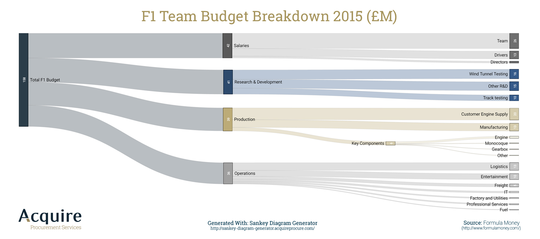
- Formula1 Budget Breakdown.
Eurostat, the Statistical Office of the European Union, has developed an interactive Sankey web tool to visualise energy data by means of flow diagrams. The tool allows you to build and customise your own diagram by playing with different options (country, year, fuel, level of detail, etc.).
The International Energy Agency (IEA) created an interactive Sankey web application that details the flow of energy for the entire earth. Users can select specific countries, points of time back to 1973, and modify the arrangement of various flows within the Sankey diagram.
The US Department of Energy's Lawrence Livermore Laboratory maintains a site of Sankey diagrams, including US energy flow and carbon flow.
Ben Schmidt, an Assistant Professor of History at Northeastern University, created a Sankey diagram relating majors in college to eventual careers.
Sankey Diagram Software Tools
The following software applications focus on drawing Sankey diagrams.
| Name | Creator | First public release date | Operating System | OS Version |
|---|---|---|---|---|
| Sankey Diagram Generator | Acquire Procurement Services | 2016 | Web based | Latest browsers with HTML5 |
| Sankey Diagram Creator | InfoCaptor Dashboard Software | 2015 | Windows,Mac,Web,Linux | Latest browsers with HTML5 |
| Sankey for Android | Jürgen Wilhelm | 2014 | Android | 3.2 or higher |
| Sankey Editor | Oliver Traun | 2011 | Windows | XP or higher |
| Sankey Diagram | squishLogic | 2014 | Apple iOS | 7.0 or higher |
| e!Sankey | ifu - The Hamburg Institute for Environmental IT | 2006 | Microsoft Windows | Vista SP2 or higher |
| s.draw | Altenburger Consulting | 2010 | Microsoft Windows | 3.x or higher |
| Sankey Diagram Maker | Dr. Hanny J Berchmans | 2012 | Microsoft Windows | 7 |
| Sankey Builder | Rob Potschka | 2014 | Web based | |
| Google Charts | 2014 | Web based | ||
| wikiBudgets | wikiBudgets | 2014 | Web based | Latest browsers with HTML5 |
| Python Library for Making Sankey Diagrams |
Matplotlib | unknown | Python based Linux, Windows, MacOsX and maybe other Python ports |
|
| Raw | Density Design | unknown | Web based | |
| SankeyMatic | Steve Bogart | unknown | Web based | |
| Aster Lens | Teradata | Unknown | Web based client | |
| riverplot | J. Weiner | 2014 | Windows, Linux, OSX, Solaris | (platform-independent R package ) |
See also
- Thermodynamics
- Material flow management
- Grassmann diagram (exergy flow and loss)
References
- ↑ Zhang, Katie (13 June 2016), Why Procurement Professionals should use Sankey Diagrams, retrieved 15 June 2016
External links
| Wikimedia Commons has media related to Sankey diagrams. |
- Scottish Executive - Energy in Scotland: Supply and Demand
- Irish Environmental Protection Agency - Material Flow Accounts (MFAs) – Demonstration for Ireland - 2001
- sankey-diagrams.com – Blog discussing the usage of Sankey diagrams
- Energy in a Sustainability Problem archived presentation from MIT ‐ Professional Education Course, June 2012, which uses both Sankey and Grassmann diagrams to present information
- IEA Energy Balance Flows – Containing International Energy Agency's data on over 150 countries and regions
- Eurostat energy flow diagrams – Interactive visualisation tool for the annual energy balance data of 42 countries reporting to Eurostat