New York City Subway map

The New York City Subway map has undergone several complete revisions over the years, with intervening periods of comparative stability. Since the last significant revision of 1979, the official transit map of the New York City Subway has evolved gradually under the control of the Marketing and Corporate Communications Department of the Metropolitan Transportation Authority (MTA). The 1979 design was created by the MTA Subway Map Committee, chaired by John Tauranac, which outsourced the graphic design of the map to Michael Hertz Associates.
History

Original maps for the privately opened Interborough Rapid Transit Company (IRT), which opened in 1904, showed subway routes as well as elevated routes.[1] However, IRT maps did not show Brooklyn–Manhattan Transit Corporation (BMT) routes; conversely, BMT maps did not show IRT routes, even after the Dual Contracts between the IRT and BMT.[2] In fact, even in 1939, the year before the unification of the IRT, BMT, and Independent Subway System (IND) into one entity,[3] maps by private businesses were still being printed showing only the routes of one company.[2] The three subway companies also published their own maps, showing their own routes.[4] (Even in 1968, maps were published that neglected to show IRT routes.)[2]
Routes were not distinguished from each other on subway maps until 1958.[2] The first route maps were aesthetically pleasing, but had the perception of being more geographically inaccurate than the diagrams today. The design of the subway map by Massimo Vignelli, published by the MTA between 1972 and 1979, has since become recognized in design circles as a modern classic; however, the MTA deemed the map flawed due to its placement of geographical elements.[5][6]
In 1985, with the subway's elimination of double-lettered routes, the map also drastically changed; routes on the maps became less straight and more circular, a design that persists today. "Trunk lines" were rearranged to be one color, rather than the multicolored routes shown on the former Vignelli maps.[2]
Expansion maps
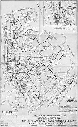
Two maps were drawn that showed routes for a never-built proposed expansion of the New York City Subway: one in 1929,[7] and one in 1939.[8]
A subway map was also drawn up in the 1970s to illustrate planned service patterns for an expanded subway system. This map showed possible service patterns upon the completion of several subway lines proposed in the 1968 Program for Action.[9]
Post-unification maps
1940–56: Separate companies' maps
After the subway operating companies were taken over by the Board of Transportation in July 1940, maps continued to be issued until 1942 in the characteristic style of the individual companies. Thus the IRT Division issued maps in the style of the former IRT company, and the BMT Division issue maps in the style of the former BMT company.[10] In order to have an integrated design, however, the Board bought in externally produced maps. From 1943 to 1952, the Board purchased stocks of Andrew Hagstrom's maps, overprinted with the Board's service information, and issued them as de facto official maps from token booths (e.g. 1948 [11]).
In 1953, the New York City Transit Authority (NYCTA) took over the subway from the Board of Transportation. They continued to issue Hagstrom maps as official maps until 1956, but instituted two changes. First: from 1954 onwards, they acquired stocks of subway maps designed by Stephen Voorhies and printed with promotional material for the Union Dime Bank. This was done to save money, as the Voorhies map was free, while Hagstrom charged for theirs. To keep the publications valid, the NYCTA periodically sent updated service information to both Hagstrom and Voorhies to be printed in service tables and, where necessary, incorporated into the map. Second: the NYCTA solicited proposals to create an in-house map design to save money and have more control of the map.
1958 redesign by George Salomon

In 1955, George Salomon submitted a proposal to the NYCTA to redesign not only the map but the entire system of nomenclature[12] Salomon was a German émigré, and his proposed system of route names and colors mirrored that of the Berlin U-Bahn. He had also spent a year studying under Eric Gill in England and expressed admiration for the London Underground map. His map adopted the same modernist style as Henry Beck's London map, and was the first map of the New York City Subway to follow a systematic visual language in diagrammatic form. The NYCTA rejected his systematic revision of nomenclature but did use his diagram of lines as its official map from 1958 to 1967.[13]
After delivering his map in 1958, Salomon had no further control of it, and disliked the TA's addition of touristic information to his minimalist design[14] (for example, the map of 1964).[15]
1967 redesign for the Chrystie Street Connection


To relieve bottlenecks in the subway system, a series of major works were carried out in the 1960. One of them, the 2-mile (3.2 km) Chrystie Street Connection in Chinatown, Manhattan, had a major impact on the subway map, as it unified the BMT and IND divisions of the subway, thereby rendering obsolete the three-colored network maps that been used since the 1930s. The Transit Authority had to devise a new map design by the time the Chrystie Street Connection opened, so in 1964, they opened the Subway Map Competition to the general public. There were three winners; one of them, R. Raleigh D'Adamo, submitted an explanatory report with his map, which detailed his innovative proposal to color-code the subway by individual routes rather than by historic operating company. This concept was implemented by Dr Stanley Goldstein of Hofstra University, working as a consultant to the TA, and by Dante Calise, art director at Diamond Packaging, the firm that printed the subway map. On November 26, 1967, when the new connections opened, the new map came into use.[2] There was also a map to explain all the newly rerouted services.[16]
1972 redesign by Massimo Vignelli
The TA's new map, released in 1967, used Raleigh D'Adamo's principle of color-coding for the first time, but it suffered from what Vignelli called "fragmentation" and was not well received. The following year, the parent body Metropolitan Transportation Authority (MTA) was formed over the TA, chaired by William J. Ronan, who wanted to create a modern brand image for this new body. While the Unimark signage project was still being finished off up with the creation of the New York City Transit Authority Graphics Standards Manual, Vignelli went to Ronan with a mock-up of part of the map for lower Manhattan.[17] Ronan approved it, and in July 1970 the TA awarded Unimark a contract to design a new system map.
The map was put together in the Unimark Office by Joan Charysyn under Vignelli's design direction. In April 1971, Vignelli left Unimark to set up Vignelli Associates. By this time, the map was almost complete, but was subject to corrections and modifications requested by Raleigh D'Adamo, who was now Head of the Office of Inspection and Review at the MTA. These changes were carried out by Charysyn, who also oversaw the printing of the map. Unimark's liaison with the MTA during this project was handled by Norbert Oehler. The map was unveiled by Ronan on August 4, 1972 at a ceremony in the station at 57th Street and Sixth Avenue.[18]
After the mechanical for the map was handed over in 1972, Vignelli had no further control over the map. Six further editions were produced from 1973 to 1978, with extensive changes. In 1974, William Ronan was replaced by David Yunich as chairman of the MTA. Yunich was formerly an executive at Macy's department store, and brought an explicit intention to 'sell' the subway to riders. He brought over from Macy's Fred Wilkinson who in 1975 formed the Subway Map Committee to design a new map to replace Vignelli's.
1978 redesign by John Tauranac
At the end of 1976, Wilkinson was assigned from Transit to be Executive Officer of Surface operations and stepped down from the Subway Map Committee.[19] For half a year, the committee did not meet; and then in the summer of 1977, John Tauranac was assigned chair of the committee and meetings resumed.[20] Further map experiments were made, and in February 1978 Tauranac organised an exhibition entitled "The Good, The Bad ... The Better? A New York City Subway Map Retrospective" at the Cityana Gallery run by Benjamin Blom, exhibiting the committee's latest prototype map and offering a questionnaire for testing public reaction.[21] Visitors said they liked the geographic information but disliked the use of a single color for all subway lines.[22] In response, Tauranac then prepared a version with two colors, blue for the former IRT lines and red for the former BMT and IND lines. This was exhibited at the Cooper Union in April, when Tauranac debated with Massimo Vignelli in a public battle between the two schools of map-making.[23]
In September 1978, Tauranac met with Phyllis Cerf Wagner, head of the MTA Aesthetics Committee, and told her that the map project was "dead in the water" because he could not make the map he wanted—a trunk-colored scheme in which lines that diverge and converge retain the color of each trunk—because there was no funding to change to signage to match the change in the map.[24] Cerf Wagner was able to secure the funds, and in June 1978 the finished subway map—a geographic map with trunk-based colors—was published in time for the Diamond Jubilee, the subway's 75-year anniversary.
Tauranac led a 12-person committee that comprised TA staff and members of the public in addition to the three staff at Michael Hertz Associates.[25][26][27] Everybody contributed to the final design, and the map cannot be said to be designed by one individual.[28] The extant minutes of the Subway Map Committee show that Tauranac was responsible for several major design decisions - such as the use of a geographic style, the use of trunk-based color coding, the use of route markers, and the appearance of transfer stations. He also organised and coordinated the contributions of everybody in the group and liaised with TA and MTA staff to get approvals and funding and then to ensure that all the station and car signs in the subway network were changed to match the color scheme of the new map when it was launched in June 1979. He also defended the map in public debate with Massimo Vignelli in April 1978 and December 2010.
Current map

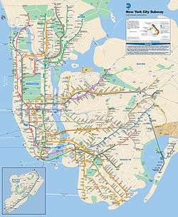
The most recent official maps of the subway system are not geographically accurate due to the complexity of the system (e.g., Manhattan being the smallest borough, but having the most services), but are known to help tourists navigate the city, as major city streets are shown alongside the subway stations serving them. However, the New York City Subway map is an anomaly among subway maps around the world, in that it shows city streets, parks, and neighborhoods juxtaposed among curved subway lines, whereas other subway maps (like the London Underground map) do not show such aboveground features and show subway lines as straight and at 45- or 90-degree angles.[29]
The newest style of the official subway map, which took effect on June 27, 2010, reflects the latest service changes and also makes Manhattan bigger and Staten Island smaller.[30][31] A late night-only version of the map was introduced on January 30, 2012.[32]
Spinoffs
There are several privately produced schematics that are available either online or in published form—such as Kick Map, a simplified subway map that shows each route on its own line segments;[33] and Bullet Map, a map that shows bus and rail connections in more complexity.[34] Additionally, the New York City Subway map has served as the subject of artistic endeavors. Among these are works by Fadeout Design and by Alexander Chen.[35][36] In the past, companies such as Hagstrom Map had also published New York City Subway maps.[37]
There are other subway map spinoffs as well, such as New York City Subway track schematics.[38][39] Recently, an augmented reality subway map was made available for the subway.[40] Additionally, "On The Go! Travel Stations" are electronic maps located in stations that make use of touchscreen technology to help subway patrons plan trips.[41] Google Maps also gives transit directions, with the locations of stations laid over an actual street grid. Such maps have been increasingly prevalent.[42]
Special maps
The Weekender
In 2011, the MTA began to look at ways of displaying service disruptions due to weekend engineering works in a visual format. They invited Vignelli Associates (comprising at that time Massimo Vignelli, Yoshiki Waterhouse, and Beatriz Cifuentes) to develop a digital version of the 2008 map. On September 16, 2011, the MTA introduced a Vignelli Associates interactive subway map, called "The Weekender",[43] to its website.[44] As the title suggests,[45] it is a way for riders to get information about any planned work, from late Friday night to early Monday morning, that is going on either on a service(s) or station(s) of the subway during the weekend only.[46][47] On June 11, 2012, the MTA duplicated "The Weekender" site as a free mobile app download for iOS.[48][49] On November 29, 2012, an Android version of the app was released.[50] The Weekender, however, is only available as an online version, because it changes every week.[51]
Night service map
A night-service map, created by Charles Gordanier of the MTA, was first released in January 2012.[51][52][53] The maps come in printed versions or as an online PDF file. Formerly, the maps were only available online or at certain stations, but as of October 2014, the maps started to be issued at all stations in the New York City Subway and Staten Island Railway systems.[54]
Super Bowl map
A special transit map was designed by Yoshiki Waterhouse at Vignelli Associates for Super Bowl XLVIII, the "Mass Transit Super Bowl". The game was played on February 2, 2014, at MetLife Stadium at the Meadowlands Sports Complex in East Rutherford, New Jersey. It was the first Super Bowl played outdoors in a cold-weather city.
Called the "Regional Transit Diagram 2014", the map was produced specifically for the Super Bowl XLVIII, and according to the MTA, "shows all inter-connections between the regional transit services, and highlights with a football icon those areas where Super Bowl related events will occur on both sides of the Hudson River. The diagram will appear on all transit provider websites, as well as on Super Bowl websites, guides, publications, mobile apps, and folding pocket maps." Since private cars were not allowed to park at the stadium, the use of public transportation had correspondingly been increased. With 400,000 visitors expected to the area and 80,000 attendees expected at the game itself, the MTA decided to work with New Jersey Transit (NJT), Amtrak, and NY Waterway to produce a special-purpose Regional Transit Map and create the Mass Transit Super Bowl plan.[55]
The map is based on a New York City Subway map originally designed by Vignelli in 1972. The map shows all the commuter rail, subway, PATH, and light rail operations in urban northeastern New Jersey and Midtown and Lower Manhattan highlighting Super Bowl Boulevard, Prudential Center, Met Life Stadium and Jersey City.[56][57][58]
The map brought in several innovations:
- The transit map showed both New York and New Jersey, and was the first time that an MTA-produced subway map had done that.[59]
- Besides showing the New York City Subway, the map also includes the MTA's Metro-North Railroad and Long Island Rail Road, New Jersey Transit lines, and Amtrak lines in the consistent visual language of the Vignelli map.
- For the first time since 1979, the MTA issued a Vignelli map on paper.
- For the first time, a Vignelli map added in topographic features, such as the MetLife Stadium, the Prudential Center, and the Super Bowl Boulevard.
Imitation and parody maps
In September 2015, a map detailing the number of calories burnt walking between adjacent subway stops was developed by Treated.com and featured on the websites of Gothamist[60] and Time Out.[61]
A "beer map" was created to show the best bars that are close to each station.[62]
The website Thrillist also created a "judgmental map" of each station in Manhattan.[63]
Color coding for subway routes
History of color coding

From 1904 to 1967, subway routes on the official subway map were drawn either in a single color or in three colors, which corresponded to the company that the route operated on — the IRT, BMT, or IND.[64] Still, after the 1940 unification of the three companies' routes under the umbrella of a Board of Transportation—later the New York City Transit Authority (NYCTA)—the three networks continued to operate separately and were generally referred to by their old names.[65] Both maps and the station signage continued to refer to the historical IRT, BMT, and IND. In 1964, a major review of wayfinding was triggered by the combination of two things: the large influx of visitors for the 1964 New York World’s Fair, which made the subway and bus maps confusing to some visitors; and the connection of the BMT and IND networks through the 60th Street Tunnel Connection and the soon-to-be-opened Chrystie Street Connection, which rendered the three-color scheme unworkable.
In 1964, the NYCTA launched the Subway Map Competition to get public input on redesigning the subway map, and in 1966 it engaged Unimark International to advise on signage and on the results of the Subway Map Competition. The winners of the competition were R. Raleigh D’Adamo,[66] Harris Schechtman, and Mary & John Condon.[67] The TA forwarded D’Adamo’s report[68] on his competition map to Professor Stanley Goldstein of Hofstra University, who was engaged to develop prototype maps. Goldstein reported in June 1965,[69] and two of his prototype maps were combined by the TA Designs Division, and the result passed to Diamond Packaging, who refined the design and printed the NYCTA’s first route-colored subway map in November 1967. To coordinate with the new color scheme in the map, the NYCTA began to roll out new station and car signage based on a design by Vignelli and Robert Noorda of Unimark International, using the route markers derived from those specified in D’Adamo’s report.
The biggest innovation in this redevelopment of the map was the introduction of color-coding by subway route, which D’Adamo recommended in his report to replace the outdated three-color scheme. After some experimentation, D’Adamo found a set of colors for subway lines that avoided clashes; Goldstein used D’Adamo’s concept but invented his own color allocation; and finally Dante Calise at Diamond Packaging devised the color assignment that was used in the published map of 1967. Those colors were inherited by Unimark International and used in the famous 1972 Vignelli map.[70][71] That color scheme was rearranged by Tauranac in 1979 to create a trunk-colored map.
Current service colors
The colors used to denote services in the current iteration of the subway map are as follows:
| Primary Trunk line | Color[72][73] | Pantone[74] | Hexadecimal | Service bullets |
|---|---|---|---|---|
| IND Eighth Avenue Line | Vivid blue | PMS 286 | #2850ad | |
| IND Sixth Avenue Line | Bright orange | PMS 165 | #ff6319 | |
| IND Crosstown Line | Lime green | PMS 376 | #6cbe45 | |
| BMT Canarsie Line | Light slate gray | 50% black | #a7a9ac | |
| BMT Nassau Street Line | Terra cotta brown | PMS 154 | #996633 | |
| BMT Broadway Line | Sunflower yellow | PMS 116 | #fccc0a | |
| IRT Broadway – Seventh Avenue Line | Tomato red | PMS 185 | #ee352e | |
| IRT Lexington Avenue Line | Apple green | PMS 355 | #00933c | |
| IRT Flushing Line | Raspberry | PMS Purple | #b933ad | |
| Shuttles | Dark slate gray | 70% black | #808183 |
Table showing when each service label and color was used
This is a table of when each service has existed (and been signed for the public). Shuttles were SS until 1985, when they became S (which had been used for specials). See here for the colors used for shuttles in 1967; in 1968 all six became green, and in 1979 all shuttles became dark gray. The maps were adjusted according to the service letters, numbers, and colors used at the time.
Before the 1960s, service colors were disregarded, as maps usually showed all subway routes of one company in the same color, using only three colors for the lines of the three companies.

Gallery
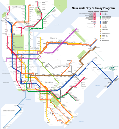 September 2015 daytime subway service map
- November 2016 subway service map
 Map of a 1929 expansion plan
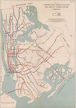 Map of a 1939 expansion plan
 Late night subway service map
 The map as a theme of art
See also
- Tube map – Map for the London Underground
Notes
References
- ↑ "IRT Route Map". IRT Company. nycsubway.org. Retrieved May 28, 2014.
- 1 2 3 4 5 6 Kelsey Campbell-Dollaghan (3 September 2013). "15 Subway Maps That Trace NYC's Transit History". Gizmodo. Retrieved 28 May 2014.
- ↑ "New York City Transit — History and Chronology". Metropolitan Transportation Authority. Retrieved 14 May 2014.
- ↑ A History of New York City Subway Maps
- ↑ Paul A. Shaw (November 18, 2008). "The (Mostly) True Story of Helvetica and the New York City Subway". AIGA. aiga.org. Retrieved February 4, 2009.
- ↑ Hogarty, Dave (August 3, 2007). "Michael Hertz, Designer of the NYC Subway Map". Gothamist. Retrieved July 4, 2009.
- ↑ Collis, Helen (2013-08-02). "Planning office maps from history reveal how metropolises might have looked | Mail Online". Dailymail.co.uk. Retrieved 2014-05-28.
- ↑ "Dreaming of the Second System: Where the subways should go :: Second Ave. Sagas". Secondavenuesagas.com. Retrieved 2014-05-28.
- ↑ "1970s NYC Subway Map That Never Was — Business Insider". Business Insider. 18 June 2013.
- ↑ "1940 BMT Division map" (PDF). nycsubway.org. 1940. Retrieved March 18, 2015.
- ↑ "1948 Hagstrom map issued by Board of Transportation". 1948. Retrieved March 18, 2015.
- ↑ George Salomon (c. 1955), three typescript booklets, held in the Archives of the New York Transit Museum, Brooklyn: (a) "Out of the Labyrinth: A plea and a plan for improved passenger information on the New York subways". (b) "Orientation". (c) "Orientation on the New York Subway (a ‘scrapbook’)".
- ↑ "1959 Salomon map". 1959. Retrieved March 18, 2015.
- ↑ Interview with Mathilde Salomon, widow of George Salomon, in 2004
- ↑ "1964 Salomon map supplemented with tourist information". 1964. Retrieved March 18, 2015.
- ↑ "1967 Chrystie Street Connection New Routes". 1967. Retrieved August 24, 2015.
- ↑ "Peter B. Lloyd, "Vignelli: Transit Maps" (RIT Press, 2012)". Retrieved August 23, 2015. p. 47
- ↑ New York Times, August 5, 1972
- ↑ Minutes of the Subway Map Committee, December 17, 1976.
- ↑ Minutes of Subway Map Committee, June 30, 1977
- ↑ New York Times, February 9, 1978, Paul Goldberger, "Putting the Subways on a New Map"
- ↑ Minutes of Subway Map Committee, March 3, 1978.
- ↑ The Times, May 8, 1978, Michael Leapman, column: "Leapman in America"
- ↑ Phyllis Cerf Wagner, interviewed by Barbaralee Diamonstein, September 1978, tapes held at Columbia University
- ↑ MTA Press Releases #86 and #87, June 24, 1979
- ↑ "The 1979 New York City Subway Map: A Question of Authorship, Part I". September 12, 2010. Retrieved March 17, 2015.
- ↑ "The 1979 New York City Subway Map: A Question of Authorship, Part II". September 12, 2010. Retrieved March 17, 2015.
- ↑ This statement is based on the existing minutes of the Subway Map Committee and interviews by Peter B. Lloyd with the traceable members of the committee, related MTA staff, and staff of Michael Hertz Associates
- ↑ Mindlin, Alex (September 3, 2006). "Win, Lose, Draw: The Great Subway Map War". The New York Times. Retrieved May 28, 2014.
- ↑ New Subway Map is Here MTA.info website. Retrieved June 18, 2010.
- ↑ "Subway Map" (PDF). Metropolitan Transportation Authority. November 2016. Retrieved 2016-11-07.
- ↑ "Late Night Subway Service" (PDF). Metropolitan Transportation Authority. November 2016. Retrieved 2016-11-07.
- ↑ "ABOUT THE KICK MAP". www.kickmap.com. Retrieved 2016-09-21.
- ↑ Denaro, Anthony (2016-08-08). "Mapping NYC Transit. All of it.". Medium. A Medium Corporation. Retrieved 2016-09-21.
- ↑ TRANSPORTNATION | New York City. Retrieved August 26, 2011.
- ↑ Artist Turns New York Subway Map Into a Musical Instrument. Retrieved August 26, 2011.
- ↑ Paul A. Shaw (November 18, 2008). "The (Mostly) True Story of Helvetica and the New York City Subway". AIGA. aiga.org. Retrieved February 4, 2009.
- ↑ New York City Trackbook
- ↑ NYC Subway Track Maps
- ↑ Tunnel Vision Uses Augmented Reality to Animate NYC Subway Maps
- ↑ "MTA's First "On The Go" Touchscreen Unveiled In Bowling Green". NY1. September 19, 2011. Retrieved October 5, 2011.
- ↑ andyjayhawk (2015-10-29). "The Great Subway Map War of 1978, revisited". The Verge. Retrieved 2015-11-12.
- ↑ "Introducing The Weekender". MTA.info (YouTube). September 30, 2011. Retrieved October 1, 2011.
- ↑ "The Weekender". MTA.info. Retrieved October 12, 2013.
- ↑ Grynbaum, Michael M. (September 15, 2011). "Aid for Baffled Weekend Subway Riders". The New York Times. Retrieved September 30, 2011.
- ↑ "Introducing 'The Weekender'". MTA.info. September 16, 2011. Retrieved September 18, 2011.
- ↑ "MTA Launches Interactive Online Map Ahead Of Difficult Weekend For Subways". NY1. September 16, 2011. Retrieved September 18, 2011.
- ↑ "MTA Releases "Weekender" Smartphone App". NY1. June 11, 2012. Retrieved June 13, 2012.
- ↑ "'The Weekender' Is Now an iPhone App". MTA.info. June 11, 2012. Retrieved June 13, 2012.
- ↑ "MTA's 'Weekender' App Comes to Android Devices". MTA.info. November 29, 2012. Retrieved October 20, 2013.
- 1 2 Christine Haughney (30 January 2012). "Looking for That Midnight Train to Jamaica?". New York Times. Retrieved 19 March 2015.
- ↑ "Limited Quantities Available of our First Late Night Map". MTA.info. January 30, 2012. Retrieved March 17, 2015.
- ↑ "Subway Night Map" (PDF). MTA.info. January 30, 2012. Retrieved March 17, 2015.
- ↑ "The City That Never Sleeps Gets Map Update for Late Night Subway Service". MTA.info. 6 October 2014. Retrieved 19 March 2015.
- ↑ "MTA Press Release, "MTA Creates First Regional Transit Diagram for Super Bowl XLVIII"". December 10, 2013. Retrieved March 18, 2015.
- ↑ Chung, Jen (December 10, 2013). "Map: 2014 NY/NJ Super Bowl's Gorgeous Vignelli Mass Transit Map". Gothamist. Retrieved 2013-12-20.
- ↑ "MTA Creates First Regional Transit Diagram for Super Bowl XLVIII" (Press release). Metropolitan Transportation Authority. December 10, 2013. Retrieved 2013-12-22."Regional Transit Diagram 2014" (PDF). New Jersey Transit. Retrieved 2013-12-22.
- ↑ Napoliello, Alex (December 11, 2013). "MTA designs regional Super Bowl mass transit map". The Star-Ledger. Retrieved 2013-12-22.
- ↑ "Thanks to the Super Bowl, New York Has Its Very First Regional Transit Map". January 31, 2014. Retrieved March 18, 2015.
- ↑ Carlson, Jen. "Map Shows How Many Calories You Can Burn By Not Taking The Subway". Gothamist. Retrieved 2016-01-11.
- ↑ "Map shows how many calories you'd burn by walking over taking the subway". Time Out New York. Retrieved 2016-01-11.
- ↑ Kasick, Paige (July 18, 2014). "Fun Maps: Find The Best NYC Bars Near Each Subway Station". Untapped Cities. Retrieved January 11, 2016.
- ↑ "Crude Subway Map Tells the Truth About Each Manhattan Stop". Curbed NY. 2015-03-12. Retrieved 2016-01-11.
- ↑ "Rapid Transit Map of Greater New York", a 1939 map of the subway, created before the companies were unified in 1940
- ↑ "Rapid Transit Lines of the New York City Transit System", a 1948 map of the subway
- ↑ Polytechnic University Cable 34:2 Winter 2007 p.7
- ↑ "3 Win Transit Authority Prizes For Designs of Subway Maps", New York Times, October 17, 1964
- ↑ Memorandum of Explanation by R. Raleigh D’Adamo, accompanying entry to the NYCTA Subway Map Competition, September 24, 1964. 19 pp. Plus Corrigenda, September 30, 1964, 2 pp.
- ↑ Methods of Improved Subway Information, report submitted to NYCTA by Stanley P. Goldstein, Professor of Engineering at Hofstra University, June 10, 1965. 40 pp.
- ↑ "Peter B. Lloyd, "Vignelli: Transit Maps" (RIT Press, 2012)". Retrieved August 23, 2015.
- ↑ New York City Subway map, 1972, based on Vignelli's design
- ↑ Official paint monikers since the colors were fixed in 1979: Grynbaum, Michael (May 10, 2010). "Take the Tomato 2 Stops to the Sunflower". New York Times, City Room Blog. Retrieved May 11, 2010.
- ↑ Official MTA video mentions "lime green" for the G line. "Subway Colors and Names". MTA Info. July 15, 2010. Retrieved August 5, 2010.
- ↑ MTA Developer Resources Download, CSV file
Further reading
- The Best Subway Map in Years, New York Times July 1, 1979 page E20
External links
| Wikimedia Commons has media related to Maps of the New York City Subway. |
Official maps:
- Official website
- "Subway Map" (PDF). Metropolitan Transportation Authority. November 2016. Retrieved 2016-11-07.
- The Weekender
- Late Night Subway Service map
Unofficial maps:
- Catalog of NYC subway maps since 1944
- 1972 NYC subway map by Vignelli
- NYC Subway operations (unofficial map)
- TransitMe: full screen New York City Subway maps
| Services |
|      | ||||||
|---|---|---|---|---|---|---|---|---|
| Stations | ||||||||
| Divisions | ||||||||
| Other lists | ||||||||
| Expansion | ||||||||
| History | ||||||||
| Infrastructure | ||||||||
| Arts and culture | ||||||||
| Miscellaneous | ||||||||
| Other rapid transit in NYC | ||||||||