Metro (design language)


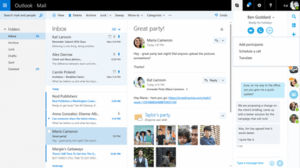
Metro is the obsolete name of a typography- and geometry-focused design language created by Microsoft primarily for user interfaces.[1] A key design principle is better focus on the content of applications, relying more on typography and less on graphics ("content before chrome"). Early examples of Metro principles can be found in Encarta 95 and MSN 2.0.[2][3] The design language evolved in Windows Media Center and Zune and was formally introduced as "Metro" during the unveiling of Windows Phone 7. It has since been incorporated into several of the company's other products, including the Xbox 360 system software, Xbox One, Windows 8, Windows Phone, and Outlook.com[4][5] under the names Microsoft design language and Modern UI[6][7][8][9] after Microsoft discontinued the name "Metro" allegedly because of trademark issues.[4]
History
The design language is based on the design principles of classic Swiss graphic design. Early glimpses of this style could be seen in Windows Media Center for Windows XP Media Center Edition,[10] which favored text as the primary form of navigation. This interface carried over into later iterations of Media Center. In 2006, Zune refreshed its interface using these principles. Microsoft designers decided to redesign the interface and with more focus on clean typography and less on UI chrome.[11] These principles and the new Zune UI were carried over to Windows Phone (from which much was drawn for Windows 8). The Zune Desktop Client was also redesigned with an emphasis on typography and clean design that was different from the Zune's previous Portable Media Center based UI. Flat colored "live tiles" were introduced into the design language during the early Windows Phone's studies.
Principles


Microsoft's design team cites as an inspiration for the design language signs commonly found at public transport systems.[12] The design language places emphasis on good typography and has large text that catches the eye. Microsoft sees the design language as "sleek, quick, modern" and a "refresh" from the icon-based interfaces of Windows, Android, and iOS.[13] All instances use fonts based on the Segoe font-family designed by Steve Matteson at Agfa Monotype and licensed to Microsoft. For the Zune, Microsoft created a custom version called Zegoe UI,[14] and for Windows Phone Microsoft created the "Segoe WP" font-family. The fonts mostly differ only in minor details. More obvious differences between Segoe UI and Segoe WP are apparent in their respective numerical characters. The Segoe UI in Windows 8 had obvious differences – similar to Segoe WP. Characters with notable typographic changes included 1, 2, 4, 5, 7, 8, I, and Q.
Microsoft designed the design language specifically to consolidate groups of common tasks to speed up usage. It achieves this by excluding superfluous graphics and instead relying on the actual content to function as the main UI. The resulting interfaces favour larger hubs over smaller buttons and often feature laterally scrolling canvases. Page titles are usually large and consequently also take advantage of lateral scrolling.
Animation plays a large part. Microsoft recommends consistent acknowledgement of transitions, and user interactions (such as presses or swipes) by some form of natural animation or motion. This aims to give the user the impression of an "alive" and responsive UI with "an added sense of depth."[15][16]
Reception
Before Windows 8
Early response to the language was generally positive. In a review of the Zune HD, Engadget said, "Microsoft continues its push towards big, big typography here, providing a sophisticated, neatly designed layout that's almost as functional as it is attractive."[17] CNET complimented the design language, saying, "it's a bit more daring and informal than the tight, sterile icon grids and Rolodex menus of the iPhone and iPod Touch."[18]
At its IDEA 2011 Ceremony, the Industrial Designers Society of America (IDSA) gave Windows Phone 7, which uses the UI, its "Gold Interactive" award, its "People's Choice Award", and a "Best in Show" award.[19][20] Isabel Ancona, the User Experience Consultant at IDSA, explained why Windows Phone won:[21]
The innovation here is the fluidity of experience and focus on the data, without using traditional user interface conventions of windows and frames. Data becomes the visual elements and controls. Simple gestures and transitions guide the user deeper into content. A truly elegant and unique experience.
Criticism particularly focused on the use of all caps text. With the rise of Internet usage, critics have compared this to a computer program shouting at its user. IT journalist Lee Hutchinson described Microsoft's using the practice as "LITERALLY TERRIBLE...[it] doesn’t so much violate OS X’s design conventions as it does take them out behind the shed, pour gasoline on them, and set them on fire."[22]
After Windows 8
With the arrival of Windows 8, the operating system's user interface and its use of the design language drew generally negative critical responses. On 25 August 2012, Peter Bright of Ars Technica reviewed the preview release of Windows 8, dedicating the first part of the review to a comparison between the Start menu designs used by Windows 8 and Windows 7. Recounting their pros and cons, Peter Bright concluded that the Start menu in Windows 8 (dubbed Start screen), though not devoid of problems, was a clear winner. However, he concluded that Windows 8's user interface was frustrating and that the various aspects of the user interface did not work well together.[23] Woody Leonhard was even more critical when he said, "From the user's standpoint, Windows 8 is a failure – an awkward mishmash that pulls the user in two directions at once."[24]
In addition to the changes to the Start menu, Windows 8 takes a more modal approach with its use of full-screen apps that steer away from reliance on the icon-based desktop interface. In doing so, however, Microsoft has shifted its focus away from multitasking and business productivity.[25]
Name change
In August 2012, The Verge announced that an internal memorandum had been sent out to developers and Microsoft employees announcing the decision to "discontinue the use" of the term "Metro" because of "discussions with an important European partner", and that they were "working on a replacement term".[26] Technological news outlets Ars Technica,[27] TechRadar,[28] CNET,[29] Engadget[30] and IDG's Network World[31] and mainstream press The New York Times[32] and the BBC[33] published that the partner mentioned in the memo could be one of Microsoft's retail partners, German company Metro AG, as the name had the potential to infringe on their "Metro" trademark. Microsoft later stated that the reason for de-emphasizing the name was not related to any current litigation, and that "Metro" was only an internal project codename,[34] despite having heavily promoted the brand to the public.[35]
In September 2012, "Microsoft design language" was adopted as the official name for the design style.[1][36] The term was used on Microsoft Developer Network (MSDN) documentation[37][38][39][40] and at the 2012 Build conference to refer to the design language.[1][41]
In a related change, Microsoft dropped use of the phrase "Metro-style apps" to refer to mobile apps distributed via Windows Store.[36]
See also
- iOS 7 § Design (by Apple)
- Material Design (by Google)
- Flat design
- Skeuomorph design
- Human interface guidelines
References
- 1 2 3 Foley, Mary Jo. "Microsoft Design Language: The newest official way to refer to 'Metro'". ZDNet. CBS Interactive. Retrieved 28 May 2013.
- ↑ Green, Jay (8 February 2012). "Why Metro now rules at Microsoft". CNET. CBS Interactive. Retrieved 15 September 2013.
- ↑ Massey, Stephane (15 February 2012). "Metro Ui Design Principles". stephanemassey.com. Self-published. Retrieved 15 September 2013.
- 1 2 Chang, Alexandra (8 August 2012). "Microsoft Doesn't Need a Name for Its User Interface". Wired. Condé Nast. Retrieved 28 May 2013.
- ↑ Kruzeniski, Mike (11 April 2011). "How Print Design is the Future of Interaction". Kruzeniski.com. Self-published. Retrieved 15 September 2013.
- ↑ Tom Warren (10 August 2012). "Microsoft now using 'Modern UI Style' to refer to Windows 8 'Metro Style' apps". The Verge.
- ↑ Qi Lu (1 October 2012). "Qi Lu: IAB MIXX Conference Keynote". Microsoft News Center. Microsoft. Retrieved 30 December 2014.
- ↑ TC Jones (15 December 2014). "Windows 10 build 9901 leak: prettier Cortana, better Modern UI". SlashGear.
- ↑ Lisa Eadicicco (16 Dec 2014). "A Closer Look At Microsoft's Big Plan To Fix The Disaster That Was Windows 8". Business Insider.
- ↑ Lefevers, Jason (15 September 2013). "A Walkthrough the History of the Metro UI". Windows Phone Metro. Self-published. Retrieved 11 July 2011.
- ↑ "Windows Phone Design System: Codenamed 'Metro'" (PDF). Retrieved 9 October 2010.
- ↑ "Design Language of Windows Phone 7". .toolbox. Microsoft. Archived from the original on 9 October 2012. Retrieved 5 October 2012.
- ↑ Hamburger, Ellis (27 April 2011). "Metro". Blackboard. Business Insider. Retrieved 3 November 2011.
- ↑ Zheng, Long (14 November 2007). ""Zegoe", the new Zune font". i started something. Self-published. Retrieved 15 September 2013.
- ↑ Roberts, Chad; Shum, Albert; Smuga, Michael (15 March 2010). "Windows Phone UI and Design Language". MIX 2010. Microsoft. Retrieved 15 September 2013.
- ↑ Kruzeniski, Mike (17 February 2011). "From Transportation to Pixels". Windows Phone Developer Blog. Microsoft.
- ↑ Topolsky, Joshua (17 September 2009). "Zune HD review". Engadget. AOL. Retrieved 19 February 2013.
- ↑ "Zune HD 64GB Review". CNET. CBS Interactive. 17 September 2009. Retrieved 19 February 2013.
- ↑ Warren, Tom (18 September 2011). "Windows Phone wins IDEA 2011 – people's choice design award". WinRumors. Retrieved 19 February 2013.
- ↑ "IDEA 2011 Best in Show". Industrial Designers Society of America. idsa.org. 23 September 2011. Retrieved 15 February 2014.
- ↑ "Windows Phone 7". Industrial Designers Society of America. idsa.org. 8 June 2011. Retrieved 15 September 2013.
- ↑ Hutchinson, Lee. "The software design trends that we love to hate". Ars Technica. Conde Nast. Retrieved 29 July 2015.
- ↑ Bright, Peter (25 April 2012). "Windows 8 on the desktop—an awkward hybrid". Ars Technica. Condé Nast Digital. pp. 1–5. Retrieved 19 February 2013.
- ↑ Leonhard, Woody (15 August 2012). "Windows 8 review: Yes, it's that bad". Infoworld. Retrieved 12 November 2013.
- ↑ "Windows 8's done, time to worry". Redmondmag. 17 August 2012. Retrieved 8 October 2012.
- ↑ Warren, Tom (2 August 2013). "Exclusive: Microsoft's Metro branding to be replaced 'this week' according to internal memo". The Verge. Vox Media. Retrieved 29 May 2013.
- ↑ "Microsoft: "Metro" out, "Windows 8-style UI" in, amid rumors of a trademark dispute". Ars Technica. Retrieved 24 September 2013.
- ↑ "Microsoft ditching 'Metro' name for Windows 8 amid trademark fears". TechRadar. Retrieved 24 September 2013.
- ↑ "Why did Microsoft kill the name 'Metro'?". CNET News. Retrieved 24 September 2013.
- ↑ "Microsoft downplays Metro design name, might face a lawsuit over all that street lingo". Engadget. Retrieved 24 September 2013.
- ↑ "Source confirms Microsoft abandoned Metro due to trademark gaffe". IDG. Retrieved 24 September 2013.
- ↑ Microsoft Drops Metro Name for New Product Look, retrieved 24 September 2013
- ↑ "Microsoft to drop 'Metro' name for Windows". BBC. 3 August 2012. Retrieved 28 May 2012.
- ↑ Mary Jo Foley. "Is 'Metro' now a banned word at Microsoft?". ZDNET. Retrieved 24 September 2013.
- ↑ Matthew Humphries (3 Aug 2012). "Microsoft discontinues use of Metro name". ZDNET. Retrieved 13 Jun 2015.
- 1 2 "Microsoft finally comes clean(er) on post-Metro naming plans". ZDNet. CBS Interactive. 12 September 2012. Retrieved 28 May 2013.
- ↑ "Make great Windows Store apps". MSDN. Microsoft. Retrieved 28 May 2013.
- ↑ "Design case study: iPad to Windows Store app". MSDN. Microsoft. Retrieved 28 May 2013.
- ↑ "Guidelines for typography". MSDN. Microsoft. Retrieved 28 May 2013.
- ↑ "Roadmap for Windows Store apps using DirectX and C++". MSDN. Microsoft. Retrieved 28 May 2013.
- ↑ "The Microsoft design language". Channel 9. Microsoft. Retrieved 28 May 2013.
External links
- Modern Design at Microsoft
- UX guidelines for Windows Store apps on MSDN
- Design Guidelines for Windows Phone on MSDN
Microsoft Windows family | |||||||||||||||
|---|---|---|---|---|---|---|---|---|---|---|---|---|---|---|---|
| DOS-based | |||||||||||||||
| Windows 9x | |||||||||||||||
| Windows NT |
| ||||||||||||||
| Windows Embedded | |||||||||||||||
| Windows Mobile | |||||||||||||||
| Windows Phone | |||||||||||||||
| Cancelled | |||||||||||||||
| |||||||||||||||