Map symbolization
Map symbolization is the characters, letters, or similar graphic representations used on a map to indicate an object or characteristic in the real world.
Cognitive issues
There are many cognitive issues involved in the cartographic process and symbolization.[1] Some people may perceive certain objects differently from others, so cartographers try not to use symbols that could be easily confused. For example, red and blue are universally known to depict hot and cold.
In cartography, the principles of cognition are important since they explain why certain map symbols work.[1] In the past, mapmakers did not care why they worked. This behaviorist view treats the human brain like a black box. Modern cartographers are curious why certain symbols are the most effective. This should help develop a theoretical basis for how brains recognize symbols and, in turn, provide a platform for creating new symbols.
Topographic maps
Topographic maps show the shape of Earth’s surface by using contour lines, the lines on the map that join points of equal elevation. They are among the most well-known symbols on modern maps as they are self-explanatory and accurately represent their phenomena. They make it possible to the depict height, depth, and even slope. Contour lines will be closer together or spaced apart to show the steepness of the area. If the line is spaced closer together, it means that there is a steeper slope. If they are farther apart, the area has a low slope. An area of low slope generally uses contour intervals of 10 feet or less. Areas that contain mountain or other high slope can use an interval of 100 feet.[2]
Apart from showing just contour lines, topographic maps also use a lot of map symbols to represent its features. Features are represented by using point, line, and area symbols. Individual features, such as houses, are shown as point symbols like a small dot or square. However, a cluster of houses or neighborhood can be shown as a shaded area or polygon. Areas of importance or landmarks may receive special symbols that represent what they are. For instance, a church may be symbolized as a picture of a little church or cross or the town hall may have a special color or symbol.
Shape and color of topographic symbols
Many of the features will be shown by straight, curved, dashed, or solid lines. They may also be colored to represent different classes of information. The typical color standard for topographic maps depicts contours in brown, bodies of water in blue, boundaries in black, and grids and roads in red. Topographic maps may use different colors to represent area features. Most topographic maps will use green for vegetation or national parks and wildlife management areas. They will also use blue for rivers, lakes, or other bodies of water. Red may also be used to represent areas of significant importance.[2]
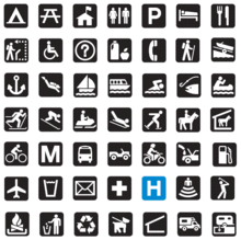
A map is a smaller representation of an area on the earth’s surface; therefore, map symbols are used to represent real objects. Without symbols, maps would not be possible.[3] Both shapes and colors can be used for symbols on maps. A small circle may mean a point of interest, with a brown circle meaning recreation, red circle meaning services, and green circle meaning rest stop. Colors may cover larger areas of a map, such as green representing forested land and blue representing waterways. To ensure that a person can correctly read a map, a map legend is a key to all the symbols used on a map. It is like a dictionary so you can understand the meaning of what the map represents/[3]
Rules to follow
There are certain rules to follow with map symbols. The representative symbols should always be placed on the left and defined to the right. This allows for the reader to view the symbol first, then its definition, which is customary in English dictionaries. In most cases, representative symbols should be vertically displayed and the symbols should be horizontally centred. The symbols should be vertically centred with the definitions. The definitions are supposed to be horizontally centred to the left.
Representing spatial phenomena
Symbols are used to represent geographic phenomena. Most phenomena can be represented by using point, line, or area symbols.[4] It is necessary to consider the spatial arrangement of the phenomena to determine what kind of symbolization it will require. Discrete phenomena occur at isolated points, whereas continuous phenomena occur everywhere. Both of these can also be broken down into either smooth or abrupt. For example, rainfall and taxes for states are both continuous in nature, but rainfall is smooth because it does not vary at state boundaries, leaving the tax to be considered abrupt. It is important to distinguish between real world and the data we use to represent it. There are basically five types of spatial dimensions that are used to classify phenomena for map symbolization. Point phenomena are assumed to have no spatial extent and are said to be zero-dimensional. These use point symbols on a map to indicate their location. An example of these would be fire hydrants or trees in a park. Linear phenomena are one-dimensional and have a length. This would include any line feature on a map like roads or sidewalks. Areal phenomena are 2-D that has both a length and a width. The best example of this would be a lake or other body of water. When volume comes into consideration, it is broken down into two types, 2 ½ dimensions and 3-D. A good example of 2 ½ D would be the elevation of a place above sea level, while 3-D being any three-dimensional objects.
Ranking
An important factor in map symbols is the order in which they are ranked according to their relative importance. This is known as intellectual hierarchy. The most important hierarchy is the thematic symbols and type labels that are directly related to the theme. Next comes the title, subtitle, and legend.[4] The map must also contain base information, such as boundaries, roads, and place names. Data source and notes should be on all maps. Lastly, the scale, neat lines, and north arrow are the least important of the hierarchy of the map. From this we see that the symbols are the single most important thing to build a good visual hierarchy that shows proper graphical representation. When producing a map with good visual hierarchy, thematic symbols should be graphically emphasized. A map with a visual hierarchy that is effective attracts the map user’s eyes to the symbols with the most important aspects of the map first and to the symbols with the lesser importance later.
The legend of the map also contains important information and all of the thematic symbols of the map. Symbol that need no explanation, or do not coincide with the theme of the map, are normally omitted from the map legend. Thematic symbols directly represent the maps theme and should stand out.[3]
Choropleth maps
Choropleth mapping is commonly used to show data for counties, states, or other enumeration units. Data collected for choropleth maps is usually grouped into separate classes based on attributes or other forms of classification. The classes are given a specific color or shading based on their values and what they are trying to portray. Choropleth maps are most effective when the data or classes change abruptly at each enumerated boundary.[5]
A proportional symbol map is better than choropleth maps for showing raw data totals. A proportional symbols map uses symbols that are proportional the data that they are representing with point locations. These symbols can be true points or conceptual points. True points represent real objects or the exact location of a tangible object. This could be an oil well or fire hydrant. A conceptual point represents the center of the enumeration unit, such as a corn field. The raw data on proportional symbol maps go hand in hand with the data shown on choropleth maps.[5]
Isopleth maps
Isopleth maps use isolines that connect points of equal values. A good example of isolines is connecting areas with similar temperatures. As with choropleth maps, Isopleth maps require standardized data to be appropriately contoured.
Dot maps
Dot maps use one single dot to represent where a single phenomenon is the most likely to occur. The total amount of dots can cover a single area or multiple areas. The density of the dots is interpreted by the user as areas of high value. This method is more accurate than proportional and Isopleth maps.[5]
References
- 1 2 Olson, J. M. (2006). "Cognitive Cartographic Experimentation". Cartographica: The International Journal for Geographic Information and Geovisualization: 34–44.
- 1 2 "Topographic Map Symbols". U.S. Geological Survey. April 28, 2005. Retrieved May 4, 2011.
- 1 2 3 "Map Symbols". Compass Dude. n.d. Retrieved May 4, 2011.
- 1 2 Krygier, J. & Wood, D. (2005). Making Maps: A Visual Guide to Map Design for GIS. New York: Guilford Press.
- 1 2 3 Slocum, T. A.; McMaster, R. B.; Kessler, F. C. & Howard, H. H. (2005). Thematic Cartography and Geographic Visualization. Upper Saddle River, NJ: Pearson Prentice Hall.