Map coloring
Map coloring is the act of assigning different colors to different features on a map. There are two very different uses of this term. The first is in cartography, choosing the colors to be used when producing a map. The second is in mathematics, where the problem is to determine the minimum number of colors needed to color a map so that no two adjacent features have the same colour.
Cartography
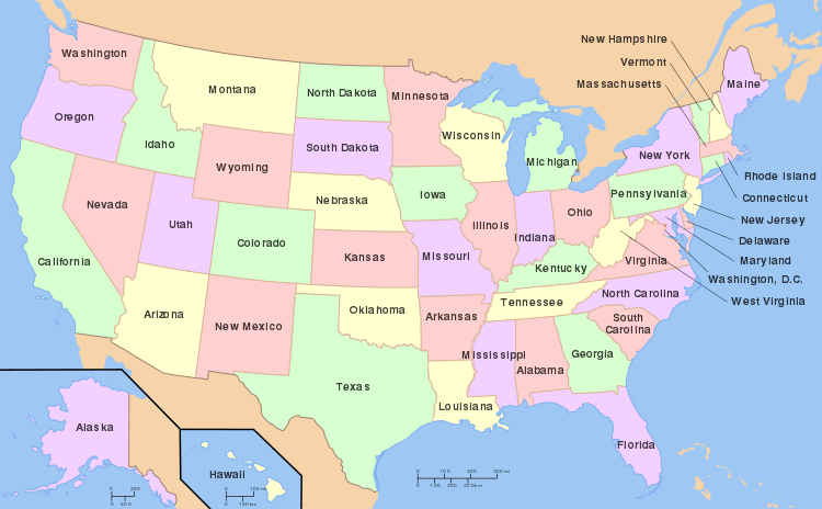
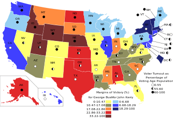
Color is a very useful attribute to depict different features on a map.[1] Typical uses of color include displaying different political divisions, different elevations, or different kinds of roads. A choropleth map is a thematic map in which areas are colored differently to show the measurement of a statistical variable being displayed on the map. The choropleth map provides an easy way to visualize how a measurement varies across a geographic area or it shows the level of variability within a region.
Displaying the data in different hues can greatly affect the understanding or feel of the map.[2] Also, the cartographer must take into account that many people have impaired color vision, and use colors that are easily distinguishable by these readers.[3]
Colors can also be used to produce three-dimensional effects from two-dimensional maps, either by explicit color-coding of the two images intended for different eyes, or by using the characteristics of the human visual system to make the map look three-dimensional.[4]
Mathematics
In mathematics there is a very strong link between map coloring and graph coloring, since every map showing different areas has a corresponding graph. By far the most famous result in this area is the four color theorem, which states that any planar map can be colored with at most four colors.
References
- ↑ Matt Rosenberg. "Map Colors - The Role of Colors on Maps".
- ↑ Robinson, A.H. (1967). "Psychological aspects of color in cartography". International Yearbook of Cartography. 7. pp. 50––61.
- ↑ Brewer, C. (1996). "Guidelines for selecting colors for diverging schemes on maps". The Cartographic Journal. 33 (2). Maney Publishing. pp. 79––86.
- ↑ Eyton, J.R. (1990). "Color stereoscopic effect cartography". Cartographica: The International Journal for Geographic Information and Geovisualization. UT Press. 27 (1): 20–29. doi:10.3138/K213-2288-7672-U72T.