Logo of the BBC
|
The blocks, the logo of the BBC since 1997 | |
| Industry | Broadcasting |
|---|---|
| Genre | General |
| Headquarters | London, United Kingdom |
| Website |
www |
The BBC logo has been a brand identity for the corporation and its work since the 1960s in a variety of designs. Until the introduction of a logo in 1958, the corporation had relied on its coat of arms for official documentation and correspondence, although this crest rarely appeared onscreen. With the increased role of television for the BBC in the 1960s, particularly after the foundation of ITV, the corporation used its logo to increase viewer familiarity and to standardise their image and content. The logo has since been redesigned a number of times, most recently, in 1997, with the BBC blocks, a logo designed to work across media.[1] From 1958, for this television network, there are five different logos. The first logo of network is used from 1958 to 1963, the second logo is used from 1963 to 1971, the third logo is used from 1971 to 1991, the fourth logo is used from 1988 to 1997, and the fifth and current logo is used from 1997.
History
Before the logo
Before the BBC introduced its logo itself, in the form of the slanted boxes, the BBC used a variety of different symbols with which to represent itself. In printed media and corporation correspondence, it used the BBC coat of arms, while on screen, it used a different logo type. Originally, it used a stylised BBC text on early equipment, not unlike the caption that accompanied the BBC1 COW globe. This logo was rarely seen on screen, with captions containing the words "BBC Television Service" along with matching clock. In 1932, when the original reception room of the BBC Broadcasting House in London opened, a logo was laid in mosaic on the floor. This logo was merely a stylized entwining of two capital B's, one facing either direction, linked by a C in the centre. This mosaic logo is still visible on the floor today, though the area no longer serves as the BBC's main reception room.
1950s
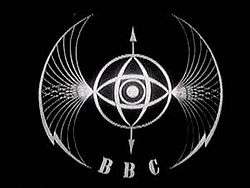
The first incarnation of the BBC blocks logo appeared in 1958. It consisted of square boxes with slanted letters, not unlike the first slanted logo seen in the 1960s. In 1953, Abram Games was commissioned to design an on-air image. Nicknamed the 'bat's wings,' it consisted of a rounded brass contraption with a tiny spinning globe in its centre, with large wing-like protrusions flanked by lightning bolts on either side. For BBC Scotland, the globe in the centre was replaced by a lion.[2] In the 1950s, the BBC began using logos to differentiate their channels from one another.[3] The BBC1 logo at this time was a circular clock with BBC1 in bubble letters below it.
1960s
In the 1960s, the main BBC logo consisted of slanted boxes with italicised bold lettering. This was introduced soon after the introduction of ITV in 1955. This type of logo would go on captions at the end of productions as well as on cameras and other equipment used by the BBC. They became important when popular BBC programmes and clips from the BBC archives were being sold to be aired on other networks and channels.[1] It was in the early 1960s that the 'bat's wings' logo ceased to be used. It was superseded by the BBC TV logo within a circle, behind which would appear a map of Britain split into broadcast regions. This set the style for a succession of circular images.[4] On 30 September 1963, the BBC's globe logo first appeared. This was a striped line broken in the middle by a globe, with BBC 1 in block letters below it. When it appeared, the continuity announcer would say 'This is BBC Television' while the globe spun.[4] saw the creation of BBC 1 and BBC 2 brands, with the distinctive horizontal stripes across the screen. In April 1964, BBC2 was launched. Its logo was similar to that of BBC1, featuring the distinctive horizontal stripe, but with a large 2 in the centre with the BBC blocks beneath. As part of the publicity campaign for the new channel, artist Desmond Marwood created images of a kangaroo, named Hullabaloo, with a baby named Custard in its pouch, to represent the new station.[4] In 1969, when BBC 1 began broadcasting in colour, it introduced the 'mirror globe' logo. This logo show a rotating blue globe superimposed over a flat globe, as on a map. Below the globes there is a line and the words BBC 1 COLOUR.[4] The word 'colour' was included to remind viewers still watching in black and white to purchase a colour TV set.
1970s
In 1971, a new softer logo was made, rounding off the boxes and making the spaces between the boxes larger. This logo was used on BBC merchandise, as well as the BBC1 idents and the BBC2 clock. More now than ever, merchandise was being branded with the logo, as more productions were being sold via the BBC's American identity, Lionheart Television. Also, records and videos were now starting to be produced and a corporate identity was getting more and more essential to ensuring that the audience knew it was authentic and that the quality programmes they were watching could be attributed to the BBC.[1] The mirror globe began using a more ornate font in 1972. From the mid-1970s to the mid-1980s, the BBC1 channel logo used several different fonts, but with each change the logo remained blue. At this time, BBC logos were mechanical models filmed by black-and-white cameras. Colour was added afterwards, electronically, rendering it simple to change the colour as needed.[4] In 1967, BBC2 introduced a logo featuring a blue 2 with a dot in the curve of the 2 and the word COLOUR underneath. In 1979, BBC2 debuted the first-ever computer-generated logo, a 2 flanked by a double line on the side. The symbols appeared on a black background, then disappeared. This logo remained in use until 1991.[5]
1980s
In August 1988, the BBC produced yet another new logo. Since the last one was made, a consumer brand was becoming part of nearly every TV station and corporation at the time (and, at ITV, had been so for many years). The BBC needed a strong and unified identity, and a change of said identity was key. Michael Peters was hired to design this all inclusive BBC identity for the corporation. They modified the then-current logo by sharpening up the parallelogram edges again and set them to an angle of 17 degrees without reducing the size of the spaces between the boxes. They also sharpened up the text to make it match the clarity of the logo itself. The typeface used was Helvetica Nue. Also, under-logo lines were added to the logo for the first time. These lines were coloured blue, red, green to reflect the flags of Scotland, Wales, and Northern Ireland respectively (an "English-bias" has always been a criticism of the BBC), as well as the three phosphors of colour television. These appeared on the BBC national-region identities from the identities' début in 1988 and its gradual television début over the period 1989–1991.
Previously, in 1986, the electronically generated BBC2 logo was updated. The number 2 was replaced with the word TWO. The letters were white, 3D letters on a white background with red striping on the T as well as green and blue striping on the W. The word TWO appeared and faded on the white background.[6]
The rebrands of both BBC1 and BBC2 in February 1991 were also based on the then-current BBC corporate identity, when these two channels were given a total corporate look, unlike previous ways of branding the channels.[1]
1990s

In the mid-1990s, when employed to rebrand BBC1, Martin Lambie-Nairn suggested that he look into the current logo choice and see what he could do, given that, the BBC at the time was also looking into the BBC brand as a whole. What he noticed, was that the BBC had a system that meant that every service or department had a different logo scheme. It had a BBC logo and the name with character. Lambie-Nairn decided to address this when he took on the project, as with all these logos, the core brand itself was severely weakened. It was also appropriate to look at the way the BBC was branded, as the BBC was about to take off in digital television and the internet, among other different ventures. After seeing a number of problems with the current logo, he decided that a new logo was necessary. The logo was technically unsuitable on-screen. When shrunk, it lost the lines underneath and the counters (the sections in the Bs) and also, when in colour on a colour photo, it again disappeared or parts vanished. Also, on a TV or computer, diagonals are difficult to work with as the logos pixelate, and anti-aliasing is required to make the logo work. The previous logo also followed the idea of the slanted boxes, and related the BBC back to the very first logo in the 1950s and 1960s, which was not what the corporation wanted at that time. Technically, the logo never looked comfortable next to the brand and straight letters. Finally, it was expensive to print as stationery would always have four-colour letterheads, and alongside other BBC brands could mean anything up to ten-colour letterheads and stationery.[1]
Lambie-Nairn's solution is the BBC logo that has been used on-screen since 4 October 1997. By straightening up the boxes and letters, it removed all the problems associated with diagonals and those associated with disappearing lines. This kept the boxes' shape, so that it would still be familiar with what people know about the BBC. The typeface used is Gill Sans, made by Eric Gill. It was chosen because, it was elegant, robust and has a timeless appeal: the typeface had been created 60 years before and so avoided the typeface looking outdated at a later date. This typeface also eliminated the disappearing counters issue, as the counters of the Bs were much larger. Appropriately, some of Gill's statues adorn the exterior of Broadcasting House. The logo was also designed so that anything could be added after the BBC logo, be it department, corporate, brand, TV, radio, etc. Also, by using this system, everything looked like it came from the same organisation, and it was also easy to add new logos. This system also only used black and white letterheads, meaning a big cost saving to the BBC and the licence fee payer.
The only visible issue with the system, was that the logo for the BBC television and radio brands did not reflect their genre or appeal to the tastes of their target audiences. Lambie-Nairn proposed to show this as personality in the idents themselves, and evidence of this can be seen in the idents for BBC One made just after the logo was introduced. The BBC One balloons were made using the new logo, with the personality device in the balloons. The BBC Two idents, the 2s remained the same but with the new logo added underneath.[1]
2000s
In 2002, the BBC One balloon idents were discontinued, as was the globe. They were replaced with 'Rhythm & Movement', with multi-cultural dancers dancing to various musical styles.[4] In 2006, BBC One Channel Controller Peter Fincham began a series of diverse channel idents playing out to this day, featuring, among many other things, hippos, surfers and cartoon characters Wallace and Gromit.[4] The current central logo of the BBC is still the BBC Blocks. It is the longest-used logo by the BBC.
See also
- History of BBC television idents
- Noddy, the BBC1 mirrored globe ident
References
- 1 2 3 4 5 6 Hayden Walker, History of BBC corporate logos, TV ARK. Retrieved 20 November 2010.
- ↑ The BBC logo story
- ↑ "BBC logo design evolution - Logo Design Love".
- 1 2 3 4 5 6 7 http://www.bbc.co.uk/historyofthebbc/resources/in-depth/bbc_logo.shtml
- ↑ "TVARK - BBC One - Idents & Continuity".
- ↑ "BBC2 cont. & Travel Show Intro, Jan 1989". YouTube.
External links
- BBC corporate logo at TV ARK.
- The BBC logo story at BBC Online.
- Branding guidelines and logos at BBC Online.
| Services | |||||||||||||||
|---|---|---|---|---|---|---|---|---|---|---|---|---|---|---|---|
| Management |
| ||||||||||||||
| Divisions | |||||||||||||||
| Nations and regions |
| ||||||||||||||
| Commercial subsidiaries | |||||||||||||||
| History | |||||||||||||||
| Key properties (full list) |
| ||||||||||||||
| Finance | |||||||||||||||
| Projects | |||||||||||||||
| |||||||||||||||