Line length
In typography, line length is the width of a block of typeset text, usually measured in units of length like inches or points or in characters per line. A block of text or paragraph has a maximum line length that fits a determined design.
Line length is determined by typographic parameters based on a formal grid and template with several goals in mind; balance and function for fit and readability with a sensitivity to aesthetic style in typography. Typographers adjust line length to aid legibility or copy fit. Text can be flush left and ragged right, flush right and ragged left, or justified where all lines are of equal length. In a ragged right setting line lengths vary to create a ragged right edge of lines varying in length. Sometimes this can be visually satisfying. For justified and ragged right settings typographers can adjust line length to avoid unwanted hyphens, rivers of white space, and orphaned words/characters at the end of lines (e.g.: "The", "I", "He", "We").
Printed text
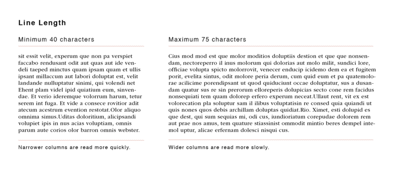
Traditional line length research, limited to print based text, resulted in a variety of results but generally for printed text it is widely accepted that line length fall between 45-75 characters per line (cpl), though the ideal is 66 cpl (including letters and spaces).[1] For conventional books line lengths tend to be 30 times the size of the type, but between 20 and 40 times is considered acceptable (i.e. 30 x 10pt font = 300 pt line).[1] Early studies considered line lengths between 59–97 mm (about 57 cpl) is optimum for 10 point font.[2] For printed works with multiple columns 40-50 cpl is often better.[1] For justified, English language text the minimum number of characters per line is 40 characters; anything less than 38-40 characters often results in splotches of white spaces (or rivers) or too many hyphenations in the block of text.[1] Longer lines (between 85-90 cpl) may be acceptable for discontinuous text such as in bibliographies or footnotes, but for continuous text lines with more than 80 characters may be too long. Short text, such as ragged marginal notes, may be as little as 12-15 characters per line.[1] Studies have shown that short lines are often preferred over long lines by study participants, likely because they feel more at ease with format, which contradicts research suggesting longer lines are best for quick reading.[3]
Electronic text
Screen reading may be more difficult making the adoption of traditional line length research to the digital format problematic.[4] Unlike with printed text glare, flicker, and Scrolling/paging all need to be considered.[5] Technological progress has made reading on screen much easier. How much or little scrolling is required to read the text will influence the speed of reading digital text. On-screen reading tasks can be completed faster with text containing long lines which allow the user to quickly scan across the page. Some studies have shown that 100 cpl can be read faster than lines with 25 characters, but the level of comprehension remains the same.[4] In order for on-screen text to have both the best speed and comprehension possible about 55 cpl should be used.[6] Like with printed text if lines are too long or too short it will result in slower reading. If lines are too long it is difficult for the reader to quickly return to the start of the next line (saccade) whereas if lines are too short more scrolling or paging will be required.[6] Research suggests that longer lines are better for quick scanning, but shorter lines are better for accuracy.[3] Longer lines should be used when the information will likely be scanned, while shorter lines should be used when the information is meant to be read thoroughly.[3] Web design is often intended to be read in full rather than skimmed, so shorter lines should be used when possible.[3]
References
- 1 2 3 4 5 Bringhurst, R. (1992). Horizontal Motion. The Elements of Typographic Style, pp 25-36. Point Roberts, WA: Hartley & Marks.
- ↑ Tinker, M. A., & Paterson, D. G. (1929). Studies of typographical factors influencing speed of reading. III. Length of line. Journal of Applied Psychology, 13(3), 205-219.
- 1 2 3 4 Ling, J., & Van Schaik, P. (2006). The influence of font type and line length on visual search and information retrieval in web pages. International Journal of Human-Computer Studies, 64(5), 395-404.
- 1 2 Dyson, M. C., & Kipping, G. J. (1998). The Effects of Line Length and Method of Movement on Patterns of Reading from Screen. Visible Language, 32(2), 150-181.
- ↑ Nanavati, A. A., & Bias, R. G. (2005). Optimal line length in reading - a literature review. Visible Language, 29(2), 121-145.
- 1 2 Dyson, M. C., & Haselgrove, M. (2001). The influence of reading speed and line length on the effectiveness of reading from screen. International Journal of Human-Computer Studies, 54(4), 585-612.