Cycle button
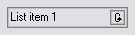
A cycle button or toggle button is a graphical control element that allows the user to choose one from a predefined set of options.[1] It is used as a button the content of which changes with each click and cycles between two or more values;[1] the currently displayed value is the user's choice.
A cycle button's advantage over radio buttons or a list box is that it takes less screen space;[1] its advantage over a drop-down list is that a single mouse click is enough to switch between the two options. However, a disadvantage is that, if the button has many options, a lot of clicks are needed to switch to the desired one. This is why some GUI environments have the ability to display the same element as a cycle button or a drop-down list, depending on the number of options.
References
- 1 2 3 "Cycle button". Usability Glossary. Usability First. Retrieved 2011-06-25.