Complementary colors

Complementary colors are pairs of colors which, when combined, cancel each other out. This means that when combined, they produce a grey-scale color like white or black.[1] When placed next to each other, they create the strongest contrast for those particular two colors. Due to this striking color clash, the term opposite colors is often considered more appropriate than "complementary colors".
Which pairs of colors are considered complementary depends on the color theory one uses:
- Modern color theory uses either the RGB additive color model or the CMY subtractive color model, and in these, the complementary pairs are red–cyan, green–magenta, and blue–yellow.
- In the traditional RYB color model, the complementary color pairs are red–green, yellow–purple, and blue–orange, though these pairings fail the modern definition of complementary colors, as they produce a brown color when combined.
- Opponent process theory suggests that the most contrasting color pairs are red–green, and blue–yellow.
Complementary colors in different color models
Traditional color model
On the traditional color wheel developed in the 18th century (see 1708 illustration by Boutet below), used by Claude Monet and Vincent van Gogh and other painters, and still used by many artists today, the primary colors were considered to be red, yellow, and blue, and the primary–secondary complementary pairs are red–green, orange–blue, and yellow–purple[2] (or yellow–purple in Boutet's color wheel).
In the traditional representation, a complementary color pair is made up of a primary color (yellow, blue or red) and a secondary color (green, purple or orange). For example, yellow is a primary color, and painters can make purple by mixing of red and blue;[3] so when yellow and purple paint are mixed, all three primary colors are present. Since paints work by absorbing light, having all three primaries together results in a black or gray color (see subtractive color). In more recent painting manuals, the more precise subtractive primary colors are magenta, cyan and yellow.[4]
Complementary colors can create some striking optical effects. The shadow of an object appears to contain some of the complementary color of the object. For example, the shadow of a red apple will appear to contain a little blue-green. This effect is often copied by painters who want to create more luminous and realistic shadows. Also, if you stare at a square of color for a long period of time (thirty seconds to a minute), and then look at a white paper or wall, you will briefly see an afterimage of the square in its complementary color.
Placed side by side as tiny dots, in partitive color mixing, complementary colors appear gray.[5]
Colors produced by light
The RGB color model, invented in the 19th century and fully developed in the 20th century, uses combinations of red, green, and blue light against a black background to make the colors seen on a computer monitor or television screen. In the RGB model, the primary colors are red, green and blue. The complementary primary–secondary combinations are red–cyan, green–magenta, and blue–yellow. In the RGB color model, the light of two complementary colors, such as red and cyan, combined at full intensity, will make white light, since two complementary colors contain light with the full range of the spectrum. If the light is not fully intense, the resulting light will be gray.
In some other color models, such as the HSV color space, the neutral colors (white, greys, and black) lie along a central axis. Complementary colors (as defined in HSV) lie opposite each other on any horizontal cross-section. For example, in the CIE 1931 color space a color of a "dominant" wavelength can be mixed with an amount of the complementary wavelength to produce a neutral color (gray or white).
-
.svg.png)
A traditional color star developed in 1867 by Charles Blanc. The traditional complementary colors used by 19th-century artists such as Van Gogh, Monet and Renoir are directly opposite each other.
-

The colors of the RGB color model, which uses combinations of red, green, and blue light on a black screen to create all the colors seen on a computer display or television. Complementary colors are opposite each other.
-

The HSV color wheel has the same complementary colors as the RGB color model, but shows them in three dimensions.
-
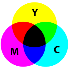
In the CMYK color model used in color printing, the primary colors magenta, cyan and yellow together make black, and the complementary pairs are magenta–green, yellow–blue, and cyan–red.


Color printing
Color printing, like painting, also uses subtractive colors, but the complementary colors are different from those used in painting, because they mask light. As a result, the same logic applies as to colors produced by light. Color printing uses the CMYK color model, making colors by overprinting cyan, magenta, yellow, and black ink. In printing the most common complementary colors are magenta–green, yellow–blue, and cyan–red. In terms of complementary/opposite colors, this model gives exactly the same result as using the RGB model. Black is added when needed to make the colors darker.
In history and art
In color theory
The effect that colors have upon each other had been noted since antiquity. In his essay On Colors, Aristotle observed that "when light falls upon another color, then, as a result of this new combination, it takes on another nuance of color."[6] Saint Thomas Aquinas had written that purple looked different next to white than it did next to black, and that gold looked more striking against blue than it did against white; the Italian Renaissance architect and writer Leon Battista Alberti observed that there was harmony (coniugatio in Latin, and amicizia in Italian) between certain colors, such as red–green and red–blue; and Leonardo da Vinci observed that the finest harmonies were those between colors exactly opposed (retto contrario), but no one had a convincing scientific explanation why that was so until the 18th century.
In 1704, in his treatise on optics, Isaac Newton devised a circle showing a spectrum of seven colors. In this work and in an earlier work in 1672, he observed that certain colors around the circle were opposed to each other and provided the greatest contrast; he named red and blue, yellow and violet, and green and "a purple close to scarlet."[7]
In the following decades, scientists refined Newton's color circle, eventually giving it twelve colors: the three primary colors (yellow, blue, and red); three secondary colors (green, purple and orange), made by combining primary colors; and six additional colors, made by combining the primary and secondary colors.
In 1793, the American-born British scientist Benjamin Thompson, Count Rumford (1753–1814), coined the term complementary colors. While staying at an inn in Florence, he made an experiment with candles and shadows, and discovered that colored light and the shadow cast by the light had perfectly contrasting colors. He wrote, "To every color, without exception, whatever may be its hue or shade, or however it may be compounded, there is another in perfect harmony to it, which is its complement, and may be said to be its companion." He also noted some of the practical benefits of this discovery. "By experiments of this kind, which might easily be made, ladies may choose ribbons for their gowns, or those who furnish rooms may arrange their colors upon principles of the most perfect harmony and of the purest taste. The advantages that painters might derive from a knowledge of these principles of the harmony of colors are too obvious to require illustration."[8]
In the early 19th century, scientists and philosophers across Europe began studying the nature and interaction of colors. The German poet Johann Wolfgang von Goethe presented his own theory in 1810, stating that the two primary colors were those in the greatest opposition to each other, yellow and blue, representing light and darkness. He wrote that "Yellow is a light which has been dampened by darkness; blue is a darkness weakened by light."[9] Out of the opposition of blue and yellow, through a process called "steigerung, or "augementation" a third color, red, was born. Goethe also proposed several sets of complementary colors which "demanded" each other. According to Goethe, "yellow 'demands' violet; orange [demands] blue; purple [demands] green; and vice versa".[10] Goethe's ideas were highly personal and often disagreed with other scientific research, but they were highly popular and influenced some important artists, including J.M.W. Turner.[11]
At about the same time that Goethe was publishing his theory, a British physicist, doctor and Egyptologist, Thomas Young (1773–1829), showed by experiments that it was not necessary to use all the colors of spectrum to create white light; it could be done by combining the light of just three colors; red orange, green, and blue. This discovery was the foundation of additive colors, and of the RGB color model.[12] He showed that it was possible to create magenta by combining red and blue light; to create yellow by mixing red and green light; and to create cyan, or blue-green, by mixing green and blue. He also found that it was possible to create virtually any other color by modifying the intensity of these colors. This discovery led to the system used today to create colors on a computer or television display. Young was also the first to propose that the retina of the eye contained nerve fibers which were sensitive to three different colors. This foreshadowed the modern understanding of color vision, in particular the finding that the eye does indeed have three color receptors which are sensitive to different wavelength ranges.[13]
At about the same time as Young discovered additive colors, another British scientist, David Brewster (1781–1868), the inventor of the kaleidoscope, proposed a competing theory that the true primary colors were red, yellow, and blue, and that the true complementary pairs were red–green, blue–orange, and yellow–purple. Then a German scientist, Hermann von Helmholtz, (1821–1894), resolved the debate by showing that colors formed by light, additive colors, and those formed by pigments, subtractive colors, did in fact operate by different rules, and had different primary and complementary colors.[14]
Other scientists looked more closely at the use of complementary colors. In 1828, the French chemist Eugene Chevreul, making a study of the manufacture of Gobelin tapestries to make the colors brighter, demonstrated scientifically that "the arrangement of complementary colors is superior to any other harmony of contrasts." His 1839 book on the subject, De la loi du contraste simultané des couleurs et de l'assortiment des objets colorés, showing how complementary colors be used in everything from textiles to gardens, was widely read in Germany, France and England, and made complementary colors a popular concept. The use of complementary colors was further publicized by the French art critic Charles Blanc in his book Grammaire des arts et du dessin (1867) and later by the American color theorist Ogden Rood in his book Modern Chromatics (1879). These books were read with great enthusiasm by contemporary painters, particularly Georges Seurat and Vincent van Gogh, who put the theories into practice in their paintings.[15]
-
Newton's color circle (1704) displayed seven colors. He declared that colors opposite each other had the strongest contrast and harmony.
-
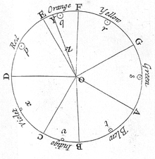
A Boutet color circle from 1708 showed the traditional complementary colors; red and green, yellow and purple, and blue and orange.
-

The color wheel designed by Johann Wolfgang von Goethe (1810) was based on the idea that the primary colors yellow and blue, representing light and darkness, were in opposition to each other.
In art
In 1872, Claude Monet painted Impression, Sunrise, a tiny orange sun and some orange light reflected on the clouds and water in the centre of a hazy blue landscape. This painting, with its striking use of the complementary colors orange and blue, gave its name to the impressionist movement. Monet was familiar with the science of complementary colors, and used them with enthusiasm. He wrote in 1888, "color makes its impact from contrasts rather than from its inherent qualities....the primary colors seem more brilliant when they are in contrast with their complementary colors."[16]
Orange and blue became an important combination for all the impressionist painters. They all had studied the recent books on color theory, and they know that orange placed next to blue made both colors much brighter. Auguste Renoir painted boats with stripes of chrome orange paint straight from the tube. Paul Cézanne used orange made of touches of yellow, red and ochre against a blue background.
Vincent van Gogh was especially known for using this technique; he created his own oranges with mixtures of yellow, ochre and red, and placed them next to slashes of sienna red and bottle green, and below a sky of turbulent blue and violet. He also put an orange moon and stars in a cobalt blue sky. He wrote to his brother Theo of "searching for oppositions of blue with orange, of red with green, of yellow with purple, searching for broken colors and neutral colors to harmonize the brutality of extremes, trying to make the colors intense, and not a harmony of greys."[17]
Describing his painting, The Night Café, to his brother Theo in 1888, Van Gogh wrote: "I sought to express with red and green the terrible human passions. The hall is blood red and pale yellow, with a green billiard table in the center, and four lamps of lemon yellow, with rays of orange and green. Everywhere it is a battle and antithesis of the most different reds and greens."[18]
-
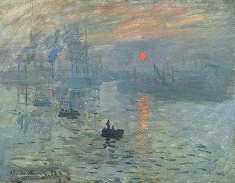
Impression, Sunrise by Claude Monet (1872) featured a tiny but vivid orange sun against a blue background. The painting gave its name to the Impressionist movement.
-

Oarsmen at Chatou by Pierre-Auguste Renoir (1879). Renoir knew that orange and blue brightened each other when put side by side.
-
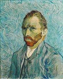
In his self-portrait, Van Gogh made the most of the contrast between the orange of his hair and the blue background.
-
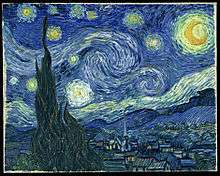
Starry Night by Vincent van Gogh, features orange stars and an orange moon.(1889)
-
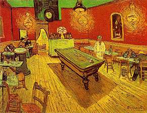
The Night Café, (1888), by Vincent van Gogh, used red and green to express what Van Gogh called "the terrible human passions."
Afterimages
When one stares at a single color (red for example) for a sustained period of time (roughly thirty seconds to a minute), then looks at a white surface, an afterimage of the complementary color (in this case cyan) will appear. This is one of several aftereffects studied in the psychology of visual perception which are generally ascribed to fatigue in specific parts of the visual system.
In the case above the photoreceptors for red light in the retina are fatigued, lessening their ability to send the information to the brain. When white light is viewed, the red portions of light incident upon the eye are not transmitted as efficiently as the other wavelengths (or colors), and the result is the illusion of viewing the complementary color since the image is now biased by loss of the color, in this case red. As the receptors are given time to rest, the illusion vanishes. In the case of looking at the white light, red light is still incident upon the eye (as well as blue and green), however since the receptors for other light colors are also being fatigued, the eye will reach an equilibrium.
Practical applications
The use of complementary colors is an important aspect of aesthetically pleasing art and graphic design. This also extends to other fields such as contrasting colors in logos and retail display. When placed next to each other, complements make each other appear brighter.
Complementary colors also have more practical uses. Because orange and blue are complementary colors, life rafts and life vests are traditionally orange, to provide the highest contrast and visibility when seen from ships or aircraft over the ocean.
Red and cyan glasses are used in the Anaglyph 3D system to produce 3D images on computer screens.
-
_check_life_rafts_for_survivors_Sept._6%2C_2009_following_the_sinking_of_a_Philippine_super_ferry.jpg)
Orange life rafts provide the highest contrast and visibility seen against blue water.
-
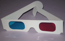
Red and cyan glasses are used for viewing Anaglyph 3D three-dimensional images on the Internet or in print.
-

This image, viewed with red and cyan Anaglyph 3D glasses, will appear in three dimensions.
See also
References
- Isabelle Roelofs and Fabien Petillion, La couleur expliquée aux artistes, Editions Eyrolles, (2012), ISBN 978-2-212-13486-5.
- John Gage, Couleur et Culture, Usages et significations de la couleur de l'Antiquité à l'abstraction, (1993), Thames and Hudson ISBN 978-2-87811-295-5
- Philip Ball, Histoire vivante des couleurs (2001), Hazan Publishers, Paris, ISBN 978-2-754105-033
- Goethe, Theory of Colours, trans. Charles Lock Eastlake, Cambridge, MA: MIT Press, 1982. ISBN 0-262-57021-1
Notes and citations
| Wikimedia Commons has media related to Complementary colors. |
- ↑ Shorter Oxford English Dictionary, 5th Edition, Oxford University Press (2002) "A colour that combined with a given colour makes white or black."
- ↑ Maloney, Tim (2009). Get Animated!: Creating Professional Cartoon Animation On Your Home Computer. Random House Digital. p. PT32. ISBN 9780823099214.
- ↑ Hammond, Lee (2006). Acrylic Painting With Lee Hammond. North Light Books. ISBN 9781600615801.
- ↑ for example, see Isabelle Roelofs and Fabien Petillion, La Couleur expliquée aux artistes, p. 16
- ↑ David Briggs (2007). "The Dimensions of Color". Retrieved 2011-11-23.
- ↑ On Colors or De Coloribus (793b) cited in John Gage, Couleur et Culture, pg. 13
- ↑ John Gage, Couleur et culture, pg. 172.
- ↑ Benjamin Thompson, Count Rumford, Conjectures respecting the Principle of the Harmony of Colors, The Complete Works of Count Rumford, Volume 5, pp. 67–68. (Google Books).
- ↑ Goethe (1810), Theory of Colors, paragraph 502.
- ↑ Goethe, Theory of Colours, trans. Charles Lock Eastlake, Cambridge, MA: MIT Press, 1982. ISBN 0-262-57021-1
- ↑ John Gage, Couleur et Culture, pp. 201–203.
- ↑ Isabelle Roelofs and Fabien Petillion, La couleur expliqée aux artistes, p. 14.
- ↑ Young, T. (1802). "Bakerian Lecture: On the Theory of Light and Colours". Phil. Trans. R. Soc. Lond. 92: 12–48. doi:10.1098/rstl.1802.0004.
- ↑ Isabelle Roelofs and Fabien Petillion, La couleur expliquée aux artistes, p. 18.
- ↑ John Gage, Couleur et culture, pp. 174–75
- ↑ Philip Ball, Histoire vivante des couleurs, p. 260.
- ↑ Vincent van Gogh, Lettres à Theo, p. 184.
- ↑ Vincent van Gogh, Corréspondénce general, number 533, cited by John Gage, Practice and Meaning from Antiquity to Abstraction.
Color topics | |||||||||||
|---|---|---|---|---|---|---|---|---|---|---|---|
| Color science |
| ||||||||||
| Color philosophy | |||||||||||
| Color terms |
| ||||||||||
| Color organizations | |||||||||||
| Lists | |||||||||||
| Related | |||||||||||
| |||||||||||