Color temperature

The color temperature of a light source is the temperature of an ideal black-body radiator that radiates light of comparable hue to that of the light source. Color temperature is a characteristic of visible light that has important applications in lighting, photography, videography, publishing, manufacturing, astrophysics, horticulture, and other fields. In practice, color temperature is only meaningful for light sources that do in fact correspond somewhat closely to the radiation of some black body, i.e., those on a line from reddish/orange via yellow and more or less white to blueish white; it does not make sense to speak of the color temperature of, e.g., a green or a purple light. Color temperature is conventionally expressed in kelvins, using the symbol K, a unit of measure for temperature based on the Kelvin scale.
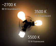
Color temperatures over 5000 K are called cool colors (bluish white), while lower color temperatures (2700–3000 K) are called warm colors (yellowish white through red).[1] This relation, however, is a psychological one in contrast to the physical relation implied by Wien's displacement law, according to which the spectral peak is shifted towards shorter wavelengths (resulting in a more blueish white) for higher temperatures.
Categorizing different lighting
| Temperature | Source |
|---|---|
| 1700 K | Match flame, low pressure sodium lamps (LPS/SOX) |
| 1850 K | Candle flame, sunset/sunrise |
| 2400 K | Standard incandescent lamps |
| 2550 K | Soft white incandescent lamps |
| 2700 K | "Soft white" compact fluorescent and LED lamps |
| 3000 K | Warm white compact fluorescent and LED lamps |
| 3200 K | Studio lamps, photofloods, etc. |
| 3350 K | Studio "CP" light |
| 4100 – 4150 K | Moonlight [2] |
| 5000 K | Horizon daylight |
| 5000 K | Tubular fluorescent lamps or cool white / daylight
compact fluorescent lamps (CFL) |
| 5500 – 6000 K | Vertical daylight, electronic flash |
| 6200 K | Xenon short-arc lamp [3] |
| 6500 K | Daylight, overcast |
| 6500 – 9500 K | LCD or CRT screen |
| 15,000 – 27,000 K | Clear blue poleward sky |
| These temperatures are merely characteristic; considerable variation may be present. | |

The color temperature of the electromagnetic radiation emitted from an ideal black body is defined as its surface temperature in kelvins, or alternatively in mireds (micro-reciprocal kelvins).[4] This permits the definition of a standard by which light sources are compared.
To the extent that a hot surface emits thermal radiation but is not an ideal black-body radiator, the color temperature of the light is not the actual temperature of the surface. An incandescent lamp's light is thermal radiation, and the bulb approximates an ideal black-body radiator, so its color temperature is essentially the temperature of the filament. Thus a relatively low temperature emits a dull red and a high temperature emits the almost white of the traditional incandescent light bulb
Many other light sources, such as fluorescent lamps, or LEDs (light emitting diodes) emit light primarily by processes other than thermal radiation. This means that the emitted radiation does not follow the form of a black-body spectrum. These sources are assigned what is known as a correlated color temperature (CCT). CCT is the color temperature of a black-body radiator which to human color perception most closely matches the light from the lamp. Because such an approximation is not required for incandescent light, the CCT for an incandescent light is simply its unadjusted temperature, derived from the comparison to a black-body radiator.
The Sun
The Sun closely approximates a black-body radiator. The effective temperature, defined by the total radiative power per square unit, is about 5780 K.[5] The color temperature of sunlight above the atmosphere is about 5900 K.[6]
As the Sun crosses the sky, it may appear to be red, orange, yellow or white depending on its position. The changing color of the Sun over the course of the day is mainly a result of scattering of light and is not due to changes in black-body radiation. The blue color of the sky is caused by Rayleigh scattering of the sunlight from the atmosphere, which tends to scatter blue light more than red light.
Some early morning and evening light (golden hours) has a lower color temperature due to increased low-wavelength light scattering by the Tyndall effect. This effect was especially pronounced with the increase in small dust particles in the atmosphere after the eruptions of Mount Tambora in 1815 and Krakatoa in 1883, which gave rise to intense red sunsets around the world.
Daylight has a spectrum similar to that of a black body with a correlated color temperature of 6500 K (D65 viewing standard) or 5500 K (daylight-balanced photographic film standard).

For colors based on black-body theory, blue occurs at higher temperatures, whereas red occurs at lower temperatures. This is the opposite of the cultural associations attributed to colors, in which "red" is "hot", and "blue" is "cold".[7]
Applications
Lighting
For lighting building interiors, it is often important to take into account the color temperature of illumination. For example, a warmer (i.e., lower color temperature) light is often used in public areas to promote relaxation, while a cooler (higher color temperature) light is used to enhance concentration in offices.[8]
CCT dimming for LED technology is regarded as a difficult task, since binning, age and temperature drift effects of LEDs change the actual color value output. Here feedback loop systems are used for example with color sensors, to actively monitor and control the color output of multiple color mixing LEDs.[9]
Aquaculture
In fishkeeping, color temperature has different functions and foci, for different branches.
- In freshwater aquaria, color temperature is generally of concern only for producing a more attractive display. Lights tend to be designed to produce an attractive spectrum, sometimes with secondary attention to keeping plants alive.
- In a saltwater/reef aquarium, color temperature is an essential part of tank health. Within about 400 to 3000 nanometers, light of shorter wavelength can penetrate deeper into water than longer wavelengths,[10][11][12] providing essential energy sources to the algae hosted in (and sustaining) coral. This is equivalent to an increase of color temperature with water depth in this spectral range. Because coral, typically living in shallow water, receives intense, direct tropical sunlight, the focus was once on simulating this with 6500 K lights. Higher temperature light sources have become more popular, first with 10000 K and more recently 16000 K and 20000 K. Meanwhile, actinic lighting is used to make the somewhat fluorescent colors of many corals and fish "pop", creating brighter "display" tanks.
Digital photography
In digital photography, color temperature is sometimes used interchangeably with white balance, which allow a remapping of color values to simulate variations in ambient color temperature. Most digital cameras and RAW image software provide presets simulating specific ambient values (e.g., sunny, cloudy, tungsten, etc.) while others allow explicit entry of white balance values in kelvins. These settings vary color values along the blue–yellow axis, while some software includes additional controls (sometimes labeled tint) adding the magenta–green axis, and are to some extent arbitrary and subject to artistic interpretation.[13] Use of absolute color temperature values are unlikely to be of use by digital photographers, as those with physical science backgrounds will note. However the general idea of high K (blue-white) and low K (red-orange) will inform all who seek to experiment with their own hardware and software.
Photographic film
Photographic emulsion film sometimes appears to exaggerate the color of the light, as it does not adapt to lighting color as human visual perception does. An object that appears to the eye to be white may turn out to look very blue or orange in a photograph. The color balance may need to be corrected during printing to achieve a neutral color print. The extent of this correction is limited since color film normally has three layers sensitive to different colors and when used under the "wrong" light source, every layer may not respond proportionally, giving odd color casts in the shadows although the mid-tones may have been correctly white-balanced under the enlarger. Light sources with discontinuous spectra, such as fluorescent tubes, cannot be fully corrected in printing either, since one of the layers may barely have recorded an image at all.
Photographic film is made for specific light sources (most commonly daylight film and tungsten film), and used properly, will create a neutral color print. Matching the sensitivity of the film to the color temperature of the light source is one way to balance color. If tungsten film is used indoors with incandescent lamps, the yellowish-orange light of the tungsten incandescent lamps will appear as white (3200 K) in the photograph. Color negative film is almost always daylight-balanced, since it is assumed that color can be adjusted in printing (with limitations; see above). Color transparency film, being the final artefact in the process, has to be matched to the light source or filters must be used to correct color.
Filters on a camera lens, or color gels over the light source(s) may be used to correct color balance. When shooting with a bluish light (high color temperature) source such as on an overcast day, in the shade, in window light or if using tungsten film with white or blue light, a yellowish-orange filter will correct this. For shooting with daylight film (calibrated to 5600 K) under warmer (low color temperature) light sources such as sunsets, candlelight or tungsten lighting, a bluish (e.g. #80A) filter may be used. More-subtle filters are needed to correct for the difference between, say 3200 K and 3400 K tungsten lamps or to correct for the slightly blue cast of some flash tubes, which may be 6000 K.
If there is more than one light source with varied color temperatures, one way to balance the color is to use daylight film and place color-correcting gel filters over each light source.
Photographers sometimes use color temperature meters. Color temperature meters are usually designed to read only two regions along the visible spectrum (red and blue); more expensive ones read three regions (red, green, and blue). However, they are ineffective with sources such as fluorescent or discharge lamps, whose light varies in color and may be harder to correct for. Because it is often greenish, a magenta filter may correct it. More sophisticated colorimetry tools can be used where such meters are lacking.
Desktop publishing
In the desktop publishing industry, it is important to know a monitor’s color temperature. Color matching software, such as Apple's ColorSync for Mac OS, will measure a monitor's color temperature and then adjust its settings accordingly. This enables on-screen color to more closely match printed color. Common monitor color temperatures, along with matching standard illuminants in parentheses, are as follows:
- 5000 K (D50)
- 5500 K (D55)
- 6500 K (D65)
- 7500 K (D75)
- 9300 K.
D50 is scientific shorthand for a standard illuminant: the daylight spectrum at a correlated color temperature of 5000 K. Similar definitions exist for D55, D65 and D75. Designations such as D50 are used to help classify color temperatures of light tables and viewing booths. When viewing a color slide at a light table, it is important that the light be balanced properly so that the colors are not shifted towards the red or blue.
Digital cameras, web graphics, DVDs, etc., are normally designed for a 6500 K color temperature. The sRGB standard commonly used for images on the Internet stipulates (among other things) a 6500 K display whitepoint.
TV, video, and digital still cameras
The NTSC and PAL TV norms call for a compliant TV screen to display an electrically black and white signal (minimal color saturation) at a color temperature of 6500 K. On many consumer-grade televisions, there is a very noticeable deviation from this requirement. However, higher-end consumer-grade televisions can have their color temperatures adjusted to 6500 K by using a preprogrammed setting or a custom calibration. Current versions of ATSC explicitly call for the color temperature data to be included in the data stream, but old versions of ATSC allowed this data to be omitted. In this case, current versions of ATSC cite default colorimetry standards depending on the format. Both of the cited standards specify a 6500 K color temperature.
Most video and digital still cameras can adjust for color temperature by zooming into a white or neutral colored object and setting the manual "white balance" (telling the camera that "this object is white"); the camera then shows true white as white and adjusts all the other colors accordingly. White-balancing is necessary especially when indoors under fluorescent lighting and when moving the camera from one lighting situation to another. Most cameras also have an automatic white balance function that attempts to determine the color of the light and correct accordingly. While these settings were once unreliable, they are much improved in today's digital cameras, and will produce an accurate white balance in a wide variety of lighting situations.
Artistic application via control of color temperature

Video camera operators can white-balance objects that are not white, downplaying the color of the object used for white-balancing. For instance, they can bring more warmth into a picture by white-balancing off something light blue, such as faded blue denim; in this way white-balancing can serve in place of a filter or lighting gel when those are not available.
Cinematographers do not “white balance” in the same way as video camera operators; they can use techniques such as filters, choice of film stock, pre-flashing, and after shooting, color grading (both by exposure at the labs and also digitally). Cinematographers also work closely with set designers and lighting crews to achieve the desired effects.
For artists, most pigments and papers have a cool or warm cast, as the human eye can detect even a minute amount of saturation. Gray mixed with yellow, orange, or red is a “warm gray”. Green, blue, or purple create “cool grays”. Note that this sense of temperature is the reverse of that of real temperature; bluer is described as “cooler” even though it corresponds to a higher-temperature black body.
 | |
| "Warm" gray | "Cool" gray |
| Mixed with 6% yellow. | Mixed with 6% blue. |
Lighting designers sometimes select filters by color temperature, commonly to match light that is theoretically white. Since fixtures using discharge type lamps produce a light of considerably higher color temperature than tungsten lamps, using the two in conjunction could potentially produce a stark contrast, so sometimes fixtures with HID lamps, commonly producing light of 6000–7000 K, are fitted with 3200 K filters to emulate tungsten light. Fixtures with color mixing features or with multiple colors, (if including 3200 K) are also capable of producing tungsten-like light. Color temperature may also be a factor when selecting lamps, since each is likely to have a different color temperature.[14]
Correlated color temperature
The correlated color temperature (CCT, Tcp) is the temperature of the Planckian radiator whose perceived color most closely resembles that of a given stimulus at the same brightness and under specified viewing conditions
Motivation
Black-body radiators are the reference by which the whiteness of light sources is judged. A black body can be described by its color temperature, whose hues are depicted above. By analogy, nearly Planckian light sources such as certain fluorescent or high-intensity discharge lamps can be judged by their correlated color temperature (CCT); the color temperature of the Planckian radiator that best approximates them. For light source spectra that are not Planckian, color temperature is not a well defined attribute; the concept of correlated color temperature was developed to map such sources as well as possible onto the one-dimensional scale of color temperature, where "as well as possible" is defined in the context of an objective color space.
Background
_diagram.svg.png)


The notion of using Planckian radiators as a yardstick against which to judge other light sources is not a new one.[16] In 1923, writing about "grading of illuminants with reference to quality of color…the temperature of the source as an index of the quality of color", Priest essentially described CCT as we understand it today, going so far as to use the term apparent color temperature, and astutely recognized three cases:[17]
- "Those for which the spectral distribution of energy is identical with that given by the Planckian formula."
- "Those for which the spectral distribution of energy is not identical with that given by the Planckian formula, but still is of such a form that the quality of the color evoked is the same as would be evoked by the energy from a Planckian radiator at the given color temperature."
- "Those for which the spectral distribution of energy is such that the color can be matched only approximately by a stimulus of the Planckian form of spectral distribution."
Several important developments occurred in 1931. In chronological order:
- Raymond Davis published a paper on correlated color temperature (his term). Referring to the Planckian locus on the r-g diagram, he defined the CCT as the average of the primary component temperatures (RGB CCTs), using trilinear coordinates.[18]
- The CIE announced the XYZ color space.
- Deane B. Judd published a paper on the nature of "least perceptible differences" with respect to chromatic stimuli. By empirical means he determined that the difference in sensation, which he termed ΔE for a "discriminatory step between colors…Empfindung" (German for sensation) was proportional to the distance of the colors on the chromaticity diagram. Referring to the (r,g) chromaticity diagram depicted aside, he hypothesized that[19]
- KΔE = |c1 − c2| = max(|r1 − r2|, |g1 − g2|).
These developments paved the way for the development of new chromaticity spaces that are more suited to the estimation of correlated color temperatures and chromaticity differences. Bridging the concepts of color difference and color temperature, Priest made the observation that the eye is sensitive to constant differences in reciprocal temperature:[20]
A difference of one micro-reciprocal-degree (μrd) is fairly representative of the doubtfully perceptible difference under the most favorable conditions of observation.
Priest proposed to use "the scale of temperature as a scale for arranging the chromaticities of the several illuminants in a serial order". Over the next few years, Judd published three more significant papers:
The first verified the findings of Priest,[17] Davis,[18] and Judd,[19] with a paper on sensitivity to change in color temperature.[21]
The second proposed a new chromaticity space, guided by a principle that has become the holy grail of color spaces: perceptual uniformity (chromaticity distance should be commensurate with perceptual difference). By means of a projective transformation, Judd found a more uniform chromaticity space (UCS) in which to find the CCT. Judd determined the nearest color temperature by simply finding the nearest point on the Planckian locus to the chromaticity of the stimulus on Maxwell's color triangle, depicted aside. The transformation matrix he used to convert X,Y,Z tristimulus values to R,G,B coordinates was:[22]

From this, one can find these chromaticities:[23]

The third depicted the locus of the isothermal chromaticities on the CIE 1931 x,y chromaticity diagram.[24] Since the isothermal points formed normals on his UCS diagram, transformation back into the xy plane revealed them still to be lines, but no longer perpendicular to the locus.

Calculation
Judd's idea of determining the nearest point to the Planckian locus on a uniform chromaticity space is current. In 1937, MacAdam suggested a "modified uniform chromaticity scale diagram", based on certain simplifying geometrical considerations:[25]

This (u,v) chromaticity space became the CIE 1960 color space, which is still used to calculate the CCT (even though MacAdam did not devise it with this purpose in mind).[26] Using other chromaticity spaces, such as u'v', leads to non-standard results that may nevertheless be perceptually meaningful.[27]
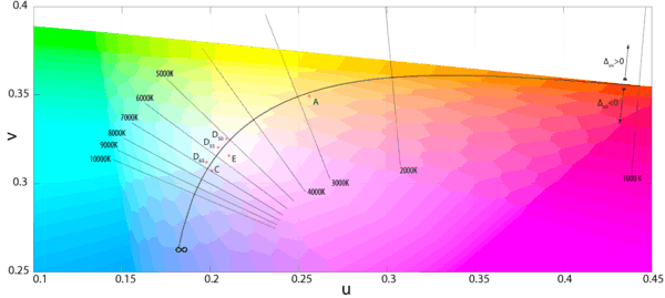

The distance from the locus (i.e., degree of departure from a black body) is traditionally indicated in units of ; positive for points above the locus. This concept of distance has evolved to become Delta E, which continues to be used today.

Robertson's method
Before the advent of powerful personal computers, it was common to estimate the correlated color temperature by way of interpolation from look-up tables and charts.[28] The most famous such method is Robertson's,[29] who took advantage of the relatively even spacing of the mired scale (see above) to calculate the CCT Tc using linear interpolation of the isotherm's mired values:[30]


where and are the color temperatures of the look-up isotherms and i is chosen such that . (Furthermore, the test chromaticity lies between the only two adjacent lines for which .)


If the isotherms are tight enough, one can assume , leading to


The distance of the test point to the i-th isotherm is given by

where is the chromaticity coordinate of the i-th isotherm on the Planckian locus and mi is the isotherm's slope. Since it is perpendicular to the locus, it follows that where li is the slope of the locus at .


Precautions
Although the CCT can be calculated for any chromaticity coordinate, the result is meaningful only if the light sources are nearly white.[31] The CIE recommends that "The concept of correlated color temperature should not be used if the chromaticity of the test source differs more than [] from the Planckian radiator."[32] Beyond a certain value of , a chromaticity co-ordinate may be equidistant to two points on the locus, causing ambiguity in the CCT.


Approximation
If a narrow range of color temperatures is considered—those encapsulating daylight being the most practical case—one can approximate the Planckian locus in order to calculate the CCT in terms of chromaticity coordinates. Following Kelly's observation that the isotherms intersect in the purple region near (x = 0.325, y = 0.154),[28] McCamy proposed this cubic approximation:[33]
- CCT(x, y) = −449n3 + 3525n2 − 6823.3n + 5520.33,
where n = (x − xe)/(y − ye) is the inverse slope line, and (xe = 0.3320, ye = 0.1858) is the "epicenter"; quite close to the intersection point mentioned by Kelly. The maximum absolute error for color temperatures ranging from 2856 K (illuminant A) to 6504 K (D65) is under 2 K.
A more recent proposal, using exponential terms, considerably extends the applicable range by adding a second epicenter for high color temperatures:[34]
- CCT(x,y) = A0 + A1exp(−n/t1) + A2exp(−n/t2) + A3exp(−n/t3),
where n is as before and the other constants are defined below:
| 3–50 kK | 50–800 kK | |
|---|---|---|
| xe | 0.3366 | 0.3356 |
| ye | 0.1735 | 0.1691 |
| A0 | −949.86315 | 36284.48953 |
| A1 | 6253.80338 | 0.00228 |
| t1 | 0.92159 | 0.07861 |
| A2 | 28.70599 | 5.4535×10−36 |
| t2 | 0.20039 | 0.01543 |
| A3 | 0.00004 | |
| t3 | 0.07125 |
The inverse calculation, from color temperature to corresponding chromaticity coordinates, is discussed in Planckian locus.
Color rendering index
The CIE color rendering index (CRI) is a method to determine how well a light source's illumination of eight sample patches compares to the illumination provided by a reference source. Cited together, the CRI and CCT give a numerical estimate of what reference (ideal) light source best approximates a particular artificial light, and what the difference is.
Spectral power distribution

Light sources and illuminants may be characterized by their spectral power distribution (SPD). The relative SPD curves provided by many manufacturers may have been produced using 10 nm increments or more on their spectroradiometer.[35] The result is what would seem to be a smoother ("fuller spectrum") power distribution than the lamp actually has. Owing to their spiky distribution, much finer increments are advisable for taking measurements of fluorescent lights, and this requires more expensive equipment.
Color temperature in astronomy

In astronomy, the color temperature is defined by the local slope of the SPD at a given wavelength, or, in practice, a wavelength range. Given, for example, the color magnitudes B and V which are calibrated to be equal for an A0V star (e.g. Vega), the stellar color temperature is given by the temperature for which the color index of a blackbody radiator fits the stellar one. Besides the , other color indices can be used as well. The color temperature (as well as the correlated color temperature defined above) may differ largely from the effective temperature given by the radiative flux of the stellar surface. For example, the color temperature of an A0V star is about 15000 K compared to an effective temperature of about 9500 K.[36]


See also
- Kruithof curve
- Luminous efficacy
- Over-illumination
- Brightness temperature
- Effective temperature
- Whiteness
- Color metamerism
References
- ↑ handprint : color temperature
- ↑ Parrott, Steve. "Moonlighting: Landscape Lighting Design Imitates Nature". Retrieved 2011-09-29.
- ↑ "OSRAM SYVLANIA XBO" (PDF).
- ↑ Wallace Roberts Stevens (1951). Principles of Lighting. Constable.
- ↑ Williams, D. R. (2004). "Sun Fact Sheet". NASA. Retrieved 2010-09-27.
- ↑ "Principles of Remote Sensing — CRISP". Retrieved 2012-06-18.
- ↑ Chris George (2008). Mastering Digital Flash Photography: The Complete Reference Guide. Sterling Publishing Company. p. 11. ISBN 978-1-60059-209-6.
- ↑ Rüdiger Paschotta (2008). Encyclopedia of Laser Physics and Technology. Wiley-VCH. p. 219. ISBN 978-3-527-40828-3.
- ↑ Thomas Nimz, Fredrik Hailer and Kevin Jensen (2012). Sensors and Feedback Control of Multi-Color LED Systems. LED Professional. pp. 2–5. ISSN 1993-890X.
- ↑ Chaplin, Martin. "Water Absorption Spectrum". Retrieved 2012-08-01.
- ↑ Pope R. M., Fry E. S. (1997). "Absorption spectrum (380–700 nm) of pure water. II. Integrating cavity measurements". Applied Optics. Optical Society of America. 36 (33): 8710–8723. doi:10.1364/AO.36.008710. Retrieved August 1, 2012.
- ↑ Jerlov N. G. (1976). Marine Optics. Elsevie Oceanography Series. 14. Amsterdam: Elsevier Scientific Publishing Company. pp. 128–129. ISBN 0-444-41490-8. Retrieved August 1, 2012.
- ↑ Kern, Chris. "Reality Check: Ambiguity and Ambivalence in Digital Color Photography". Retrieved 2011-03-11.
- ↑ Color Temperature and Metal Halide Sources
- ↑ Borbély, Ákos; Sámson, Árpád; Schanda, János (December 2001). "The concept of correlated colour temperature revisited". Color Research & Application. 26 (6): 450–457. doi:10.1002/col.1065.
- ↑ Hyde, Edward P. (June 1911). "A New Determination of the Selective Radiation from Tantalum (abstract)". Physical Review. Series I. The American Physical Society. 32 (6): 632–633. doi:10.1103/PhysRevSeriesI.32.632.
This existence of a color match is a consequence of there being approximately the same energy distribution in the visible spectra.
- 1 2 Priest, Irwin G. (1923). "The colorimetry and photometry of daylight ·and incandescent illuminants by the method of rotatory dispersion". JOSA. 7 (12): 1175–1209. doi:10.1364/JOSA.7.001175.
The color temperature of a source is the temperature at which a Planckian radiator would emit radiant energy competent to evoke a color of the same quality as that evoked by the radiant energy from the source in question. The color temperature is not necessarily the same as the 'true temperature' of the source; but this circumstance has no significance whatever in the use of the color temperature as a means to the end of establishing a scale for the quality of the color of illuminants. For this purpose no knowledge of the temperature of the source nor indeed of its emissive properties is required. All that is involved in giving the color temperature of any illuminant is the affirmation that the color of the luminant is of the same quality as the color of a Planckian radiator at the given temperature.
- 1 2 Davis, Raymond (1931). "A Correlated Color Temperature for Illuminants". National Bureau of Standards Journal of Research. 7: 659–681. doi:10.6028/jres.007.039.
The ideal correlated colour temperature of a light source is the absolute temperature at which the Planckian radiator emits radiant energy component to evoke a colour which, of all Planckian colours, most closely approximates the colour evoked by the source in question.
from Research Paper 365 - 1 2 Judd, Deane B. (1931). "Chromaticity sensibility to stimulus differences". JOSA. 22 (2): 72–108. doi:10.1364/JOSA.22.000072.
- ↑ Priest, Irwin G. (February 1933). "A proposed scale for use in specifying the chromaticity of incandescent illuminants and various phases of daylight". JOSA. 23 (2): 42. doi:10.1364/JOSA.23.000041.
- ↑ Judd, Deane B. (January 1933). "Sensibility to Color-Temperature Change as a Function of Temperature". JOSA. 23 (1): 7. doi:10.1364/JOSA.23.000007.
Regarding (Davis, 1931): This simpler statement of the spectral-centroid relation might have been deduced by combining two previous findings, one by Gibson (see footnote 10, p. 12) concerning a spectral-centroid relation between incident and transmitted light for daylight filters, the other by Langmuir and Orange (Trans. A.I.E.E., 32, 1944–1946 (1913)) concerning a similar relation involving reciprocal temperature. The mathematical analysis on which this latter finding is based was given later by Foote, Mohler and Fairchild, J. Wash. Acad. Sci. 7, 545–549 (1917), and Gage, Trans. I.E.S. 16, 428–429 (1921) also called attention to this relation.
- ↑ Judd, Deane B. (January 1935). "A Maxwell Triangle Yielding Uniform Chromaticity Scales". JOSA. 25 (1): 24–35. doi:10.1364/JOSA.25.000024.
An important application of this coordinate system is its use in finding from any series of colors the one most resembling a neighboring color of the same brilliance, for example, the finding of the nearest color temperature for a neighboring non-Planckian stimulus. The method is to draw the shortest line from the point representing the non-Planckian stimulus to the Planckian locus.
- ↑ OSA Committee on Colorimetry (November 1944). "Quantitative data and methods for colorimetry". JOSA. 34 (11): 633–688. (recommended reading)
- ↑ Judd, Deane B. (November 1936). "Estimation of Chromaticity Differences and Nearest Color Temperatures on the Standard 1931 I.C.I. Colorimetric Coordinate System". JOSA. 26 (11): 421–426. doi:10.1364/JOSA.26.000421.
- ↑ MacAdam, David L. (August 1937). "Projective transformations of I.C.I. color specifications". JOSA. 27 (8): 294–299. doi:10.1364/JOSA.27.000294.
- ↑ The CIE definition of correlated color temperature (removed)
- ↑ Schanda, János; Danyi, M. (1977). "Correlated Color-Temperature Calculations in the CIE 1976 Chromaticity Diagram". Color Research & Application. Wiley Interscience. 2 (4): 161–163. doi:10.1002/col.5080020403.
Correlated color temperature can be calculated using the new diagram, leading to somewhat different results than those calculated according to the CIE 1960 uv diagram.
- 1 2 Kelly, Kenneth L. (August 1963). "Lines of Constant Correlated Color Temperature Based on MacAdam's (u,v) Uniform Chromaticity Transformation of the CIE Diagram". JOSA. 53 (8): 999–1002. doi:10.1364/JOSA.53.000999.
- ↑ Robertson, Alan R. (November 1968). "Computation of Correlated Color Temperature and Distribution Temperature". JOSA. 58 (11): 1528–1535. doi:10.1364/JOSA.58.001528.
- ↑ ANSI C implementation, Bruce Lindbloom
- ↑ Walter, Wolfgang (February 1992). "Determination of correlated color temperature based on a color-appearance model". Color Research & Application. 17 (1): 24–30. doi:10.1002/col.5080170107.
The concept of correlated color temperature is only useful for lamps with chromaticity points close to the black body…
- ↑ Schanda, János (2007). "3: CIE Colorimetry". Colorimetry: Understanding the CIE System. Wiley Interscience. pp. 37–46. doi:10.1002/9780470175637.ch3. ISBN 978-0-470-04904-4.
- ↑ McCamy, Calvin S. (April 1992). "Correlated color temperature as an explicit function of chromaticity coordinates". Color Research & Application. 17 (2): 142–144. doi:10.1002/col.5080170211. plus erratum doi:10.1002/col.5080180222
- ↑ Hernández-Andrés, Javier; Lee, RL; Romero, J (September 20, 1999). "Calculating Correlated Color Temperatures Across the Entire Gamut of Daylight and Skylight Chromaticities" (PDF). Applied Optics. 38 (27): 5703–5709. doi:10.1364/AO.38.005703. PMID 18324081.
- ↑ Gretag's SpectroLino and X-Rite's ColorMunki have an optical resolution of 10 nm.
- ↑ Unsöld, Albrecht; Bodo Baschek (1999). Der neue Kosmos (6 ed.). Berlin, Heidelberg, New York: Springer. ISBN 3-540-64165-3.
Further reading
- Stroebel, Leslie; John Compton; Ira Current; Richard Zakia (2000). Basic Photographic Materials and Processes (2E ed.). Boston: Focal Press. ISBN 0-240-80405-8.
- Wyszecki, Günter; Stiles, Walter Stanley (1982). "3.11: Distribution Temperature, Color Temperature, and Correlated Color Temperature". Color Science: Concept and Methods, Quantitative Data and Formulæ. New York: Wiley. pp. 224–229. ISBN 0-471-02106-7.
External links
- Kelvin to RGB calculator from Academo.org
- Boyd, Andrew. Kelvin temperature in photography at The Discerning Photographer.
- Charity, Mitchell. What color is a black body? sRGB values corresponding to blackbodies of varying temperature.
- Lindbloom, Bruce. ANSI C implementation of Robertson's method to calculate the correlated color temperature of a color in XYZ.
- Konica Minolta Sensing. The Language of Light.
Color topics | |||||||||||
|---|---|---|---|---|---|---|---|---|---|---|---|
| Color science |
| ||||||||||
| Color philosophy | |||||||||||
| Color terms |
| ||||||||||
| Color organizations | |||||||||||
| Lists | |||||||||||
| Related | |||||||||||
| |||||||||||