Bembo
 | |
| Category | Serif |
|---|---|
| Classification | Old-style |
| Designer(s) | |
| Foundry | Monotype |
| Variations |
|
| Shown here | ET Bembo |
Bembo is a 1929 serif typeface created by the British branch of the Monotype Corporation and most commonly used for body text. It is a member of the "old-style" of serif fonts, with a regular or roman style based on a design cut around 1495 by Francesco Griffo for Venetian printer Aldus Manutius, sometimes generically called the "Aldine roman". Bembo is named for Manutius's first publication with it, a small 1496 book by the poet and cleric Pietro Bembo. The italic is based on work by Giovanni Antonio Tagliente, a calligrapher who worked as a printer the 1520s, after the time of Manutius and Griffo.
Monotype created Bembo during a period of renewed interest in the printing of the Italian Renaissance, under the influence of Monotype executive and printing historian Stanley Morison. It followed a previous more faithful revival of Manutius's work, Poliphilus, whose reputation it largely eclipsed. Monotype also created a second, much more eccentric italic for it to the design of calligrapher Alfred Fairbank, which also did not receive the same attention as the normal version of Bembo.
Since its creation, Bembo has enjoyed continuing popularity as an attractive, legible book typeface. Prominent users of Bembo have included Penguin Books, the Everyman's Library series, Oxford University Press, Cambridge University Press, the National Gallery, Yale University Press and Edward Tufte. Bembo has been released in versions for phototypesetting and in several revivals as digital fonts by Monotype and other companies.
History
The regular (roman) style of Bembo is based on Griffo's typeface for Manutius.[1][2][3] Griffo, sometimes called Francesco da Bologna (of Bologna), was an engraver who created designs by cutting punches in steel. These were used as a master to stamp matrices, the moulds used to cast metal type.[4]
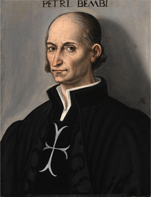
Manutius at first printed works only in the Greek language. His first printing in the Latin alphabet, in February 1496 (1495 by the Venetian calendar), was a book entitled Petri Bembi de Aetna Angelum Chabrielem liber. This book, usually now called De Aetna, was a short 60-page text about a journey to Mount Etna, written by the young Italian humanist poet Pietro Bembo, later a Cardinal, secretary to Pope Leo X and lover of Lucrezia Borgia.[5][6][7]
Griffo was the one of the first punchcutters to fully express the character of the humanist hand that contemporaries preferred for manuscripts of classics and literary texts, in distinction to the book hand humanists dismissed as a gothic hand or the everyday chancery hand. One of the main characteristics that distinguished Griffo's work from most of the earlier "Venetian" tradition of roman type by Nicolas Jenson and others is the horizontal cross-stroke of the "e", although he was not the first to introduce this style.[5][8] Modern font designer Robert Slimbach described Griffo's work as a breakthrough leading to an "ideal balance of beauty and functionality".[9] The style is sometimes known as the "Aldine roman" after Manutius' name.[10]
In France, his work inspired many French printers and punchcutters such as Geoffroy Tory and Claude Garamond from 1530 onwards, even though the typeface of De Aetna with its original capitals was apparently used in only about twelve books between 1496 and 1499.[10][11][12][13] Historian Beatrice Warde suggested in the 1920s that this may have been due to the high quality of printing shown in the original De Aetna volume, perhaps created as a small pilot project.[5] De Aetna was printed using a mixture of alternate characters, perhaps as an experiment, which included a lower-case p in the same style as the capital letter with a flat top.[10] In 1499, Griffo recut the capitals, changing the appearance of the typeface slightly. This version was used to print Manutius' famous illustrated volume Hypnerotomachia Poliphili.[14][15][16]
Griffo's roman typeface, with several replacements of the capitals, continued to be used by Manutius's company until the 1550s, when a refresh of its equipment brought in French typefaces which had been created by Garamond, Pierre Haultin and Robert Granjon under its influence.[17] UCLA curators, who maintain a large collection of Manutius's printing, have described this as a "wholesale change ... the press followed precedent; popular in France, [these] types rapidly spread over western Europe".[14] Ultimately, old-style fonts like all of these fell out of use with the arrival of the much more geometric Didone types of the eighteenth and nineteenth centuries.[18][19][20][21] They returned to popularity later in the century, with the arrival of the Arts and Crafts movement.[22]
In 1500, Manutius released the first books printed using italic type, again designed by Griffo.[23] This was originally not intended as a complementary design, as is used today, but rather as an alternative, more condensed typeface suitable for small volumes.[24]
Italic
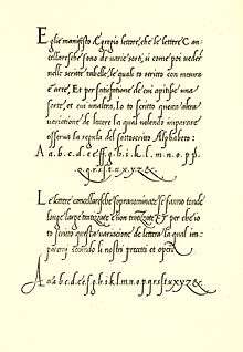
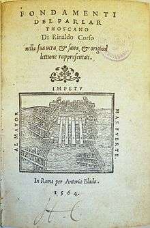
Bembo's italic is not based directly on the work of Griffo, but on the work of calligrapher and handwriting teacher Giovanni Antonio Tagliente (sometimes written Giovannantonio). He published a writing manual, The True Art of Excellent Writing, in Venice in 1524, after the time of Manutius and Griffo, with engravings and some text set in an italic typeface presumably based on his calligraphy.[25][26][27][lower-alpha 1] (Tagliente did not only publish on handwriting, but also self-help guides on learning to read, arithmetic, embroidery and a book of model love letters.[28][29][30]) It too was imitated in France, with imitations appearing from 1528 onwards.[12] Another influential italic type created around this time was that of Ludovico Vicentino degli Arrighi, also a calligrapher who became involved in printing. His almost upright italic design was also imitated in France and would also become influential to twentieth-century font designs.[12]
Monotype history


Monotype Bembo is one of the most famous revivals of the Aldine typeface of 1495. It was created under the influence of Monotype executive and printing historian Stanley Morison by the design team at the Monotype factory in Salfords, Surrey, south of London.[31][32][33] While most printers of the Arts and Crafts movement of the previous sixty years had been more interested in the slightly earlier typefaces of Nicolas Jenson, Morison greatly admired Aldus Manutius' typeface above others of the period.[34][35] The main reasons for his admiration were the balance of the letter construction, such as the evenness of the 'e' with a level cross-stroke and the way the capitals were made slightly lower than the ascenders of the tallest lower-case letters.[lower-alpha 2] He described the Aldine roman as "inspired not by writing, but by engraving; not script but sculpture."[36][37]
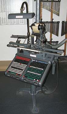
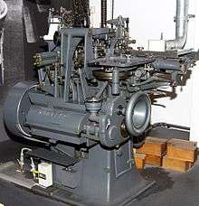
Bembo's development took place following a series of breakthroughs in printing technology which had occurred over the last fifty years without breaking from the use of metal type. Pantograph engraving had allowed punches to be precisely machined from large plan drawings. This gave a cleaner result than historic typefaces whose master punches had been hand-carved out of steel at the exact size of the desired letter. It also allowed rapid development of a large range of sizes.[38][39] In addition, hand printing had been superseded by the hot metal typesetting systems of the period, of which Monotype's was one of the most popular (in competition with that of Linotype's). Both allowed metal type to be quickly cast under the control of a keyboard, eliminating the need to manually cast metal type and slot it into place into a printing press. With no need to keep type in stock, just the matrices used as moulds to cast the type, printers could use a wider range of fonts and there was increasing demand for varied typefaces. Artistically, meanwhile, the preference for using mechanical, geometric Didone fonts introduced in the eighteenth and nineteenth century was being displaced by a revival of interest in "old-style" serif fonts developed before this, a change that has proved to be lasting.[40][41][42] At the same time, hot metal typesetting had imposed new restrictions: in Monotype's system (while less restrictive than Linotype's), in order to mechanically count the number of characters that could be fitted on a line, letters could only be certain widths, and care was needed to produce letters that looked harmonious in spite of this.[42]
Morison was interested in the history of the 15th century Italian printing, and had discussed the topic with his correspondent, the Italian-based German printer Giovanni Mardersteig, in correspondence with whom he wrote a series of letters discussing Bembo's development.[43][44][45] He also discussed the project with the Poet Laureate Robert Bridges, who had some interest in printing.[lower-alpha 3]
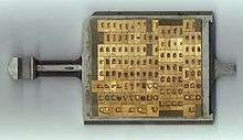
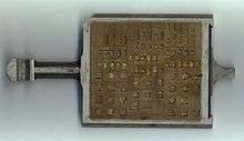
Bembo's technical production followed Monotype's standard method of the period. The characters were drawn on paper in large plan diagrams by the highly experienced drawing office team, led and trained by American engineer Frank Hinman Pierpont and Fritz Steltzer, both of whom Monotype had recruited from the German printing industry. The drawing staff who executed the design was disproportionately female and in many cases recruited from the local area and the nearby Reigate art school. A wax-copy was made from these drawing, the wax-copy was used to produce a lead plate with the design. These plates were then used as a plan for machining metal punches to stamp matrices in the Benton-pantographs.[46][47] It was Monotype's standard practice at the time to first engrave a limited number of characters and print proofs from them to test overall balance of colour on the page, before completing the remaining characters.[46]
Monotype commissioned from the calligrapher Alfred Fairbank a nearly upright italic design based on the work of Arrighi, and considered using it as Bembo's companion italic before deciding it was too eccentric for this purpose.[26][lower-alpha 4] Monotype created a more conventional design influenced by Tagliente's typeface and sold Fairbank's design as Bembo Condensed Italic.[50][51][52] It was digitised as "Fairbank" in 2003, and sold independently of Monotype's Bembo digitisations.[53][54][55][56] Morison wrote in his memoir that the Fairbank design "looked its best when given sole possession of the page".[26] Monotype's publicity team described the italic as "fine, tranquil" in a 1931 showing, emphasising their desire to avoid a design that seemed too eccentric.[57]
As was normal in metal type fonts of the period from Monotype and other companies, the font was drawn differently at different sizes by modifying Griffo's original design, a quite large letter at an approximate size of 15 points.[42] The changes made were looser spacing, higher x-height (taller lower-case letters) and a more solid colour of impression at smaller sizes, and a finer, more graceful and tightly spaced design at large sizes.[42]
Characteristics
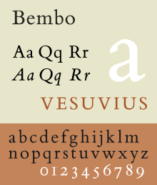
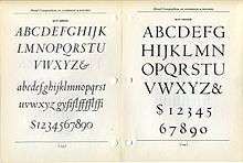
Among Bembo's more distinctive characteristics, the capital "Q"'s tail starts from the glyph's centre, the uppercase "J" has a slight hook and the sides of the "M" splay outwards slightly. Many lowercase letters show subtle, sinuous curves; the termination of the arm of both the r and the e flare slightly upward and outward.[41] The lowercase "c" and "e" push slightly forwards. Characters "h", "m", and "n" are not quite vertical on their right-hand stems, with a subtle curve towards the left going down the stroke.[58] In italic, the k has an elegantly curved stroke in the lower-right and descenders on the p, q and y end with a flat horizontal stroke.[59] In the 1950s, Monotype noted that its features included: "serifs fine slab, fine-bracketed and in l.c. prolonged to right along baseline."[60] This meant that many of the serifs (especially the horizontals, for example on the W) are fine lines of quite uniform width, rather than forming an obvious curve leading into the main form of the letter. The ascenders reach above the cap height.[61]

In metal type, Bembo includes two capital "R"s, one with a long, extended leg following Griffo, one with a more tucked-in leg suitable for body text.[62]
Bembo does not attempt to strictly copy all the features of Renaissance printing, instead blending them with a twentieth-century sensibility and the expectations of contemporary design. An eccentricity of Griffo's first De Aetna capitals was an asymmetrical M that does not seem to have a serif at top right. So odd it has been suggested it may have been the result of faulty casting of type, it was nonetheless often copied in French imitations by Garamond and his contemporaries.[12] Monotype's revival declined to follow this, although it was recreated for a British Museum exhibition catalogue.[63] Monotype also did not copy the curving capital Y used by Manutius in the tradition of the Greek letter upsilon which had been used in some versions of Poliphilus and Blado, although not in the digitisation of Poliphilus.[64][65][66][lower-alpha 5] Nesbitt has described the capitals as "a composite design in the spirit of [Griffo's] type".[67]
In the italic, the expansive ascenders of Tagliente's type were shortened and the curl to the right replaced with more conventional serifs. Monotype also cut italic capitals sloped to match the lower-case, whereas in the Renaissance italics were used with upright capital letters in the Roman inscriptional tradition. The bold (Monotype's invention, since Griffo and his contemporaries did not use bold type) is extremely solid, providing a very clear contrast to the regular styles, and Monotype also added lining (upper-case height) figures as well as the text figures (at lower-case height) used in the fifteenth and sixteenth centuries.[68] Historian James Mosley suggests that the numerals of Bembo were based on those Monotype had already developed for the typeface Plantin.[69]
Related fonts
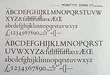
Poliphilus and Blado
Monotype had already designed two other types inspired by the same period of Italian printing and calligraphy, the roman Poliphilus and italic Blado (both 1923).[71][72][73] Made more eccentric and irregular than the sleek lines of Bembo to evoke the feel of antique printing, these remained in Monotype's catalogue and have been digitised, but are much less known today.[65][74][75][76][77] Bembo can therefore be seen as an iteration of a preexisting design concept towards mass market appeal, taking the basic idea of the Griffo design and (unlike Poliphilus) updating its appearance to match the more sophisticated printing possible by the 1920s. Bembo's original working name was "Poliphilus Modernised".[69][71]
Poliphilus is named after the book Hypnerotomachia Poliphili, one of Manutius's most famous books in the Latin alphabet, which was printed with the same roman as De Aetna but recut capitals; it was made for a publisher who planned to create an English translation.[14][21] Blado is named after the printer Antonio Blado, a colleague of Arrighi.[26][78] Morison preferred Bembo's roman and was somewhat dismissive of Poliphilus.[71] Unlike Bembo, both in metal featured a Greek-influenced Y with a curving head, as in the original.[15][65]
Centaur
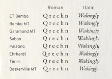
Monotype licensed and released the font Centaur around the same time as Bembo. It was drawn by the American book designer Bruce Rogers.[79] Its roman is based on a slightly earlier period of Italian renaissance printing than Bembo, the work of Nicolas Jenson in Venice around 1470 (the so-called Venetian style). Like Bembo, its italic comes from the 1520s, being again loosely based on the work of Arrighi from around 1520.[80][81][82] Compared to Bembo it is somewhat lighter in structure, something particularly true in its digital facsimile.[83][lower-alpha 6] Penguin often used it for headings and titles of 'classic' editions, particularly its capitals and italic; its lower-case does not so effectively harmonise with Bembo due to the different letter shapes such as the tilted 'e'.[84][85]
Titling fonts
Monotype created several titling designs based on Renaissance printing that could be considered complementary to Bembo: Bembo Titling (based directly on Bembo's capitals, but more delicate to suit a larger text size) and the more geometric Felix Titling in 1934, inspired by humanist capitals drawn by Felice Feliciano in 1463.[86][87] In the hot metal type era Monotype also issued a titling version of Centaur, which was often used by Penguin; Monotype's digitisations of Centaur do not include it.[88]
Timeline
The Renaissance
- 1496 Griffo's roman
- 1501 Griffo's italic; development of italic type follows over the next fifty years.
- 1515 Death of Manutius.[89]
- 1518 Death of Griffo.[90]
- 1520s Tagliente publishes in Venice, Ludovico Vicentino degli Arrighi in Rome (possibly also Venice). Both are former calligraphers who publish writing manuals.
- 1522–25 Tagliente publishes a writing manual The True Art of Excellent Writing, as does Arrighi, La Operina... around the same time.[25][91][92][lower-alpha 7] Arrighi's friend Gian Giorgio Trissino writes of Arrighi that "in calligraphy he has surpassed all other men of our age so [he now does] in print all that was formerly done with the pen, in his beautiful types he has gone beyond all other printers."[27] His contemporary Antonio Blado publishes in Rome in an italic apparently derived from Arrighi's work.
- 1527 War in central Italy. Arrighi disappears from history; he may have been killed in the Sack of Rome.[27][95]
- 1528 Tagliente dies in Venice.[92]
- 1535 Blado appointed printer to the papacy and remains in this role until his death in 1567.[96][97]
- 1530s–1550s France becomes a centre of the typefounding industry under the influence of the work of Manutius and others. French typefaces replace old Italian designs at the Aldine Press in Venice.[14] Tradition that italic capitals should slope like the lower case established.[98]
20th Century
- 1910s The italic calligraphy style of the Italian renaissance is revived by calligraphers including Edward Johnston and Alfred Fairbank.[26]
- 1923 Monotype releases Blado, an italic based on the work of Arrighi and Antonio Blado, and Poliphilus, a roman based on the work of Griffo.
- 1926 Edward Johnston develops a font based on his italic calligraphy, but it remains obscure.[26]
- 1926 Frederic Warde creates an italic based on the work of Arrighi. It is now almost always used as the companion italic of the font Centaur, but initially had an independent existence.[26]
- 1928–29 Monotype develops and releases Bembo, based on the work of Griffo but much smoother in texture. After considering releasing an italic by Fairbank-based the work of Arrighi, Monotype abandons the idea, making Bembo's default italic on the Tagliente model.[26]
- 1929 Monotype releases Centaur and the Warde italic as a matching set.[79]
- 1960s Monotype releases Bembo for phototypesetting.[99] Other companies also release versions.[100][101]
Reception
Bembo has been very popular in book publishing, particularly in Britain. It was also recommended by HMSO in its style guide for outsourced printing jobs.[103] Cambridge University Press's history describes Bembo as one of its most commonly used typefaces; Morison was closely connected to Cambridge and his personal archive (as well as much of Monotype's) went to the university after his death.[104][105]
Among reviews of typefaces, writing in the anthology Typographic Specimens: The Great Typefaces, Jeff Price commented that Bembo became noted for its ability to "provide a text that is extremely consistent in colour", helping it to "remain one of the most popular book types since its release".[106] Modern font designer Nick Shinn has also commented, "Bembo has a sleek magnificence, born of high-precision technology at the service of accomplished production skills, which honours the spirit of the original, and an exotic grace of line which humbles most new designs made more ostensibly for the new technology."[107] Oxford University Press editor John Bell also borrowed the name for his set of comic verse lampooning publishing, Mutiny on the Bembo.[108][109][110]
Digitisations and derivatives
Monotype digitisations
Monotype has released two separate digitisations named Bembo and more recently Bembo Book, as well as the more slender caps-only display font Bembo Titling and the alternate italic design Fairbank.[111][112] Bembo Book is considered to be superior by being thicker and more suitable for body text, as well as for offering the alternate shorter R for better-spaced body text.[62][113][114]
Monotype's original, early digitisation of Bembo was widely seen as unsuccessful.[115] Two main problems have been cited with it: it was much lighter in type colour than the original metal type, perhaps through failure to anticipate the reduced ink spread on modern printing equipment.[116] In addition, the digital Bembo was based on the 9 pt metal drawings, creating a font with different proportions to the metal type in the point sizes at which Bembo was most often used in books.[102] This made the proportions of the digital font appear wrong, failing to match the subtlety of the metal type and even phototype, which was released in three different optical sizes for different print sizes.[99][117][118][119][lower-alpha 8][120] Future Monotype executive Akira Kobayashi commented:
"I got into a slight panic. None of the letters looked like Bembo! For a moment I froze in front of the computer, thinking about writing a letter of complaint to the company for sending us the wrong font. After a while I checked the Bembo Italic and I slowly began to realise that the fonts were Bembo. I calmed down enough to recall that the typeface was originally designed for metal type, and most of the specimens and texts I saw were set in metal type in text size. That was why the images of the characters did not overlap. I knew that a metal typeface was cut or designed separately for each size, but a film composition or digital face is a kind of compromise having proportions designed for reduction and enlargement. I was overwhelmed to see the huge gap. Then I looked into the types used in Western offset-litho prints to see the digital Bembo types in use ... the types that were originally designed for hot-metal often looked too light and feeble ... Bembo Book is more or less what I expected."[121]
While Bembo Book is considered the superior digitisation, the original continues to offer the advantages of two extra weights (semi- and extra-bold) and infant styles with simplified a and g characters resembling handwriting; its lighter appearance may also be of use on printing equipment with greater ink spread. Cross-licensing has meant that it is sold by a range of vendors, often at very low prices. As an example of this, Fontsite obtained the rights to resell a derivative of the original digitisation, using the alternative name Borgia and Bergamo, upgrading it by additional OpenType features such as small capitals and historical alternate characters.[122] Neither version includes digitisations of the larger size versions of Bembo, which had a more delicate and elegant design.[102]
Other Griffo-inspired fonts
A major professional competitor to Bembo is Agmena, created by Jovica Veljović and released by Linotype in 2014.[123][124] Intended as a unified serif design supporting Roman, Greek and a range of Cyrillic alphabets such as Serbian, it features a more calligraphic italic than Bembo with swash capitals and support for Greek ligatures.[125][126][127]
A looser interpretation of the Griffo designs is Iowan Old Style, designed by John Downer and also released by Bitstream. With a larger x-height (taller lower-case letters) than the print-oriented Bembo and influences of signpainting (Downer's former profession), it was intended to be particularly clear for reading at distance, in displays and in signage.[128] It is a default font in Apple's iBooks application.[129][130][131]
Not explicitly influenced by Bembo but also influenced by Griffo is Minion by Slimbach.[132] Released by Adobe, a 2008 survey ranked it as one of the most popular typefaces used in modern fine printing.[133][134]
Besides designs with similar inspiration, a number of unofficial releases and digitisations of Bembo have been made in the phototypesetting and digital periods, reflecting the lack of effective intellectual property protection for typefaces.[135][136][137] Several unofficial versions were released during the phototypesetting period under alternate names; for example one unofficial phototypesetting version was named "Biretta" after the hat worn by Roman Catholic clergy, and another by Erhard Kaiser was created for the East German printing concern Typoart, outside the reach of Western intellectual property laws.[100][101][138][139] In the digital period, Rubicon created a version named "Bentley" intended for small sizes and Bitstream made a version under the name of "Aldine 401".[140][141][142] Its licensee ParaType later created a set of Cyrillic characters for this in 2008.[143] The name "Bembo" remains a Monotype trademark and may not be used to describe such clones.[144]
Free and open-source fonts
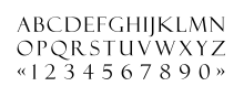
Two open-source designs based on Bembo are Cardo and ET Book. The Cardo fonts, developed by David J. Perry for use in classical scholarship and also including Greek and Hebrew, are freely available under the SIL Open Font License.[145] Unimpressed by the first Bembo digitisation, statistician and designer Edward Tufte commissioned an alternative digitisation for his books in a limited range of styles and languages, sometimes called 'ET Bembo'. He released it publicly as an open-source font named 'ET Book' in September 2015.[146]
Privately used fonts
Heathrow and other British airports used a highly divergent adaptation of Bembo for many years. Designed by Shelley Winters and named BAA Bembo or BAA Sign, it was very bold with a high x-height.[147][148]
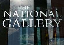
The National Gallery in London used Bembo, then its corporate font, as a plan for the carving of its name into its frontage.[149][150]
The Yale face, developed by Matthew Carter as a corporate font for Yale University, is based on Griffo's work; Yale commissioned a custom font from Carter, a member of the university faculty, after being dissatisfied with digital versions of Bembo.[151] Carter commented on the design that "John Gambell, the Yale University printer who initiated and ran the project, also liked the idea of an Aldine face ... Monotype Bembo had been used for University printing at an earlier time, so there was a useful precedent."[152] It is available exclusively to "Yale students, employees, and authorized contractors for use in Yale publications and communications. It may not be used for personal or business purposes, and it may not be distributed to non-Yale personnel."[153]
In the pre-digital period, IBM offered Aldine, a font inspired by Bembo, as a font for the IBM Composer. This was an ultra-premium electric golfball typewriter system, intended for producing copy to be photographically enlarged for small-scale printing projects, or for high-quality office documents.[154][155] Ultimately the system proved a transitional product, as it was displaced by cheaper phototypesetting, and then in the 1980s by word processors and general-purpose computers.[156]
See also
Notes
- ↑ This is a shortened form of the full title.[28]
- ↑ As noted above, it is now accepted that the "Aldine roman was the key influence on new French renaissance typefaces of the 1530s cut by artisans including Claude Garamond and therefore on almost all typefaces created since. Morison and his collaborator at Monotype Beatrice Warde were crucial promoters of this conclusion.
- ↑ Two late publications of Bridges would be set in Monotype typefaces reviving Italian renaissance printing as a result of this interest. Bridges' poem The Tapestry had been printed in Arrighi and The Testament of Beauty was printed to a design by Morison in Bembo italic.
- ↑ Fairbank reported that he was not told that his italic was intended to be a complementary design.[48][49]
- ↑ A more muted form of it is used in Hermann Zapf's Palatino.[62]
- ↑ Unlike Bembo, Centaur's first rather spindly digitisation was never augmented with a more text-oriented one, possibly because it is particularly commonly used in titles anyway.
- ↑ Arrighi's book had a complex publication history apparently involving a dispute between Arrighi and his publisher, making its dating and printing location(s) both somewhat involved.[93][94]
- ↑ Many early typeface digitisations now look too light even when they were digitised from the original metal type drawings. The type was made lighter than the desired appearance on paper to take account of the fact that the ink would spread as it soaked into the paper. However, modern printing methods show less ink spread than metal type.
References
- ↑ Barker, Nicolas (1992). Aldus Manutius and the Development of Greek Script & Type in the Fifteenth Century (2nd ed.). New York: Fordham University Press. pp. 43–55. ISBN 978-0-8232-1247-7. Retrieved 28 December 2015.
- ↑ Angerhofer, Paul J.; Maxwell, Mary Ann Addy; Maxwell, Robert L. In aedibus Aldi: the Legacy of Aldus Manutius and his Press. Provo, Utah: Brigham Young University. Retrieved 26 June 2016.
- ↑ Barker, Nicolas (1989). Aldus Manutius: Mercantile Empire of the Intellect. Los Angeles: UCLA. Retrieved 26 June 2016.
- ↑ Baines, Phil; Haslam, Andrew (2005). Type and Typography. Laurence King Publishing. pp. 92–5. ISBN 978-1-85669-437-7.
- 1 2 3 Warde, Beatrice (1926). "The 'Garamond' Types:Sixteenth & Seventeenth Century Sources Considered". The Fleuron: 131–179.
- ↑ Kidwell, Carol (2004). Pietro Bembo: Lover, Linguist, Cardinal. Montreal: McGill-Queen's University Press. pp. 13–20 etc. ISBN 978-0-7735-7192-1. Retrieved 11 January 2016.
- ↑ Morris, Roderick Conway. "A Rare Look at the Life of a Renaissance Man". New York Times. Retrieved 14 May 2016.
- ↑ Boardley, John. "The First Roman Fonts". i love typography. Retrieved 4 May 2016.
- ↑ Slimbach; Twardoch; Sousa; Slye (2007). Arno Pro (PDF). San Jose: Adobe Systems. Retrieved 14 August 2015.
- 1 2 3 Barker, Nicholas (1974). "The Aldine Roman in Paris, 1530–1534". Library. doi:10.1093/library/s5-XXIX.1.5.
- ↑ Mosley, James (2006). "Garamond, Griffo and Others: The Price of Celebrity". Bibiologia. Retrieved 3 December 2015.
- 1 2 3 4 Vervliet, Hendrik D.L. (2008). The palaeotypography of the French Renaissance. Selected papers on sixteenth-century typefaces. 2 vols. Leiden: Koninklijke Brill NV. pp. 90–91. ISBN 978-90-04-16982-1.
- ↑ The Monotype Corporation limited, specimen blade 5–64, Bembo 270
- 1 2 3 4 The Aldine Press: catalogue of the Ahmanson-Murphy collection of books by or relating to the press in the Library of the University of California, Los Angeles : incorporating works recorded elsewhere. Berkeley [u.a.]: Univ. of California Press. 2001. pp. 22–25. ISBN 978-0-520-22993-8.
- 1 2 Colonna, Francesco (1499). Hypnerotomachia Poliphili. Venice: Aldine Press. Retrieved 11 January 2016.
- ↑ Aldo Manuzio (Aldus Manutius): Oxford Bibliographies Online Research Guide. Oxford University Press. 2010. pp. 9–10. ISBN 978-0-19-980945-5.
- ↑ Fletcher, H. George (1995). In Praise of Aldus Manutius: a quincentenary exhibition (exhibition catalogue). Pierpont Morgan Library/UCLA. p. 18. Retrieved 26 June 2016.
- ↑ Devroye, Luc. "Louis Perrin". Type Design Information. Retrieved 20 February 2016.
- ↑ Ovink, G.W. (1971). "Nineteenth-century reactions against the didone type model – I". Quaerendo. 1 (2): 18–31. Retrieved 20 February 2016.
- ↑ Ovink, G.W. (1971). "Nineteenth-century reactions against the didone type model – II". Quaerendo. 1 (4): 282–301. Retrieved 20 February 2016.
- 1 2 Mosley, James (2003). "Reviving the Classics: Matthew Carter and the Interpretation of Historical Models". In Mosley, James; Re, Margaret; Drucker, Johanna; Carter, Matthew. Typographically Speaking: The Art of Matthew Carter. Princeton Architectural Press. pp. 31–34. ISBN 978-1-56898-427-8. Retrieved 30 January 2016.
- ↑ Johnson, A. F. (1931). "Old-face Types in the Victorian Age" (PDF). Monotype Recorder. 30 (242): 5–14. Retrieved 11 January 2016.
- ↑ Bornstein, George (2005). "The Book as Artefact". In Hansen, Anna Mette. The book as artefact, text and border. Amsterdam [u.a.]: Rodopi. pp. 151, 162. ISBN 978-90-420-1888-4. Retrieved 11 January 2016.
- ↑ Vervliet, Hendrik D. L. (2008). The Palaeotypography of the French Renaissance: Selected Papers on Sixteenth-century Typefaces. BRILL. pp. 287–289. ISBN 90-04-16982-2.
- 1 2 Tagliente, Giovanni Antonio (1524). Lo presente libro insegna la vera arte de lo excellente scriuere de diuerse varie sorti de litere le quali se fano per geometrica ragione & con la presente opera ognuno le potra stampare e impochi giorni per lo amaistramento, ragione, & essempli, come qui sequente vederai. Venice. Retrieved 28 December 2015.
- 1 2 3 4 5 6 7 8 Morison, Stanley (1973). A Tally of Types (New with additions by several hands ed.). Cambridge: Cambridge University Press. pp. 41–60. ISBN 978-0-521-09786-4.
- 1 2 3 Morison, Stanley; Johnson, Alfred (2009). "3: The Chancery Types of Italy and France". In McKitterick, David John. Selected essays on the history of letter-forms in manuscript and print (Paperback reissue, digitally printed version. ed.). Cambridge: Cambridge University Press. pp. 30–45. ISBN 978-0-521-18316-1. Retrieved 28 December 2015.
- 1 2 Moulton, Ian Frederick (2014-04-16). Love in Print in the Sixteenth Century. Macmillan. pp. 119–125. ISBN 978-1-137-40504-3. Retrieved 28 December 2015.
- ↑ Moulton, Ian Frederick (2009). "Chapter 6: Sex, Love and Sixteenth-Century Print Culture". In Dimmock, Matthew; Hadfield, Andrew. Literature and popular culture in early modern England. Farnham, England: Ashgate. pp. 99–100. ISBN 978-0-7546-6580-9.
- ↑ Calabresi, Bianca (2008). Hackel, Heidi; Kelly, Catherine, eds. Reading women literacy, authorship, and culture in the Atlantic world, 1500–1800. Philadelphia: University of Pennsylvania Press. pp. 97–99. ISBN 978-0-8122-0598-5. Retrieved 28 December 2015.
- ↑ Dreyfus, John (1995). Into Print: Selected Writings on Printing History, Typography and Book Production. Boston: David R. Godine. pp. 151–155. ISBN 978-1-56792-045-1.
- ↑ "Bembo". The Dolphin. Limited Editions Club. 2: 25–26. 1935.
- ↑ Lawson, Alexander S. "Stanley Morison: Significant Historian (obituary)". The Alexander S. Lawson Archive. Retrieved 14 May 2016.
During the 20th century two typographic historians have achieved notable stature and will be long remembered. The first of these, Daniel Berkeley Updike of Boston, died in 1940. The second, Stanley Morison, died at his home in London on October 11, 1967. He was 78 years of age... During the 1920’s when there was slight interest in the production of new “book” types, the Monotype firm—with Morison’s guidance—embarked upon a program of classic type revivals which resulted in the cutting of such faces as Garamond, Bembo, Poliphilus, Baskerville, Bell, and Fournier. These types remain in demand and are among the best of the historic revivals.
- ↑ Amert, Kay (April 2008). "Stanley Morison's Aldine Hypothesis Revisited". Design Issues. 24 (2): 53–71. doi:10.1162/desi.2008.24.2.53.
- ↑ Morison, Stanley (1943). "Early Humanistic Script And The First Roman Type". The Library. s4-XXIV (1-2): 1–29. doi:10.1093/library/s4-XXIV.1-2.1.
- ↑ Lawson, Alexander S. "Letter to the Editor". New York Times. Retrieved 14 May 2016.
- ↑ Clough, Victor. "O and Bembo". Newspaper World and Advertising Review.
- ↑ Morison, Stanley. "Printing the Times". Eye. Retrieved 28 July 2015.
- ↑ "Monotype matrices and moulds in the making" (PDF). Monotype Recorder. 40 (3). 1956.
- ↑ Lawson, A. (1990). Anatomy of a typeface. Boston: Godine, p.200.
- 1 2 "Facts about Bembo" (PDF). Monotype Recorder. 32 (1): 15.
- 1 2 3 4 Bigelow, Charles; Seybold, Jonathan (1981). "Technology and the aesthetics of type". The Seybold Report. 10 (24): 3–16. ISSN 0364-5517.
- ↑ Lawson, Alexander S. "A Few Comments on the Life of Mardersteig, Part 1". The Alexander S. Lawson Archive. Retrieved 14 May 2016.
- ↑ Lawson, Alexander S. "A Few Comments on the Life of Mardersteig, Part 2". The Alexander S. Lawson Archive. Retrieved 14 May 2016.
- ↑ Stanley Morison: A Portrait. London: British Museum. 1971. pp. 22, 30–31.
- 1 2 Rhatigan, Daniel (September 2014). "Gill Sans after Gill" (PDF). Forum (28): 3–7. Retrieved 26 December 2015.
- ↑ Rhatigan, Dan. "Time and Times again". Monotype. Retrieved 28 July 2015.
- ↑ Osley, A.S. (1965). Calligraphy and paleography: essays presented to Alfred Fairbank on his 70th birthday. Faber & Faber. p. 18.
His only contribution to type design has been the so-called Narrow Bembo Italic ... it was conceived as an italic type to be used entirely in its own right and not in any way related to Monotype Bembo, which Fairbank had not seen.
- ↑ "Former Chairmen". The Society of Scribes and Illuminators. Retrieved 14 May 2016.
At the instance of Stanley Morison, he [Fairbank] designed in 1928 the elegant compact typeface known as Narrow Bembo, a title he detested.
- ↑ Bixler, M & W. "Bembo Condensed Italic specimen". Retrieved 30 June 2015.
- ↑ Lawson, Alexander (1990). Anatomy of a typeface (1st ed.). Boston: Godine. pp. 74–83. ISBN 978-0-87923-333-4.
- ↑ Parker, Mike. "A history of type". Font Bureau.
- ↑ "Fairbank". Monotype. Retrieved 30 June 2015.
- ↑ "Fairbank". MyFonts. Monotype.
- ↑ "Fairbanks Italic specimen" (PDF). Monotype. Retrieved 14 May 2016.
- ↑ "Alfred Fairbank" (PDF). Klingspor Museum. Retrieved 14 May 2016.
- ↑ "Monotype Bembo advertisement" (PDF). Monotype Recorder. 30 (242): 20. 1931. Retrieved 11 January 2016.
A roman lower case which seems to many critics to represent the finest Old Face design ever cut; classic capitals and small caps[;] a fine, tranquil italic and a notable series of Display Capitals combine to make Bembo an excellent investment for the wise printer
- ↑ Matteson, Steve. "Type Q&A: Steve Matteson from Monotype". Typecast. Monotype. Retrieved 27 March 2016.
I had hoped to create a good screen version of the Bembo Book typeface, a beautiful and very popular design for book publishing. I was unhappy with my attempts to reconcile some of its unique qualities in the screen version and decided not to release it until it was really working well. One particular characteristic is the lowercase n, which has a slight bow in the right stem – as opposed to a straight side. Finding a workable solution would have delayed the general release so I'll get back to it in the future.
- ↑ "Facts about Bembo" (PDF). Monotype Recorder. 32 (1): 10–11, 15. 1933. Retrieved 20 September 2015.
- ↑ Hardwig, Florian. "How And Why Type Faces Differ – Detail I". Flickr. Retrieved 30 June 2015.
- ↑ "Bembo Book: PDF specimen" (PDF). Monotype. Retrieved 14 May 2016.
- 1 2 3 Shaw, Paul. "Flawed Typefaces". Print magazine. Retrieved 30 June 2015.
- ↑ Barker, Nicolas (1972). Stanley Morison. p. 279.
- ↑ Bixler, M&W. "Poliphilus". Michael & Winifred Bixler.
- 1 2 3 "Poliphilus specimen". Flickr. Retrieved 9 December 2015.
- ↑ "The Type Faces used in this Journal" (PDF). Monotype Recorder. 28 (232): 4, 25. 1929. Retrieved 11 January 2016.
- ↑ Nesbitt, Alexander (1998). The history and technique of lettering. Mineola, N.Y.: Dover Publications. p. 196. ISBN 978-0-486-40281-9.
- ↑ Haley, Allan. "Bold type in text". Monotype. Retrieved 11 August 2015.
- 1 2 Mosley, James (2001). "Review: A Tally of Types". Journal of the Printing History Society. 3, new series: 63–67.
The surviving records of the progress of some of the classic typefaces demonstrate that their exemplary final quality was due to a relentless willingness on the part of 'the works' to make and remake the punches over and over again until the result was satisfactory. The progression of series 270 from the weak Poliphilus Modernised to the familiar Bembo is an object lesson in the success of this technique. That it was [engineering manager Frank] Pierpont himself who was central to this drive for quality is made abundantly clear by the abrupt changes that are seen after his retirement in 1937.
- ↑ Vervliet, Hendrik (2005). "Early Paris Italics: 1515-1545". Journal of the Printing Historical Society (8): 5–55.
- 1 2 3 Mosley, James (2003). "Reviving the Classics: Matthew Carter and the Interpretation of Historical Models". In Mosley, James; Re, Margaret; Drucker, Johanna; Carter, Matthew. Typographically Speaking: The Art of Matthew Carter. Princeton Architectural Press. pp. 31–34. ISBN 978-1-56898-427-8. Retrieved 30 January 2016.
In 1923 [Monotype engineer Frank] Pierpont made a version of the type of the Hypnerotomachia Poliphili printed by Aldus in 1499 for a publisher who planned to produce an English translation which in the end never materialised. The result is an astonishingly close recreation of the original type ... Monotype has a page from the Hypnerotomachia reset in the new type, which is almost indistinguishable from the original. Morison scornfully wrote of Pierpont's "pathetic" pride in the achievement. This, in Monotype's terms, was a rough" revival, staying faithful to all the distortions caused by the ink-squeeze and damaged letters of the printed page ... Monotype's Bembo, originally named "Poliphilus Modernised", is the "smooth" version of the same type in the form used a few years earlier by Aldus in the De Aetna of Pietro Bembo, a usage of which Morison mistakenly believed himself to be the discoverer. The Monotype classics dominated the typographical landscape in which Matthew Carter [and I] grew up ... in Britain, at any rate, they were so ubiquitous that, while their excellent quality was undeniable, it was possible to be bored by them and to begin to rebel against the bland good taste that they represented.
- ↑ "Poliphilus and Blado". The Chestnut Press. Retrieved 30 June 2015.
- ↑ "Bembo". Chestnut Press. Retrieved 30 June 2015.
- ↑ "Scalable Fonts". PC Mag. 24 September 1991.
- ↑ "Poliphilus Pro". Monotype. Retrieved 30 June 2015.
- ↑ "Blado". MyFonts. Retrieved 16 September 2015.
- ↑ "Poliphilus". MyFonts. Retrieved 16 September 2015.
- ↑ "Monotype Blado poster". Flickr. Retrieved 8 December 2015.
- 1 2 "Facts about Centaur" (PDF). Monotype Recorder. 32 (1): 20–21. 1933. Retrieved 20 September 2015.
- ↑ Friedl, Ott, and Stein, Typography: an Encyclopedic Survey of Type Design and Techniques Throughout History. Black Dog & Levinthal Publishers: 1998. ISBN 1-57912-023-7, pp. 540–41.
- ↑ Alexander S. Lawson, Anatomy of a Typeface David R. Godine: 1990. ISBN 978-0-87923-333-4, pp. 92–93.
- ↑ "The Fifty Best Books exhibition" (PDF). Monotype Recorder. 29: 6–11. September 1930. Retrieved 19 September 2015.
- ↑ "Centaur & Arrighi". Chestnut Press. Retrieved 28 December 2015.
- ↑ Shaw, Paul. "Book Review: Type Revivals". Blue Pencil. Retrieved 19 September 2015.
- ↑ Doubleday, Richard (October 2015). "Jan Tschichold at Penguin Books: A Resurgance [sic] of Classical Book Design" (PDF). MX Design Conference 2015. Universidad Iberoamericana. Retrieved 19 February 2016.
- ↑ Strizver, Ilene (2010). Type rules! The designer's guide to professional typography (3rd ed.). Hoboken, NJ: Wiley. ISBN 978-0-470-63755-5.
- ↑ "Felix Titling". MyFonts. Retrieved 16 September 2015.
- ↑ "Centaur". MyFonts. Monotype. Retrieved 5 May 2016.
- ↑ "Aldus Manutius the elder". Encyclopaedia Britannica. Retrieved 14 May 2016.
- ↑ Alastair Campbell; Alistair Dabbs (1 February 2014). Pocket Essentials: Typography: The History and Principles of the Art. Octopus Books. p. 44. ISBN 978-1-78157-155-2.
- ↑ Arrighi, Ludovico Vicentino degli (1524). La operina di Ludouico Vicentino, da imparare di scriuere littera cancellarescha. Rome/Venice?. Retrieved 28 December 2015.
- 1 2 Clayton, Ewan (2013). The Golden Thread: the story of writing. Counterpoint. pp. 128–151. ISBN 978-1-61902-350-5.
- ↑ Goldberg, Jonathan (1990). Writing matter: from the hands of the English Renaissance. Stanford University Press. pp. 70–75. ISBN 978-0-8047-1958-2. Retrieved 28 December 2015.
- ↑ Witcombe, Christopher L.C.E. (2004). Copyright in the Renaissance: prints and the privilegio in sixteenth-century Venice and Rome. Leiden: Brill. pp. 285–286. ISBN 978-90-04-13748-6. Retrieved 28 December 2015.
- ↑ Novoa, James Nelson (2011). Zinguer, Ilana, ed. Hebraic Aspects of the Renaissance: Sources and Encounters. Leiden: Brill. pp. 65–77. ISBN 978-90-04-21255-8. Retrieved 28 December 2015.
- ↑ "Antonio Blado". Vassar College Libraries. Vassar College. Retrieved 14 May 2016.
- ↑ Ilana Zinguer; Abraham Melamed; Zur Shalev (25 August 2011). Hebraic Aspects of the Renaissance: Sources and Encounters. BRILL. pp. 68–9. ISBN 90-04-21255-8.
- ↑ Dearden, James (1973). Encyclopedia of Library and Information Science: Claude Garamond. New York u.a.: Dekker. pp. 196–199. ISBN 978-0-8247-2109-1. Retrieved 11 December 2015.
- 1 2 "The design of faces for 'Monophoto' film matrices" (PDF). Monotype Recorder. 42 (2): 15–23. 1961. Retrieved 3 January 2016.
- 1 2 Raposo, Tânia; Hardwig, Florian. "Always now by Section 25". Fonts In Use. Retrieved 15 April 2016.
- 1 2 Frank O'Hara (1995). The Collected Poems of Frank O'Hara. University of California Press. p. 592. ISBN 978-0-520-20166-8.
- 1 2 3 "Bembo Book". Monotype. Retrieved 19 April 2015.
- ↑ David Finkelstein; Alistair McCleery (23 November 2007). The Edinburgh History of the Book in Scotland, Volume 4: Professionalism and Diversity 1880–2000. Edinburgh University Press. p. 128. ISBN 978-0-7486-2884-1.
- ↑ McKitterick, David (2004). A history of Cambridge University Press. (1. publ. ed.). Cambridge: Cambridge University Press. pp. 245, 286, 367. ISBN 978-0-521-30803-8. Retrieved 13 July 2015.
- ↑ Robinson, C.D.; Smith, N.A. "Monotype Material in the University Library, Cambridge" (PDF). Cambridge University Library. Retrieved 14 May 2016.
- ↑ Price, Jeff (1993). Meggs, Philip; Carter, Rob, eds. Typographic specimens: the great typefaces. New York: VNR. pp. 40–50. ISBN 978-0-471-28429-1. Retrieved 11 January 2016.
- ↑ Shinn, Nick. "Lacunae" (PDF). Codex. Retrieved 1 July 2015.
- ↑ "Mutiny on the Bembo by John Bell, Perpetua Press". Fonts In Use. Retrieved 11 September 2016.
- ↑ Bell, Alan; Hardyment, Christina. "John Bell: Quietly persuasive OUP editor". The Independent. Retrieved 11 September 2016.
- ↑ Bell, John (1984). Mutiny on the Bembo. Perpetua Press.
- ↑ "Bembo". MyFonts. Retrieved 19 April 2015.
- ↑ "Bembo Titling". MyFonts. Monotype. Retrieved 19 April 2015.
- ↑ Butterick, Matthew. "Bembo Book". Typography for Lawyers (archived). Archived from the original on April 7, 2015. Retrieved 13 April 2016.
- ↑ "Bembo Book". Monotype. Retrieved 30 June 2015.
- ↑ Haley, Allan. "Dancing with the Dead" (PDF). Communication Arts. Retrieved 14 May 2016.
The problem, however, was that no allowances were made for the way the 9-point type looked when inked and printed. The resulting phototype and first digital fonts produced a Bembo that was much less robust than the original metal versions.
- ↑ Richard Hendel (15 June 2013). Aspects of Contemporary Book Design. University of Iowa Press. pp. 251–252. ISBN 978-1-60938-175-2.
- ↑ Loxley, Simon (31 March 2006). Type: The Secret History of Letters. I.B.Tauris. pp. 124, 134, 185, 238. ISBN 978-0-85773-017-6.
- ↑ Jackson, Brandon. "The Yale Type". The New Journal. Yale University. Retrieved 30 June 2015.
- ↑ Sowersby, Kris. "Why Bembo Sucks". Retrieved 30 June 2015.
- ↑ Tracy, Walter (2003). Letters of Credit: a view of type design. Boston: David R. Godine. pp. 50–8. ISBN 9781567922400.
- ↑ Kobayashi, Akira. "Akira Kobayashi on FF Clifford". FontFeed. Retrieved 1 July 2015.
- ↑ "Borgia Pro". FontSpring. Retrieved 19 April 2015.
- ↑ Haley, Allan. "Agmena, a new book type from Jovica Veljovic". fonts.com. Monotype. Retrieved 22 September 2015.
- ↑ "Agmena". MyFonts. Linotype. Retrieved 22 September 2015.
- ↑ "Interview with Jovica Veljović". Linotype. Retrieved 22 September 2015.
- ↑ Shaw, Paul. "Agmena Marks the Triumphant Return of Jovica Veljovic to the Realm of Text Typefaces". Print magazine. Retrieved 22 September 2015.
- ↑ Jamra & Berkson. "Agmena (Typographica review)". Typographica. Retrieved 22 September 2015.
- ↑ "Alastair Johnson interviews John Downer" (PDF). Alastair Johnson. Retrieved 21 February 2016.
- ↑ "Iowan Old Style". Identifont. Retrieved 2 August 2015.
- ↑ Butterick, Matthew. "Iowan Old Style". Typography for Lawyers. Archived from the original on January 16, 2015. Retrieved 2 August 2015.
- ↑ Berry, John. "An American Typeface Comes of Age". dot creative. Retrieved 2 August 2015.
- ↑ "Minion". Typekit. Adobe. Retrieved 2 July 2015.
- ↑ Coles, Stephen. "Top Ten Typefaces Used by Book Design Winners". FontFeed. Retrieved 2 July 2015.
- ↑ Butterick, Matthew. "Minion". Typography for Lawyers. Archived from the original on May 1, 2015. Retrieved 15 August 2015.
- ↑ Copyright, Designs and Patents Act 1988 (c. 48), § 54 (England)
- ↑ Copyright and Related Rights Act, 2000 (Ireland), §§ 84-85. Accessed January 31, 2013.
- ↑ Raustiala, Kal; Sprigman, Christopher (15 August 2012). The Knockoff Economy: How Imitation Sparks Innovation. Oxford University Press. pp. 130–135. ISBN 978-0-19-991176-9.
- ↑ "Erhard Kaiser" (PDF). Klingspor Museum. Retrieved 14 May 2016.
- ↑ Devroye, Luc. "Westcott & Thomson, Inc. for Fotosetter or Fototronic composition". Type Design Information. Retrieved 14 May 2016.
- ↑ "Rubicon Fonts". Rubicon Software. Retrieved 14 May 2016.
- ↑ Devroye, Luc. "Rubicon Computer Labs". Type Design Information Page. Retrieved 14 May 2016.
- ↑ Möller, K.T. Kristian. "KM InPectore". .T. Kristian Möller Typography. Retrieved 14 May 2016.
- ↑ "Aldine 401". ParaType. Retrieved 13 April 2016.
Cyrillic version was developed by Isabella Chaeva and released by ParaType in 2008.
- ↑ "BEMBO - Trademark Details". Justia. Retrieved 5 May 2016.
- ↑ Perry, David (April 20, 2011). "The Cardo Font". Retrieved July 2, 2013.
- ↑ Tufte, Edward. "ET Book". EdwardTufte.com. Retrieved 25 September 2015.
- ↑ Coles & Kupferschmidt. "BAA Bembo". Flickr. Retrieved 14 August 2015.
- ↑ James R. Harding; et al. (2011). Wayfinding and signing guidelines for airport terminals and landside. Washington, D.C.: Transportation Research Board. p. 136. ISBN 978-0-309-21346-2.
- ↑ Mosley, James. "The National Gallery's new inscription: a very English blunder". Type Foundry. Retrieved 30 January 2016.
- ↑ "National Gallery". Incisive Letterwork. Retrieved 13 April 2016.
In 2004 and 2005 the National Gallery was undergoing building and refurbishment work. Incisive Letterwork was awarded the contract to design and carve the lettering for the project. The National Gallery's house style, used for signage and graphics is Bembo and we were asked to use this as a starting point for our design. Faced with this task we referred back to the original Bembo type designed by Aldus Manutius and cut by Francesco Griffo in the 1490's. The challenge was to design letters which would look good as large cut forms, for instance along the frieze of the portico, but also at a much smaller and massed scale as on the donor plaques for the entrance hall. The width of the original face was retained in the new design but the thins were thickened and the serifs turned into small slab serifs. As the lettering is asked to do a variety of different jobs we designed 3 related versions of the basic alphabet. The widest and largest version is used in the newly carved name on the portico above the main entrance. The proportion of the frieze, long and narrow, means that the letters need to be fairly wide and widely spaced. The letter height could only be 400mm yet the words THE NATIONAL GALLERY needed to fill a substantial part of the 18 metre long portico ... the carving and gilding took 3 weeks ... The main entrance hall features plaques, 24 Portland stone slabs in all, carved with the names of donors to the Gallery from the years 1826 to 2002. We designed a narrower version of the Bembo face for these. Legibility required the largest cap height possible for the letters and a height of 33mm was made possible by narrowing the original design. This also had the effect of making the mass of lettering into a pleasing yet readable abstract pattern. All the people who helped with this part are mentioned below. For the Getty entrance and the Annenberg Court we used the letter width most closely related to Manutius's original typeface.
- ↑ "A brief history of the Yale typeface". Yale University Printer. Retrieved 13 April 2016.
- ↑ Shaw, Paul. "An Interview with Matthew Carter". Print Magazine. Retrieved 13 April 2016.
- ↑ "Introducing the Yale Typeface: Font Download". Yale University. Retrieved July 2, 2013.
- ↑ Swiss Foundation Type and Typography (2009). Osterer, Heidrun; Stamm, Philipp, eds. Adrian Frutiger typefaces: the complete works (English ed.). Basel: Birkhäuser. p. 192. ISBN 978-3-7643-8581-1.
- ↑ Harry Danks (1979). The Viola D'amore. Theodore Front Music. p. 4. ISBN 978-0-900998-16-4.
- ↑ McEldowney, Dennis (1 October 2013). A Press Achieved: the Emergence of Auckland University Press, 1927–1972. Auckland University Press. pp. 102–5. ISBN 978-1-86940-671-4.
- Meggs, Philip B. and McKelvey, Roy.Revival of the Fittest: Digital Versions of Classic Typefaces. RC Publications: 2000. ISBN 1-883915-08-2
- Meggs, Philip B. History of Graphic Design. John Wiley & Sons, Inc.: 1998. ISBN 0-470-04265-6
External links
- Typowiki: Bembo
- Bembo Infant at Fonts.com
- Monotype digital releases of Griffo-inspired typefaces
- Fonts for Scholars: the Cardo Font
- Borgia Pro
- Specimen of Bembo in hot metal type (3 pages)
- Bembo type specimen from 1950 (Danish)
- Swamp Press specimen - with many other Monotype faces and images
- Sample of Bembo Titling
- Index of Monotype order numbers
- Research Report on Bembo (Vaishnavi Murthy, University of Reading; MA thesis)
- Digital scan of De Aetna (Internet Archive, via Biblioteca Nazionale Centrale di Firenze)
- Five Hundred Years of Bembo - Kevin Steele bibliography
- Who Was Francesco da Bologna? – Anthony Panizzi, 1858. An article on "Francesco da Bologna" from before modern research. Notable as an article on his reputation in the nineteenth century, at a time when old-style serif fonts had apparently been superseded by the Didone types of the eighteenth and nineteenth centuries.
Monotype typefaces | |
|---|---|
| 1900s |
|
| 1910s |
|
| 1920s |
|
| 1930s |
|
| 1940s |
|
| 1950s |
|
| 1960s | |
| 1970s |
|
| 1980s | |
| 1990s |
|
| 2000s |
|
| 2010s |
|