Anscombe's quartet
Anscombe's quartet comprises four datasets that have nearly identical simple statistical properties, yet appear very different when graphed. Each dataset consists of eleven (x,y) points. They were constructed in 1973 by the statistician Francis Anscombe to demonstrate both the importance of graphing data before analyzing it and the effect of outliers on statistical properties. He described the article as being intended to attack the impression among statisticians that "numerical calculations are exact, but graphs are rough."[1]
Data
For all four datasets:
| Property | Value | Accuracy |
|---|---|---|
| Mean of x | 9 | exact |
| Sample variance of x | 11 | exact |
| Mean of y | 7.50 | to 2 decimal places |
| Sample variance of y | 4.125 | plus/minus 0.003 |
| Correlation between x and y | 0.816 | to 3 decimal places |
| Linear regression line | y = 3.00 + 0.500x | to 2 and 3 decimal places, respectively |
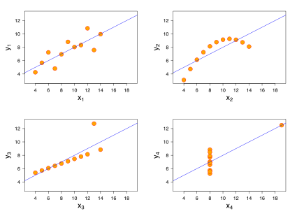
The first scatter plot (top left) appears to be a simple linear relationship, corresponding to two variables correlated and following the assumption of normality. The second graph (top right) is not distributed normally; while an obvious relationship between the two variables can be observed, it is not linear, and the Pearson correlation coefficient is not relevant (a more general regression and the corresponding coefficient of determination would be more appropriate). In the third graph (bottom left), the distribution is linear, but with a different regression line, which is offset by the one outlier which exerts enough influence to alter the regression line and lower the correlation coefficient from 1 to 0.816 (a robust regression would have been called for). Finally, the fourth graph (bottom right) shows an example when one outlier is enough to produce a high correlation coefficient, even though the relationship between the two variables is not linear.
The quartet is still often used to illustrate the importance of looking at a set of data graphically before starting to analyze according to a particular type of relationship, and the inadequacy of basic statistic properties for describing realistic datasets.[2][3][4][5][6]
The datasets are as follows. The x values are the same for the first three datasets.[1]
| I | II | III | IV | ||||
|---|---|---|---|---|---|---|---|
| x | y | x | y | x | y | x | y |
| 10.0 | 8.04 | 10.0 | 9.14 | 10.0 | 7.46 | 8.0 | 6.58 |
| 8.0 | 6.95 | 8.0 | 8.14 | 8.0 | 6.77 | 8.0 | 5.76 |
| 13.0 | 7.58 | 13.0 | 8.74 | 13.0 | 12.74 | 8.0 | 7.71 |
| 9.0 | 8.81 | 9.0 | 8.77 | 9.0 | 7.11 | 8.0 | 8.84 |
| 11.0 | 8.33 | 11.0 | 9.26 | 11.0 | 7.81 | 8.0 | 8.47 |
| 14.0 | 9.96 | 14.0 | 8.10 | 14.0 | 8.84 | 8.0 | 7.04 |
| 6.0 | 7.24 | 6.0 | 6.13 | 6.0 | 6.08 | 8.0 | 5.25 |
| 4.0 | 4.26 | 4.0 | 3.10 | 4.0 | 5.39 | 19.0 | 12.50 |
| 12.0 | 10.84 | 12.0 | 9.13 | 12.0 | 8.15 | 8.0 | 5.56 |
| 7.0 | 4.82 | 7.0 | 7.26 | 7.0 | 6.42 | 8.0 | 7.91 |
| 5.0 | 5.68 | 5.0 | 4.74 | 5.0 | 5.73 | 8.0 | 6.89 |
A procedure to generate similar data sets with identical statistics and dissimilar graphics has since been developed.[7]
See also
References
- 1 2 Anscombe, F. J. (1973). "Graphs in Statistical Analysis". American Statistician. 27 (1): 17–21. JSTOR 2682899.
- ↑ Elert, Glenn. "Linear Regression". The Physics Hypertextbook.
- ↑ Janert, Philipp K. (2010). Data Analysis with Open Source Tools. O'Reilly Media, Inc. pp. 65–66. ISBN 0-596-80235-8.
- ↑ Chatterjee, Samprit; Hadi, Ali S. (2006). Regression analysis by example. John Wiley and Sons. p. 91. ISBN 0-471-74696-7.
- ↑ Saville, David J.; Wood, Graham R. (1991). Statistical methods: the geometric approach. Springer. p. 418. ISBN 0-387-97517-9.
- ↑ Tufte, Edward R. (2001). The Visual Display of Quantitative Information (2nd ed.). Cheshire, CT: Graphics Press. ISBN 0-9613921-4-2.
- ↑ Chatterjee, Sangit; Firat, Aykut (2007). "Generating Data with Identical Statistics but Dissimilar Graphics: A Follow up to the Anscombe Dataset". American Statistician. 61 (3): 248–254. doi:10.1198/000313007X220057.
External links
- Department of Physics, University of Toronto
- Dynamic Applet made in GeoGebra showing the data & statistics and also allowing the points to be dragged (Set 5).