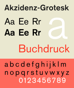
Akzidenz-Grotesk
 | |
| Category | Sans-serif |
|---|---|
| Classification | Grotesque sans-serif |
| Foundry | H. Berthold AG |
| Date released | 1896 |
Akzidenz-Grotesk is a sans-serif or grotesque typeface originally released by the Berthold Type Foundry of Berlin.[1] 'Akzidenz' means a 'trade' typeface for commercial use such as publicity materials, adverts, tickets and forms, as opposed to typefaces intended for decorative or book use.[2][3][4]
Dating to the late nineteenth century, Akzidenz Grotesk belongs to a tradition of general-purpose, unadorned sans-serif fonts that had become popular during the nineteenth century, at first in Britain and later in Germany, becoming one of the most popular examples of this style. Its simple, unadorned design has influenced many later faces and became commonly used in the International or 'Swiss' design style by the 1950s and 1960s. It has sometimes been sold as Standard or Basic Commercial in the USA.[5]
History

Like most sans-serifs Akzidenz Grotesk is 'monoline' in structure, with all strokes of the letter of quite similar width, giving a sense of simplicity and an absence of adornment and flourishes seen in many more decorative sans-serifs of the late nineteenth century influenced by the Art Nouveau style.[6] Modern type designer Martin Majoor has described the general design of Akzidenz Grotesk and its ancestors as similar in letterforms to Didone serif fonts such as Didot and Walbaum, most visibly in the folded-up apertures of letters such as ‘a’ and ‘c’.[6][7]
Akzidenz-Grotesk's metal type family included fonts made by a range of foundries to slightly different designs, some reportedly from the Berlin foundry Ferdinand Theinhardt Schriftgiesserei and designed by Ferdinand Theinhardt.[8][9] Many other grotesques in the same style were available in German by the early twentieth century, for example Grotesk and Koralle by Schelter & Giesecke and Venus-Grotesk of the Bauer foundry; Monotype Grotesque also is based on German typefaces of this period.[6][10][11]
Unlike the earliest sans-serifs designed in Britain and the United States, the 'g' of Akzidenz Grotesk is a 'single-story' design, like in many other German sans-serifs. Walter Tracy describes this as a German trait influenced by the tradition of blackletter, still very popular for general-purpose use in Germany in the nineteenth century.[6]
With the end of mass use of metal type, Akzidenz Grotesk has been rereleased and adapted in versions for phototypesetting and digital technologies. Contemporary versions of Akzidenz-Grotesk descend from a late-1950s project, directed by Jimmy Lazar at Berthold, to enlarge the typeface family, adding a larger character set, but retaining all of the idiosyncrasies of the 1898 face. Under the direction of Günter Gerhard Lange, he had designed 33 font styles to the Akzidenz-Grotesk family, including AG Extra (1958), AG Extra Bold (1966) and AG Super (1968), AG Super Italic (2001) and Extra Bold italic (2001).[12]
Berthold released Akzidenz-Grotesk in OpenType format in 2006, under the name Akzidenz-Grotesk Pro, and added matching Cyrillic and Greek characters the next year.[13][14]
Distinctive characteristics
Characteristics of this typeface are:
lower case: A rather 'folded-up' appearance with narrow apertures and strokes curled up towards the vertical, most obvious on letters such as c, e, s and a. Stroke endings are less consistently horizontal or vertical than in Helvetica. A square dot over the letter i. Double story a.
upper case: G with a vertical spur. A dropped horizontal stroke on A.
number: A top serif on 7.
Akzidenz Grotesk uses an oblique rather than a true italic, in which the letters are basically slanted rather than using handwriting forms.[7]
Variations
Several other type designers modelled typefaces from this popular typeface. Max Miedinger at the Haas Foundry used it as a model for the typeface Neue Haas Grotesk, released in 1957 and renamed Helvetica in 1960.[15] Miedinger sought to refine the typeface making it more even and unified, with a higher x-height and tighter spacing. Two other releases from 1957, Adrian Frutiger's Univers and Bauer and Baum's Folio, take inspiration from Akzidenz-Grotesk.
Akzidenz-Grotesk Book

Akzidenz-Grotesk Book is a variant designed by Günter Gerhard Lange between 1969 and 1973. Designed after Helvetica had become popular, it incorporates some of its features, such as strike-through tail in 'Q', a curved tail for the 'R', horizontal and vertical cut stroke terminators. As in some Helvetica versions, the cedilla is replaced with a comma.[16] Erik Spiekermann has described it as "Berthold's answer to Helvetica."[17]
In 2006, the font family was updated with OpenType feature, and was expanded to 3 widths with 5 (later 6) weights (4 weights in condensed and extended fonts) each, and includes complementary italic fonts. In 2007, OpenType Pro versions of the fonts were released. In 2008, medium outline, bold outline, and medium stencil fonts were released.
AG Book Pro+ (2008)
This version supports Cyrillic and Greek characters.
Akzidenz-Grotesk Book Rounded
Akzidenz-Grotesk Book Rounded is a variant designed by Günter Gerhard Lange in 1980. It features rounded stroke terminators on AG Book design (hax). In 2007, OpenType Pro versions of the fonts were released.
AG Book Rounded Pro+ (2008)
This version supports Cyrillic and Greek characters.
Akzidenz-Grotesk Schulbuch

Akzidenz-Grotesk Schulbuch (Schoolbook) is a variant designed by Günter Gerhard Lange in 1983. It uses schoolbook characters, characters intended to be more distinctive and handwriting-influenced to be easier for children to recognise.
Based on Akzidenz-Grotesk Book, it includes a single-storey 'a', curled 'l', lower- and upper-case 'k' that are symmetrical, and 't', 'u' and 'y' without curls on the base. The 'J' has a top bar, the 'M' centre does not descend to the baseline and the 'G' and 'R' are simplified in the manner of Futura. A particularly striking feature is a blackletter-style upper-case 'I' with a curl at the bottom: this is not normal in the English-speaking world, but much more common in Germany.[18][19]
Each font weight has 2 fonts featuring alternative designs. In 2008, OpenType Pro versions of the fonts were released. FontFont's FF Schulbuch family is in a similar style.[19]
Akzidenz-Grotesk Old Face

Akzidenz-Grotesk Old Face is a variant designed by Günter Gerhard Lange in 1984, inspired by the earliest versions of Akzidenz-Grotesk and incorporating more eccentricities than some modern versions. Euro sign was changed to diagonal cut. It also incorporates quirks, such as comma-styled cedilla on medium and bold weights, inward hook in regular-weighted ß, shortened horizontal serif in regular-weighted 1, which are absent in the original font family.
Regular, medium, bold, outline, bold outline, shaded fonts have been made for the family, but no italic fonts. In 2008, a shaded font was released.
Akzidenz-Grotesk Next
In December 2006, Berthold announced the release of Akzidenz-Grotesk Next.[20] Designed by Bernd Möllenstädt and Dieter Hofrichter, this typeface family features readjusted x-heights and weights throughout the family, giving a more consistent type design. The family consists of 14 variants with 7 weights in roman and italic, in a single width.
Similarities to other typefaces
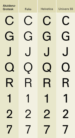
Akzidenz-Grotesk is sometimes at first glance mistaken for the Helvetica or Univers typefaces. The similarities of Helvetica and Akzidenz-Grotesk are apparent, but the subtle differences include the uppercase and lowercase C and the uppercase G, J, R and Q. Aside from the subtle differences in these individual letters, Miedinger's primary change to Akzidenz-Grotesk is Helvetica's higher x-height, the distance from the baseline to the height of the lowercase letter x. The general effect is that Helvetica appears more oblong while Akzidenz-Grotesk maintains circular counters and bowls. Both Helvetica and Univers are more regular and have a greater consistency of stroke weight.
Some new weights, condensed and extended widths were released under the title Standard.
The Optimo design house of Switzerland has released an alternative digitisation of Akzidenz-Grotesk.[21] Erik Spiekermann has praised this as the best Akzidenz-Grotesk digitisation.[22] Spiekermann has also released with Ralph du Carrois a very loose digitsation of Akzidenz Grotesk, FF Real, in two optical sizes, with variant features like a two-storey 'g' and ligatures.[23][24]
Linotype sells a version of Akzidenz-Grotesk under the name Basic Commercial. This is based on Linotype's digitization of the typeface, which is also sold under the Akzidenz-Grotesk name by various foundries; Linotype uses a different name to avoid trademark infringement.[25] However, as of 2008, Linotype's online store also sells Akzidenz-Grotesk and other Berthold variants under the original names.
Much more loosely, Transport, the typeface used on British road signs, was designed by Jock Kinneir and Margaret Calvert influenced by Akzidenz-Grotesk.[26] However, many adaptations and letters influenced by other typefaces were incorporated to increase legibility and make characters more distinct.[27][28]
Notable users

Akzidenz-Grotesk and Georgia are the official fonts of the American Red Cross. Akzidenz-Grotesk is used on the national logo and national guidelines require the font to be used on all chapter logos. All American Red Cross publications must be printed in Akzidenz-Grotesk or Georgia fonts.[29]
Akzidenz-Grotesk is also the font used in Arizona State University brand logo;[30] in extra bold italic form, used in the NASCAR Sprint Cup Series for the driver's surname placed on the windshield of the race cars; and in light condensed form, used in the Brooklyn Nets' logo. In the late 1990s and early 2000s, Akzidenz-Grotesk was used heavily on The Weather Channel's on-screen graphics.
See also
Notes
- ↑ Akzidenz-Grotesk Goes Greek and Cyrillic
- ↑ "Identifont post". Identifont. Retrieved 20 June 2015.
- ↑ Majoor, Martin. "Inclined to be dull". Eye magazine. Retrieved 20 June 2015.
- ↑ Spiekermann, Erik. "Comments on Typophile thread". Typophile. Archived from the original on July 9, 2008. Retrieved 20 June 2015.
- ↑ Shaw, Paul. "Helvetica & Standard". Blue Pencil. Retrieved 1 July 2015.
- 1 2 3 4 Tracy, Walter. Letters of Credit: A View of Type Design. D. R. Godine. pp. 58, 86–97. ISBN 978-1-56792-240-0.
- 1 2 Majoor, Martin. "My Type Design Philosophy". Typotheque. Retrieved 12 November 2015.
- ↑ Akzidenz Grotesk roots
- ↑ page 21, Sans Serif: The ultimate sourcebook of classic and contemporary sans serif typography, Thames & Hudson, Cees W. de Jong, 2006
- ↑ Kupferschmid. "Koralle". Alphabettes. Retrieved 13 July 2016.
- ↑ "Venus - MyFonts". MyFonts. Retrieved 13 July 2016.
- ↑ page 23, Sans Serif: The ultimate sourcebook of classic and contemporary sans serif typography, Thames & Hudson, Cees W. de Jong, 2006
- ↑ Berthold Announces the Release of Akzidenz-Grotesk in OpenType Format
- ↑ AG goes Greek and Cyrillic
- ↑ Shinn, Nick. "Uniformity" (PDF). Nick Shinn. Graphic Exchange. Retrieved 1 July 2015.
- ↑ Schwartz, Christian. "Neue Haas Grotesk". Retrieved 28 November 2014.
- ↑ Spiekermann, Eric. "Twitter post". Twitter. Retrieved 21 July 2016.
AG Buch war GGL’s Antwort auf Helvetica, für die Berthold keine Lizenz kriegte von Linotype.
- ↑ Coles, Stephen. "Wikipedia Redefined". Fonts In Use. Retrieved 13 July 2016.
- 1 2 Coles, Stephen. "Design Museum". Fonts In Use. Retrieved 13 July 2016.
- ↑ Berthold Releases Akzidenz-Grotesk Next
- ↑ "Theinhardt". Optimo. Retrieved 21 July 2016.
- ↑ Spiekermann, Erik. "Twitter post". Twitter. Retrieved 21 July 2016.
ist ja auch die beste AG
- ↑ "FF Real". Linotype. Retrieved 21 July 2016.
- ↑ "Interview with Erik Spiekermann and Ralph du Carrois". FontShop. Retrieved 21 July 2016.
- ↑ Thread on Typophile containing Linotype's official explanation of the origin of Basic Commercial, in response to an accusation of forgery.
- ↑ Calvert, Margaret. "New Transport". A2-Type. Retrieved 1 March 2016.
- ↑ Sudjic, Deyan. "From Akzidenz to Transport Solution". Port. Retrieved 21 July 2016.
- ↑ Jackson, Tanya (31 January 2013). British Railways: The Nation's Railway. History Press. p. 130. ISBN 978-0-7524-9742-6.
- ↑ American Red Cross Brand Standards
- ↑ Arizona State University Communication Guide | Font Standard
References
- Bringhurst, Robert. The Elements of Typographic Style. Hartley & Marks: 1992. ISBN 0-88179-033-8.
- Fellici, James. The Complete Manual of Typography. Adobe Press: 2002. ISBN 978-0-321-12730-3.
- Fiedl, Frederich, Nicholas Ott and Bernard Stein. Typography: An Encyclopedic Survey of Type Design and Techniques Through History. Black Dog & Leventhal: 1998. ISBN 1-57912-023-7.
- Kane, John. A type primer. Prentice Hall: 2002. ISBN 0-13-099071-X.
- Macmillan, Neil. An A–Z of Type Designers. Yale University Press: 2006. ISBN 0-300-11151-7.
- "Berthold Fonts".
External links
| Wikimedia Commons has media related to Akzidenz Grotesk. |
- Berthold pages: AG Book Pro+, AG Book Rounded, AG Book Stencil et al, AG Old Face, AG Schoolbook, Akzidenz-Grotesk Pro+, Akzidenz-Grotesk Next
- Akzidenz-Grotesk Next
- Akzidenz Grotesk sample books
- Typowiki: Akzidenz-Grotesk
- Some notes on the history of Akzidenz-Grotesk, Indra Kupferschmid
- Akzidenz-Grotesk on Fonts.com